📱 Responsive Design
More than 50% of your visitors are on their phones right now. A clunky mobile experience sends them straight to competitors. Dorik automatically adapts your design to phones, tablets, and desktops.
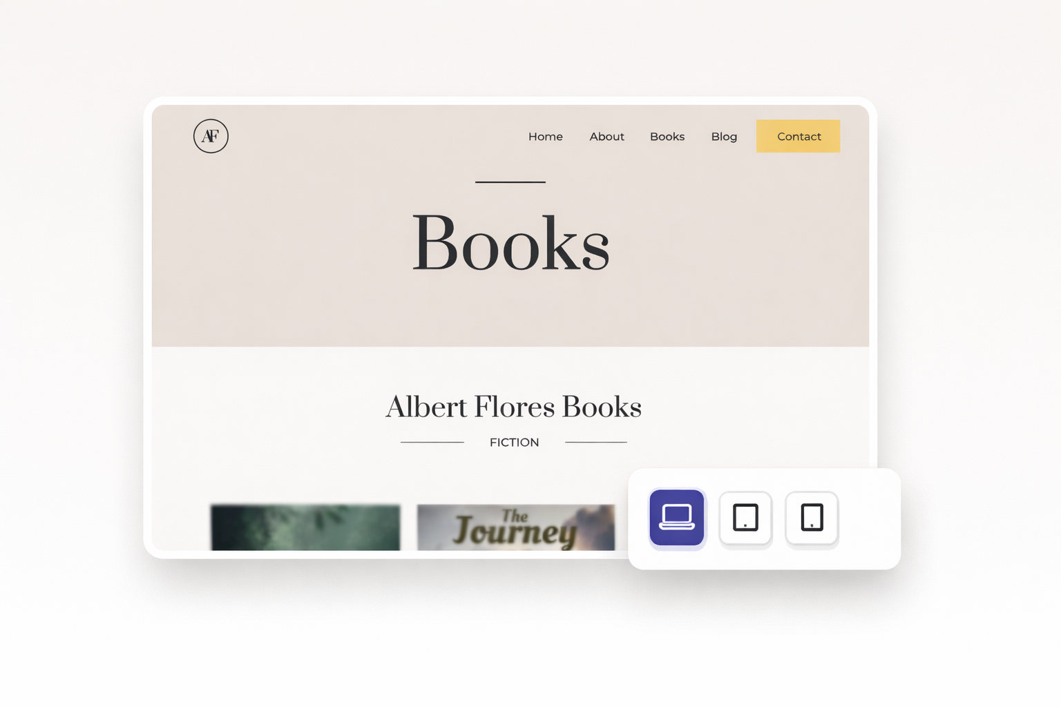
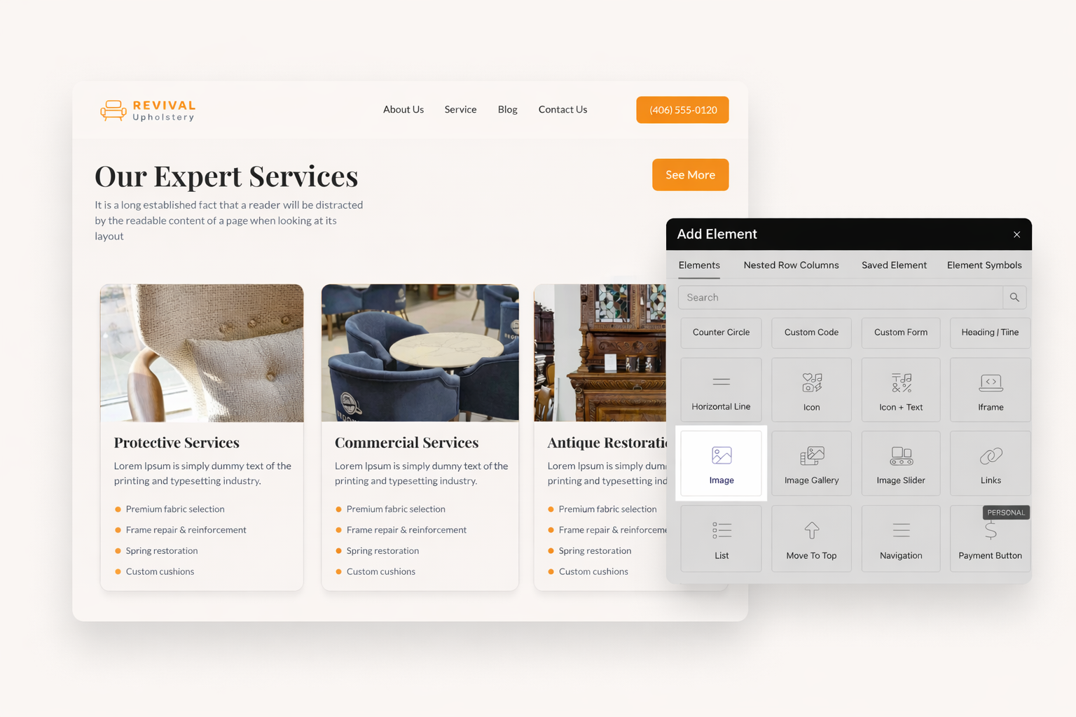
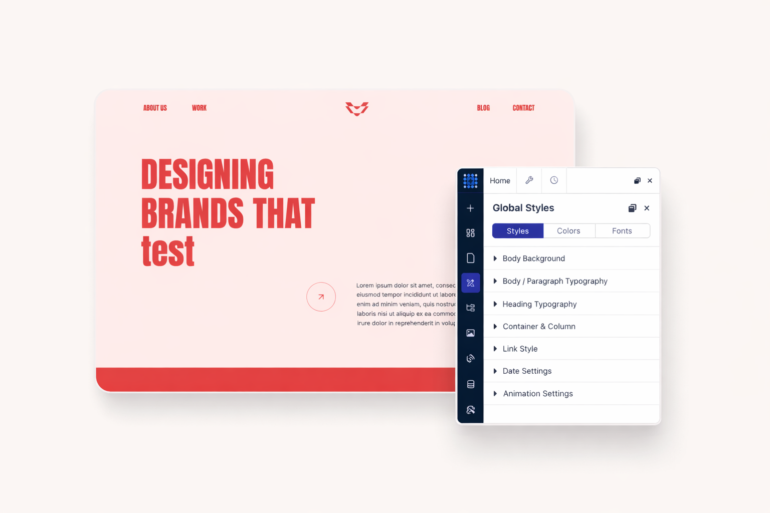
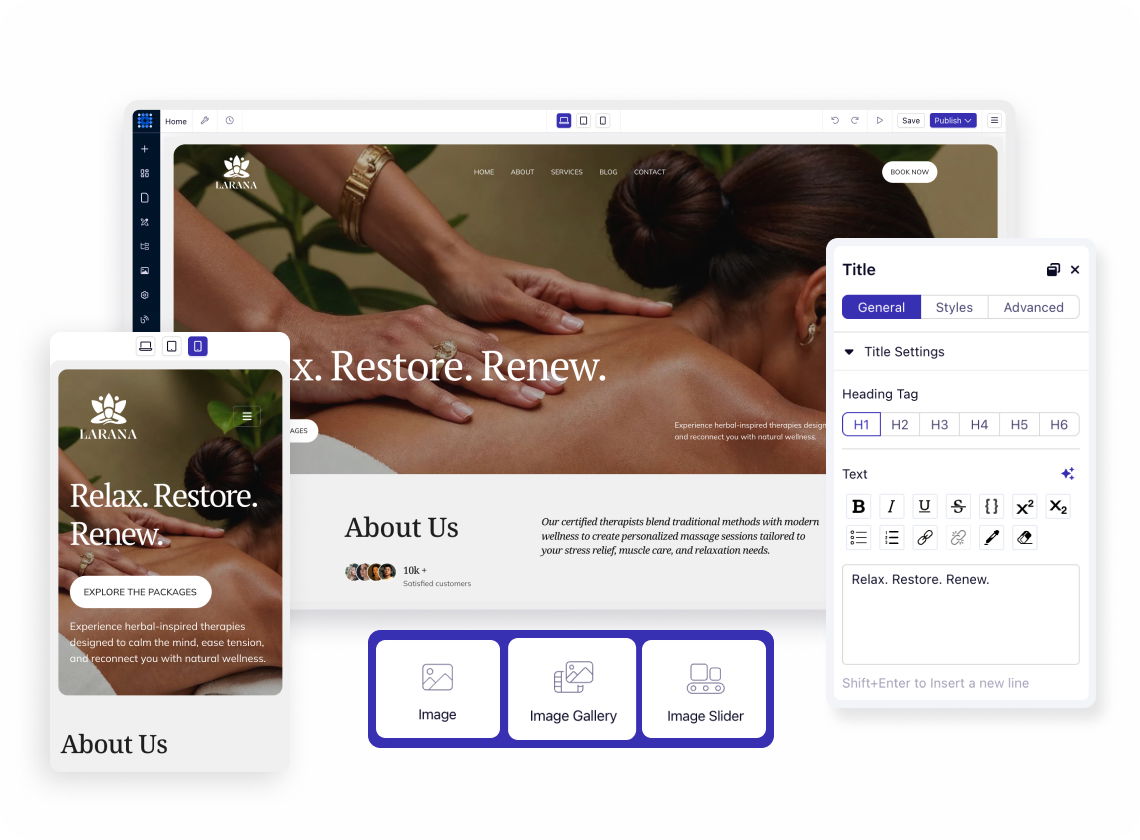
Switch between desktop, tablet, and mobile views with one click. See exactly how your design adapts before publishing. Make adjustments in real time. The device switcher shows your layout at each breakpoint. No guesswork required.
Every breakpoint offers independent styling options. Adjust column sizes specifically for tablets. Fine-tune spacing for mobile screens. Desktop changes cascade down, but you control what stays and what changes.
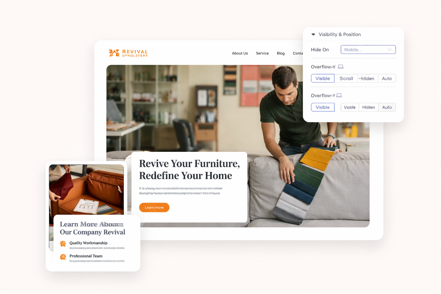
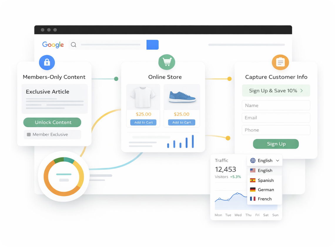
Some elements shine on desktop but clutter mobile views. Hide them with one click. Show different content to mobile visitors. Create tailored experiences without building separate sites.
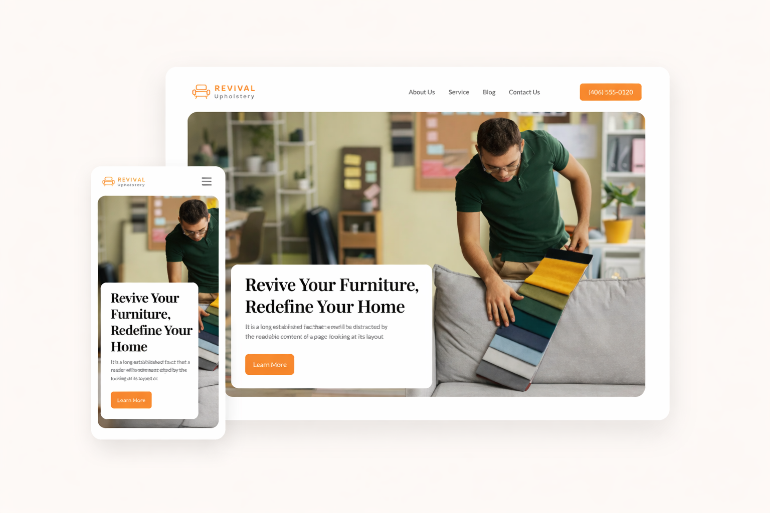
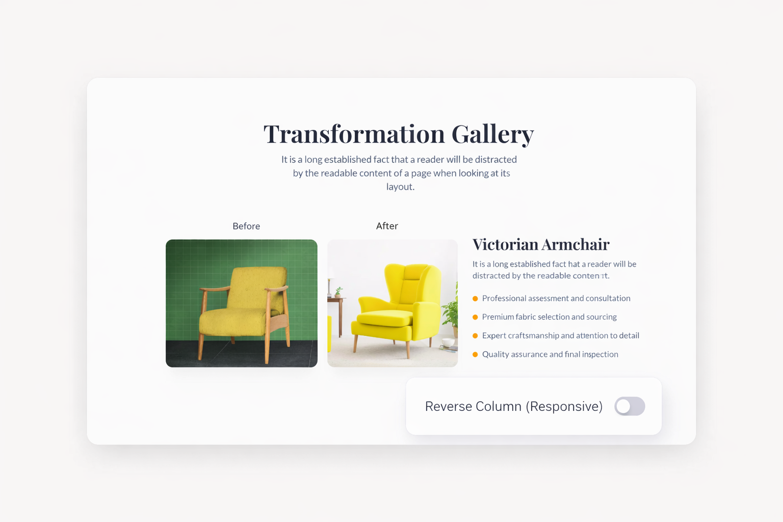
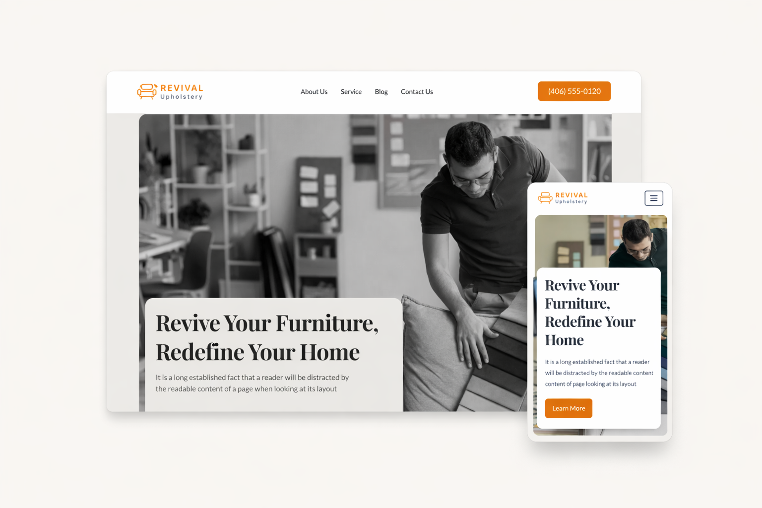
Desktop columns transform into stacked mobile sections. Content reorders intelligently for smaller screens. Reverse the stacking order when needed. Your layouts always make sense on any device.
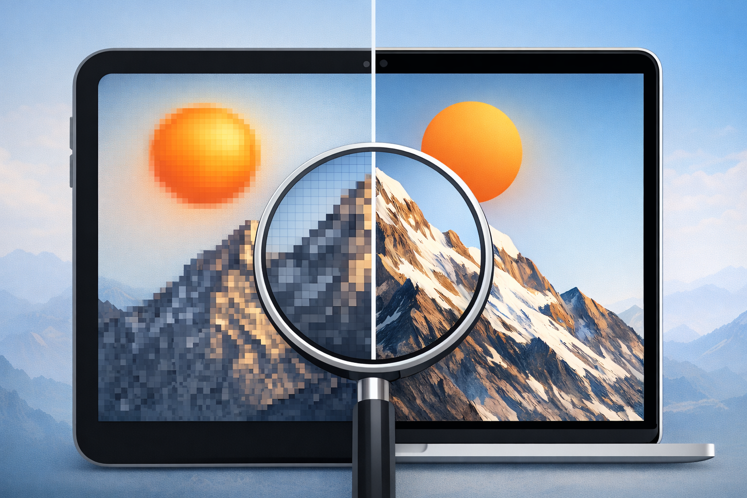
Large images slow down mobile connections. Dorik compresses and resizes images server-side without quality loss. Visitors get fast-loading pages on any device. No manual optimization needed.
High-resolution screens deserve sharp images. Dorik delivers retina-ready graphics automatically. Your photos look crisp on iPhone, iPad, and MacBook displays. Professional quality comes standard.

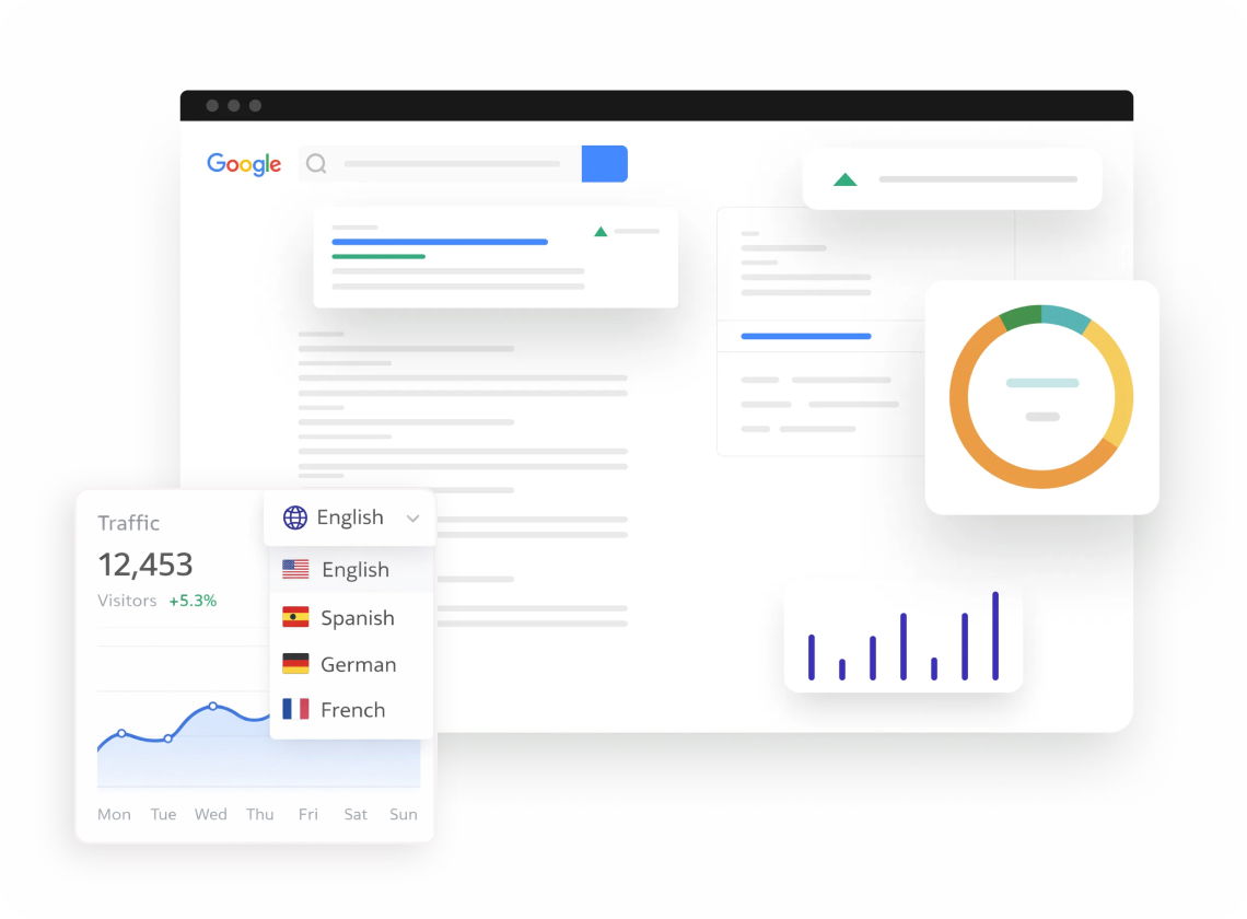
Over 150 CDN locations serve your site. Mobile visitors get content from the nearest server. Pages load quickly on cellular networks. Fast sites rank higher and convert better.
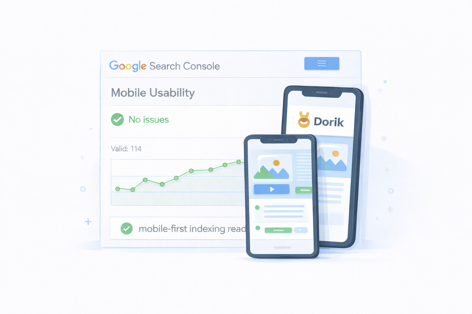
Google ranks your mobile site first. Dorik sites are mobile-first indexing ready. Your responsive design satisfies search engine requirements. Better rankings mean more traffic.
Desktop hover menus need mobile alternatives. Navigation elements adapt automatically for touch. Buttons size appropriately for easy tapping. Visitors navigate comfortably on phones.
Typography scales appropriately across devices. Headlines remain impactful on small screens. Body text stays readable without zooming. Global styles control sizing at each breakpoint.
Stop worrying about device compatibility. Dorik handles responsiveness automatically. Every template adapts to every screen. Start creating your mobile-perfect website today.
Dorik includes three responsive breakpoints: Desktop at 1140px default width, Tablet at 768px, and Mobile at 420px. All templates automatically adapt to screens between and beyond these sizes.
Yes. Use the device visibility feature to hide or show any element on specific devices. Create mobile-only sections or desktop-exclusive content without building separate pages.
No. Dorik automatically compresses images server-side and delivers appropriately sized versions. This happens without quality loss, keeping your site fast on all connections.
Yes. Responsive layouts adapt to screen width regardless of orientation. Content reflows naturally whether visitors hold tablets vertically or horizontally.
Positively. Google uses mobile-first indexing, meaning your mobile site determines rankings. Dorik's responsive approach ensures content parity across devices, satisfying search engine requirements.
Absolutely. The device switcher in the builder lets you preview desktop, tablet, and mobile views instantly. See exactly how visitors experience your site on each device.
❤️ This website is built with Dorik, without writing any code
© 2026 Dorik, Inc. All rights reserved