🧩 Visual Website Editor
Your ideas deserve a website that matches them perfectly. Dorik's visual editor lets you move elements like arranging apps on your phone. Create pixel-perfect layouts, customize every detail, and publish with confidence.
Place elements exactly where you want them. Click any component and drag it into position. The grid-based layout system keeps everything aligned automatically. No coding knowledge required.
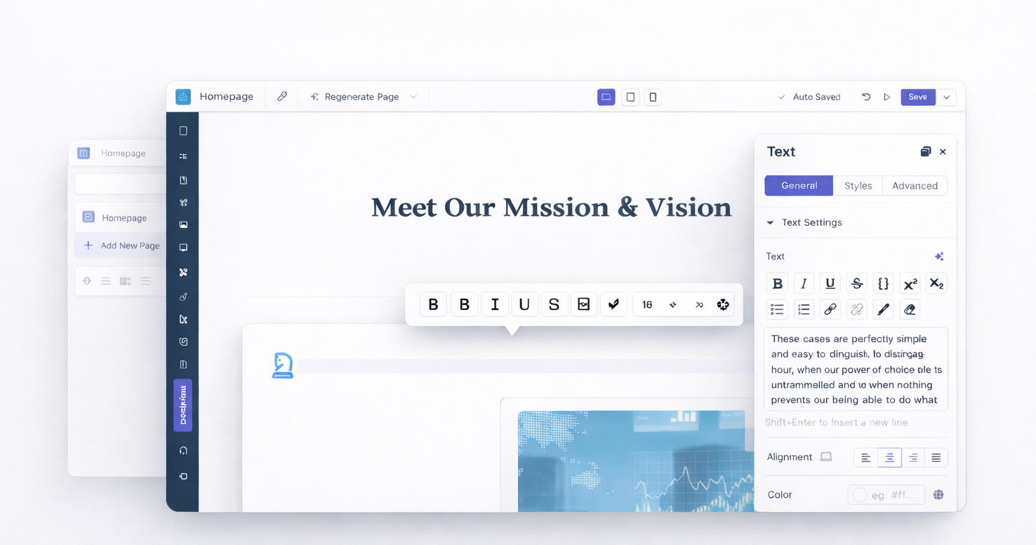
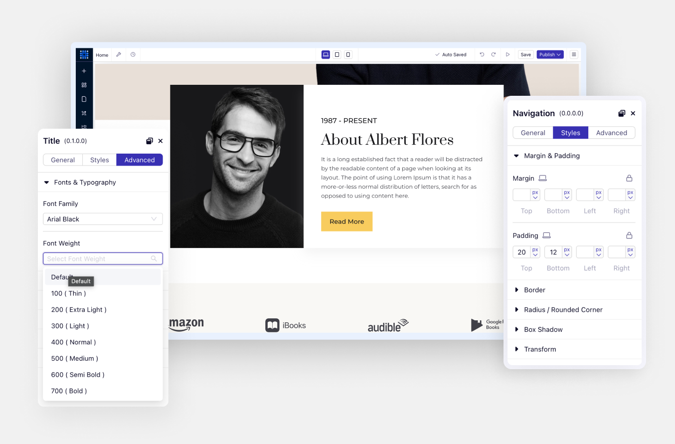
Click any text and start typing. Change fonts, sizes, and colors without opening separate panels. Your edits appear instantly where they'll display on your live site.
Every adjustment appears in real time. Background colors, spacing, typography changes all display immediately. Preview your site exactly as visitors will see it before publishing.
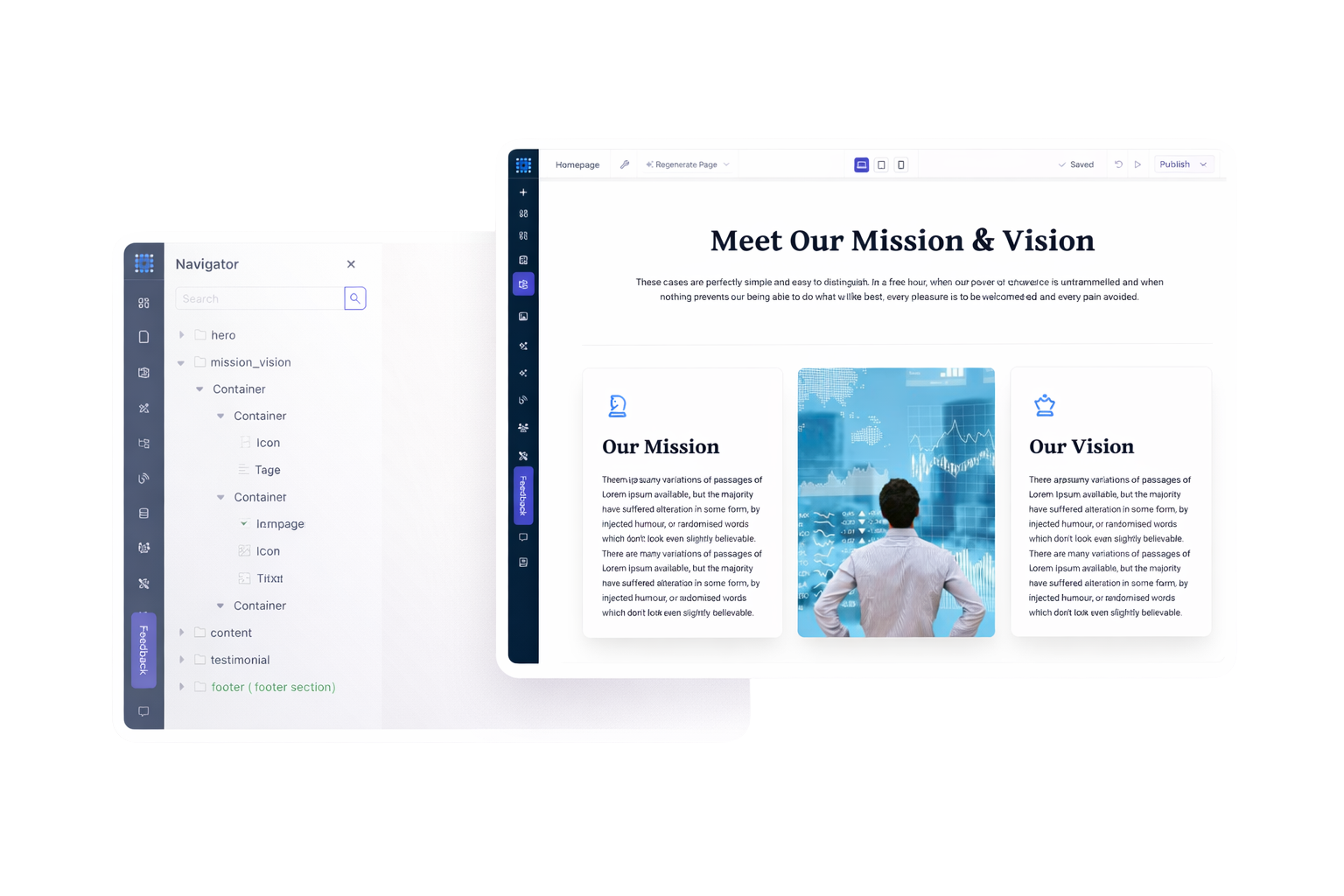
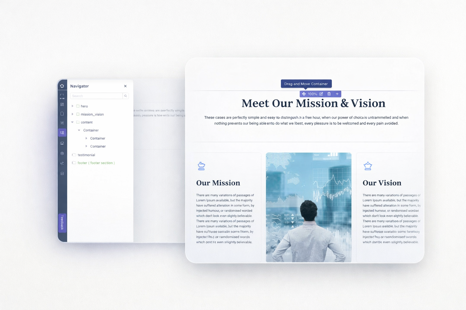
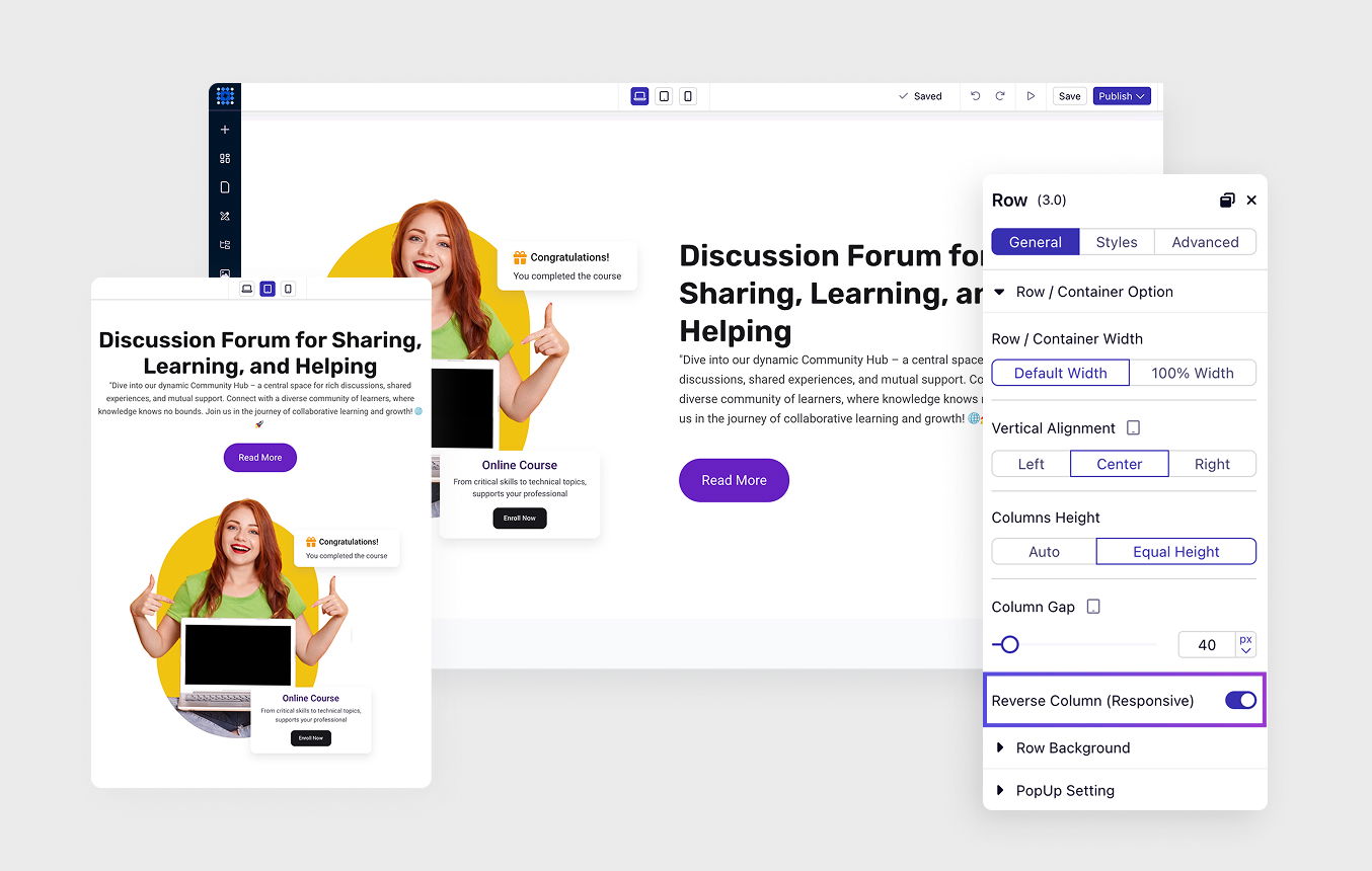
Start with sections as your building blocks. Add rows and columns inside them. Nest containers within containers for complex layouts. Each element resizes and repositions independently.
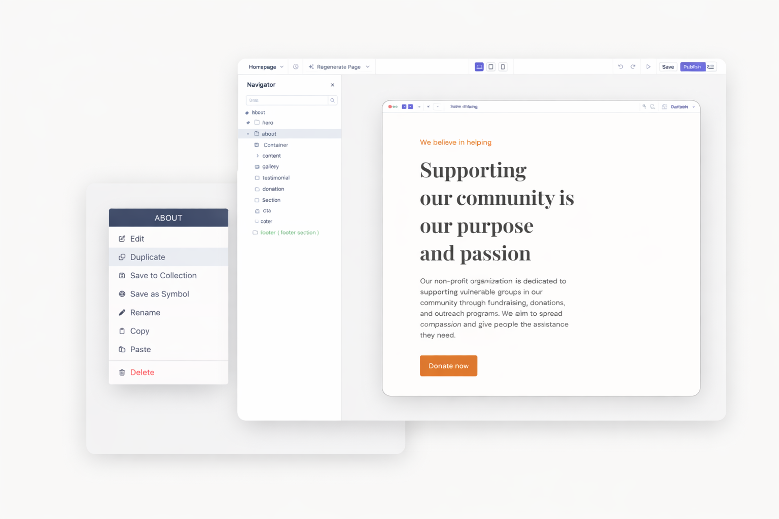
Duplicate any section, row, column, or element instantly within the same page. Reuse your layouts to build faster and stay consistent.
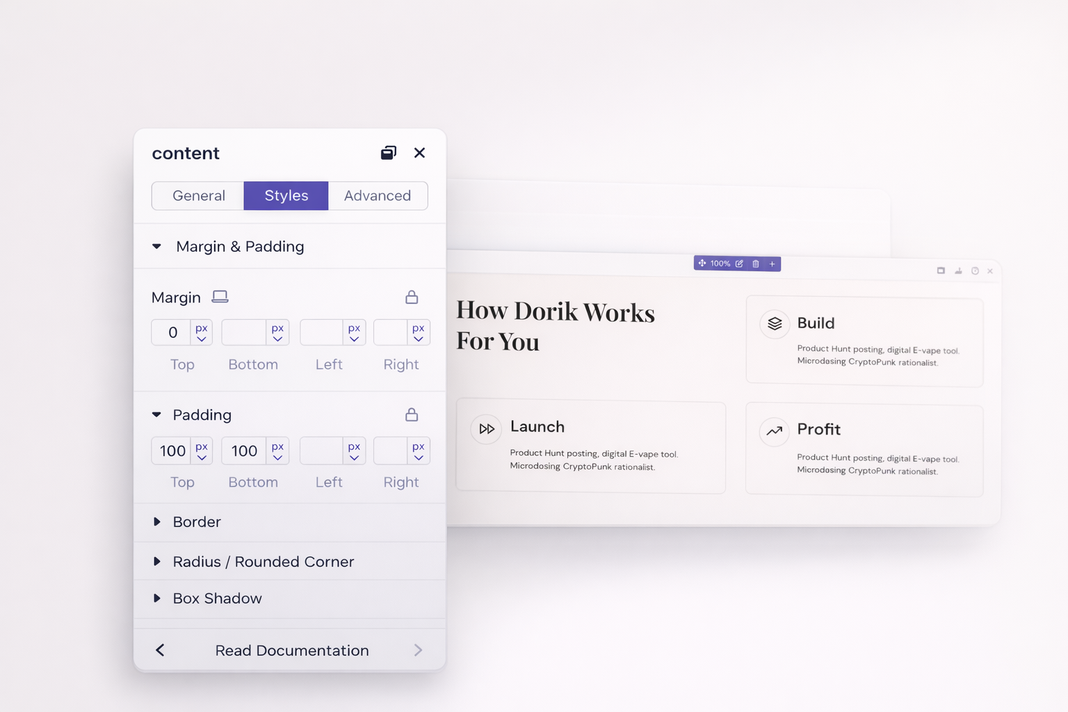
Set precise margins and padding on all sides. Adjust spacing between elements visually or enter exact pixel values. Consistent spacing creates professional, polished designs.
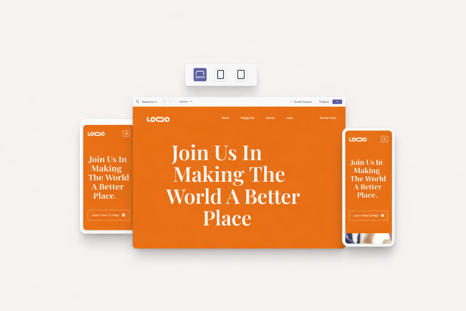
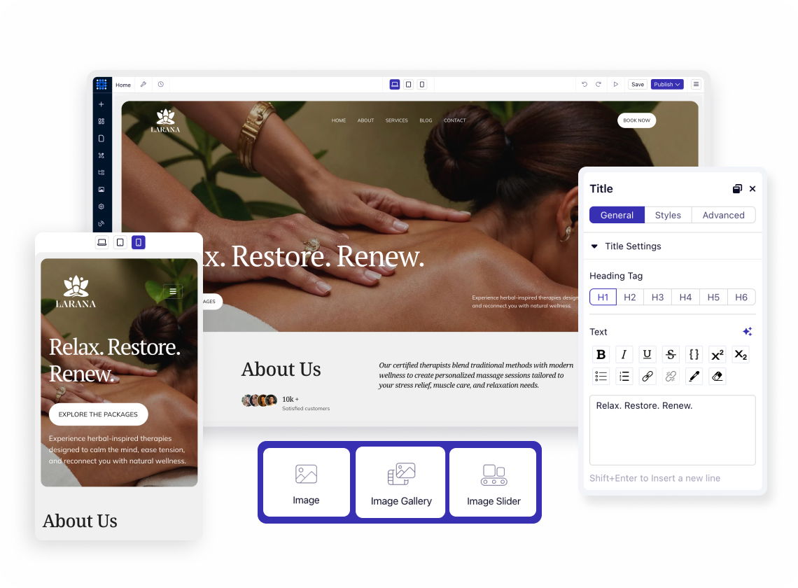
Click device icons to see your design at different breakpoints. Desktop displays at 1140px, tablet at 768px, mobile at 420px. Design once, then refine for each screen size.
Change layouts, font sizes, and spacing for specific devices only. What you adjust on mobile stays on mobile. Desktop settings remain untouched while you perfect the mobile experience.
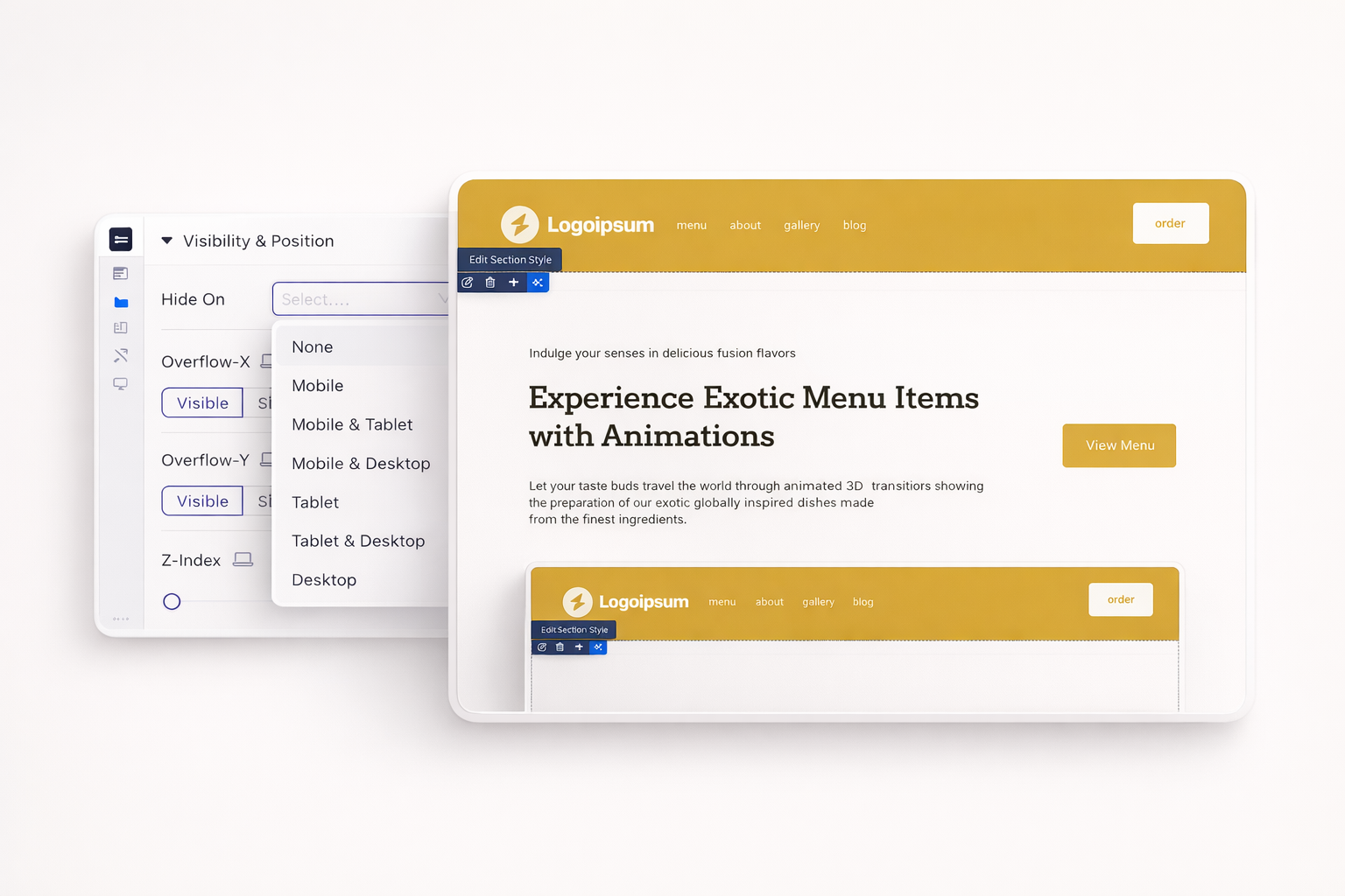
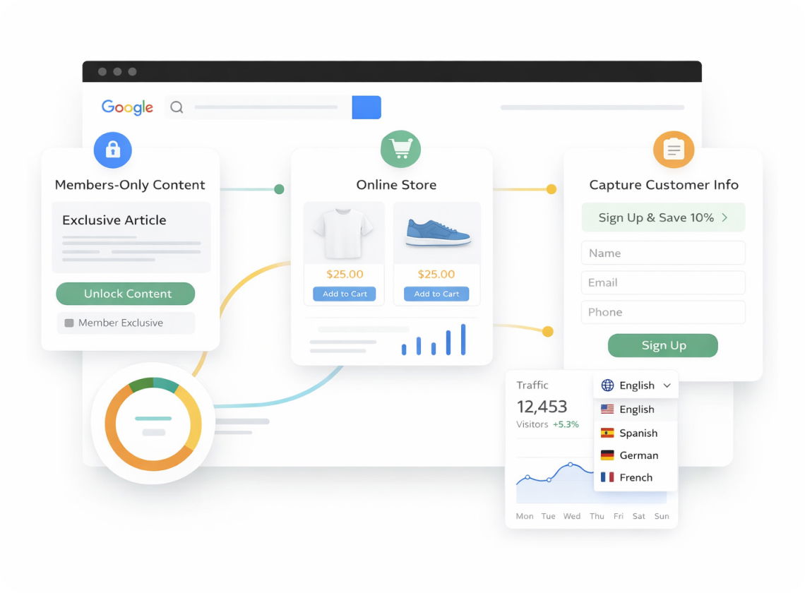
Show promotional banners on desktop, hide them on mobile. Display different navigation styles per device. Control exactly what appears on each screen size.
Columns automatically stack vertically on smaller screens. Control the stacking order. Reverse the sequence if needed. Mobile layouts look intentional, not accidental.
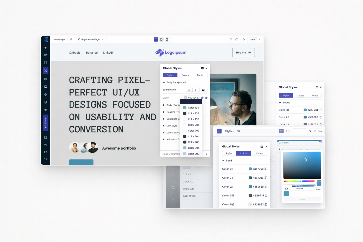
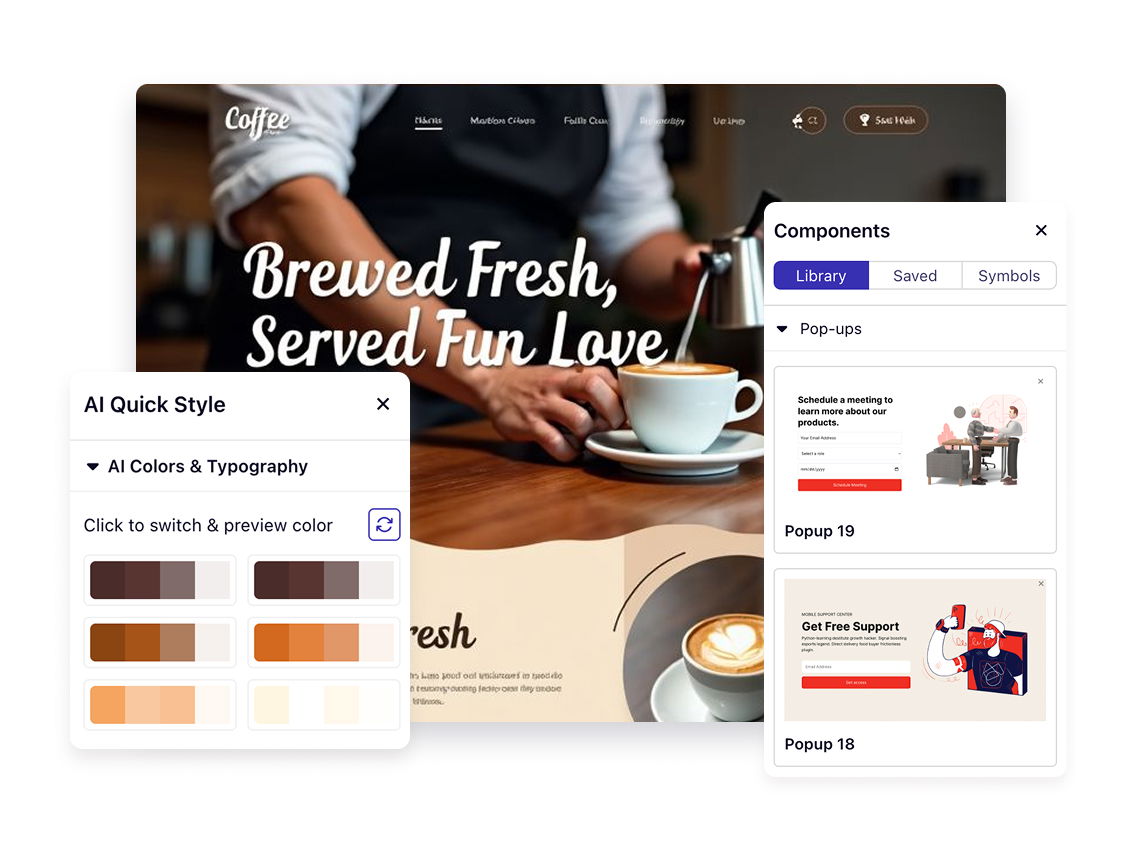
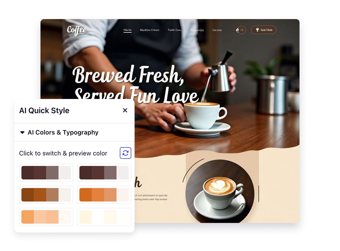
Define your brand colors in global styles. Apply them consistently across every page. Change one color setting, watch it update everywhere instantly.
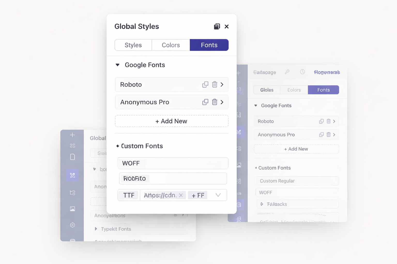
Access the entire Google Fonts library at no extra cost. Upload custom fonts if needed. Connect Adobe Typekit for premium typography. Your brand fonts work everywhere.
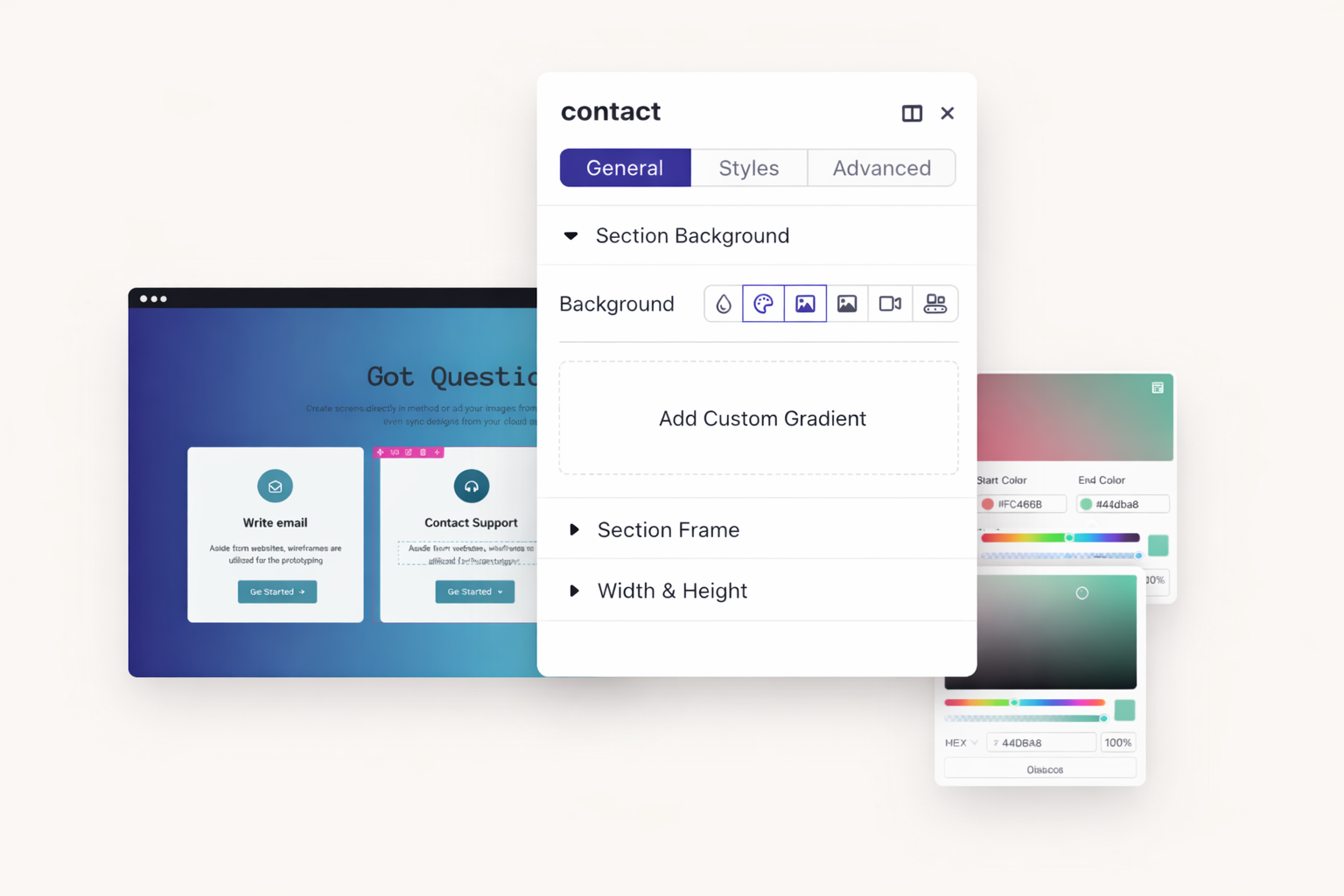
Build multi-color gradients with precise control. Add multiple color stops. Adjust angles and positions. Create stunning backgrounds without external design tools.
Set typography for H1 through H6 headings once. Every heading across your site follows your rules. Update heading styles globally when your brand evolves.
Dorik saves automatically every 10 minutes. Never lose progress to browser crashes or accidental closures. Your work stays safe even when life interrupts.
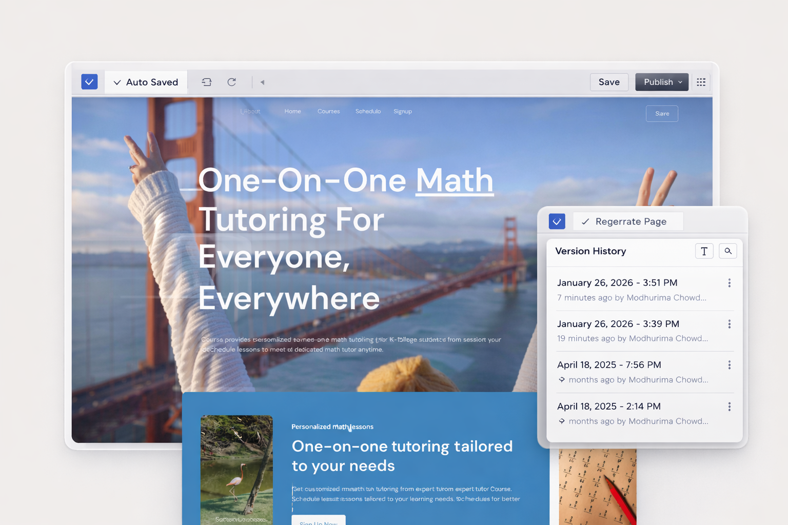
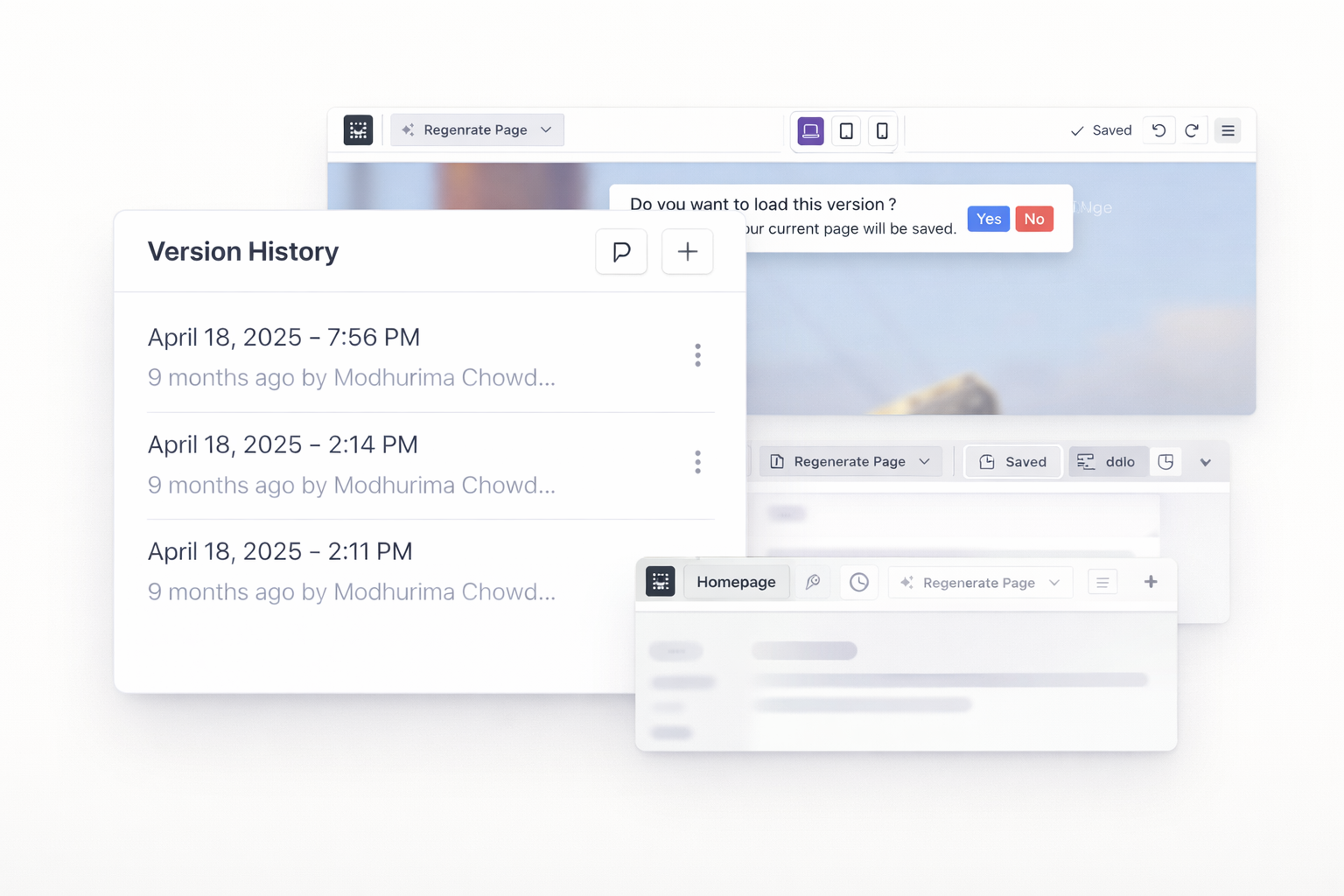
Access unlimited version history for every page. Preview old versions before restoring. Roll back to any saved state with one click. Experiment freely without risk.
Made a mistake? Press undo. Changed your mind? Press redo. Navigate backward and forward through your recent changes. Every action is reversible.
Create named checkpoints before major changes. Label versions for easy identification. Return to specific milestones whenever needed. Document your design process.
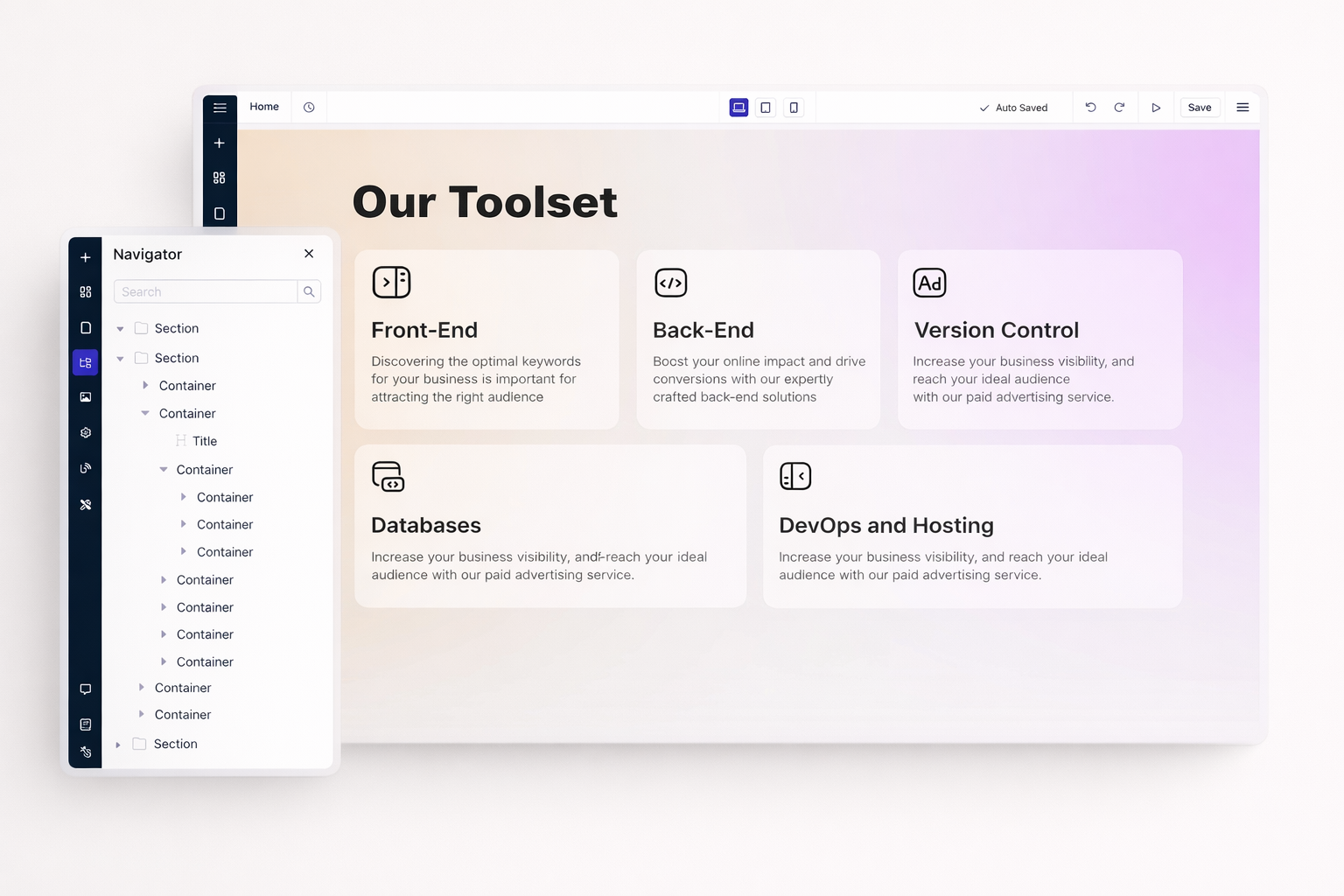
See every section, row, column, and element in a hierarchical tree. Click any item to select it instantly. Reorder elements by dragging within the navigator panel.
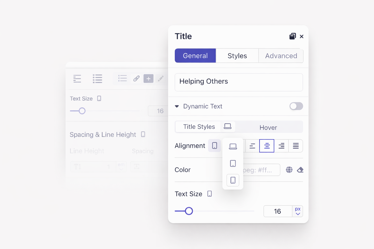
Choose sidebar editing for quick adjustments. Use modal editor for detailed styling. Each mode offers the same controls with different layouts to match your workflow.
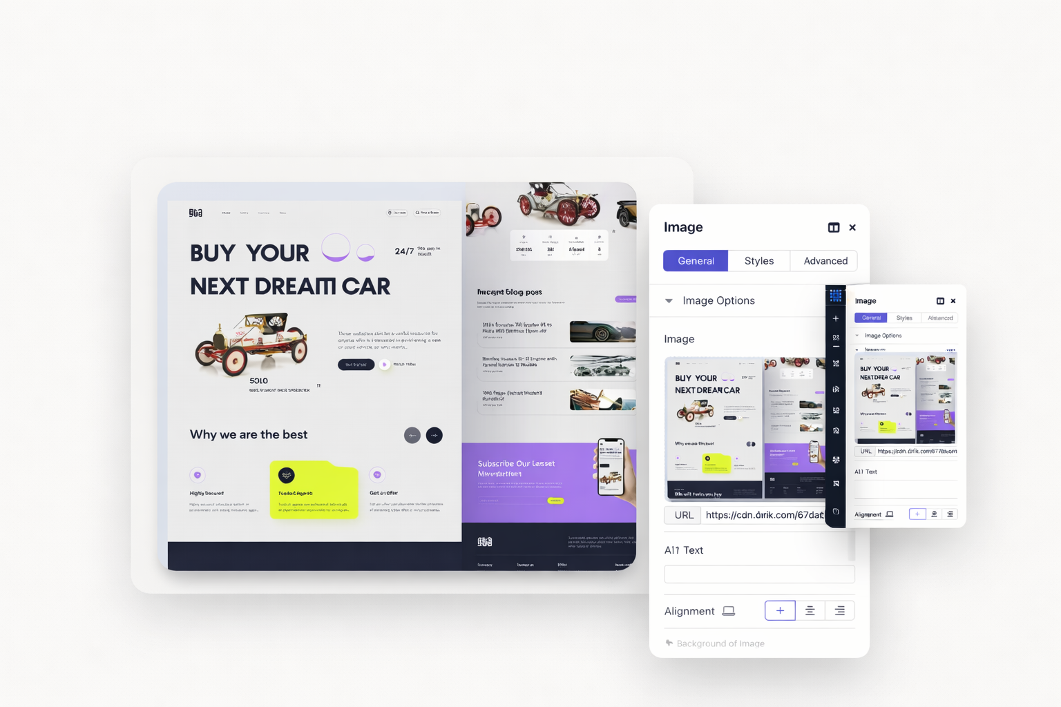
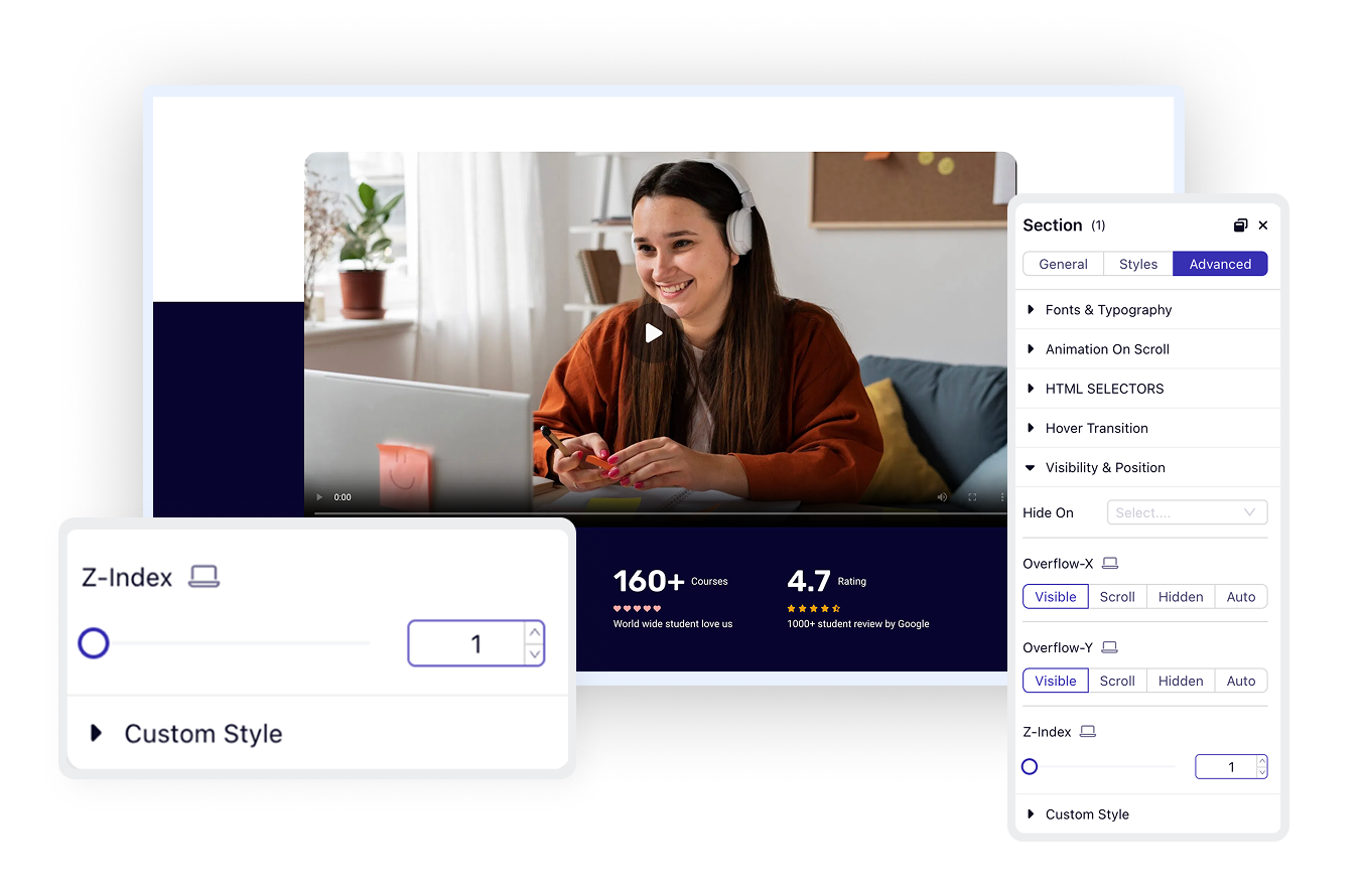
Basic styling options appear in the Styles tab. Advanced controls like transforms, z-index, and custom CSS live in the Advanced tab. Everything organized logically.
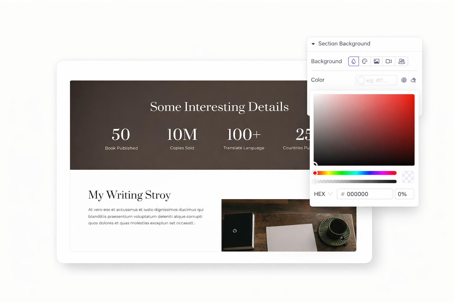
Choose solid colors, gradients, or images. Layer multiple backgrounds together. Control positioning, sizing, and repeat options. Create depth with overlays and blends.
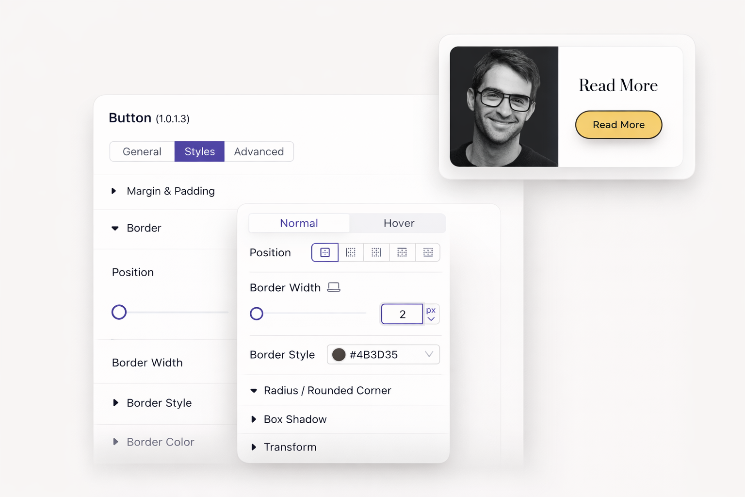
Add borders on any side. Control width, style, and color independently. Round corners to any radius. Create pills, circles, or subtle curves with precision.
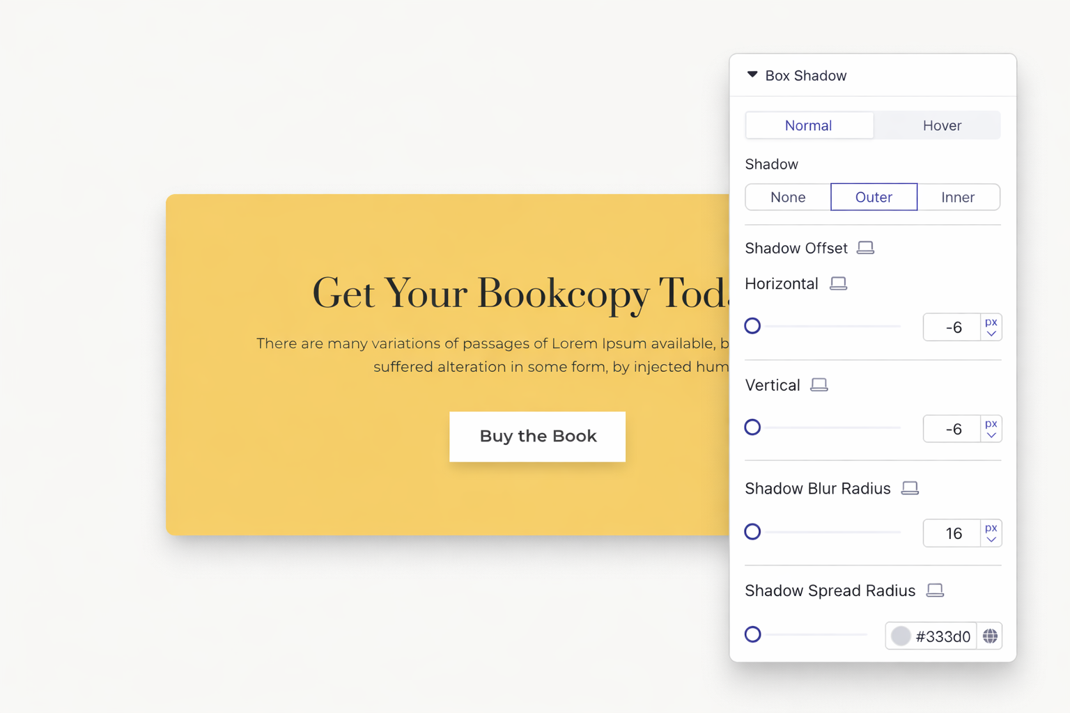
Add shadows to create visual hierarchy. Control blur, spread, and offset. Use multiple shadows for realistic effects. Subtle shadows make elements pop.
Set z-index values to control stacking order. Bring elements forward or send them backward. Create overlapping designs that look intentional and polished.
Save your progress without publishing. Return anytime to continue editing. Share draft previews with clients for feedback. Publish only when everything looks perfect.
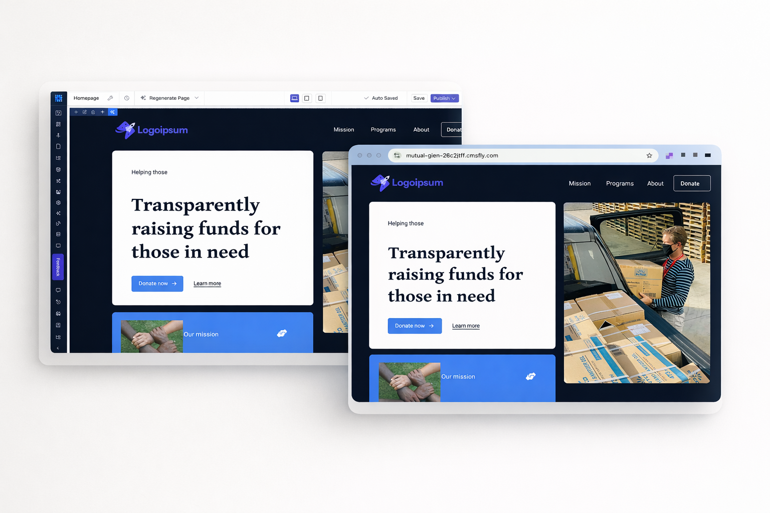
Click preview to see your site in a new tab. Test on actual devices if needed. Check every page before making changes public. Catch issues before visitors do.
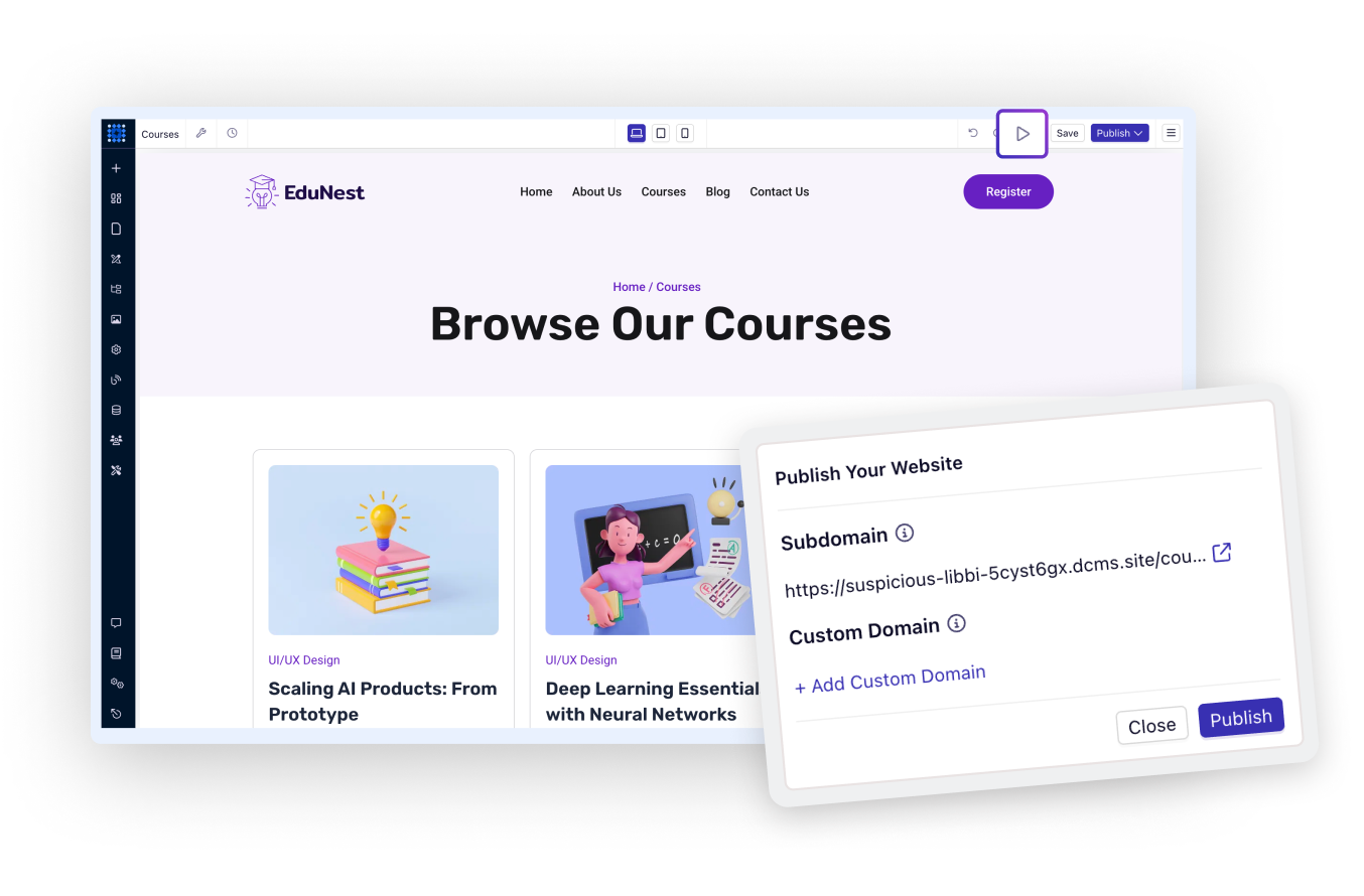

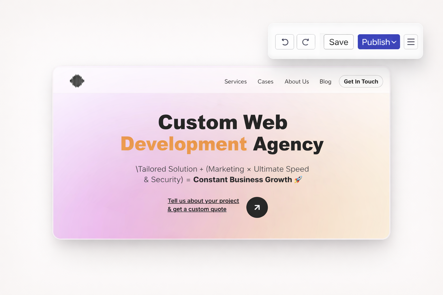
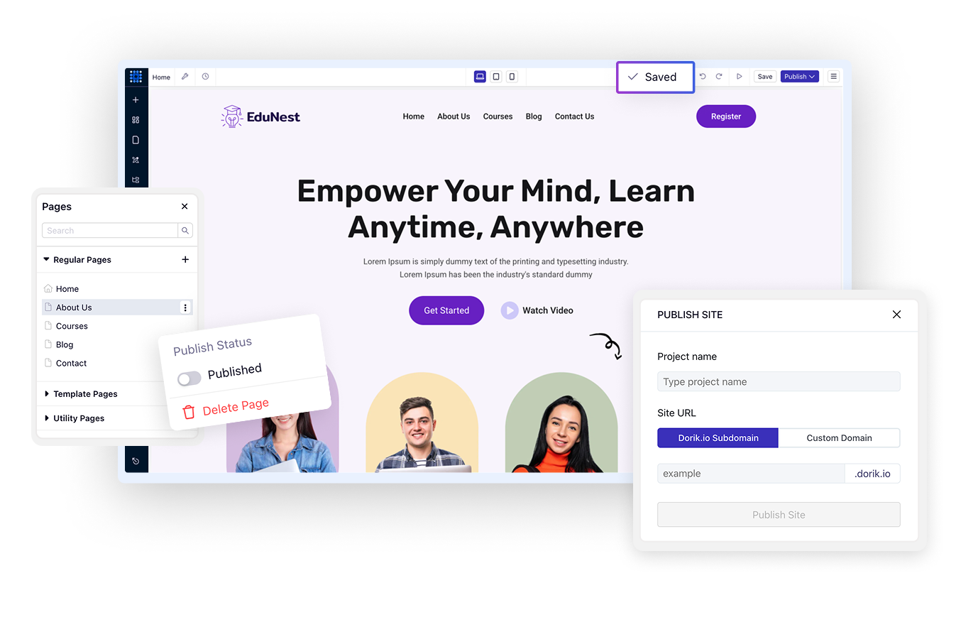
Ready to launch? Click publish. Your changes go live instantly. Update existing sites just as easily. Fast publishing means quick iterations based on feedback.
Your website should reflect your vision perfectly. Dorik's visual editor gives you the tools to design professionally without writing code or hiring developers. Start with a free account and build your first page in minutes.
No coding required. The drag-and-drop interface handles everything visually. However, you can add custom CSS if you want advanced customization beyond the visual controls.
Yes. Dorik maintains unlimited version history with automatic saves every 10 minutes. You can restore any previous version with one click, even after publishing.
Use the device switcher to view and edit your site at tablet and mobile breakpoints. Customize layouts, hide elements, and adjust spacing specifically for smaller screens.
Absolutely. Choose from 1000+ Google Fonts, upload custom font files, or connect Adobe Typekit. Set fonts globally to maintain consistency across your entire site.
Only when you click Publish. You can save drafts and preview changes without affecting your live site. This lets you work on updates without visitors seeing unfinished work.
Set your brand colors in Global Styles. When you apply these global colors to elements, changing the global color updates every instance automatically.
❤️ This website is built with Dorik, without writing any code
© 2026 Dorik, Inc. All rights reserved