Searching for the quickest and most effective way to build a one-page website?
A one-page website will allow you to showcase your unique skills and hard work to your clients online. It will stand as your voice to the person, and it works best to increase client conversion rate.
Freelancers, photographers, and other professionals who do not have a variety of content to display can create a one-page website rather than a multi-page website.
So, in this guide, I will show you how you can create one in 6 easy steps.
Step-by-step Guidelines to Create a One-Page Website
To create a single-page website, you can follow these 6 easy steps:
-
Choose a Website Builder
-
Create a Content Plan
-
Create the Website
-
Customize the Website Design
-
Add Social Proof and Testimonials to Establish Trust
-
Test and Launch the Website
[Note: You can literally build any website, including a one-page website, with Dorik in just 4 steps. However, to perfectly optimize and personalize your one-page website, adhere to all the steps we discuss here.]
Now that you know the steps, let's dive into the details.
1. Choose a Website Builder
First things first, you need to pick the easiest and fastest way to create a website because hiring designers and developers are not the ideal choice here. So, what can we do?
We need to pick a no-code one-page website builder. A website builder takes the hassle of coding and designing the website out of the equation. You can create a website with zero technical knowledge with website-building tools.
You can create a portfolio website, landing pages, wedding website, personal website, business website, and any other one-page website with a website builder within hours.
So, you should look for a beginner-friendly website builder with templates to enjoy a smooth ride.
With a top no-code website builder, you can develop, customize, personalize, and, yes, save a ton of time while building websites.
Which builder to choose?
Many one-page website-building platforms, including Dorik, Carrd, Strikingly, and many more, allow you to create a website easily.
Among them, Dorik is the best drag-and-drop web-building platform where you get three website-building options. You can create a website with AI, select a template, or build a website from scratch. It also comes at a reasonable price.
Other key features of Dorik include:
-
AI website builder, AI image generator, and AI text generator to automate the website-building process.
-
User-friendly drag-and-drop editor.
-
A wide range of pre-made templates, UI blocks, and custom website elements.
-
Auto-responsive design.
-
Free SSL/ HTTPS certification.
-
Dedicated Content Management System (CMS).
-
Live chat support.
Rather than choosing only one-page functionality, isn't it better to have all website features, including AI tools, a wide range of professionally designed templates, global CDN, native SEO, and white-labeling?
In that case, Dorik could be your ideal choice as it offers all the above-mentioned features and more. You can give it a try for free.
You can also deal with another important part of creating a one-page website in this step, which is hosting your website. To do this, you need to select a hosting provider.
You can easily avoid dealing with hosting services if you choose Dorik to create your website. It offers unlimited storage and bandwidth along with a global CDN.
However, if you want to build a completely custom website or use a self-hosted platform like WordPress.org, the second thing you need to do is choose a hosting plan. For a one-page website, you can select a hosting plan that offers a few GBs of storage and 99.9% uptime.
2. Create a Content Plan
A website, whether a single-pager or multi-pager, has to have mandatory things like- A contact form, an about me section, achievements display, an informative but clear footer, etc.
So, before you start building a website, plan your content. Since all the information will be on a single page, you need to be strategic about what to include and how to present it.
Here's how you can proceed:
-
Identify Your Core Message: What’s the main purpose of your website? Is it to showcase your portfolio, promote a product, or provide essential information? Keep this focus in mind as you structure your content.
-
Prioritize Key Sections: A one-page website doesn't have room for fluff. Outline the most important sections, like an introduction, about, services, testimonials, or contact. Each section should serve a clear purpose and guide the user to take action.
-
Keep It Concise: You want to keep your content short and impactful. Long paragraphs will overwhelm your visitors. Break your content into bite-sized pieces and use headings, bullet points, and visuals to keep it engaging.
-
Create a Natural Flow: The order in which you present your content matters. Start with the most important information at the top, like a strong headline and call to action. Then, lead visitors through your content in a logical sequence. This will keep them engaged until they reach the end.
-
Use Proper CTAs: Since there’s only one page, you need clear calls to action (CTAs) throughout the site. It can be a sign-up button, a contact me button, or a buy button. Make it easy for visitors to take the next step.
3. Create the Website
As we mentioned earlier, Dorik offers three website-building options. You can choose any one of them to create a one-page website. We’ll show you the step-by-step process for all of them so you can make an informed decision.
Option 1: Create a One-Page Website with AI
This method is ideal for those who want to save time and have a fully functional website ready in minutes.
Here are the steps to create a one-page website with AI:
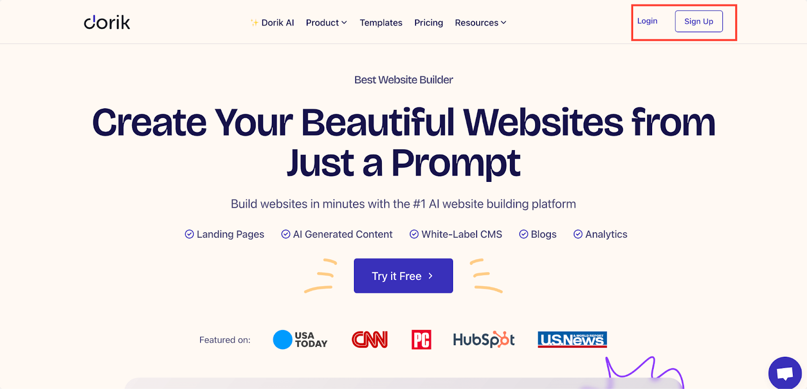
1. Sign up or log in to Dorik.
2. Head to the 'Sites' tab in your dashboard.
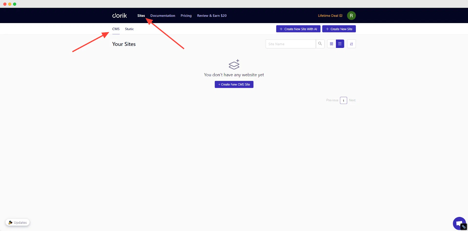
If you want to create a website filled with static content like text and images, then create a Static site. But if you want more dynamic features like a blog, gated content, payment integrations, etc., then creating a CMS website is the way to go.
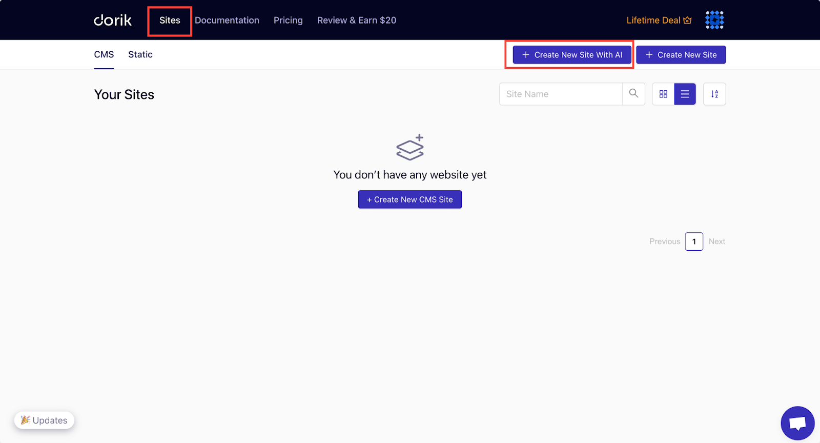
3. Click "Create New Site with AI".
4. Name your website and provide a detailed prompt describing the site you want. You can also set the language for your website.
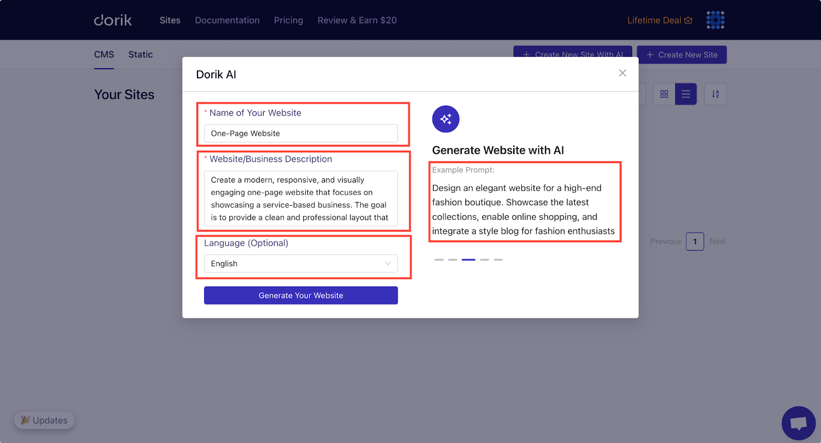
Check out the example prompts if you need inspiration.
5. Click "Generate Your Website".
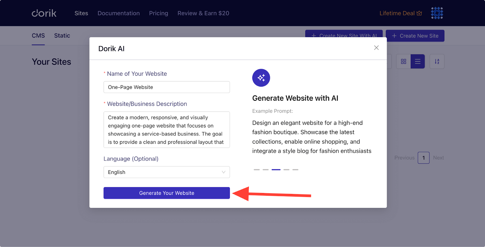
Dorik AI will generate your one-page website in less than a minute. It’s perfect for when you want a fast, professional-looking result without much effort.
Here’s an example prompt that we used to create a one-page website with the AI builder:
Prompt: “Create a modern, responsive, and visually engaging one-page website that focuses on showcasing a service-based business. The goal is to provide a clean and professional layout that highlights key offerings, testimonials, and contact information. Include the following sections: Hero, Services, About Us, Portfolio, Testimonials, Contact Us, and Footer section.
Maintain a clean, minimalistic, and modern design. Use a consistent color palette (choose 2-3 complementary colors) and Professional and legible typography.”
Here’s the result:

As soon as the AI builder generates the website, you can see the color palettes and typography used on your website. You can regenerate them if you want easily inside the builder.
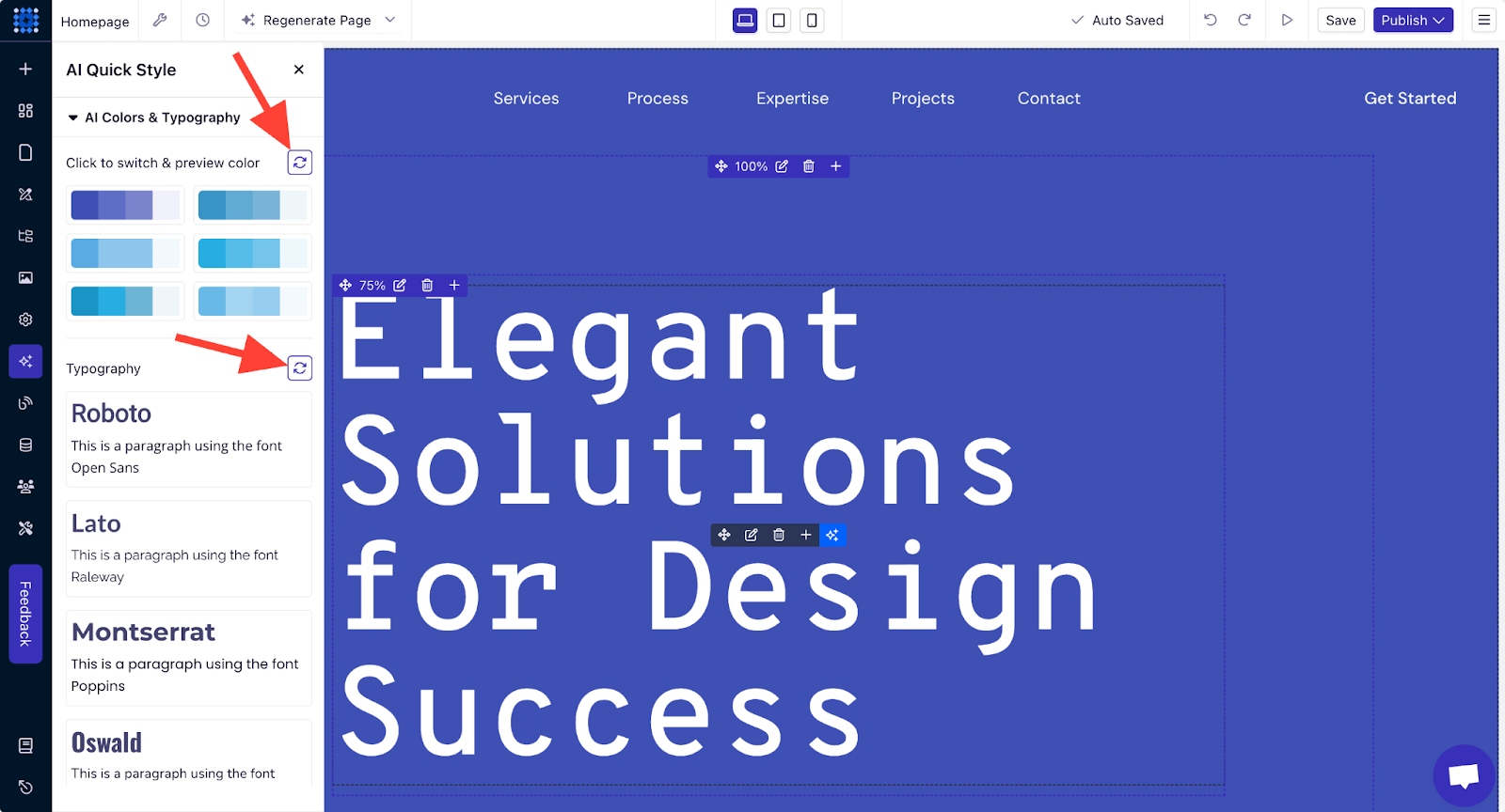
You can also tweak the design and content with AI tools to match your style.
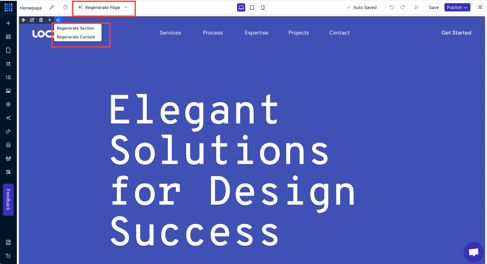
Watch the video below and explore how easy it is to create a website with Dorik AI.
You might not get the best result for your prompt on the first try if your prompt is not specific enough. So, try to modify your prompt until you get your preferred output.
If you need help, you can read our beginner guide on writing prompts for AI website builders.
Option 2: Create a One-Page Website with Templates
This way is perfect for those who want a pre-designed structure and minimal customization.
But why choose a template over AI website-building?
Well, templates are designed with specific needs in mind, like portfolios, landing pages, services, or business websites. They provide a solid foundation that you can customize to fit your style.
Templates also save time and ensure your website covers all the important sections.
Here are the steps to make a one-page website using a template:
1. Sign up or Log in to Dorik.
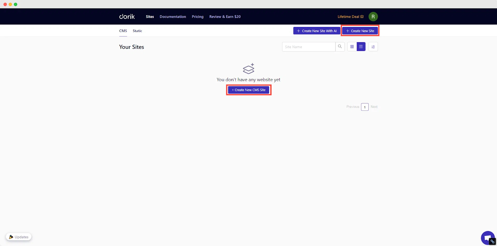
2. Go to the 'Sites' tab in your Dorik dashboard and choose either CMS or Static site.
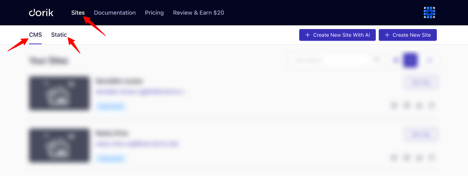
3. Click "Create New CMS Site" or “Create New Site”.
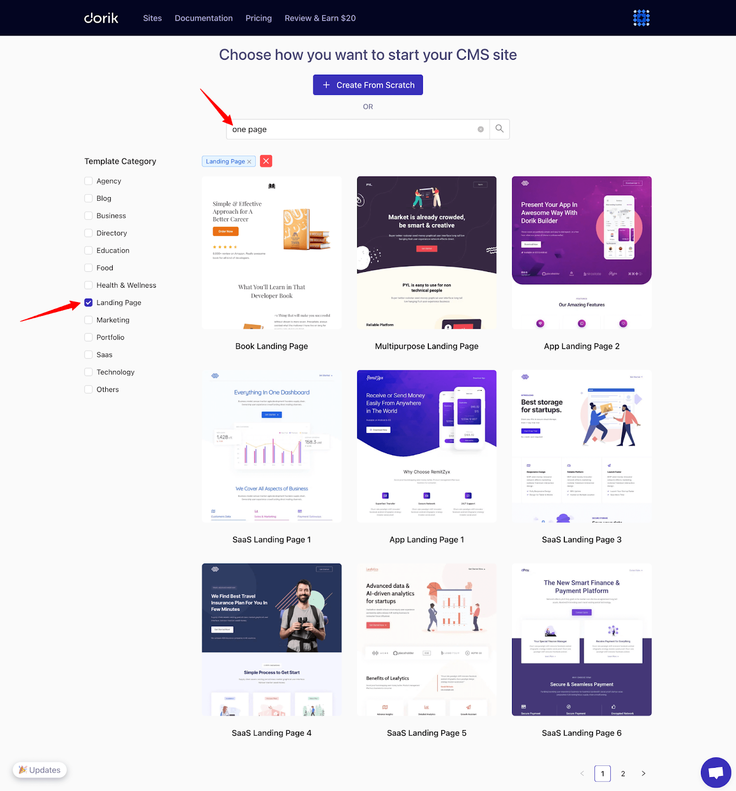
4. Browse through the template library. Look for templates that suit one-page websites. Dorik offers plenty of them. You can search for the keyword “one page” or set the filter landing page to find all the one-page website templates.
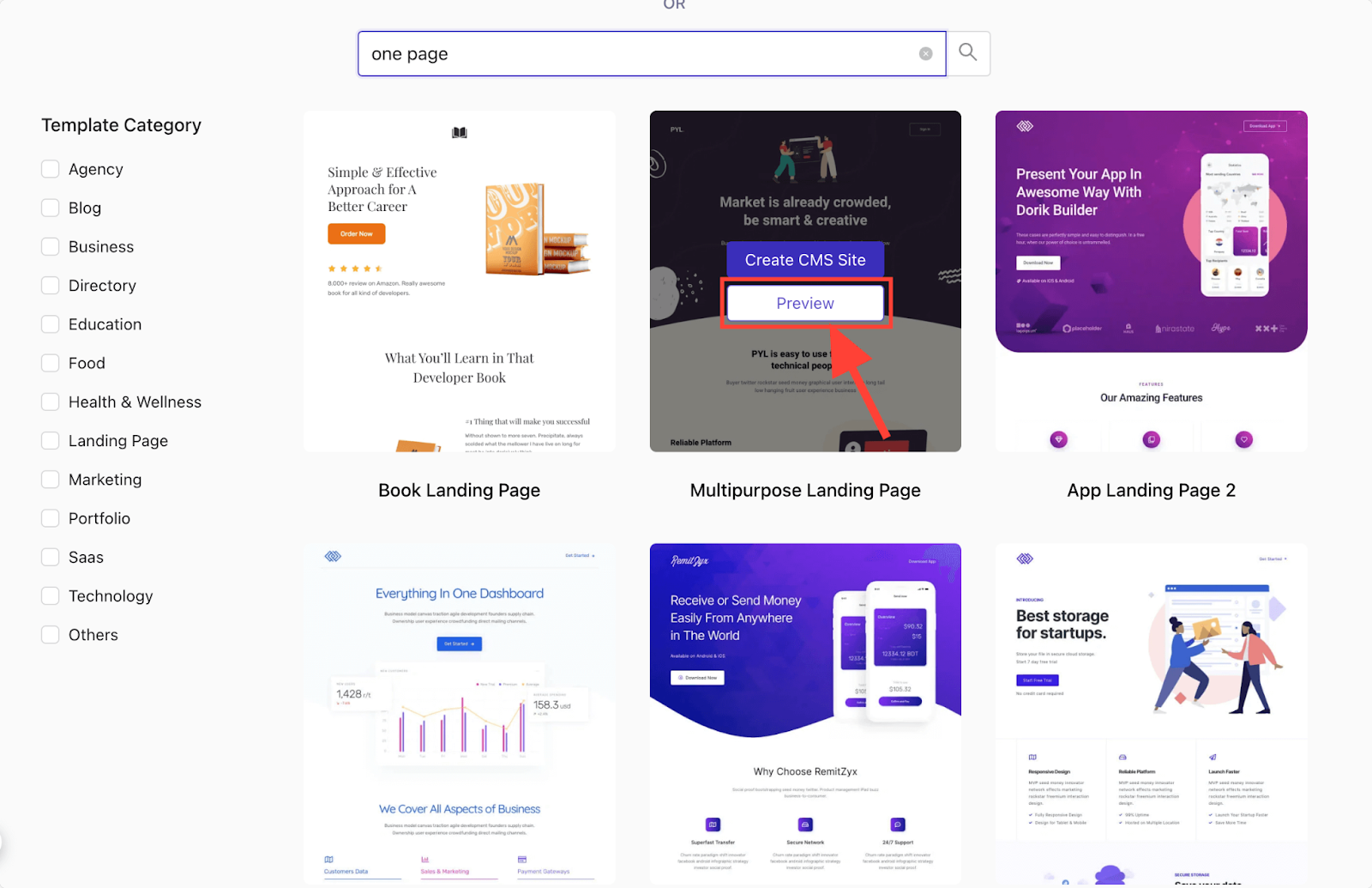
5. Preview your favorite options and select one that fits your style and preferences.
6. Once you find one you like, click “Create CMS Website” to enter the builder where you customize the template by adding your content, changing colors, and adjusting layouts.
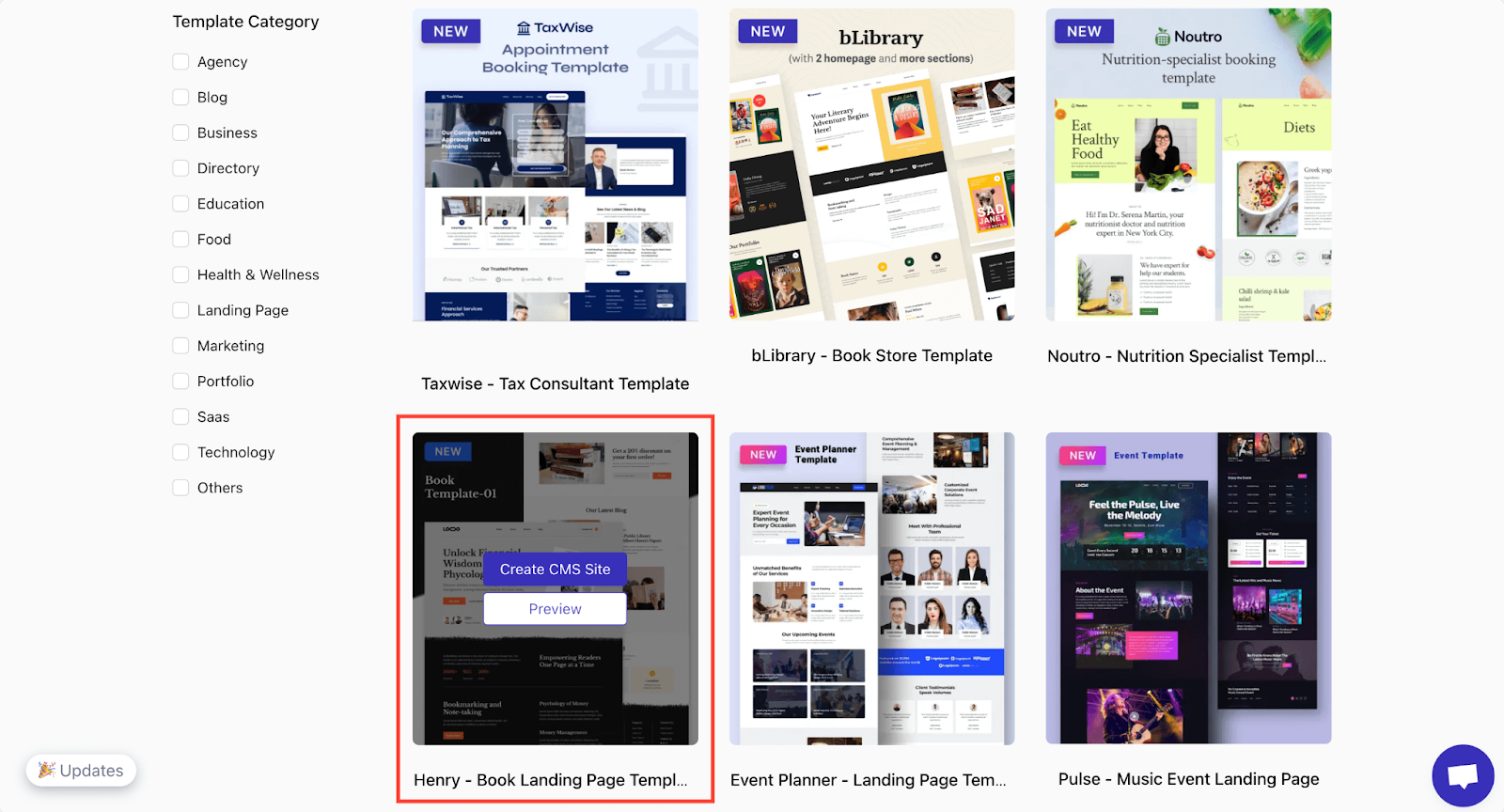
Here, we’re selecting the “Henry - Book Landing Page Template” to show you the process. You can explore and select any template you like. You’ll find some amazing templates there.
Once you enter the builder, check out all the editing features and settings to get yourself familiarized with the platform.
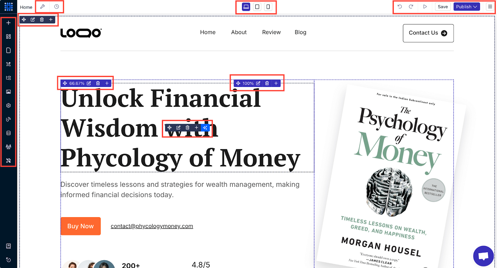
Templates make it easy to get started quickly, with minimal design skills required. Just replace the existing content with your content and make some tweaks.
We’ll discuss the customization features in detail in the “Customize the Website” section later in this guide.
Option 3: Create a One-Page Website from Scratch
This one is best for those with specific design ideas who want full control over the look and feel.
This method gives you complete creative freedom, but it requires more time and effort.
Steps to build a one-page website from scratch:
1. In your Dorik dashboard, go to 'Sites' and click "Create New Site".
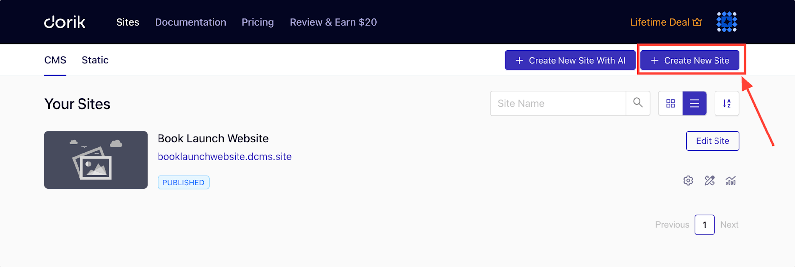
2. Select "Create From Scratch".
3. Familiarize yourself with the drag-and-drop editor to build your layout.
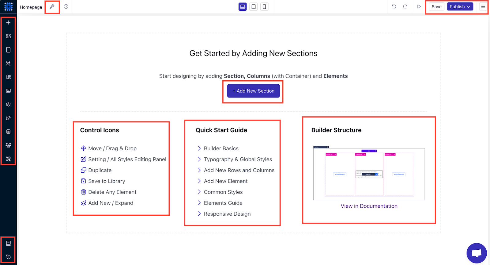
4. Add sections for your core content, such as your intro, services, or testimonials.
Dorik offers an extensive pre-designed component library that you can drag and drop into your website. You can further customize the elements.
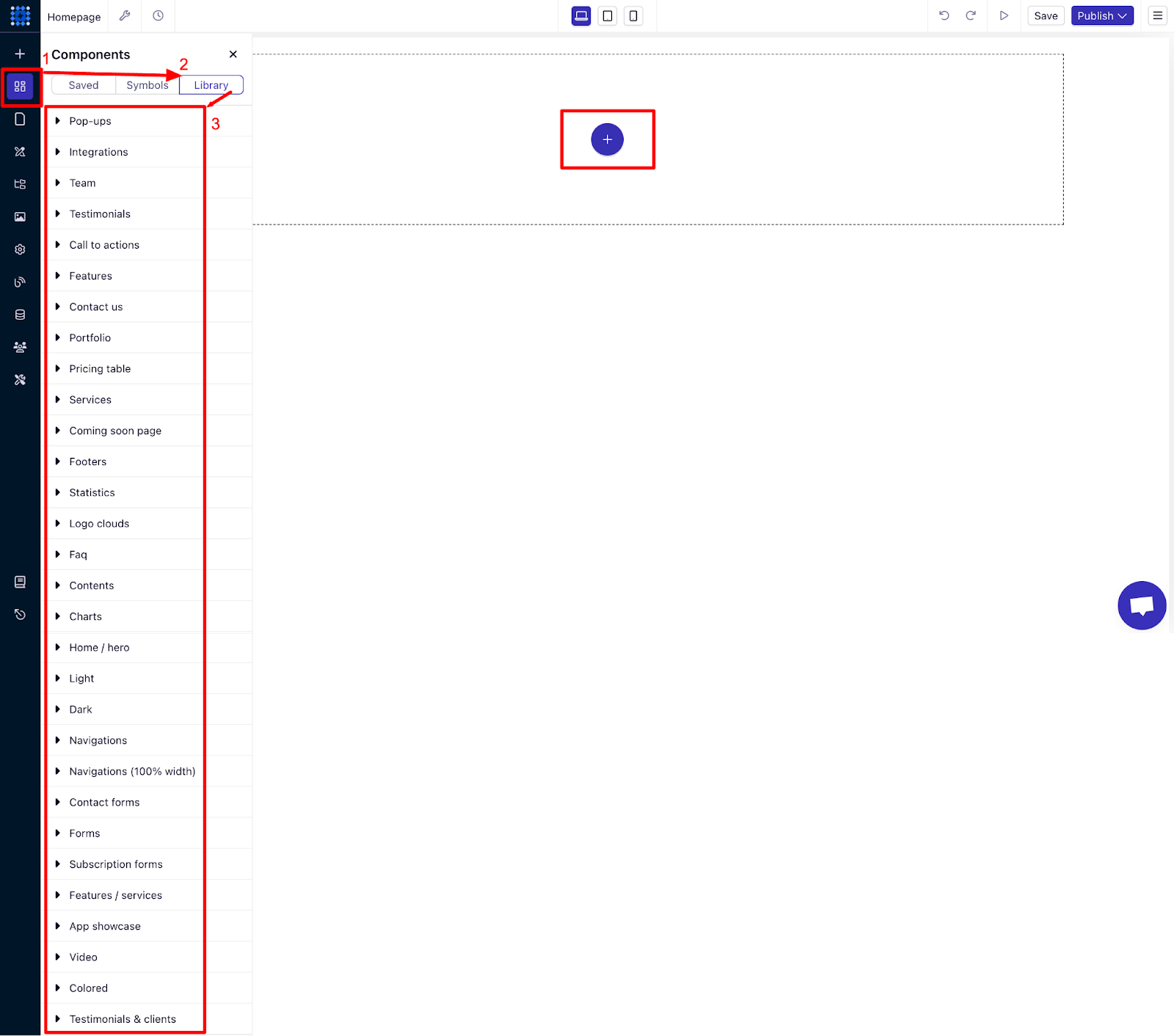
This option gives you total flexibility to create a truly unique one-page website.
With these three methods, you can create your one-page website easily, no matter your skill level. Choose the one that best suits your needs, and start building today!
4. Customize the Website Design
Now that your one-page website structure is ready, it’s time to make it visually appealing and aligned with your brand.
What makes a website stand out in the crowd is the design. To create aesthetically pleasing designs, web designers maintain and follow some design principles and laws.
From adjusting the correct color scheme to choosing the right font, web design principles come with an effective strategy.
There are a few principles and laws of web design, including Gestalt law, Fitt's law, and Hick's law, which one-page websites may use to create a standard design structure. Moreover, you may prefer to use some trendy web designs to help your website stand out.
Website design is the core element to creating the perfect user interface design and user experience. For instance, utilizing easy navigation, using white space, and keeping consistency in user journey flow.
You need to customize the design to make your site aesthetically pleasing and functionally unmatched.
Customizing the Navigation Menu
Let’s start the customization process with the navigation menu, which is a must-have feature for your one-page website.
I’m showing you the process using a one-page website template where you’ll get a professionally designed navigation menu by default. However, you can also follow this approach for AI-generated sites and sites built from scratch.
If you don’t have a navigation menu by default, you can easily add one from Dorik's Components library. You’ll get multiple Navigation menu layouts that you can drag and drop to the top of your site and start customizing.
Create Jump Links:
You might have many sections on your website, like contact, testimonials, pricing, features, products/services, etc., and you must mention them in your navigation as well.
But since it's a one-page website, the navigation links should work as "Jump Links" instead of linking to other pages. Let’s show you how.
Step 1: Go to the Navigation menu and click on ‘Edit Elements’ to open the sidebar editor.
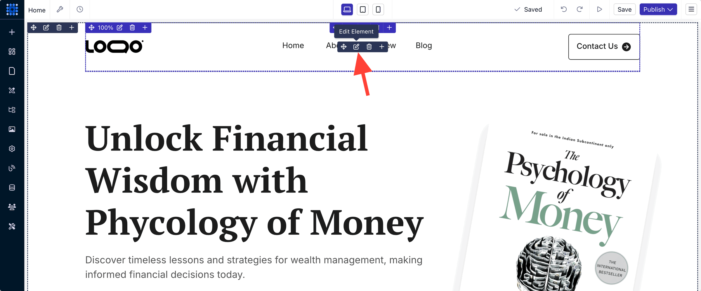
You can also do it by clicking anywhere inside the navigation menu area.
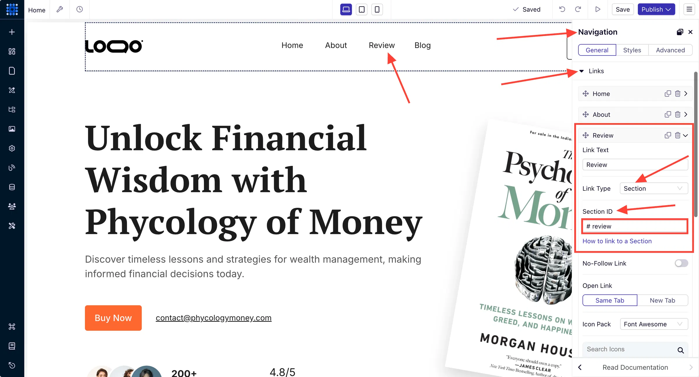
Step 2: You’ll see options to customize the logo, links, buttons, etc. in the editor. Click on links to get options to add more links, and create jump links.
Here, you can see the jump link for the Review section. You need to select "Link Type --> Section" as this will allow you to use a Section ID as a link. After that, set a section ID that matches the name of the section you want to jump to. You can see in the image below that we set the ID "review" as we're jumping to the review section.
Step 3: Finally, we need to go to the review section and set the same section ID we used in the link to the review section. Make sure you use the ID on the proper section that you want people to see when they click on the link.
Click anywhere on the section to open the sidebar editor and go to the “Advanced” tab.
Click on “HTML SELECTORS” and find the field “HTML ID.”
Put the section ID into the field, and the jump link will be ready.
In our case, the section ID is “review,” so we’re inserting that into the field.
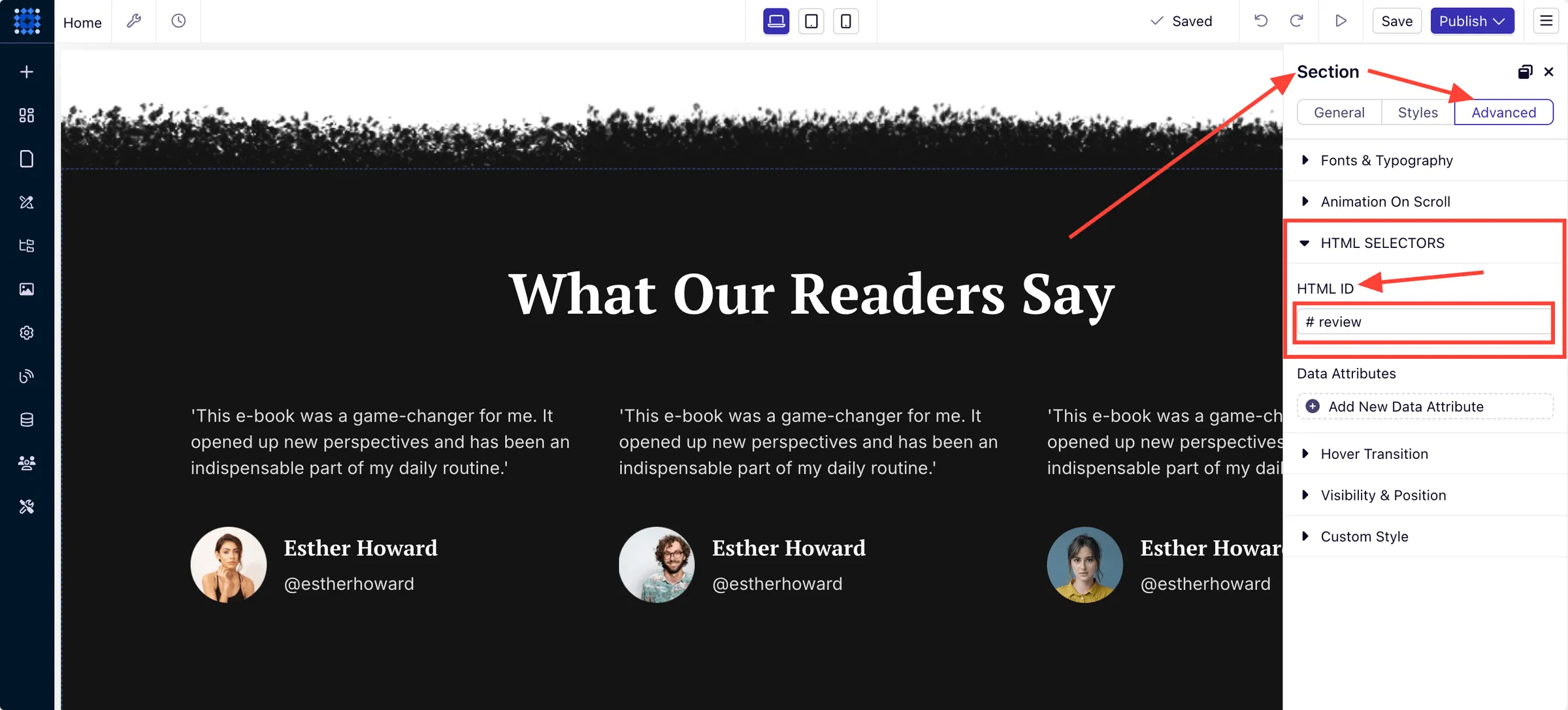
Once we do that, our jump link is ready. You can see the demo here. You can follow these steps to create jump links to any section of your website and provide a better user experience.
If you need more info on this, you can read our detailed guide on how to link a section to a navigational link.
Add Buttons:
Let’s show you how to add a button to your navigation menu and insert a link to the button.
Step 1: Click on “Edit Elements” or anywhere on the navigation menu to open the sidebar. Find the Buttons dropdown and click on it.
You’ll see an “Add New” button to create and add a button to the navigation menu.
Step 2: Now, you need to set the button text and a URL.
You can link the button to an external source or you can link it to a section of your site following the same method I discussed earlier in the “Create Jump Links” section.
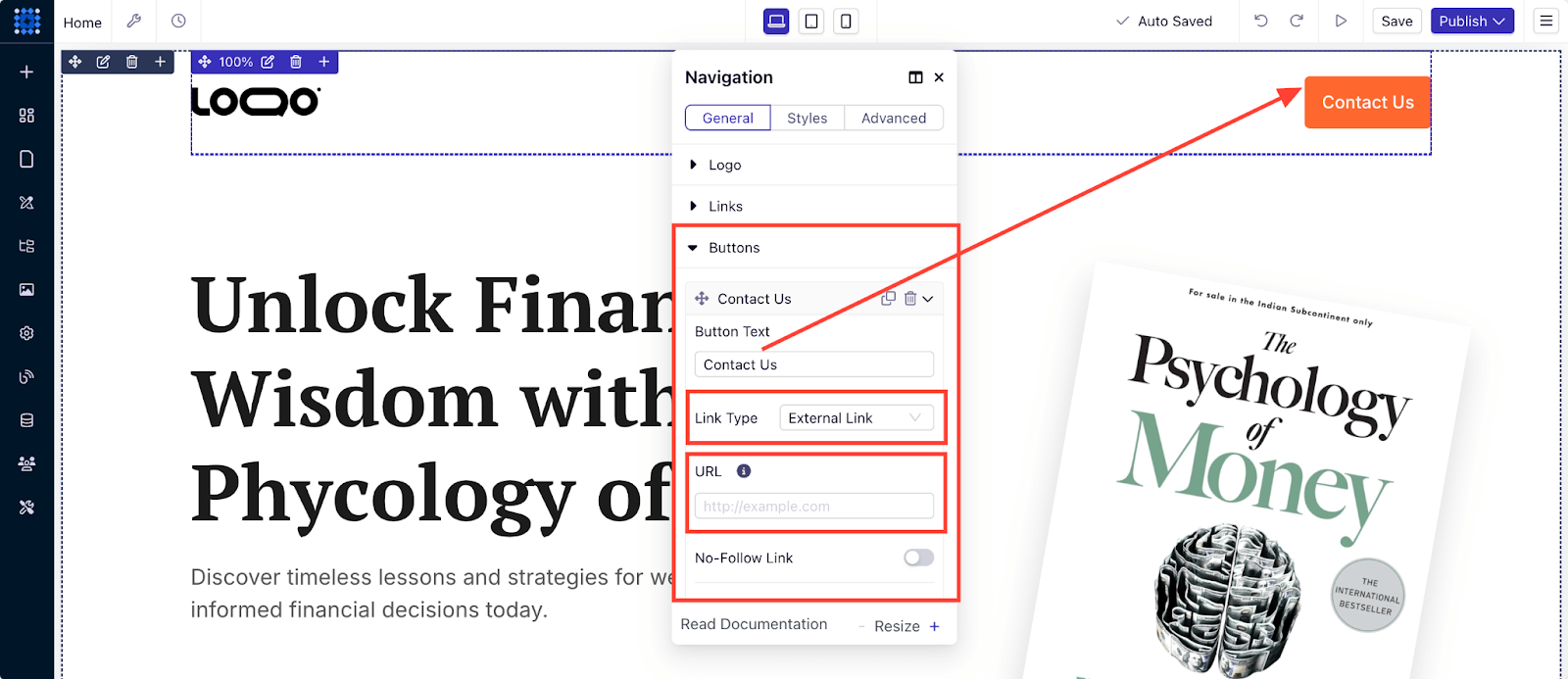
This way, you can add buttons and insert links to them.
Add CTAs:
You can add a CTA button to your website in one of two ways with Dorik.
Option 1: You can click and drag a pre-designed CTA component into your preferred position.
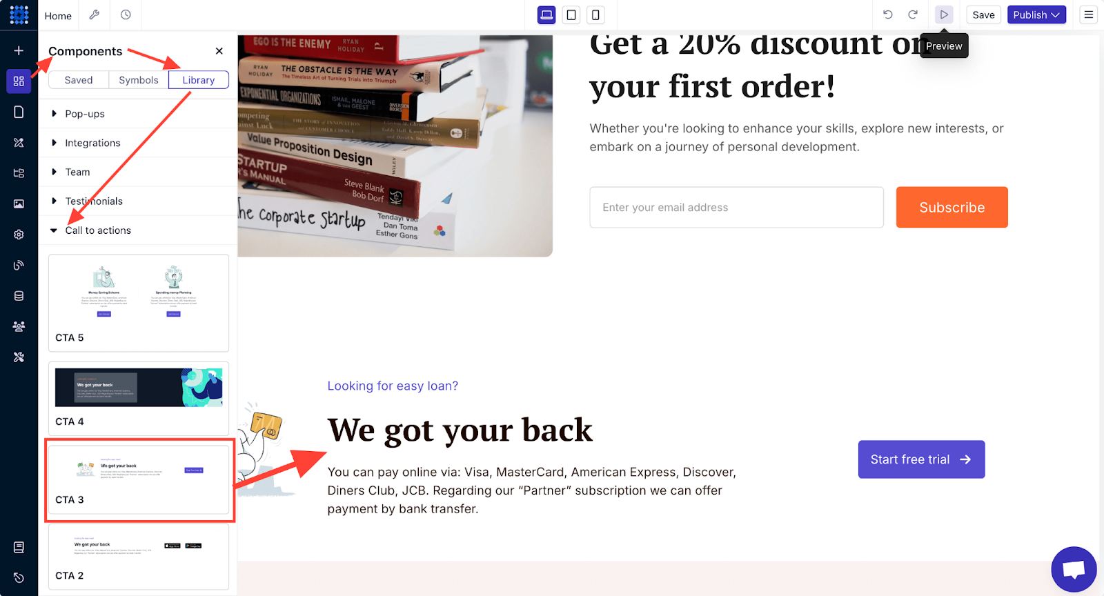
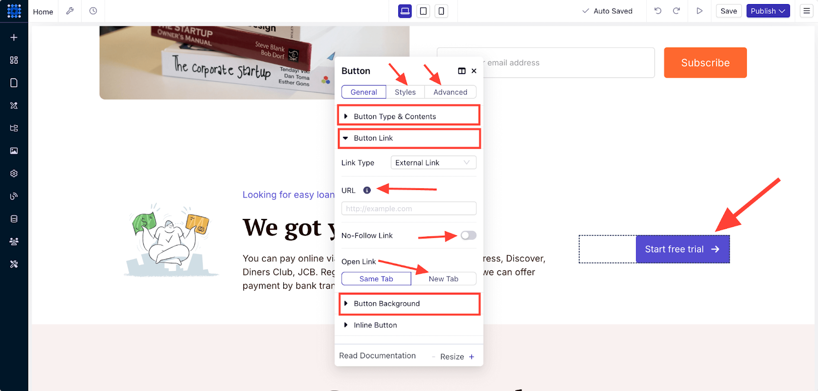
You can then customize the CTA button by clicking on the button. You can change the text, color, and icon of the button and also add a link to the button.
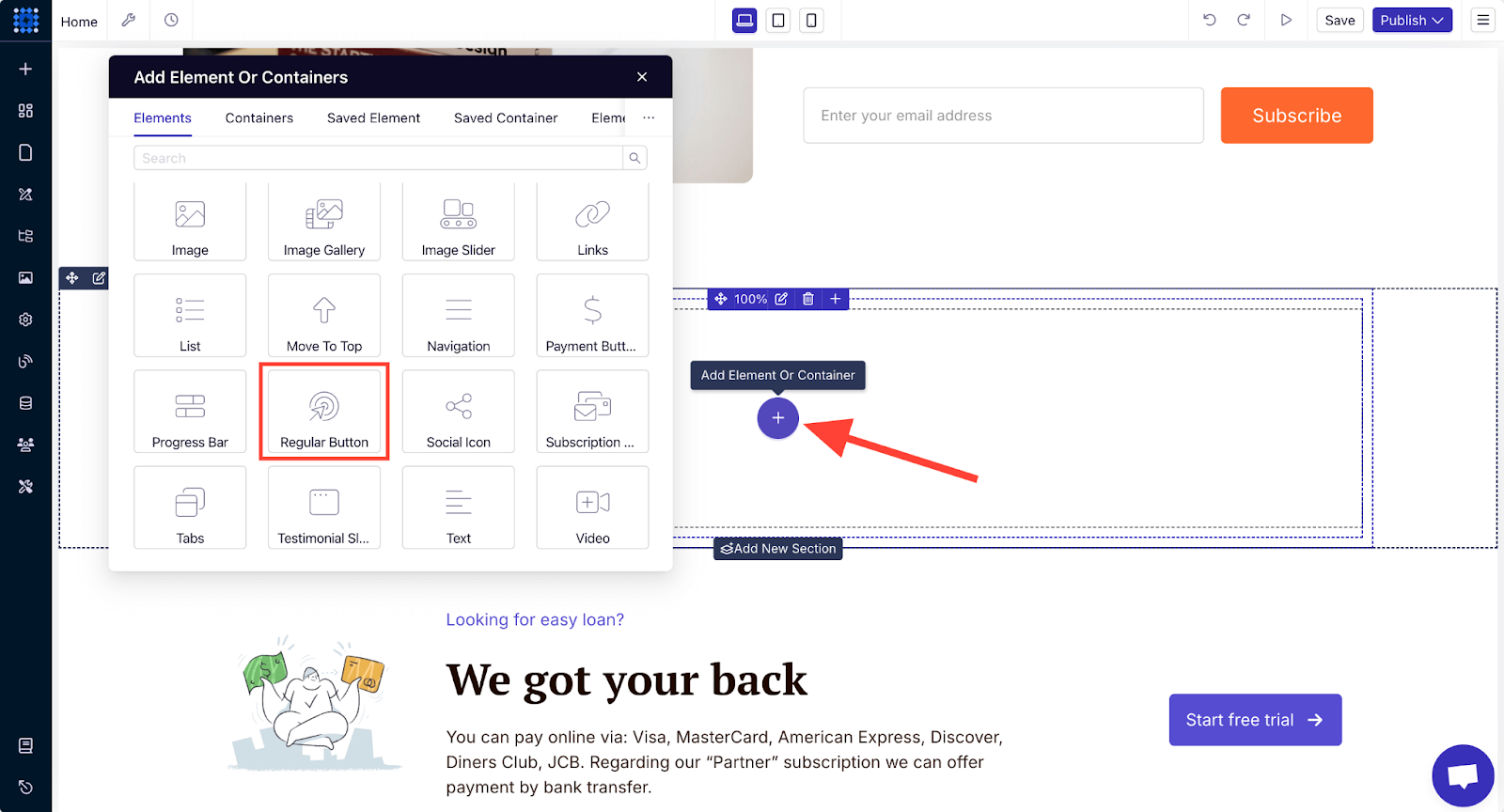
Option 2: If you only want a CTA button without the additional text and image, you can use a regular button element.
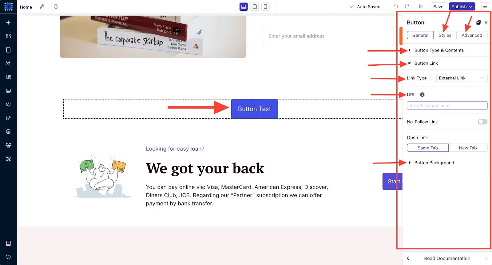
You can customize the regular button, too, following the same process as option 1.
Placing call-to-actions strategically on your website can significantly boost the conversion rate, so be extra attentive when designing them.
For example, instead of writing generic terms like “Click Here,” write more specific and compelling calls to action that align with the user's goal, such as 'Start Your Free Trial' or 'Download Your Guide Now.'
You can read our detailed guide on designing CTA buttons that boost conversion.
Customize Individual Text Elements
Start by editing the text elements on your page to fit your tone and messaging. Dorik’s flexible text customization features make this simple.
General Text Customization
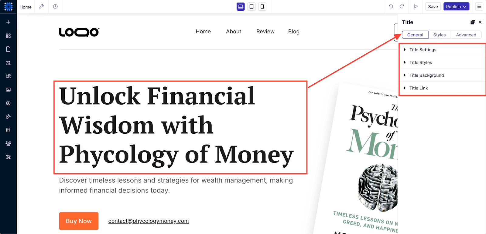
Click on any text element to access the editing panel. Here, you can modify:
-
Text content and formatting to reflect your message.
-
Font style, size, and color to match your branding.
-
Text alignment for a clean layout.
-
Spacing and line height for improved readability.
-
Hover effects to create an interactive experience for visitors.
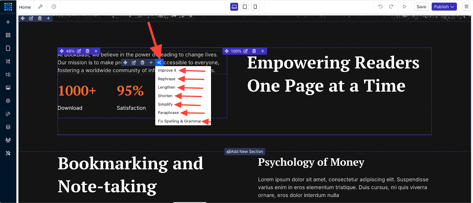
You can leverage Dorik's AI-powered content rewriting tool to write professional website copy. You can rewrite or enhance your text by selecting commands like "simplify" or "improve." This tool helps maintain consistency in tone while refining your message.
Text Style Customization
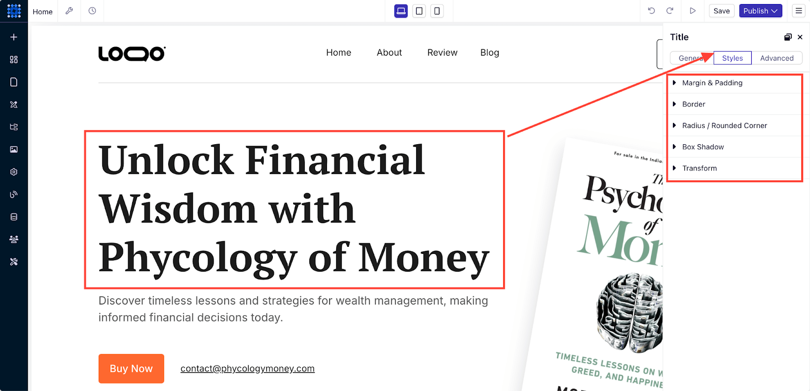
Go beyond basic text adjustments with advanced style options:
-
Adjust margins and padding to create optimal spacing between elements.
-
Add borders and rounded corners for a modern and clean look.
-
Apply box shadows to create depth and visual separation.
-
Use transformations (scale, rotate, skew) for unique visual effects.
Advanced Text Customization
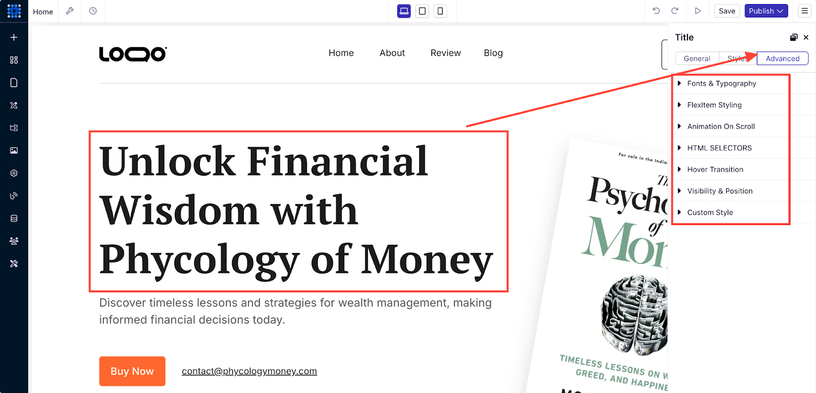
For more intricate customizations, the Advanced tab provides additional controls:
-
Custom fonts and typography allow you to align text with your brand identity.
-
Use Flex Item Styling for responsive, adaptive designs across all devices.
-
Add scroll animations to engage users as they scroll through your page.
-
Utilize HTML selectors to apply precise styles to specific elements.
-
Add hover transitions to make your text elements interactive.
-
Implement custom CSS for limitless styling possibilities and highly personalized design.
Customize Visual Elements
Visuals play a key role in capturing your audience’s attention. Dorik provides extensive options for customizing images and other media.
Basic Image Customization
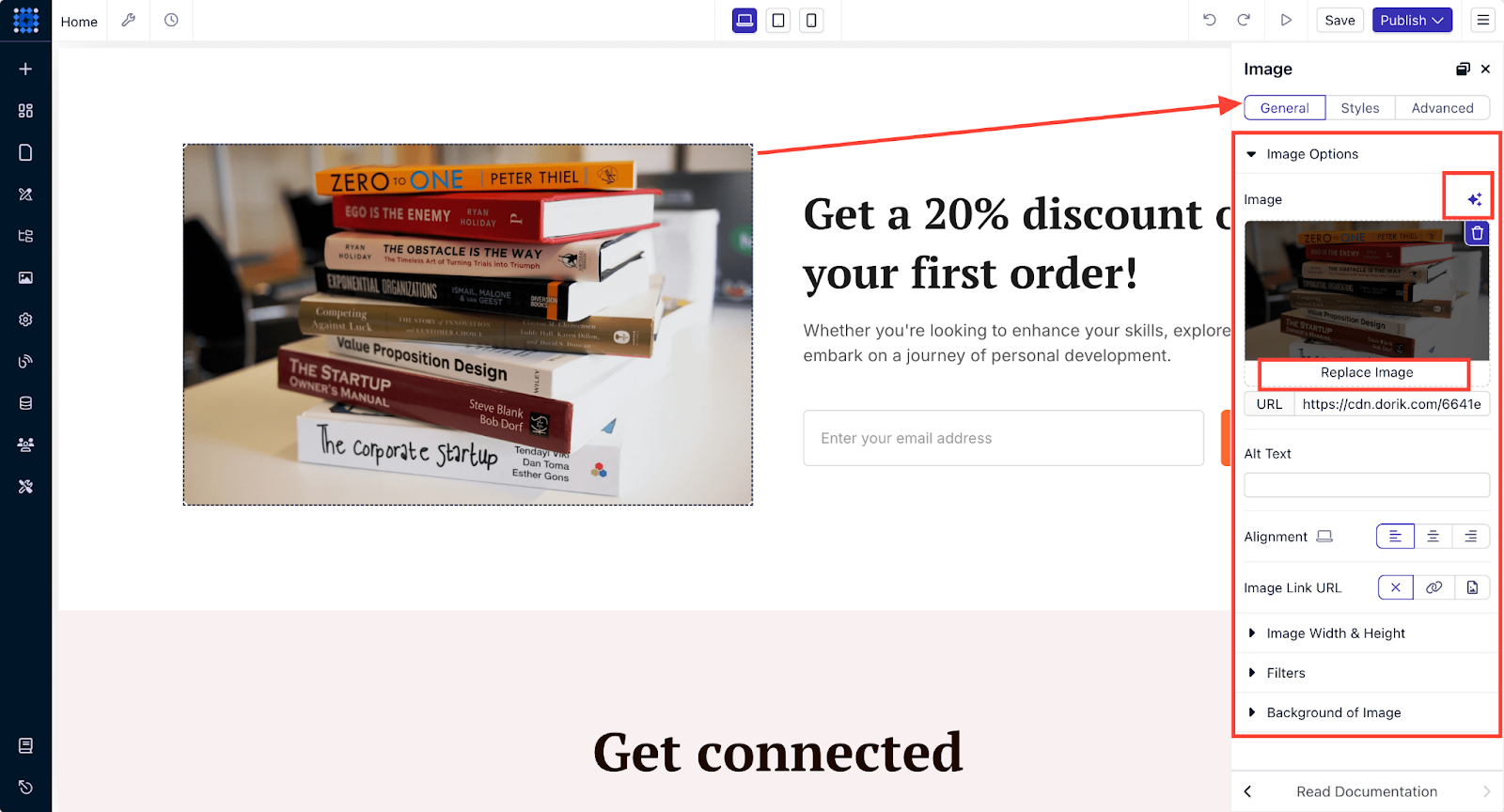
Click on any image to access the modal editor. In the image editing panel, you can:
-
Replace images or upload new ones from various sources.
-
Adjust image dimensions and alignment for a perfect fit.
-
Choose between image fit options like cover or contain to optimize for different screen sizes.
-
Apply filters and effects to create a distinct visual style.
-
Add alt text to improve SEO and accessibility.
Dorik also offers an AI image generator tool to create unique images or illustrations that align with your website’s theme.
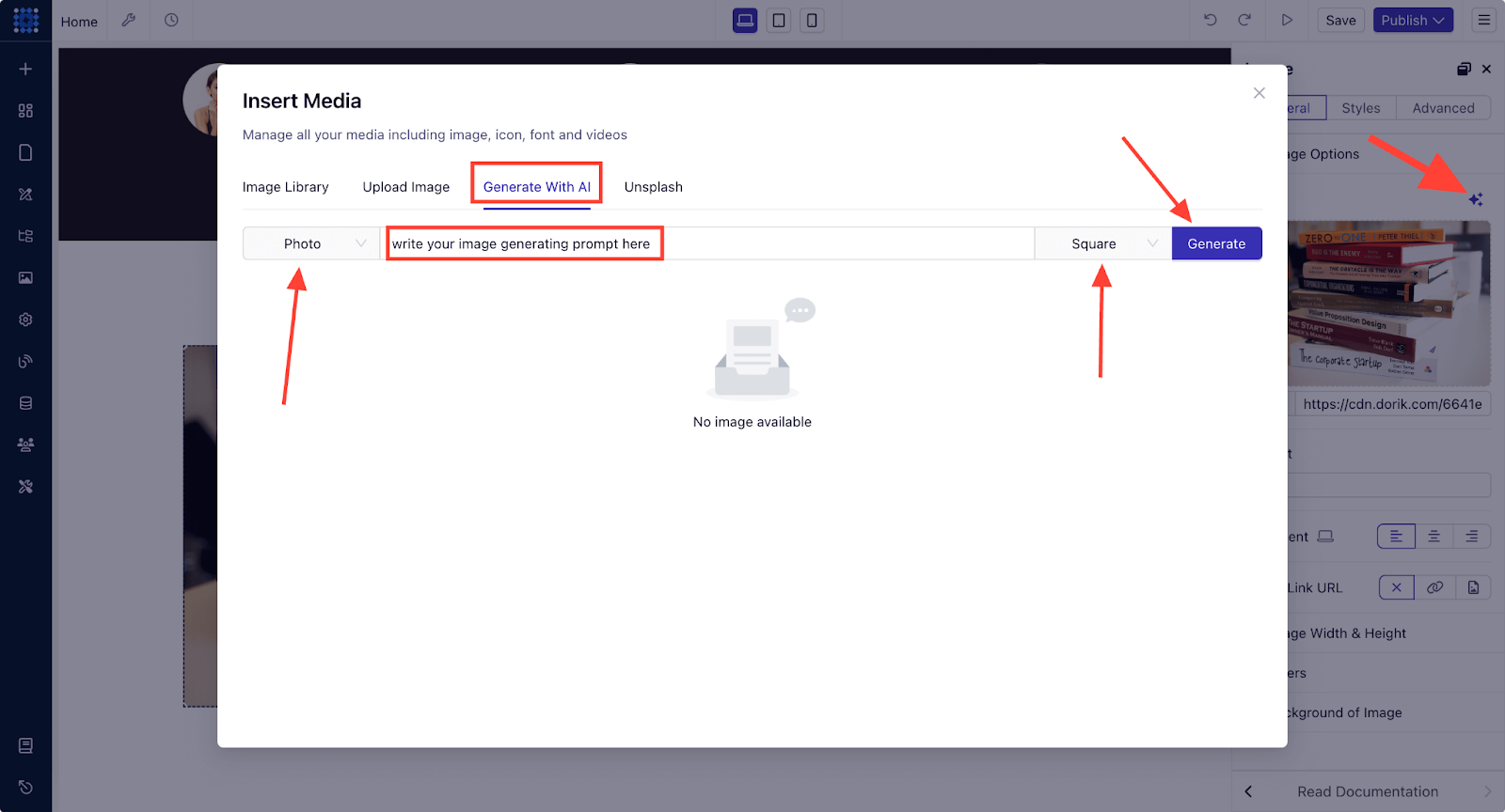
Image Styling and Layout
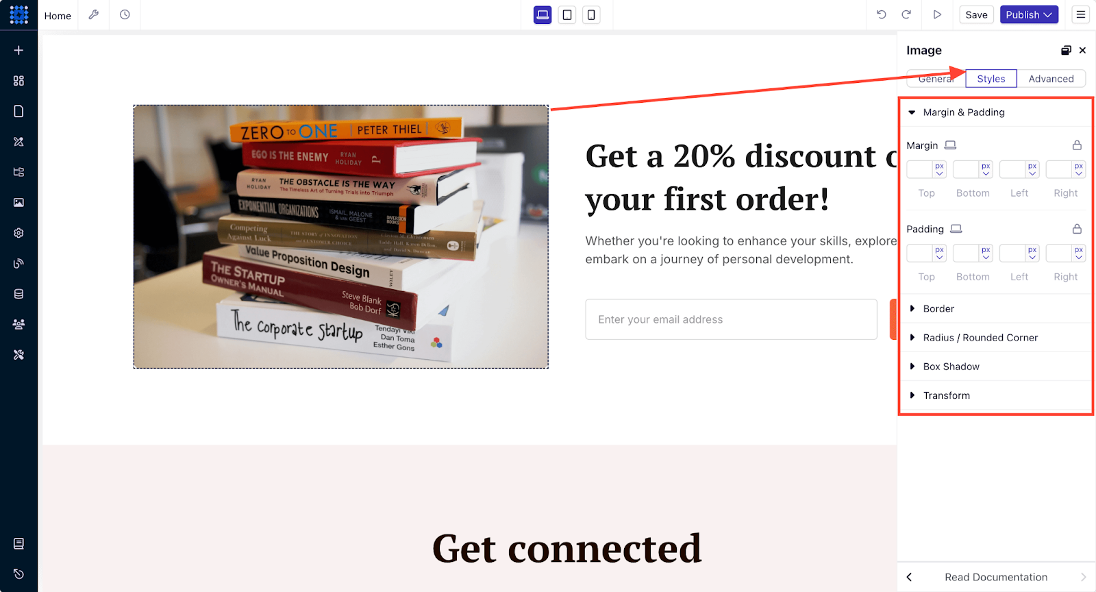
Take image customization to the next level with these layout controls:
-
Margins and padding adjustments ensure your images are spaced well.
-
Add borders and rounded corners for a polished, clean look.
-
Apply box shadows to add depth and emphasis to your images.
-
Use transform options to create eye-catching visual effects.
Advanced Image Customization
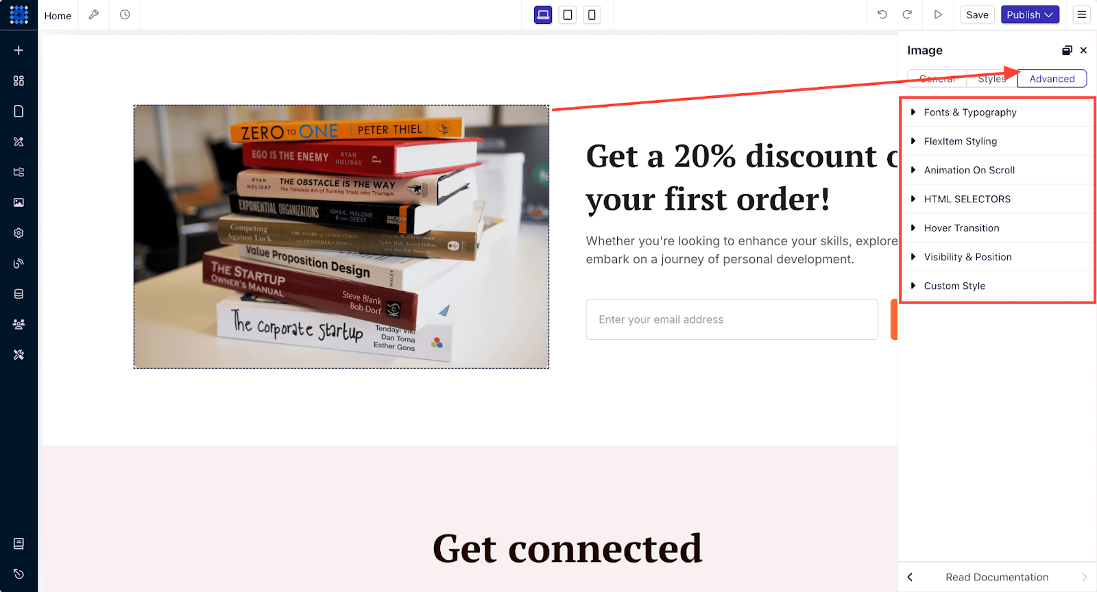
For even more creative control over images, the Advanced tab provides:
-
Flex item styling for responsive image layouts that adapt to different screen sizes.
-
Scroll animations to engage users with dynamic visuals as they navigate the page.
-
Control element visibility for a more streamlined display on mobile or desktop.
-
Add custom CSS for unlimited styling possibilities.
Utilize the Drag-and-Drop Builder
Dorik’s intuitive drag-and-drop builder lets you customize your website without needing any coding skills. Here’s how you can enhance your one-page site:
Add Elements
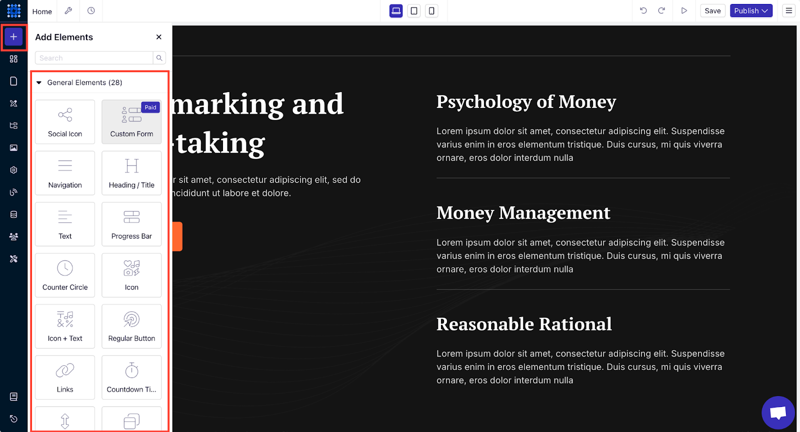
You can choose from over 23 pre-made elements to add functionality and interactivity to your site. These elements range from text boxes and headings to more advanced options like image galleries and custom forms. Simply drag and drop the elements into place.
Add Components
Dorik offers pre-designed components like FAQs, testimonials, hero sections, and more. These are fully customizable and allow you to quickly build a professional-looking site.
For example, you can add an FAQ section with Dorik using two different methods.
Method 1: You can use the pre-made FAQ component from the sidebar and drag and drop it to your preferred position.
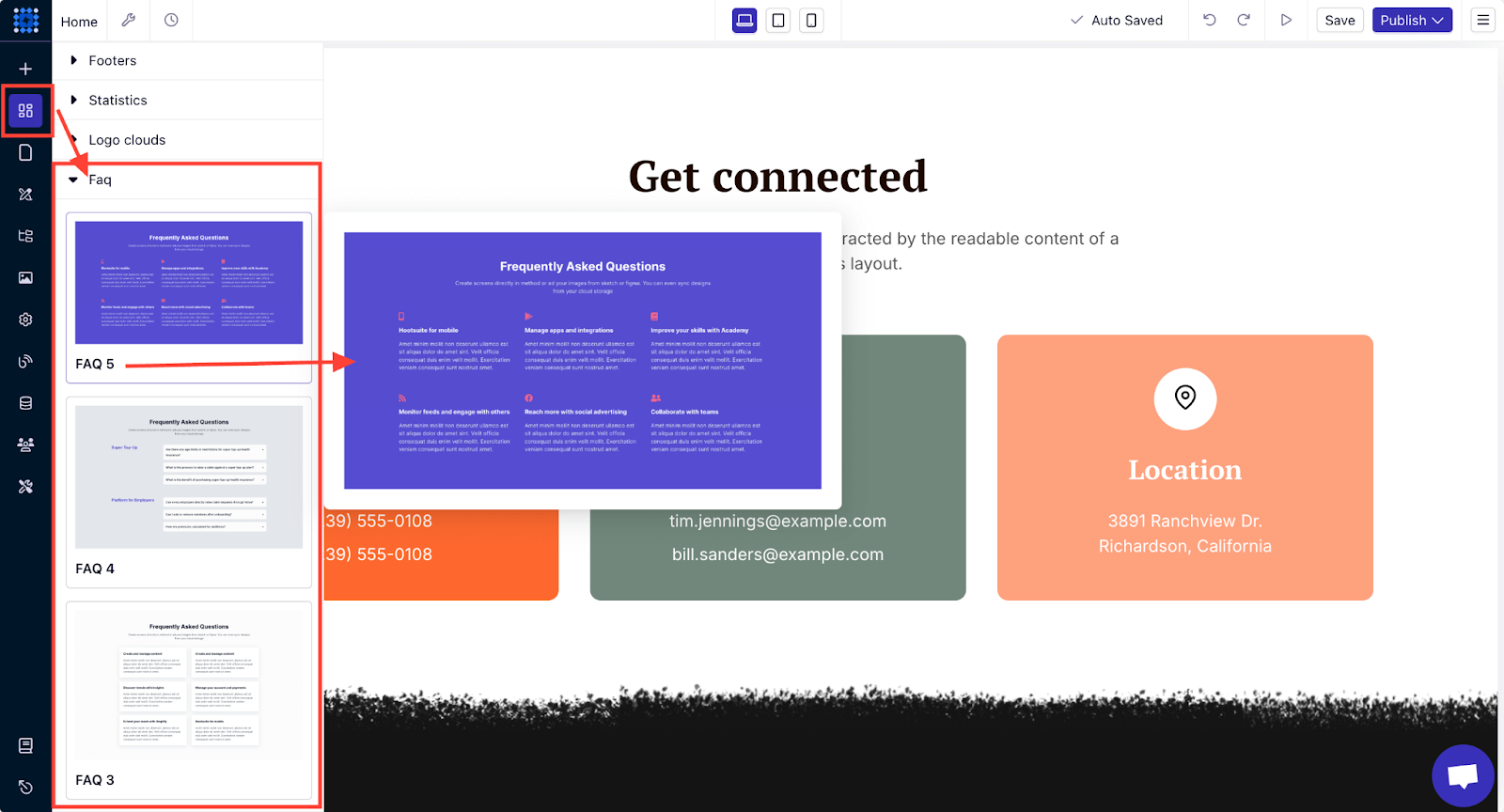
After that, you can customize the questions and answers to match your content. You can also customize the design element if you want.
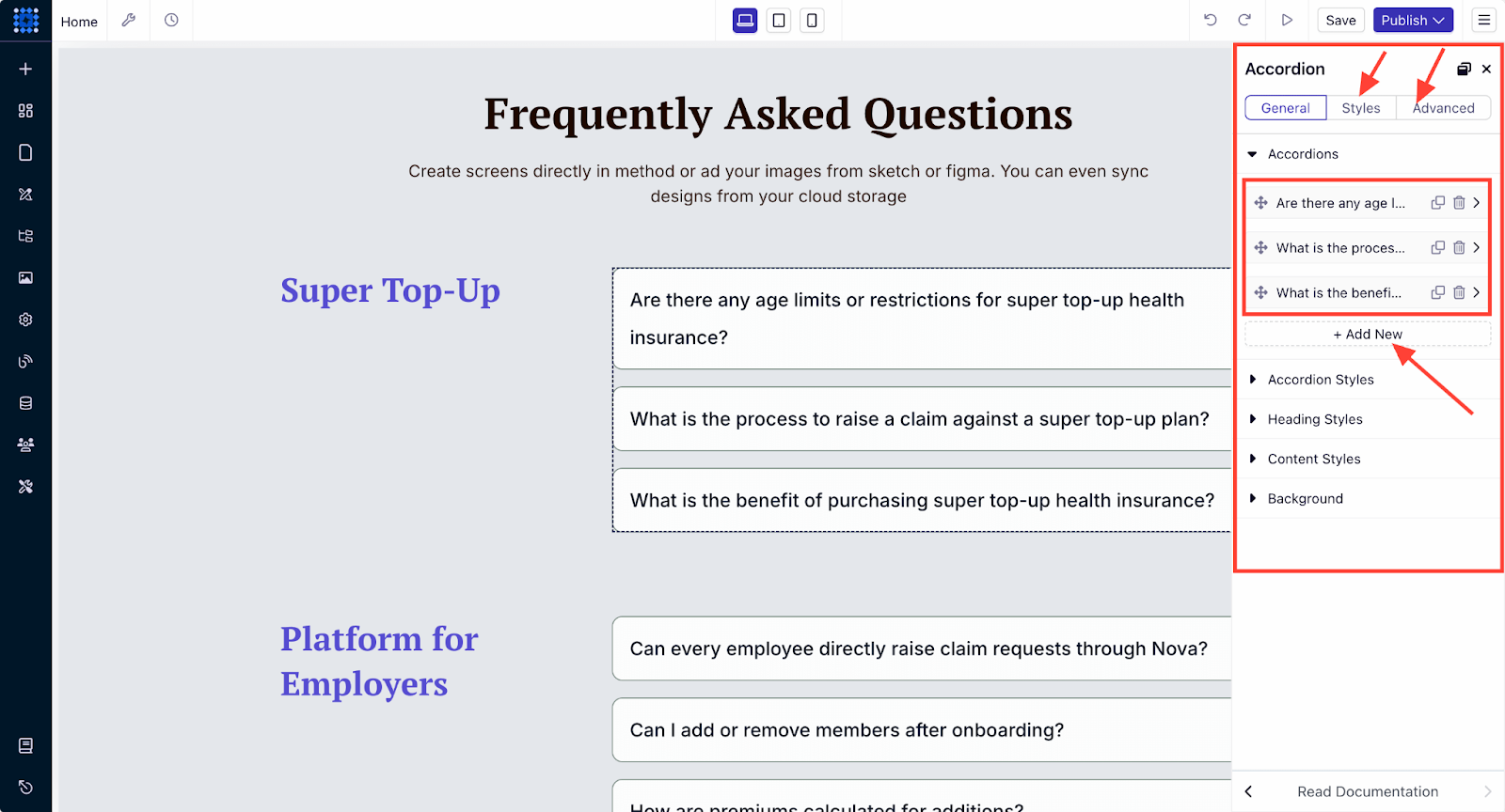
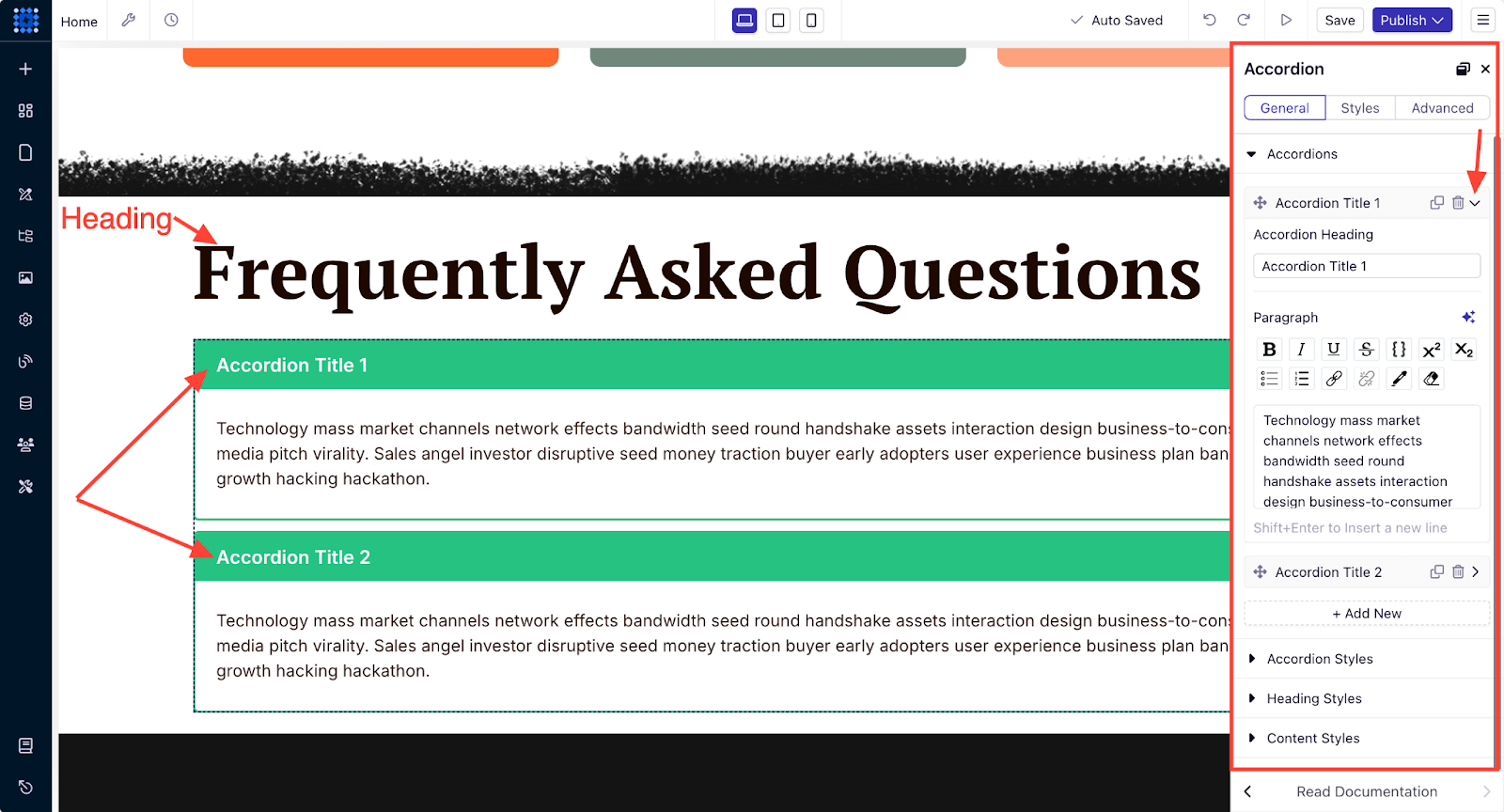
Method 2: You can also add a FAQ section with Dorik’s pre-made Accordion and Heading elements.
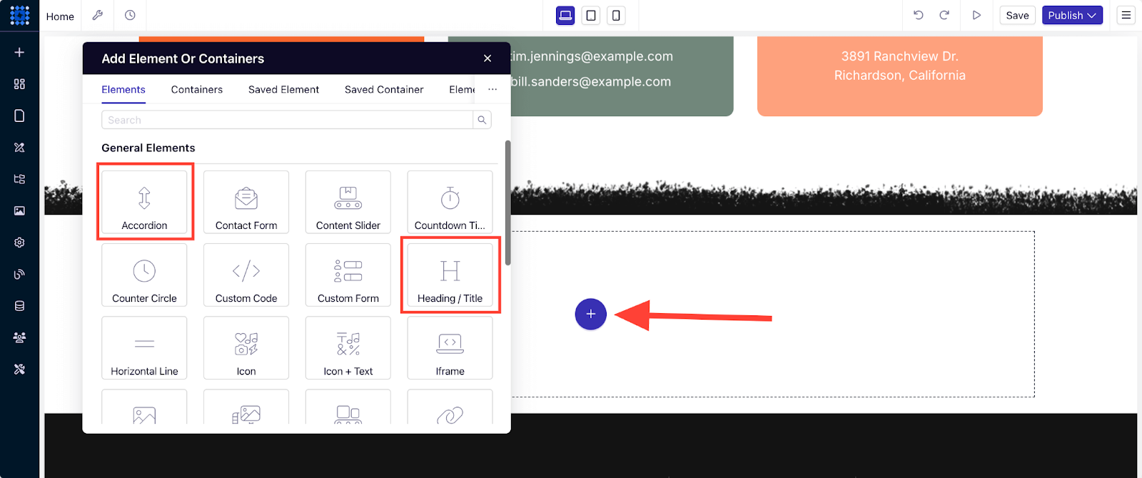
After adding the Accordion, you can customize it to edit the text, add new accordion for multiple questions, and change the styling.
Customize Global Styles
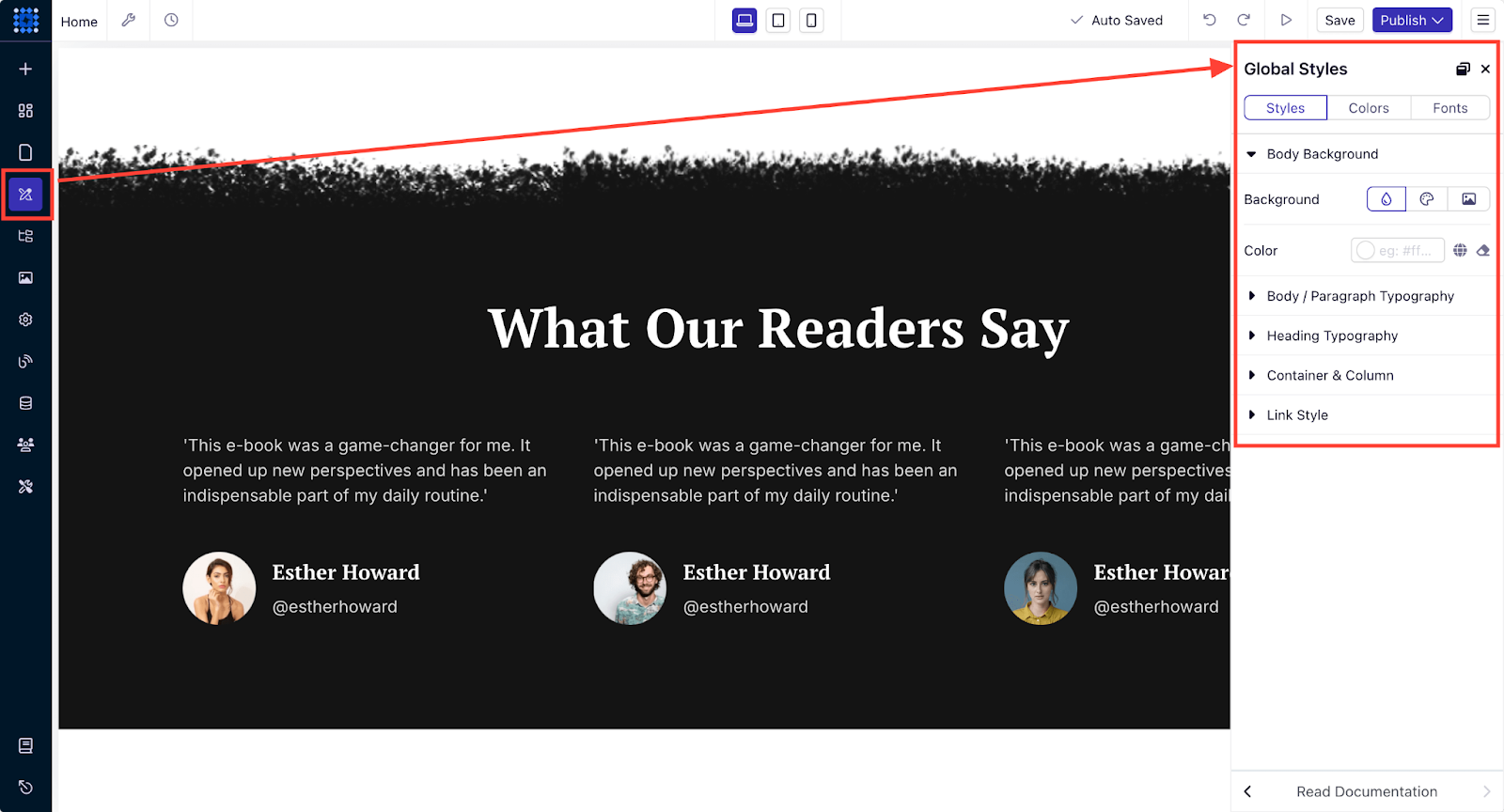
Maintaining consistency across your entire website is easy with Dorik’s Global Styles feature. This ensures your one-page site looks cohesive.
-
Set body and heading typography to establish a consistent text style.
-
Choose a color scheme that matches your brand.
-
Adjust container widths and column gaps to create a well-balanced layout.
-
Customize link styles to improve navigation and interactivity.
Leverage Other Sidebar Menus
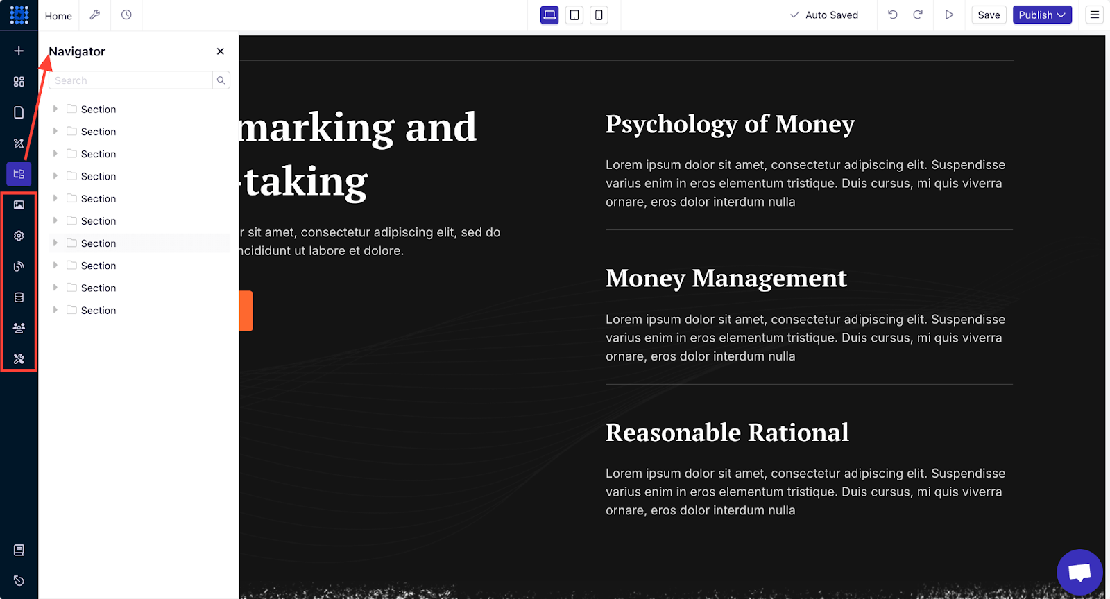
Aside from the drag-and-drop functionality, Dorik’s sidebar menus offer more tools to enhance your customization experience:
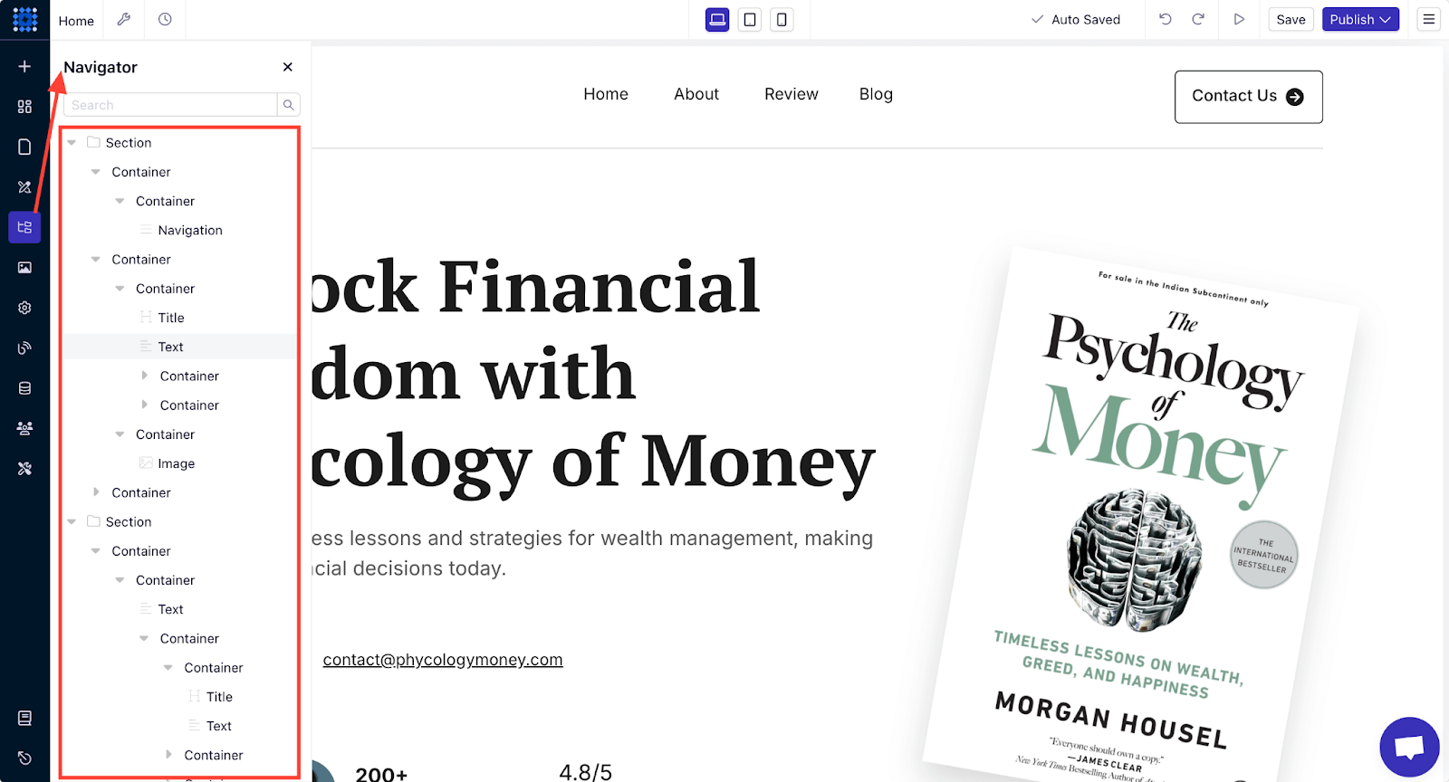
1. Navigator: This gives you a clear overview of your website’s structure and helps you organize and navigate the elements with ease. You can navigate to all elements on a page using this Navigator menu.
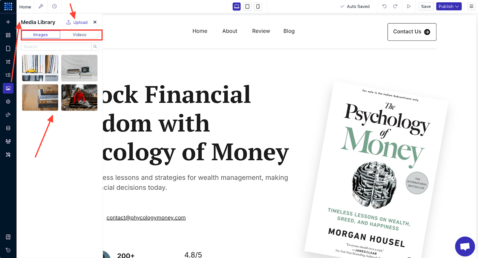
2. Media Library: The Media Library menu allows you to upload, store, and manage all your visual content in one place. You can easily drag and drop images and videos from the library into your site.
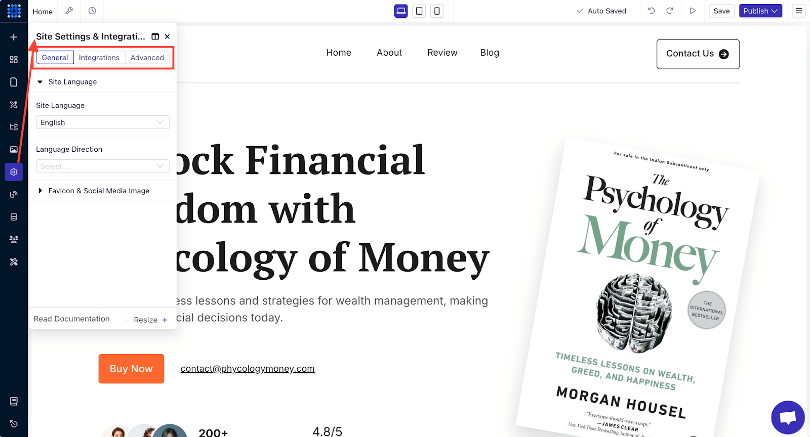
3. Site Settings: You can fine-tune various aspects of your site using the Site Settings menu, such as:
-
Set site language and configure SEO settings.
-
Add analytics tools like Google Analytics or Hotjar for tracking performance.
-
Integrate chatbots or payment systems if necessary.
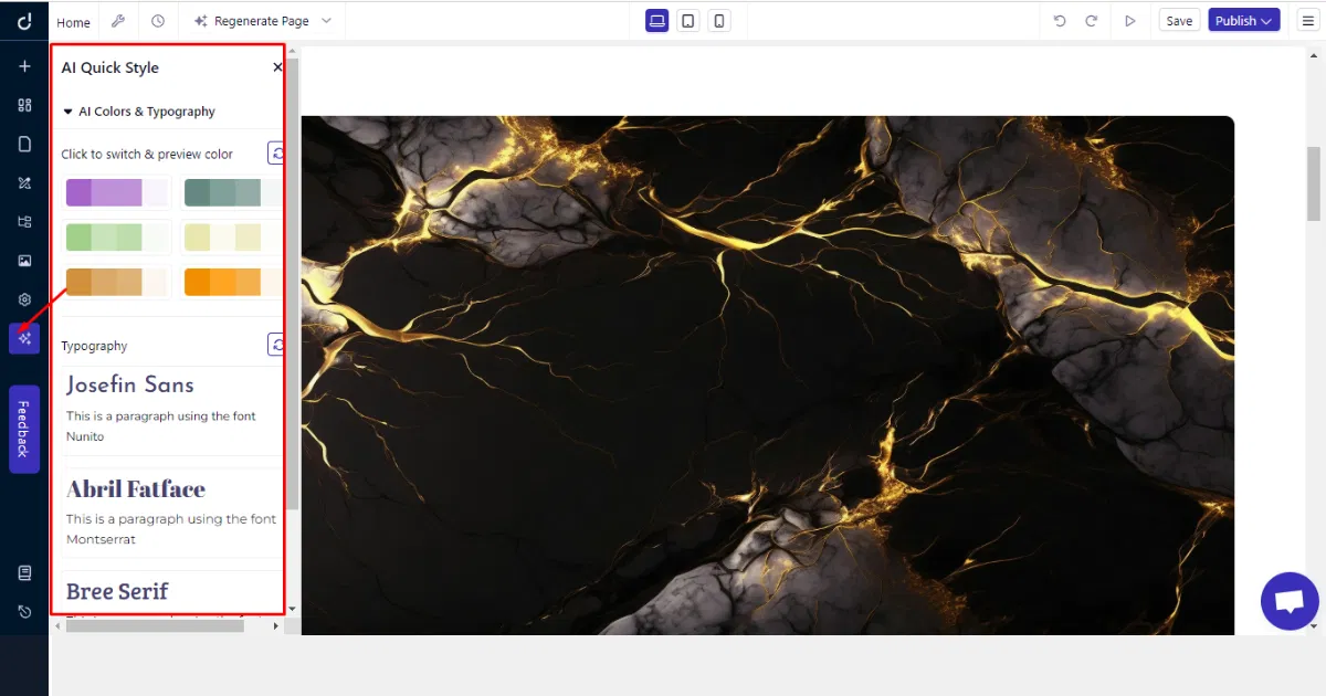
4. AI Quick Style: The AI Quick Style menu is available for AI-generated sites only. This feature allows you to quickly experiment with color palettes, typography, and overall site aesthetics.
Add Scrolling Effects
You can add scrolling effects to your one-page website to make the user experience more dynamic. You can add scrolling effects to your Dorik website in a few clicks.
Here’s how to add scrolling animation to any component of your website:
1. Select the component you want to animate when someone scrolls over it and click Edit. For example, we’re adding a scrolling effect to a section, so we’re clicking on Edit Section Style.

2. Go to the Advanced tab and expand the Animation on Scroll option.
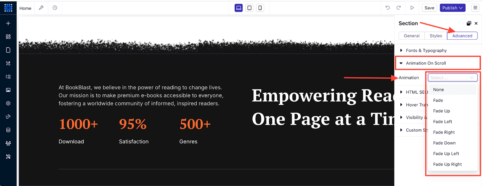
3. Select your preferred animation type. Here, we’re selecting the “Zoom In” effect. You can apply different animations to your site to understand how the scrolling effect works.
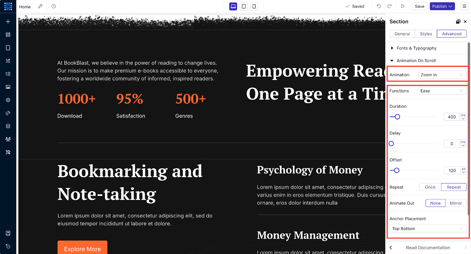
Once you've applied the effect, publish your website and watch the animation in action! Scrolling effects can bring your website to life with interactivity and visual appeal.
If you want to learn more about adding scrolling effects to your site, you can check out our in-depth guide on how to add scrolling effects.
5. Add Social Proof and Testimonials to Establish Trust
Social proof brings trustworthiness and emulates the behavior of the customers of a website.
Here, in Bizzabo, they have used a clean and effective testimonial section that would help their visitor know about the company, their production values, and all.
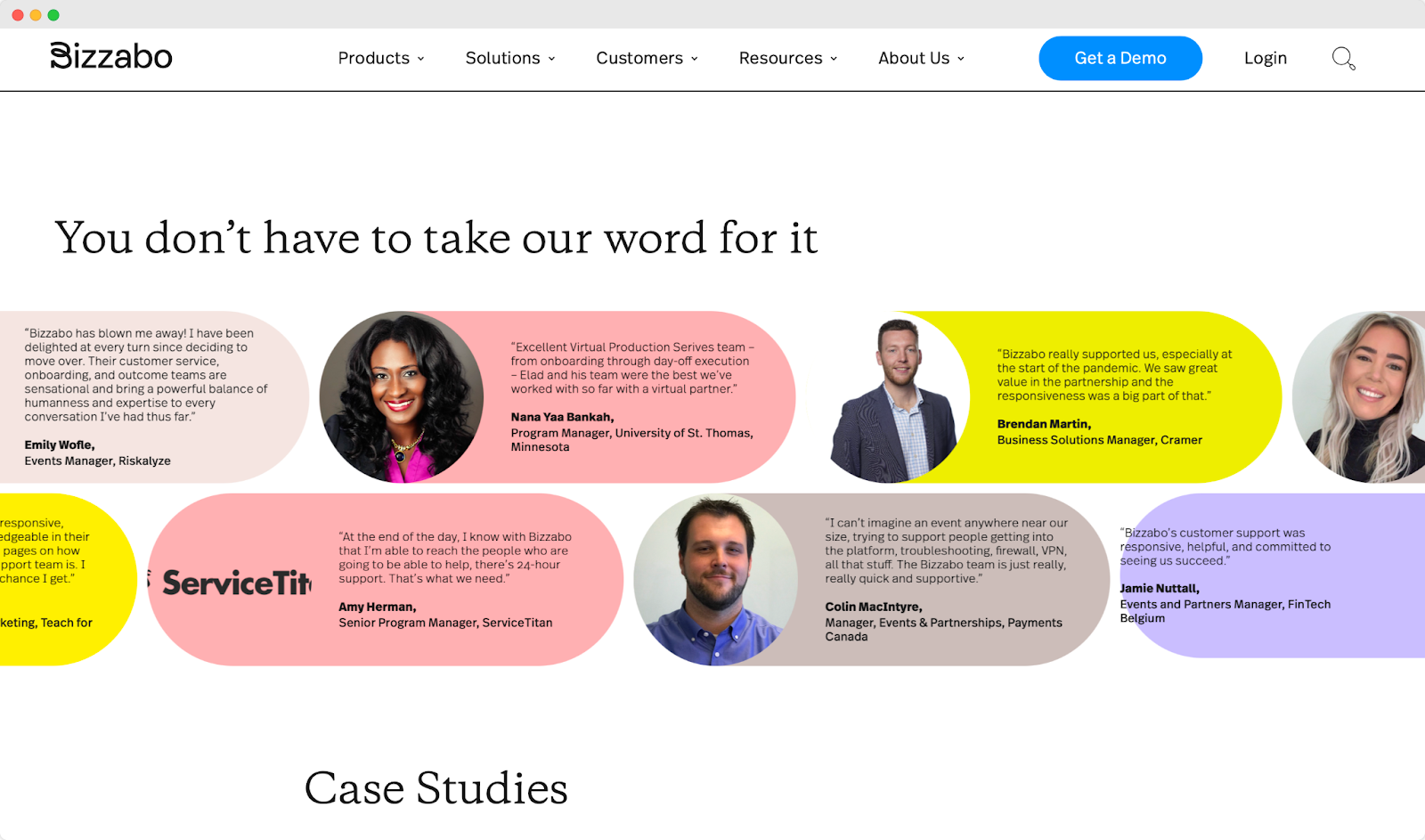
You can add testimonials to your one-page website without any hassle using Dorik´s pre-designed testimonial layout collection.
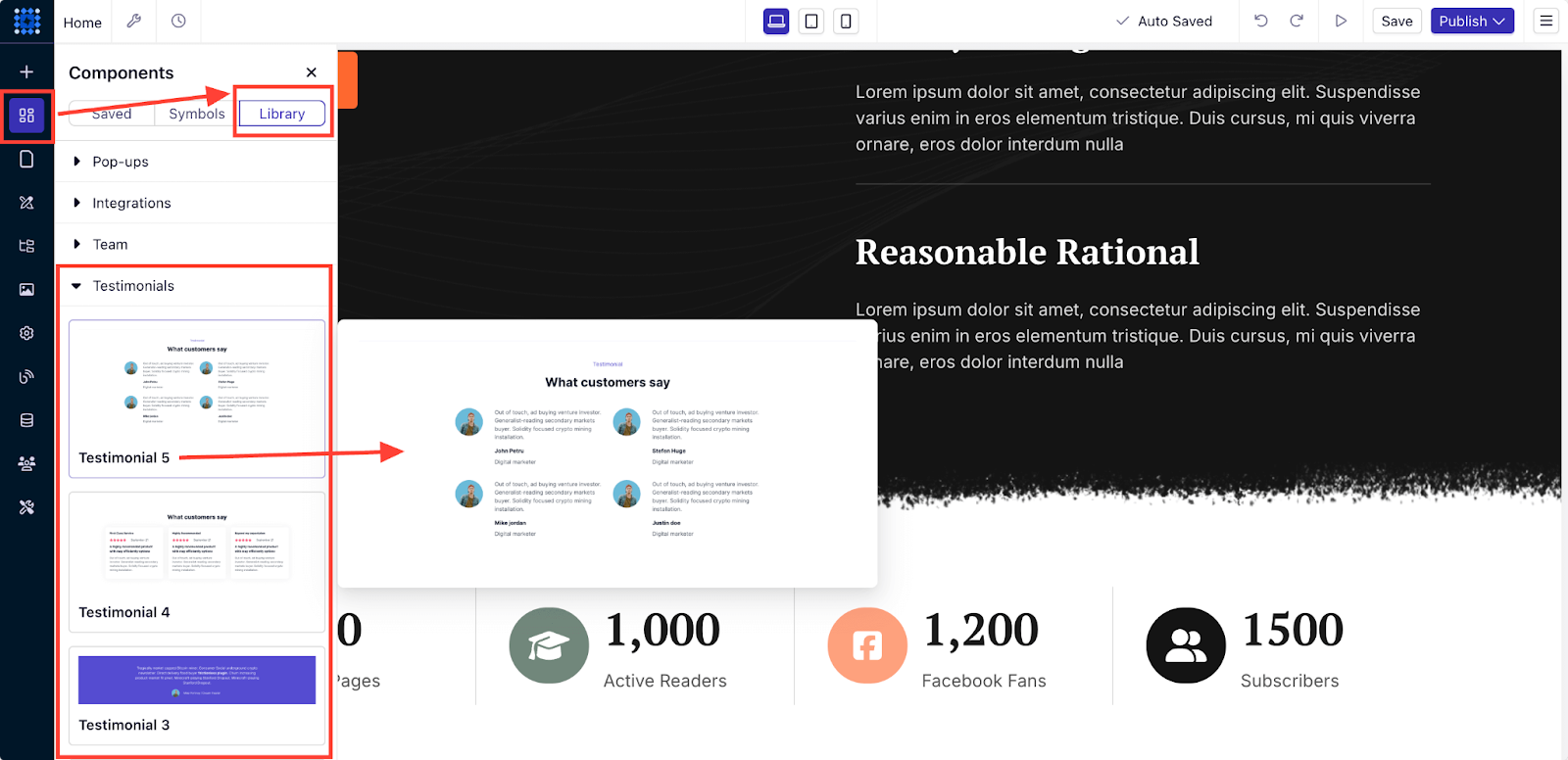
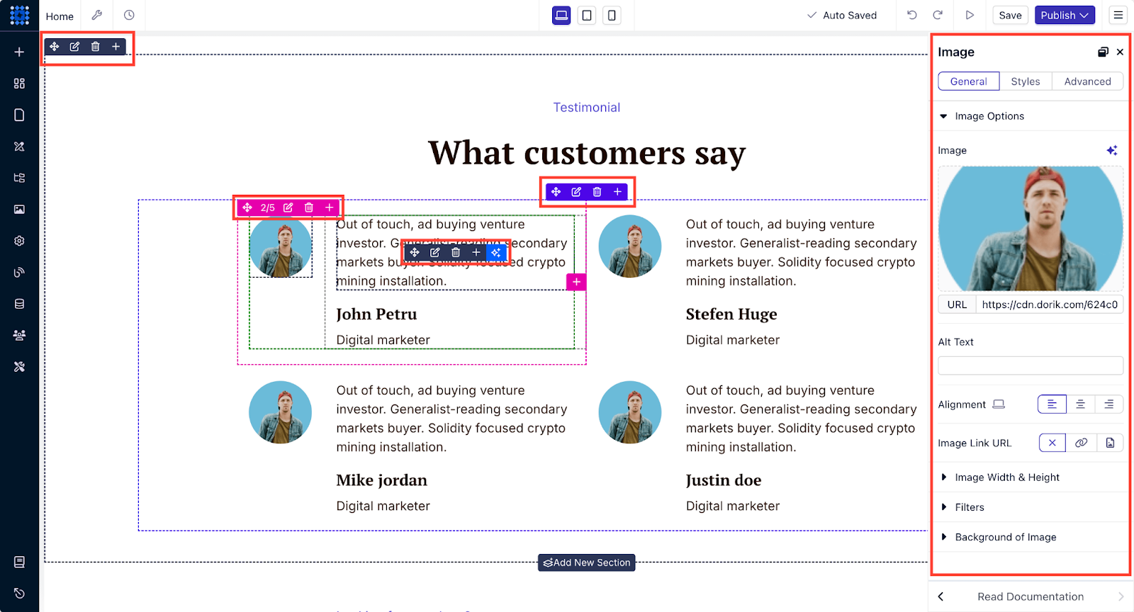
Just select a layout and drag it to drop on a preferred section of your website. After that, you can customize it to match your style. You can change the layout design, the images, the text, and any other element you want.
6. Test and Launch the Website
Before testing and launching the website, we need to talk about adding that custom domain, remember?
Choose a Domain Name
Right after selecting a one-page website builder, you can finish two more important tasks before creating the website. First, you need to select a domain name for your website. A domain name is the online address where people can find your website.
After selecting a domain name, you can purchase it from a domain name registrar like Namecheap or Godaddy.
Once you own the domain, you can easily connect it to your website.
Add a Custom Domain
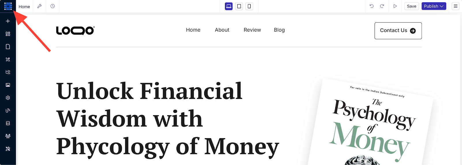
To add a custom domain to your Dorik website, you need to visit your website’s dashboard by clicking the square-shaped blue icon at the top left corner.
Once you’re inside the dashboard, go to Advanced Configurations >> Custom Domain and follow the instructions to connect your domain.
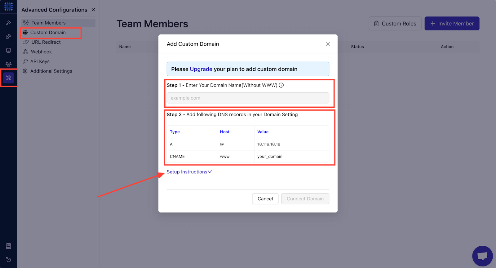
👉 You can read our guide on how to connect a custom domain to get a clear idea of the things you need to do.
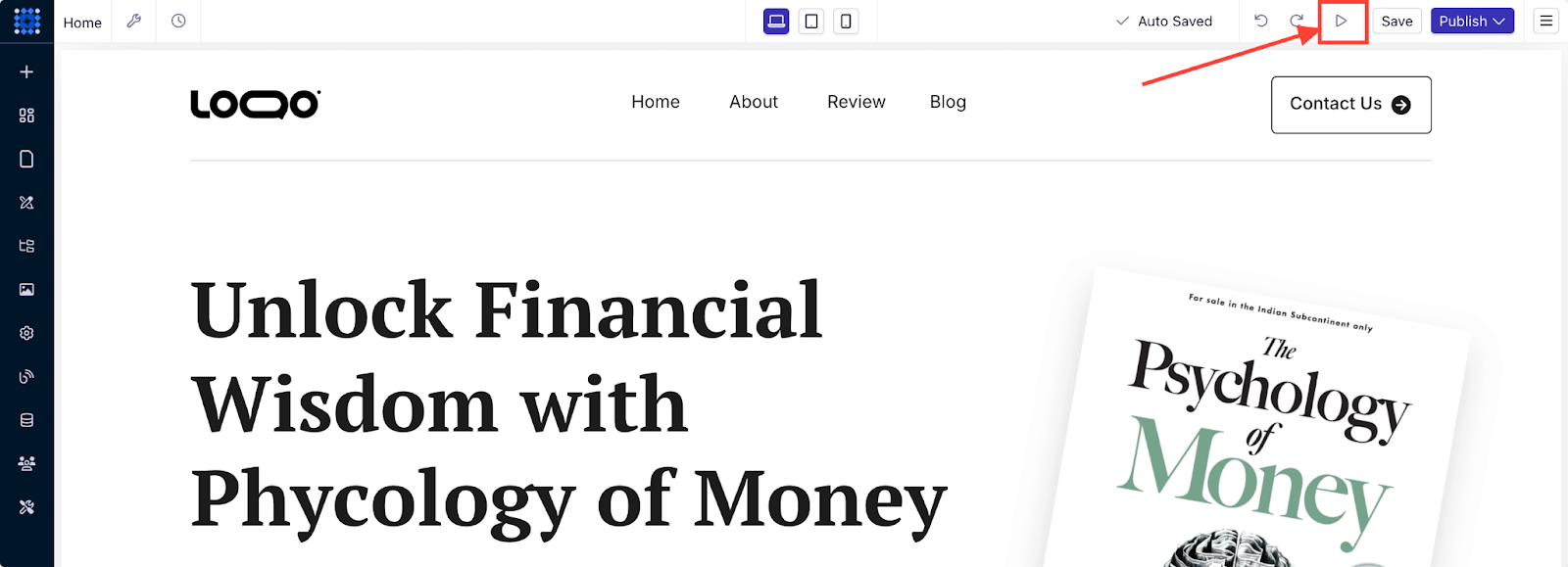
After customizing the design and connecting the domain, your site is ready to be published. But before you hit the publish button, you can preview it by clicking on the arrowhead icon to check if everything is working exactly as they’re meant to.
Click on the buttons to ensure they’re functional, and open the website on a mobile device to see if it’s responsive.
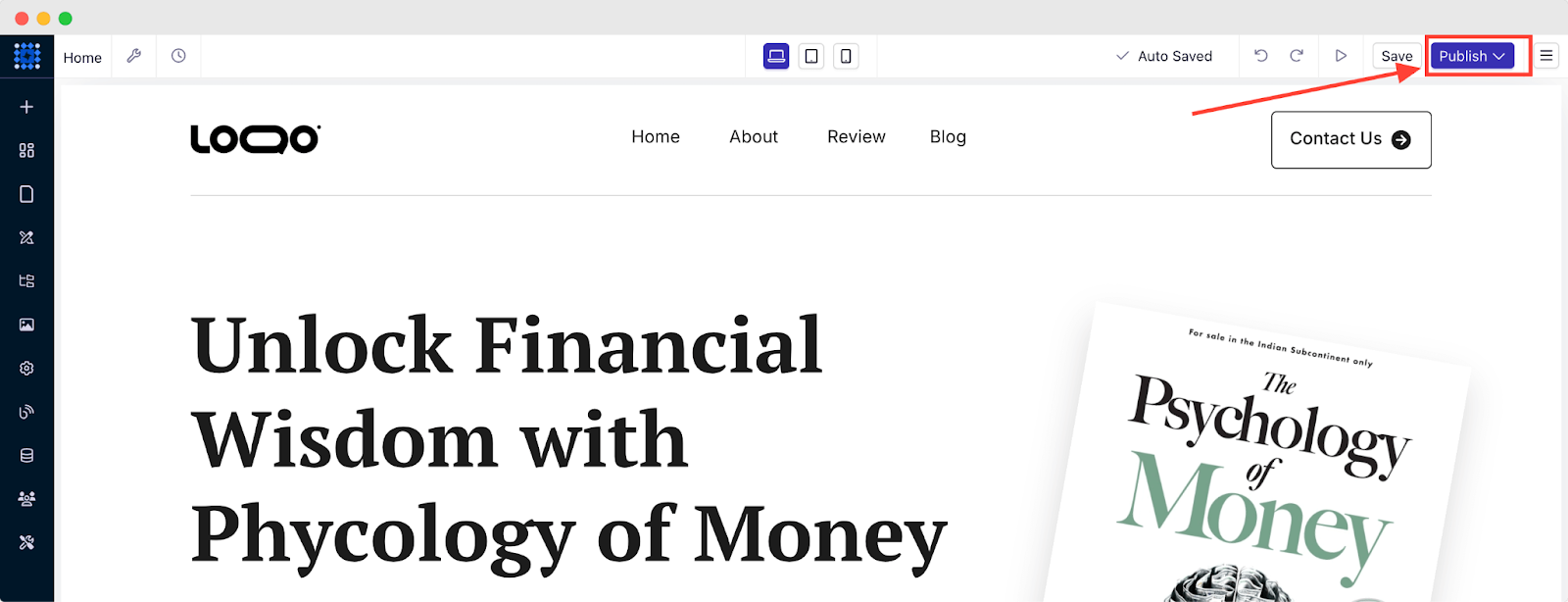
Once you’re satisfied with everything, you can click 'Publish' and your site will be live.
And that's all you need to know about creating a one-page website.
What to Include in a Single-page Website
According to TechTarget, an identifiable part of a more extensive content or program is a component.
Scroll down to learn several vital components for a single-page website that you should maintain while creating one for your own.
Simple but Catchy Visual
Research found that 94% of users create their first impression relying on its design.
So, understanding the viewer's perspective and matching it with relevant visuals would be great to grab their impression. Dorik’s AI image generator can help you in this regard. It can turn your prompts into eye-catching visuals.
👉 You can read our guide on how to write prompts for AI image generators to get the best results.
Actionable Calls-to-actions (CTAs)
Since a one-pager website does not have additional pages like -about, team, or services, it beholds all these pages in a single page as different sections. Therefore, these types of websites need to have some actionable hyperlinks to help users get connected.
A call To action is a crucial element for a website's performance. These can be a pop-up button, a sign-up button, a form, or an anchor link.
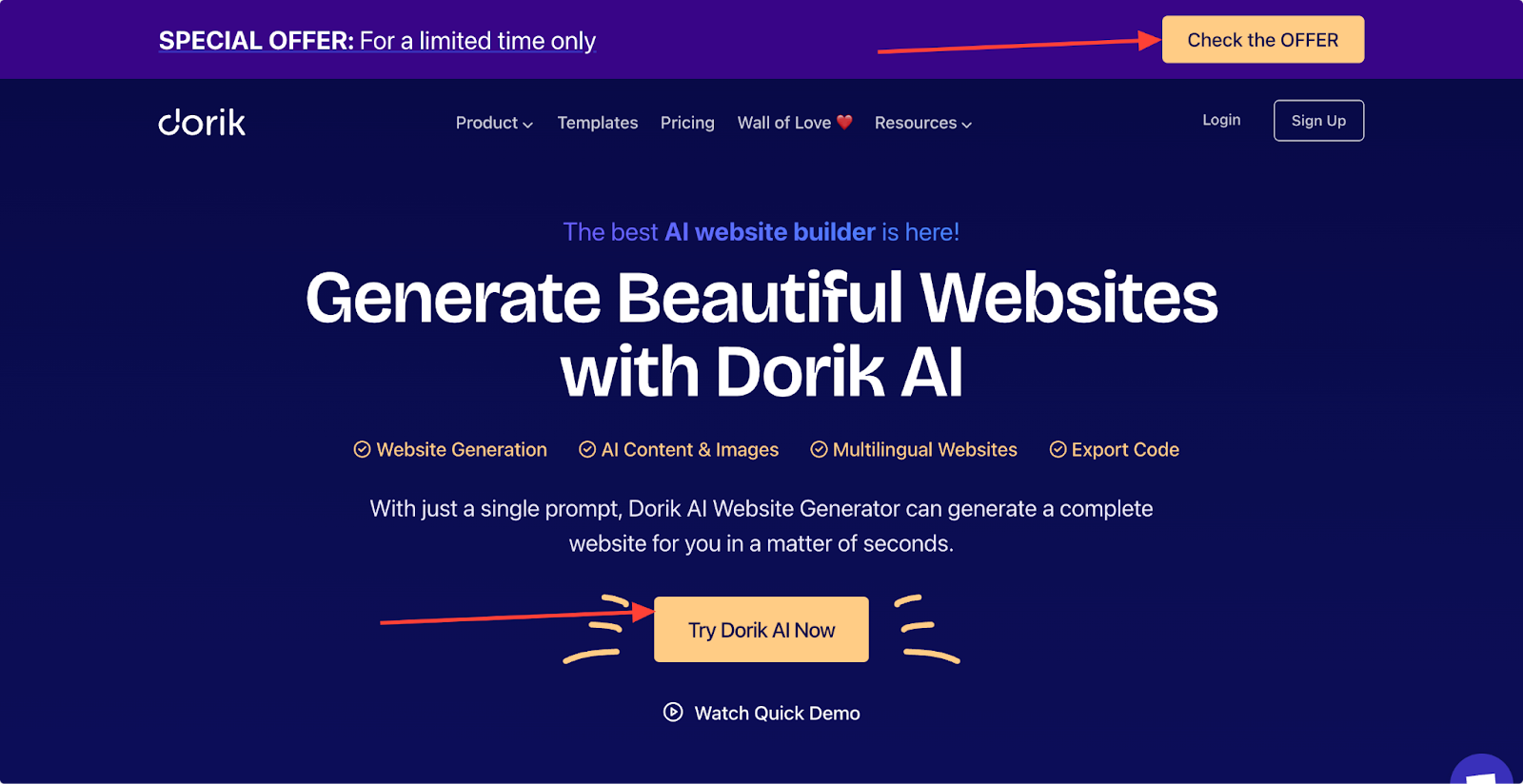
For example, you can see the CTA buttons placed on the landing page of the Dorik AI website builder. You can’t miss them.
Product Messaging and Power Words
People will visit your site to learn more about it and to get some information that they did not know before.
Product messaging allows one to introduce the benefits of their product to their targeted audience.
It's the most significant opportunity for a person to make their target audiences into successful clients.
And here, punch words work the best.
Use powerful words that grab the user's attention, like- 'Free,' 'biggest,' 'instant,' 'expert,' 'eye-opening,' 'easy, 'amazing,' essential,' etc. There are three types of power words: Seductive, emotional, and sensory.
Read more about how and where to use power words on your website from RankMath's brief research article on this basis.
Service or Product Showcasing
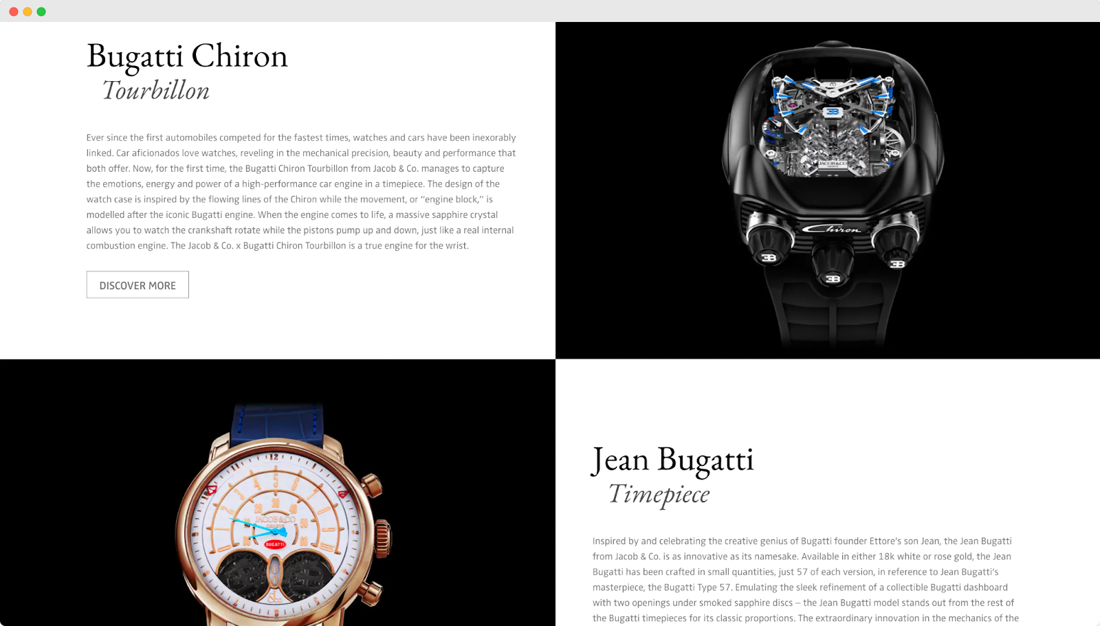
One of the primary goals of building a one-page website is to let others be intimate with your skills or the service you provide.
Your product sections encourage your visitors to scroll more, simplify your message, increase conversion rate, and lastly, allow you to get customer data from this section.
Display your products and services naturally in a section, and let visitors find them by scrolling or using jump-link.
Integrate Social Media Profiles
You can incorporate your social media profiles into your website if you want to establish a strong online presence. It is a must-have feature for a one-page website that is focused on personal branding, portfolio, or businesses that rely heavily on online engagement.
Social media buttons allow visitors to connect with you across platforms. It can help you to build a stronger online presence.
However, if your goal is just to present basic information (e.g., for a restaurant or a local service), social media buttons might not be necessary.
FAQs
Can I make a One-page Website For Free?
Yes, you can make a one-page website for free.
With Dorik, you can design, customize, and publish your one-page website for free. However, you’ll have to purchase a premium plan if you plan to officially launch the website with a custom domain and keep it live after the 14-day trial ends.
Is a One-page Website Better than a Multi-page Website?
A one-page website is better than a multi-page website if you can focus on a targeted audience with specific features. It's ideal for landing pages, portfolios, or event promotions, where all the necessary information is presented in one scrollable page.
However, a multi-page website may be more appropriate if you need to cover a wide range of content, products, or services that require detailed explanations. Ultimately, the decision depends on your content needs and user experience goals.
What Are the Key Benefits of a One-Page Website?
One-page websites offer several advantages, including faster loading times, improved mobile responsiveness, and a streamlined user experience. With all the information on one page, users can easily find what they need without navigating through multiple pages.
This makes one-page sites highly effective for driving conversions, especially for specific campaigns or targeted audiences.
Do One-Page Websites Rank?
Yes, one-page websites can rank on search engines, but it's a bit more challenging compared to multi-page sites. Since there’s only one page, you have fewer opportunities to target a wide range of keywords.
You need to optimize your content with highly relevant keywords, proper headings, meta descriptions, and internal links to improve your chances of ranking. Fast loading times, mobile optimization, and good user engagement will also play key roles in helping your one-page website rank faster.
Final Words
In a world where attention spans are short, a one-page website can deliver your message quickly and effectively. With this guide, you’ve learned how to map out your content, create a beautiful layout, and personalize your design for maximum engagement.
Now, you’re ready to create your website. Use a website builder like Dorik to simplify the process.


