

How do designers make a design that is easy to use?
How do they know this idea will work?
Well, designing itself is a sturdy job to do. But, there are endless possibilities that you have to consider which one is best for your user experience.
According to Review42, 38% of users will stop browsing a website if the design is not attractive.
Here, knowing the laws of web designs can be a great help to keep visitors engaged on your site. It also assists in achieving an effective and successful design.
This article will familiarize you with the 8 web design principles and laws you should implement in your effective website design plan.
What Are The Principles and Laws of Web Design?
From visual hierarchy to typography, there is a vast space to learn about website design principles and laws. Here are the eight most essential laws and principles discussed below:
-
Law Of Proximity
-
Law Of Similarity
-
Law Of Alignment
-
Law Of Repetition
-
Law Of Contrast
-
Fitt's law.
-
Hick's Law.
-
Principle of Balance.
8 Principles and Laws of Web Design
Creating a website contributes to many cores, including how it would be visible to the users.
Whether you are looking for how to start a productized web design business or trying to boost your website performance, maintaining the laws and principles can lead it to a new peak.
Here, in this article, you will learn about all the laws and principles of Gestalt, Hick, and Fitt.
1. Law of Proximity in Design
According to Gestalt's website design principles, the law of proximity stands for how human eyes judge visuals that are kept closer together, believed as related things.
In a word, keeping items closed along with the others should mainly get grouped together. On the contrary, items that have been kept farther away are less likely to be grouped alongside.
Down below there is an example of the law of proximity:

Looking at the image attached above, you will notice that the feature performing as 'before' seems to be a group with the same perspective with many items.
But, when they have been divided into smaller groups, it helps catch visitors' attention easier and tends to be believed as two different groups.
Your eyes are seeing these visual elements as two different groups because the gap between them makes them less closed. Though they are all in the same color, shape, and size.
The law of proximity in design reflects the belief that your visitors see your visuals, perceiving them as a group that has been kept together. This law helps UX designers determine what the visitors are looking for and take action to bring clients' needs to the design.
2. Law of Similarity in Design.
The law of similarity is one of the Gestalt web design principles that describe things that are likely to be seen.
This law states that items that look similar tend to be grouped and kept together or believed as the same item.

Image source: Medium
To get a better idea of this law, look at this image where multiple figures have been grouped together depending on their categories. When you see it, your brain first tries to find similarities in its shape, color, texture, and size. So, keeping this in mind, laws of similarity suggest designers group liking things together.
3. Law of Alignment In Design
The alignment of items can be done in multiple formulas. Keeping an alignment on a group of contents helps to grab visitors' attention and makes the website more scannable.
There are a lot of aligning categories for elements of a website, like —
-
Optical alignment
-
Text alignment.
-
Edge alignment.
-
Label placement (top aligned, floating items, etc.)
A case study of Nielsen Norman Group found out that aligning elements on your web page based on an 'F' shaped pattern helped readers get the information the way their eyes scan for it.

Image source- Noble Word.
When we look for something on a website, our eyes run through it in an 'F' pattern, not looking at everything. First, looking at the left side alignments contents, searching for important headlines, bullet points, and buttons.
So, keep it on your design, especially on a page where your target is to get more action from your visitors. As many web designers are following this, it will help you create a better user interface (UI) in your website design.
If you are going to build a one-page website, where the law of alignment is super effective, go through the guideline of creating a one-page website!
4. Law of Repetition In Design
The law of repetition in design stands for using the same layout or design elements in your website for multiple times. It can be a single line that you will design to use in a part of your website. Then, reusing it again in any other part stands for the Repetition law of Gestalt design laws.
This law fasten the design process for web designers. For example, a website's logo can be used several times on a web page just like Spotify design used it.

5. Law of Contrast in Design
Contrast brings meaning to a good design. A design can not be properly meaningful without adding contrast to it.
So, how do designers do that?
Contrast can be added to a website's design in various ways. There is a range of contrast in shape, color, scale, layout, font type, alignment, etc. It makes your website more focused on its visitors' eyes.

Image source: Useplink
In the image above, the contrast of color and shades has been used to grab the visitor's attention in the middle of the webpage.
Tips:
-
Try to figure out color scheme analysis.
-
Utilize White Space or Negative Space in design.
-
Understanding the focal point makes a design aesthetically pleasing.
-
Understand how the contrast of color dances by its weight on every page of your website.
-
Keep a limitation on the color palette on a particular website. For example, use a primary color and 1 or 2 lighter shades. Keep it related to the text color as well.
6. Fitts's Law In Web Design
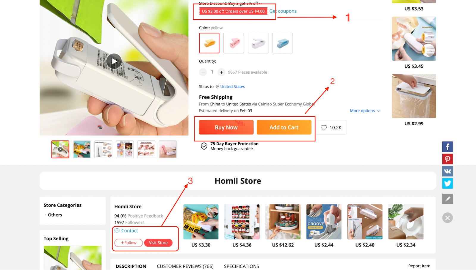
In AliExpress, they focused on turning a visitor directly into a successful client by adding colors to the specific area of the site.
Firstly, on No. 1, they grabbed the visitor's attention by keeping it bright in color where they offer discounts. Mainly to make a visitor feel in need of the product. Then on No. 02, instead of turning this client to press the Ádd to cart button, they focused on the 'Buy Now´ button.
Thirdly, instead of making a visitor follow the site, they prefer to suggest the person visit it instantly.

Gestalt's principle of contrast in visual hierarchy focuses on the term of making a design that is visually engaging and aesthetically appropriate to turn a target audience into a successful client. Thus, Fitts's law also focuses on making designs easier to understand for visitors.
Tips:
-
Try to add actionable Calls to action (CTAs) in a place where you prefer your visitors' actions most.
-
Add attractive colors to drive attention.
7. Hick's Law In Web Design
Hick's law in design states that the more options available on your website, the more challenging and longer it will become for your customer to take action. It also suggests a designer orgenize their design elements to make it easier for visitors to find their needs and jump into a decision.
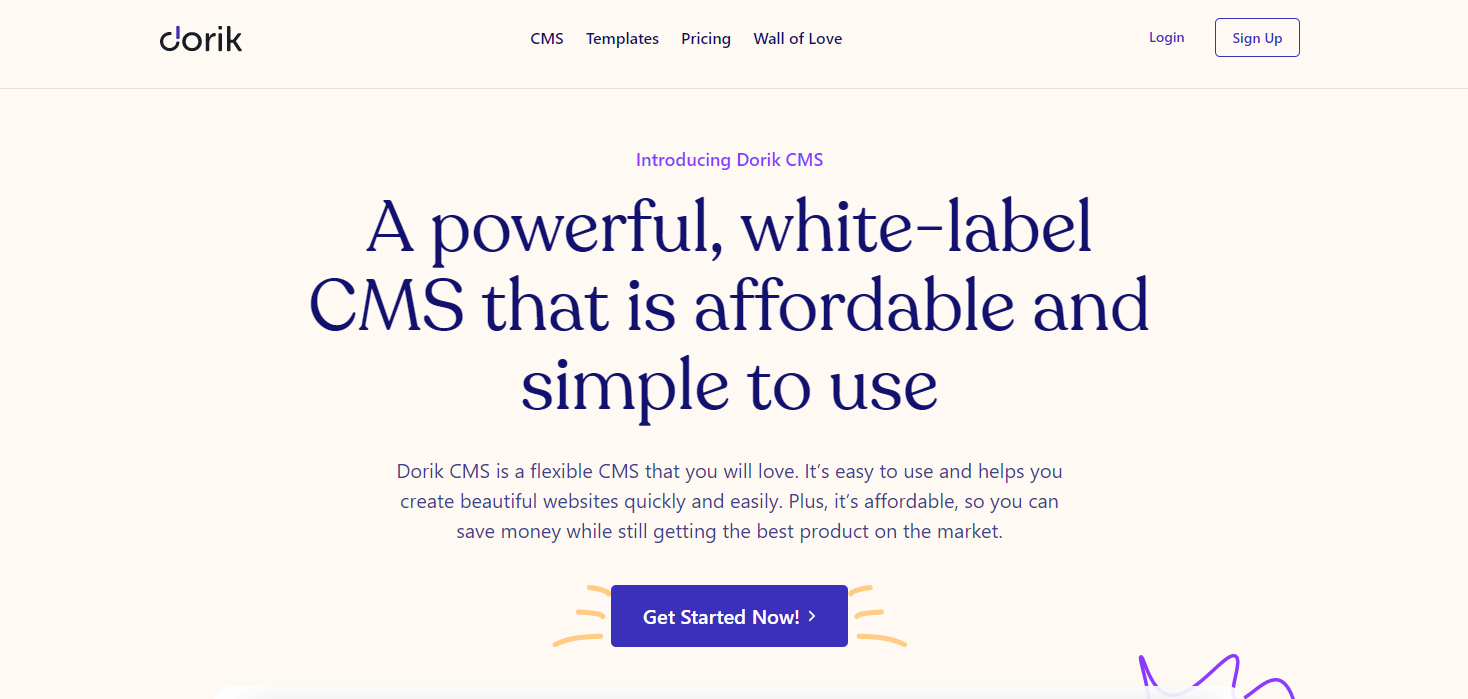
If you look at this image, you can find yourself clicking on one of the nav menu items to help you get what you need instead of searching for its features. The design is accessible and eye-catchy for viewers' action.
The 'Pricing,' 'Templates,' and 'Wall of love' will help you know about Dorik within clicks. So, here you can say the design theme of this website has maintained a good quality of Hick's law.
Tips:
-
Outline a visual hierarchy of your website's navigation bar.
-
Give your plan a view of how you want your visitors to take action.
-
Check all the links you have embedded on your nav items to ensure they all are working perfectly as they are supposed to (it's easy to do it on your own on Dorik as it does not require any coding knowledge).
8. Principle of Balance In Web Design
ResearchGate shows that a website's objects can be balanced while maintaining a weight of equality. Such as, keeping a significant weight element on the right side of your webpage and a group of minor elements on the left can maintain the balance of this page's weight.
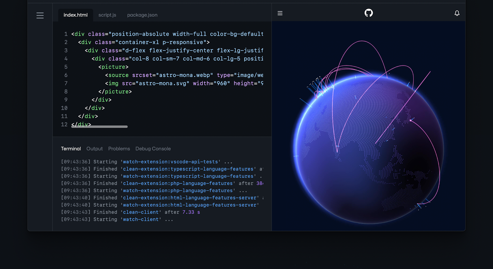
Image source: GitHub
Here, in this image of Github, the designer preferred to add a set of text lines against the colorful picture on the right side. Thus, it balanced both the size and value of color in this single section.
Master all these methods of website design principles and laws more effectively if you are starting a web design business.
How Will You Use Web Design Principles and Laws While Creating Your Website with Dorik?
While building websites with Dorik (one of the best top-level web builders) for personal or business purposes, it's pre-built and pre-designed by our experienced illustrators and designers. So you can easily organize them without having difficulties making their arrangement.
Though it is all set up for you, there is always a space to put your knowledge about web design principles and laws on your website.
Design and let your visuals run while creating a website from scratch. To know more about how to design a website from scratch, peep inside Dorik´s documentation or leave a ping in the comment section.
Final Wrap Up on Web Design Principle and Laws
Now you have a firm grasp of web design principles and laws. These all elements works together to create a unified and effective website, from layout to color theory, typography to user experience.
You should now be able to approach website design with confidence, creating a website that not only looks good but also functions smoothly for your visitors.
Remember that, good web design is not just about visual appeal; it's about creating an engaging and usable platform for your users. Also make designs mobile friendly for better user interact.
So, put these principles and laws into action and advance your web design skills!
More Dorik Blogs on Web Design
-
Learn about all the factors influencing web design in this ultimate guide to web design to develop a unique website today!
-
Looking for some stunning wedding website examples? Get some ideas from these best wedding website examples to build your one with more perfection.
-
Looking for some best trendy designs? check out our insightful guide to website design trends.
