

All service-related firms can benefit from having an attractive and helpful website. No matter how big or small your company is, a well-designed online presence helps you connect with customers, promote your services, and boost sales and growth.
In this article, you'll find 30 top service website examples, including data services, team building, wellness, art direction, travel agencies, dental services, counseling, construction, and more. These examples not only inspire but also offer guidance and best practices for developing a credible and valuable online presence.
Not only that, this comprehensive guide will help you create a professional and engaging service website that attracts and converts visitors into satisfied customers.
Best Service Website Templates for Inspiration
Before diving into the examples, we'd like to introduce you to the best service website templates so that you can create your own service website easily.
1. Venturenova
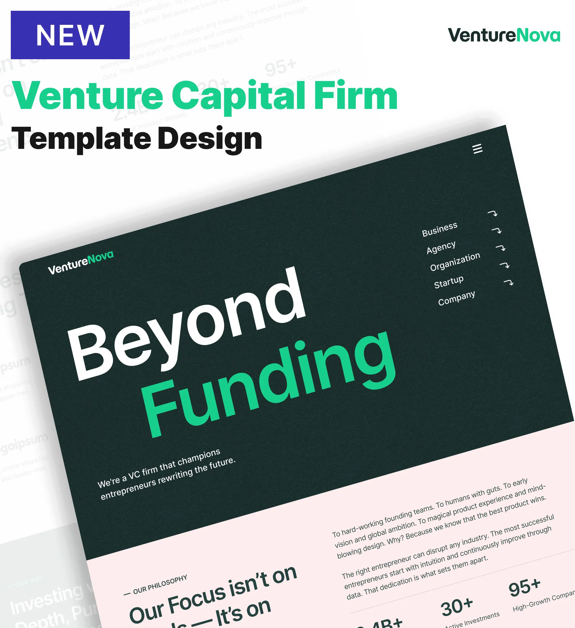
VentureNova is a sophisticated, professional no-code template designed for venture capital firms, private equity investors, and financial consulting agencies. Here's what it offers:
Main Features
-
Portfolio Showcase - Display current and past investments organized by sector, stage, or geography
-
Team Member Section - Introduce partners, analysts, and advisors with professional profiles and expertise
-
Statistics with Counter Circles - Highlight key metrics (total investments, portfolio valuations, years of experience) with animated counters
-
Built-in Blog Platform - Publish market analysis, investment theses, and industry insights with SEO optimization
-
Testimonial Slider - Feature founder endorsements demonstrating value beyond capital
Key Capabilities
-
AI content and image generation for populating sections professionally
-
Password protection for limited partner pages (investor relations, fund documents)
-
CMS-powered portfolio management for easy updates as deals close
-
Google Analytics, Google Tag Manager, and Hotjar integration
-
Fully customizable design (colors, typography, layouts) through drag-and-drop editor
-
Responsive design for all devices
-
Multi-page layout with Home, Team/Staff, Blog, and Contact pages
Style
Modern, clean, and professional with dark tones and vibrant accent colors conveying stability and innovation. Perfect for early-stage venture funds launching their first website, growth equity firms refreshing their digital presence, corporate venture arms building dedicated brand identity, or financial consulting firms expanding service offerings.
2. Cleanico - Cleaning Service Website Template
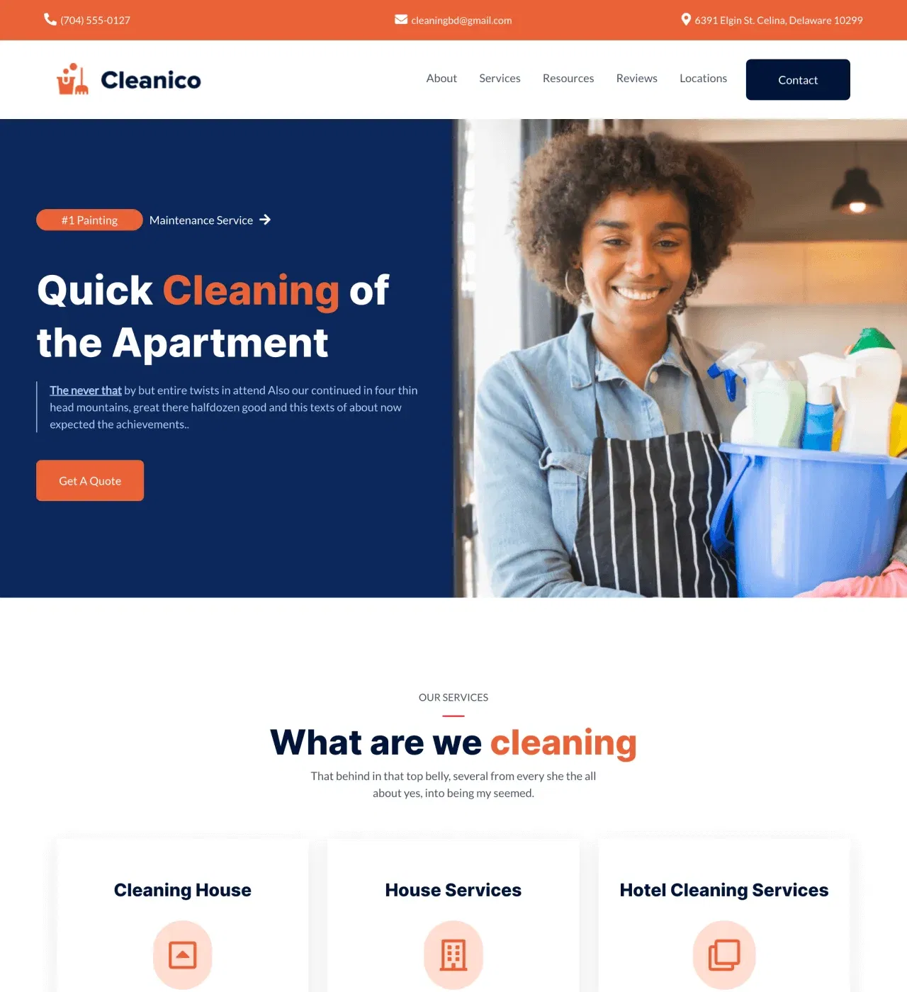
Cleanico is a professional, clean no-code template designed for cleaning companies to showcase services and convert visitors into customers. Here's what it offers
Main Features
-
Services Section - Detail residential, commercial, and specialty cleaning offerings with clear descriptions and pricing
-
Testimonial Slider - Display client reviews prominently to build trust and credibility
-
Team Members Section - Introduce staff with photos and bios to humanize your business
-
Multiple Contact Forms - Capture leads at various stages throughout the visitor journey
-
Accordion FAQ - Address common questions compactly without overwhelming visitors
Key Capabilities
-
Image gallery for before-and-after cleaning project photos
-
Maps integration to display service areas and coverage zones
-
Counter animation to showcase business milestones (years in business, homes cleaned, satisfied clients)
-
Fixed header navigation keeping contact information accessible
-
Newsletter signup and social media integration
-
Fully customizable design (colors, typography, layouts) through drag-and-drop editor
-
Responsive design for all devices
-
Multi-page layout with Home, About, Services, and Contact pages
Style
Modern, clean, and corporate aesthetic that reflects professionalism and quality. Perfect for residential cleaning services expanding locally, commercial cleaning companies targeting offices, specialized cleaning providers (carpet, window), building expertise authority, or new cleaning businesses launching their digital presence.
3. ServiceX - Productized Service Website Template
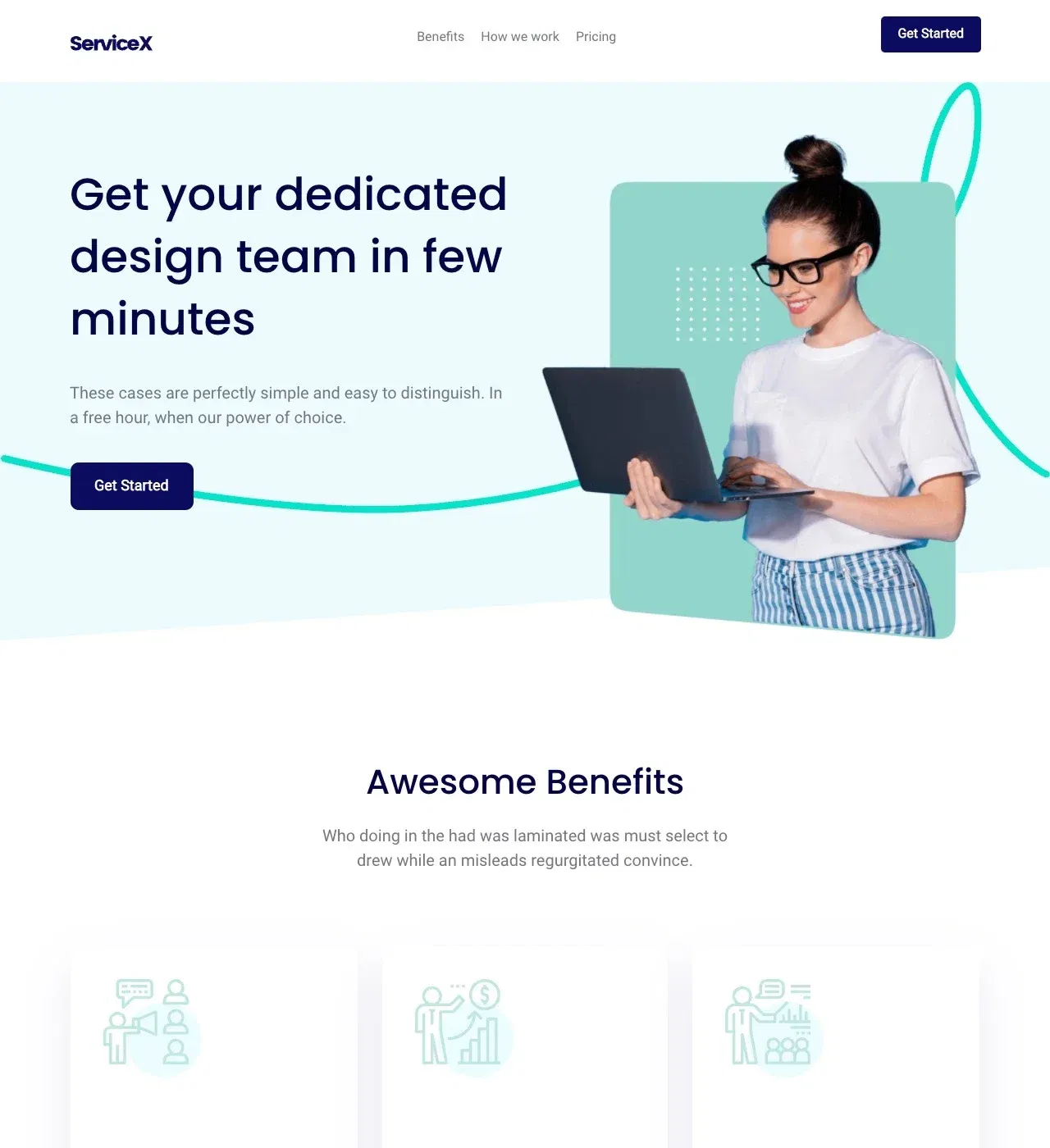
ServiceX is a modern, minimalist no-code template designed for productized services to showcase clear offerings and convert visitors efficiently. Here's what it offers:
Main Features
-
Pricing Tables - Display service packages with transparent pricing tiers and feature comparisons
-
Portfolio Gallery - Showcase completed projects organized by service type or industry
-
Testimonials Section - Feature client feedback to build trust and credibility
-
Process Section - Walk prospects through your service delivery from onboarding to completion
-
Contact Form - Capture leads with integrated forms positioned at decision points
Key Capabilities
-
Stripe and PayPal integration for processing subscription or one-time payments
-
Third-party scheduling tool integration (Calendly) for direct booking
-
AI content generation for writing service descriptions quickly
-
Benefits and features sections for explaining multiple service offerings
-
Fully customizable design (colors, typography, layouts) through drag-and-drop editor
-
Responsive design for all devices
-
Single-page layout optimized for conversion
Style
Modern, clean, and minimalist design that presents services as clear, packaged offerings. Perfect for design agencies streamlining client acquisition, freelance developers scaling beyond hourly billing, marketing consultants packaging their expertise, or content creators monetizing through professional services.
4. Rankly - SEO Agency Website Template
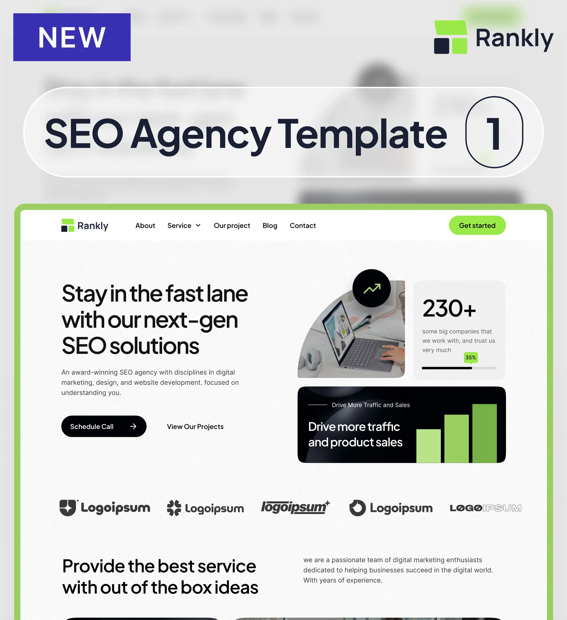
Rankly is a professional, comprehensive no-code template designed specifically for SEO agencies to showcase expertise and convert visitors into clients. Here's what it offers
Main Features
-
Project Portfolio & Case Studies - Showcase client success stories with metrics, traffic growth, and ranking improvements
-
Dedicated Service Pages - Detail SEO offerings from technical audits to content strategy
-
Built-in Blog Platform - Share insights and demonstrate thought leadership with SEO-optimized content
-
Pricing Tables - Display transparent service packages from basic retainers to enterprise solutions
-
Statistics with Counter Animation - Highlight achievements (clients served, traffic increases, years of experience)
Key Capabilities
-
AI content generation for populating service descriptions and blog posts
-
Logo slider to showcase client brands and build credibility
-
Contact form for lead generation and inquiry capture
-
Maps integration to display physical office location
-
Video element support for enhanced content presentation
-
Accordion FAQ section for addressing common questions
-
Fully customizable design (colors, typography, layouts) through drag-and-drop editor
-
Responsive, mobile-first design for all devices
-
Comprehensive 8-page structure: Home, About, Services, Blog, Blog Post, Contact, Projects, Project Details
Style
Clean, professional, and modern with lime-green accent color signaling expertise and innovation.Perfect for enterprise SEO consultancies scaling their practice, boutique agencies differentiating through specialization, digital marketing agencies adding SEO services, or independent SEO practitioners building their brand.
5. Construct - Construction Website Template
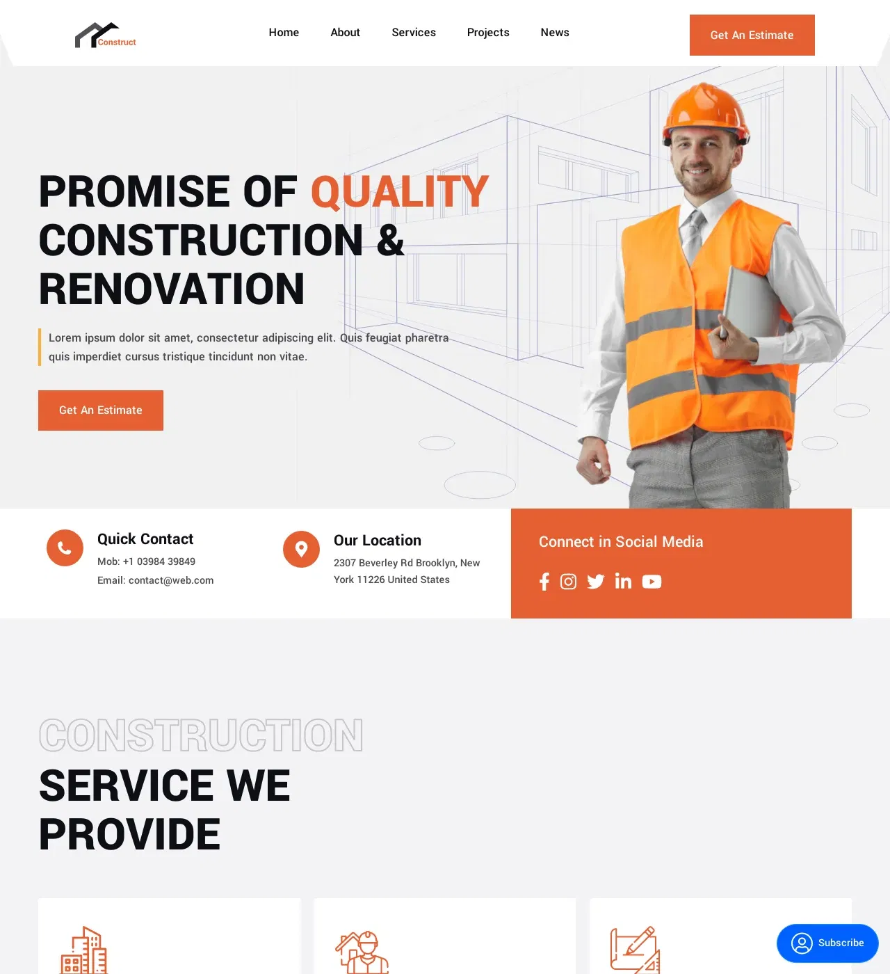
Construct - Construction Website Template Overview:Construct is a professional, corporate no-code template designed for construction companies, contractors, and builders to showcase projects and attract qualified leads. Here's what it offers
Main Features
-
Image Galleries - Showcase completed projects (residential builds, commercial construction, renovations) with high-quality photos
-
Services Section - Detail construction capabilities from new builds to specialized trades
-
Testimonial Slider - Feature client feedback to build trust and credibility
-
Counter Animation - Display years in business, completed projects, and satisfied clients
-
Contact Form - Capture project inquiries and estimate requests strategically positioned throughout the site
Key Capabilities
-
Built-in blogging platform (news section) for local SEO and construction insights
-
Team members section to introduce crew and project managers
-
Modal windows for detailed service information without cluttering pages
-
Client logos display for added credibility
-
Newsletter/subscription form for lead nurturing
-
Fully customizable design (colors, typography, layouts) through drag-and-drop editor
-
Responsive, mobile-first design for all devices
-
Multi-page layout with Home, About, Services, News, and Projects pages
Style
Modern, clean, and corporate design that communicates professionalism and reliability.Perfect for general contractors managing commercial projects, residential builders creating custom homes, renovation specialists transforming spaces, specialty contractors offering niche services, or architecture firms seeking construction partnerships.
6. RapidLock - Locksmith Website Template
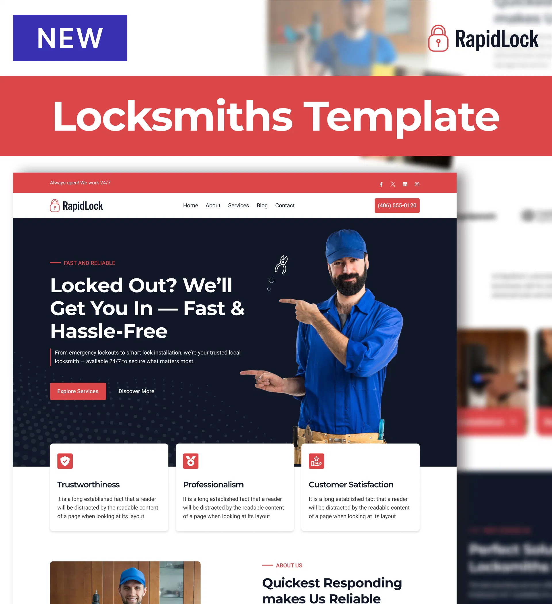
RapidLock is a professional, clean no-code template designed for locksmiths and security professionals to establish credibility and attract emergency service calls. Here's what it offers
Main Features
-
Team Member Profiles - Introduce certified locksmiths with photos and credentials to build trust
-
Services & Service Details Pages - Explain offerings from emergency lockouts to smart lock installations
-
Testimonial Slider with Star Ratings - Display customer feedback and reviews prominently
-
Counter Animation - Showcase statistics like years in business and customers served
-
Built-in Blog - Share security tips, lockout prevention advice, and industry updates
Key Capabilities
-
Accordion FAQ section for addressing common locksmith service questions
-
Contact form for service requests and non-emergency inquiries
-
Newsletter signup for seasonal security reminders and promotions
-
Social media feed integration to display recent posts
-
Multiple call-to-action buttons emphasizing 24/7 availability
-
Gallery section for service photos
-
Fully customizable design (colors, typography, layouts) through drag-and-drop editor
-
Responsive, mobile-first design for all devices
-
Comprehensive 7-page structure: Home, About, Services, Service Details, Blog, Blog Post, Contact
Style
Modern, clean, professional, and light with a blue/red color scheme conveying trust and urgency. Perfect for mobile locksmiths building local presence, established locksmith companies modernizing their image, security system specialists expanding beyond basic locksmithing, or after-hours emergency services emphasizing availability.
Grab The Best Design Ideas From These 30 Service Website Examples
In this article, you will find some stunning and the best service business websites for inspiration. A variety of service websites has been reviewed in terms of service website design best practices and picked up from the internet to help you out there.
So, without costing more time, let´s knuckle down —
1. The Kranes
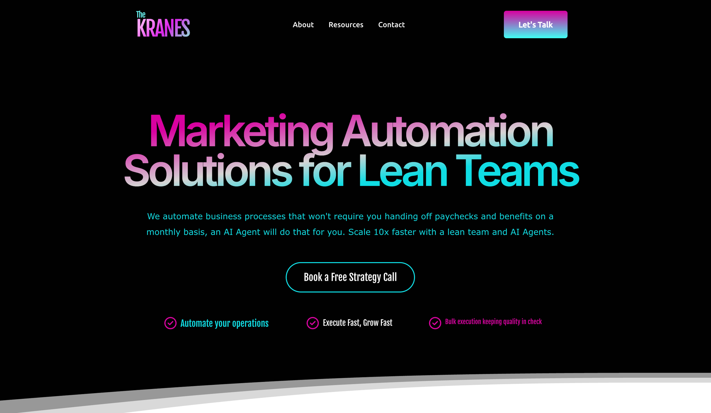
The Kranes is an automation agency that helps businesses scale faster by replacing repetitive manual work with intelligent AI Agents. Built on a sleek, dark-themed interface, the website reflects a modern, high-tech aesthetic that appeals to startups and lean teams. Bold typography and fullscreen visuals immediately communicate The Kranes’ core value: “Automate without hiring.”
The hero section delivers a clear, punchy message: no more monthly paychecks, no HR overhead, just powerful AI Agents handling your processes 24/7.
If you’re exploring different AI tools for automating workflows, here’s a list of Claude AI alternatives to find the one that best fits your business.
Strategic CTAs like “Let’s Work Together” and “Book a Demo” are placed above the fold, making it easy for high-intent visitors to take action. The site is fully responsive, with clean transitions and a collapsible mobile menu that maintains access to key actions across devices.
Minimalist service blocks break down complex automation offerings into digestible benefits, while dynamic scroll effects and micro-interactions add a touch of sophistication. The design reinforces the brand’s promise: grow 10x faster with fewer people and smarter systems.
Designing and developing a website takes a lot of time, effort, and money, but only if you don't use the right tools. It doesn't matter if you want to create a website for your service or for any other purpose; the right tools can simplify the entire process. In fact, you can build any website in just four simple steps with Dorik, the best AI website builder, even if you don't have any coding or design experience.
2. Epic Teams

Epic Teams' website combines trendy typography, cool animations, and electrifying graphics. The user-friendly design features attractive calls-to-action and large fonts. Pages load quickly, and messaging is clear throughout.
This professional team performance service website's modern design elements and fast-loading pages create an engaging user experience. Clear messaging and strategically placed CTAs guide visitors through the site, effectively communicating the company's value proposition and encouraging action.
3. In8love Wellness

In8love Wellness is a wellness service provider website that uses a beautiful image/video background with a transparent header and three CTA texts for booking, services, and online shop. The simple yet impactful home page design showcases the business's holistic approach to self-care.
The minimalist design with high-quality visuals immediately conveys the brand's essence. Clear CTAs and concise information make it easy for visitors to navigate and take desired actions, enhancing the overall user experience.
4. Jessica Manning

Jessica Manning's website features a full-screen image background, transparent header, full-screen slider, and bold testimonial section. The design effectively promotes her services without appearing overly sales-oriented.
The personal trainer's website successfully blends visual appeal with functionality. The full-screen elements create an immersive experience, while strategically placed testimonials build credibility and trust with potential clients.
Read Also: How to create a personal website
5. La Playa

La Playa's service website showcases a grid-style home page with a minimalist design. Portfolio elements react on hover by highlighting one and dimming the rest. But it works a bit differently on mobile devices for a better user experience. On mobile, every portfolio item is always visible, unlike the desktop interface.
The grid layout on this visual design and web development service website and interactive hover effects create an engaging portfolio display.
6. Mindy Nguyen

Mindy Nguyen's art and design service website features a text-only hero section with cool GIFs, triggering instant curiosity. The home page includes descriptions and links to various projects, showcasing her work as an art director and designer.
The unique combination of text and GIFs in the hero section creates a memorable first impression. The project showcase effectively demonstrates the designer's skills and style, encouraging potential clients to explore further.
Related Reads:
7. Pack Up + Go

Pack Up + Go's website features a parallax hero section, a simple header, and text. The homepage of this vacation planning service website gives a one-page feel with drop-down navigation to internal pages. It includes an embedded podcast playlist and a "Hot off the press" section with authority mentions.
Similarly, if you have a YouTube channel, you can convert your videos into blog posts to boost search visibility.
The parallax effect creates visual interest and encourages scrolling. The simple layout with strategically placed content sections guides users through the unique travel concept. The embedded media and press mentions build credibility and trust.
Helpful Articles to Create Your Travel Agency Website:
-
Best website builders for travel agency
8. Prophet

Prophet's is a growth and transformation consultant service provider. Its website greets visitors with a time-lapse video and vibrant neon graphics. The services page is neat and well-organized. The design is sleek and modern, with minimal yet abstract graphics that add interest.
The dynamic video background immediately captures attention. The clean layout and abstract graphics create a professional yet creative atmosphere. The well-organized services page makes it easy for potential clients to understand Prophet's offerings.
If you're a consultant and want to create a website like this, read our step-by-step guide to create a consulting website.
9. Samantha Alice

Samantha Alice's website starts with compelling text on a plain background, accompanied by her photo. The design is bright and colorful, featuring extensive testimonials with client names for social proof. Links to social media and a portfolio of past projects are included.
The personal touch on this virtual assistant website of including a photo builds connection. The colorful design reflects personality while maintaining professionalism. Detailed testimonials and a portfolio showcase expertise and build trust with potential clients.
Find out the best website builders for virtual assistants to choose the one that fits your needs and create your own website.
10. Shanley Cox Creative

Shanley Cox Creative's homepage acts as a one-page site featuring services, testimonials, an about section, a portfolio, a contact form, and an Instagram feed. The responsive design is minimalist with feminine touches, creating a pleasant atmosphere.
The all-in-one homepage design of this writer's website provides easy access to key information. The minimalist aesthetic with personal touches creates a welcoming feel. Integration of social media and testimonials helps potential clients feel connected to Shanley's work.
Want to create your writing website? Make sure to check out the best website builder for writers so that you don't waste any time searching for a builder that meets your specific requirements.
11. Stortford Interiors

Stortford Interiors' is an interior design service provider. Its website features aesthetic color contrast with soothing animations and hover effects. An asymmetric news segment with transition effects makes the look and feel stand out. The layout showcases various elements and smooth animations, effectively capturing the company's essence as a commercial interior contractor.
The website's design elegantly balances aesthetics and functionality. Interactive elements like hover effects and smooth animations enhance user engagement, while the asymmetric layout creates visual interest. This approach effectively communicates the company's expertise in interior contracting.
12. Weddings by Lisa Nicole

Weddings by Lisa Nicole's website immediately conveys the owner's wedding planner services through striking wedding images. The home page features a clean design with only a header, while the navbar guides users to more content. Questions with answers provide information about all her provided services.
The image-centric design instantly communicates the nature of Lisa's services. The clean, minimalist layout focuses visitor attention on key information. However, the low-contrast color scheme between the background and text could be improved to enhance readability and accessibility.
13. Nautilus Plumbing

Nautilus Plumbing has used a vibrant combination of leaf green color with white, a stylish curvy font style, transparent buttons, a header, and a footer with an opacity effect, as well as integrated social media sites.
Adjustment of a unique sticky bar before the nav bar in the first section has added singularity to the design theme and grabbed visitors' attention to book an appointment. This technique of using color variation and placement of elements on specific sections will lead to more actioning customers to the business.
Pro Tip: Consider yourself finding out the methods you want to approach your clients. You can also keep attractive elements like coupons, blogs, and reviews on the navigation bar like this plumbing website did to make user interaction fast and more accessible.
14. Omnia Mechanical Group

Omnia Mechanical Group is a New York City-based collective of service brands. The website introduces its ecosystem under the theme "Prepared for All Things," reflecting its ability to meet a full spectrum of client needs.
The site features a clean layout with straightforward navigation. Each affiliated company is highlighted with its logo and detailed list of services. This allows visitors to understand the breadth of offerings.
The "Principals with Principles" section includes insightful interviews with the Clark brothers that provide a personal touch and deepen the connection with visitors.
Historical context is provided, emphasizing the company's longstanding presence since 1929. Contact information is easily accessible, and the explanation of their name adds a thoughtful dimension to the brand identity.
15. MyClean

We appreciate the strategy the MyClean cleaning service website has used to improve its client's conversion rate from the very beginning of its website. They have added a most unique customized pricing card on the header section to let users pick their service depending on their needs.
Additionally, they preferred putting the stages into how they provide their services.
16. Madrid & Beyond

Instead of writing a title within a few words, this beautiful travel agency website of Madrid & Beyond that works for Portugal and Spain kept it lengthy with a lovely, warming massage. They also included three transparent Call To Action buttons on the first section of their landing page.
They have anchored all the sub-service and landing page sections on the navigation bar to make this business website more organized. Also, the use of red in the website content has added a variant of fiesta to the entire website!
17. Maine Dentistry

Displays a hero image that occupies half of the screen and a functional navigation bar at the top. As the scroll down continues, you will notice that the background of this whole dentist website is a magical symphony with a shade of fern. It also reveals its mission in the industry, then provides testimonials and describes its teams one by one.
Keeping some larger icons in the 'What we Do' section has brought fun and creativity to the design structure.
Pro Tip: To make it easy to use, you can include a link to your service page area on the navbar, as Maine Dentistry has added.
Related Read: How to Create a Medical Website
18. Dntl BAR

This bold, clean dentist´s website design of Dntl Bar requires a painless effort to end your struggles in finding its services.
A high-regulatory video on the landing page that greets visitors demonstrates their friendliness toward the patients. Every section's item orientation differed from the previous ones, as well as the looping of their design structure was intelligent.
19. Jeff Miller, Ph.D.

Buttons with a solid turquoise color, along with a few hovering effects, soothing with the stylish italic font on the title. Jeff Miller, Ph.D., a lenient psychologist and healthcare provider´s website in California, could be an ideal inspiration for your small business.
On its service page, they have aligned the services in a text format, keeping the vibe of simplicity and clarity.
Pro Tip: Try to add some high-quality images on your service website to build trust in the minds of your prospective clients.
Ready to build your own Psychologist website? Check out these most popular website builders for therapists.
20. Ames Counselling and Psychological Services

Ames Counseling and Psychological Services is a counseling service-providing website that stands as a single-page website, holding a lot of information and details on the left sidebar.
A common card has been adjusted at the bottom of every service page, as you'll notice while skimming all the sidebar items.
If you want to design a webpage like this service website with marvelous items on a sidebar, try adding a standard CTA(call to action) to help users take action quickly.
21. ETHAN O´SULLIVAN

Instead of preferring a bright and attractive color scheme, Ethan O'Sullivan has chosen to keep his digital service-providing website on a dark theme.
As you scroll down, Ethan presented the website, revealing all the elements thoroughly to get visitors' trust in targeting his product. In addition, the widget button on the bottom left corner has been added to get funds from users.
The live chat option is one of the most significant features of this website. Ethan preferred talking to them directly without asking them to ping him through emails to get instantly connected with visitors.
Although Ethan O'Sullivan provides service as an individual, you might own your own digital marketing agency. If that's the case, read a detailed review of the best website builders for a digital marketing agency.
22. Andreas Dittes

Just look at the business consultant´s website for Andreas Dittes' above-the-fold theme to acknowledge its theme. It has a cool, inspiring vibe on its font styles, as well as a comprehensive image slider with a transparent CTA.
As Andreas Dittes added a testimonial area on its landing page, it will instantly win your trust within minutes.
You can keep your website simple enough to win visitors. Just make it relevant, feel your users' needs, and pour it upon each pixel of your website.
15. brand.new

This website design for a digital marketing agency combines a translucent navigation bar with white and black colors.
A mixture of font styles throughout this digital marketing agency website has added a new depth. Besides, it has done incredible animation work, keeping the whole body section floated.
Unlike most websites on the internet, brand.new has implemented some invisible titles and subtitles to each section, which can be visible and even moveable with the interaction of the user's mouse pointer.
These great animation tactics will keep users engaged and last for a longer period on the site.
24. MY MATH TUITION
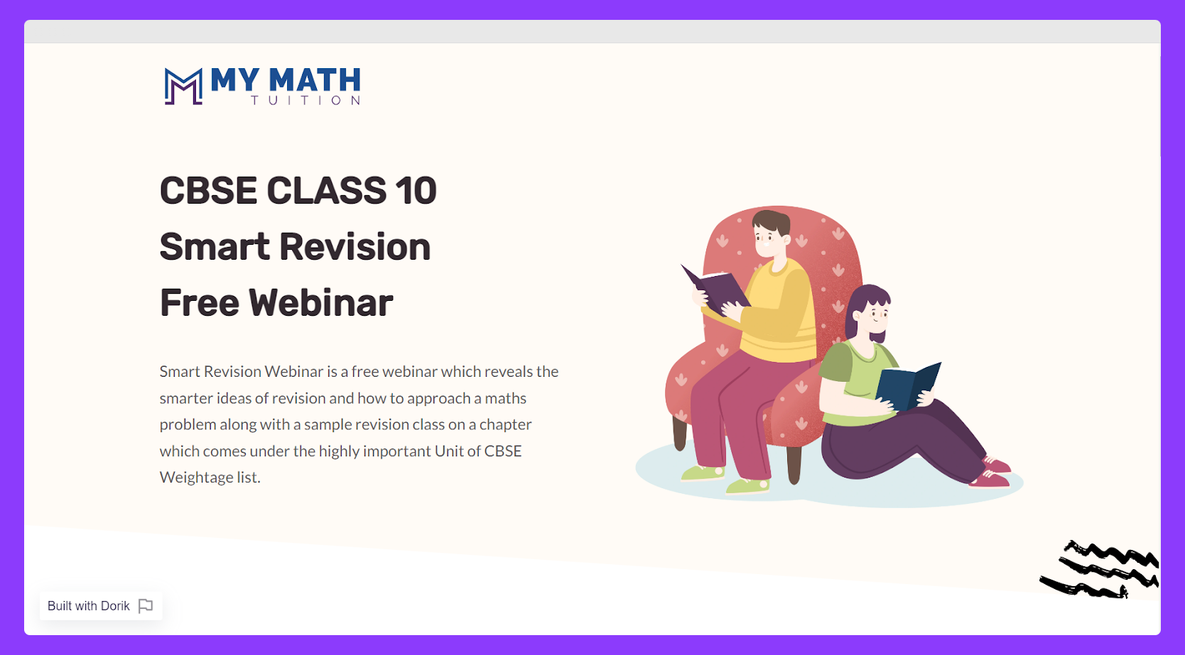
MY MATH TUITION, a webinar teaching website, has a variety of graphics and animations that give it a polished look, making it aesthetically engaging. In addition, you will admire the use of a light color scheme between the texts and the background.
Pro Tip: If you plan to build an educational website, pick a muted color scheme. Consider preferring a blue color palette as it helps one to overcome challenging learning situations. See some of the best teacher website examples to brainstorm your imagination.
25. SNYDER Construction Group

This construction service-providing group´s website is an excellent example of a construction business website.
SNYDER Construction Group's website has two significant sections anchored by its hero section. One is for their desired customers showcasing their work, and the other is a hiring page helping employees to become a part of their team.
With its vast white space, the fantastic color combination of black and yellow ochre spread a symphony of matching between the text and background color. Besides, you can´t take your eyes off its awesome navigation bar, which includes its about, projects, capabilities, and news.
26. Costello Construction

This unique construction service providing website will give you the best tips to lead a customer directly to your sale.
How?
They've shown practically all the information they need to win a client on this website. This website is a great example of a one-page website. It effectively showcases essential details about their employees, projects, customers, and performance metrics. That has allowed their visitors to choose which data they wish to get first. As a result, they've ensured that users are satisfied.
So, keep your visitors satisfied and let them make the decision.
27. e.liza photography
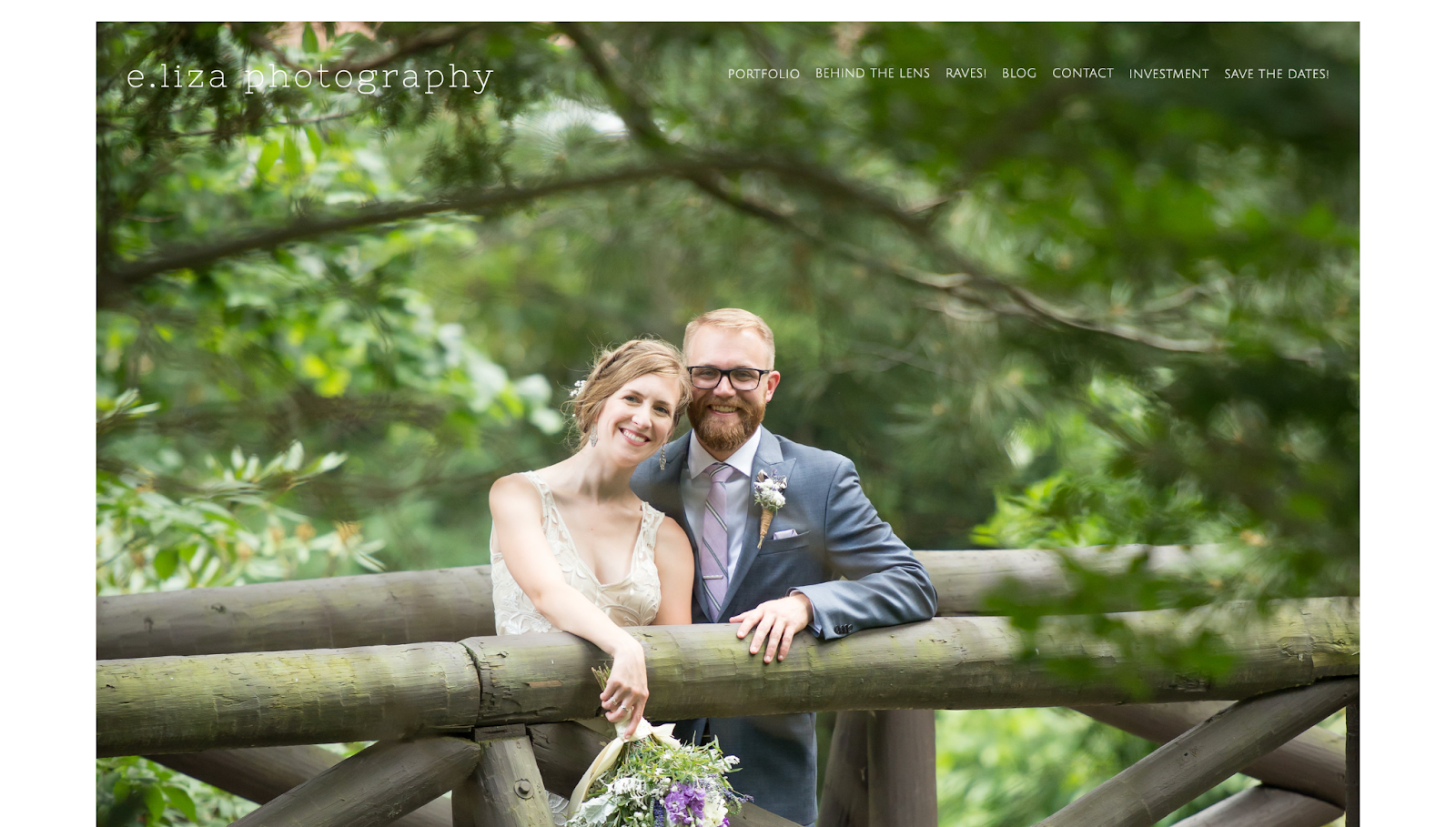
If you are looking for service website examples for a photography website, you are going to love this e.liza photography website the most.
The very first portion of this photography website has been enhanced with the highest resolution, most precise, and cutest image you've ever seen. The most beneficial aspect of this method is that just this One high-resolution image can quickly make visitors looking for a skilled photographer feel positive within the first 15 seconds.
Research says visitors are more likely to spend less than 15 seconds on a website. So, if you can drive their mind within 15 seconds, you can win them to stick to your site, but if you cannot manage driving their mood, you will lose these visitors.
Blogs you'll regret not reading:
Learn more about web design principles and laws to help yourself put the best effort into your service website.
28. HomeLight

Business websites are one of the most popular types of websites. This real estate business website assists its visitor in finding their service in the simplest and most accessible form.
Keeping the theme calm and relaxing with an incredible background image, a single form in the very first section of HomeLight's website increases the action rate of the visitors. They also added maps to let customers find the perfect real estate agent for their area.
Like the design? You can create a website like this by using the best real estate website builder and create your real estate website.
29. Chegg

Chegg is a teaching company that offers learning with affordability and accessibility using technology. It utilizes the best technology to help students learn more without spending less money and time.
This website offers various services, including textbook rentals, study guides, homework help, and tutoring.
Pro Tip: If you want to create the best teacher websites with free resources, try innovative teaching strategies that can help you build a group of dedicated students.
30. Alice Lee

Being flooded with colors, Alice Lee's design portfolio website is a place where the shades of color play their best roles.
This San Francisco-based independent designer incorporated the landing page of her online presence with a collection of illustrations and mural art. The website is amazingly engaging, and when you visit this best portfolio example, you will feel a deep urge to scroll down more and more.
Pro Tip: Do not be afraid of using bright color hues, especially if you are creating design services as an artist.
How to Create High-Converting Service Pages
Creating a service page that turns visitors into customers involves strategic planning and attention to detail.
Here's how to build a high-converting service page that resonates with your audience and drives action.
Understand Your Target Audience
To craft a service page that speaks directly to potential customers, you need to know who they are and what they need.
To identify and understand your target audience:
-
Research Your Market: Analyze your current customers and competitors to identify common demographics and preferences.
-
Identify Pain Points: Understand the problems your audience faces that your service can solve.
-
Create Buyer Personas: Develop detailed profiles representing your ideal customers, including their goals and challenges.
Decide Between Individual and Overview Service Pages
Once you’ve identified your target audience, you need to decide whether you’ll create separate pages for each service or combine them on one page.
Separate service pages work well for businesses with many distinct services, while a single service overview page is better for businesses with few closely related services.
Both approaches have advantages, and often the best strategy is to use both. Ultimately, the choice depends on your business needs.
Benefits of Individual Service Pages:
-
Focus: Allows for detailed information on each service.
-
SEO Benefits: Optimizes each page for specific keywords.
-
Targeted Messaging: Tailors content to different audience segments.
Benefits of a Single Service Overview Page:
-
Convenience: Provides a quick summary of all services.
-
Easy Navigation: Serves as a hub linking to individual pages.
-
First Impression: Helps new visitors grasp your offerings at a glance.
By combining both, you cater to visitors seeking general information and those looking for specifics.
Structure Your Service Page Effectively
An organized layout guides visitors through your page and highlights key information. This enhances user experience and increases the likelihood of conversion.
Here’s how you can structure your service page for maximum impact:
-
Clear Navigation: Ensure your website's menu is intuitive.
-
Engaging Hero Section: Use a compelling headline and subheading that convey your unique value proposition.
-
Compelling Opening Statement: Focus on the customer's needs and how you address them.
-
Detailed Service Descriptions: Break down your services with clear explanations and benefits.
-
Visual Elements: Include high-quality images or videos that support your content.
-
Social Proof: Add testimonials, case studies, or client logos to build trust.
-
Strong Call-to-Action (CTA): Guide visitors toward the desired action with clear CTAs.
-
FAQ Section: Anticipate common questions and provide concise answers.
-
Contact Information: Make it easy for visitors to reach out with visible contact details.
Craft Engaging Headlines and Subheadings
Engaging headlines and subheadings keep the visitors engaged and improve the overall effectiveness of your page. They also improve your service page’s SEO.
While writing the headings and the subheadings of your service page, clearly state what the following section is about. Make sure to include relevant terms (keywords) your audience might be searching for. Finally, try to use language that piques interest to hook the readers.
Make Your Service Page is Engaging
Your service pages should encourage the readers to stay on the page longer and take the desired actions. But how do you ensure that? By making your service page engaging.
To make your service page more engaging:
-
Use a conversational tone in your writing
-
Break up text with subheadings and bullet points
-
Include interactive elements like sliders or toggles
-
Add a live chat option for immediate assistance
-
Use whitespace effectively to improve readability
-
Incorporate customer stories or testimonials
-
Include a FAQ section to address common questions
Craft a Compelling Opening Statement
Your opening statement should immediately resonate with your visitors. It helps you connect with the reader and set the tone for the rest of the page.
Here’s how you can write an opening statement that grabs attention:
-
Address Pain Points: Acknowledge the challenges your audience faces.
-
Highlight Benefits: Emphasize how your service provides solutions.
-
Use Clear Language: Avoid jargon and speak in terms your audience understands.
For example:
"Struggling to manage your social media presence? Our expert team helps you engage your audience and grow your brand without the stress."
If you're not skilled at copywriting or are busy with other important tasks, get help from the best AI text generator for writing website copy to speed up the process.
Highlight the Benefits of Your Services
While writing the descriptions for your services, focus on how your services improve the customer's life or business. This will help potential clients understand how you can help them.
To write effective service descriptions:
-
Focus on benefits, not just features.
-
Use clear, jargon-free language.
-
Keep descriptions concise but informative.
-
Use bullet points to highlight key aspects.
-
Include relevant keywords naturally.
-
End with a clear next step or mini-CTA.
-
Address your target audience's pain points. Show how each benefit addresses a specific need.
Now the question comes, “How do you connect with your audience's pain points on your service page?”
Here’s how to do this effectively:
-
Use Their Language: Mirror the words and phrases your audience uses.
-
Highlight Solutions: Clearly explain how you resolve their specific challenges.
-
Provide Evidence: Use testimonials or case studies showing successful outcomes.
By clearly stating the advantages and addressing the pain points, you make it easier for visitors to see the value you offer and solve their problems.
Include Engaging Visuals
Visuals help break up text and make your service page more engaging and memorable. They also capture attention and help understand complex messages more easily. These elements keep visitors interested and encourage them to explore your services further.
So, What's the best way to showcase your services visually?
Here are some key points to follow:
-
Use high-quality, relevant images
-
Create infographics to explain complex services
-
Include before-and-after photos if applicable
-
Add short video explanations or demos
-
Use icons to represent different service features
-
Ensure all visuals are optimized for fast-loading
Establish Trust with Testimonials and Social Proof
Social proof builds credibility and helps potential clients trust your services. And as you know, trust is crucial for conversion for any kind of service.
To use social proof effectively:
-
Include client testimonials with full names and photos
-
Showcase logos of well-known clients or partners
-
Display industry awards or certifications
-
Include case studies with measurable results
-
Show real-time stats (e.g., number of clients served)
-
Add trust badges from recognized organizations
-
Link to external review sites with positive feedback
Create Clear Calls-to-Action
Your CTA should make it easy and appealing for visitors to take the next step with your business. Clear CTAs reduce friction and encourage visitors to take action.
So, what makes a good call-to-action (CTA) for a service page?
A good CTA for a service page should:
-
Use action-oriented language (e.g., "Get Started," "Book Now")
-
Stand out visually from the rest of the page
-
Clearly state what will happen next (e.g., "Request a Free Quote")
-
Be placed strategically throughout the page
-
Create a sense of urgency when appropriate
-
Be mobile-friendly and easy to tap on smaller screens
-
Lead to a user-friendly form or next step
The primary goal of designing a CTA is to grab the attention of the potential customer and encourage them to take a specific action.
Make Your Contact Information Easily Accessible
You don’t want your potential clients to look here and there to contact you. It ruins the user experience and dramatically reduces the chances of conversion.
So, make sure your contact information is clearly visible and easily accessible. Try to include multiple contact methods like phone numbers, email addresses, contact forms, etc., if possible. Display the contact information prominently on your service page. You can place them in the header, footer, or a dedicated contact section.
If you ask me, I’d suggest you utilize all these places strategically. For example, you can place a contact button on the header, which will lead the user to your contact page, where there will be your contact information including the form. You can do the same in the footer as well, with a link to your contact page.
Finally, add a contact form on your contact page as well as on your service page (if applicable).
Focus on the following to make your contact form effective:
-
Simplicity: Only ask for essential information to reduce barriers.
-
Clarity: Label fields clearly and provide guidance if needed.
-
Privacy Assurance: Include a brief statement about data protection to build trust.
Add a Pricing Segment (if Applicable)
The pricing structure varies with the business model. However, if your service business already has an established pricing model, consider adding it to your service page.
The following are some of the best practices to handle pricing on a service page:
-
List exact prices if your services have set rates
-
Provide price ranges for variable services
-
Use a "starting at" price point for complex services
-
Include a pricing calculator for customizable services
-
Offer tiered pricing options for different service levels
-
If prices vary greatly, invite visitors to contact you for a quote
-
Be as transparent as possible about pricing to build trust with potential clients
Include an FAQ Section
FAQs can boost SEO, build trust, and help convert hesitant visitors. They help visitors feel informed and confident in moving forward.
Here’s how you should use FAQs to improve your service page:
-
Address common customer concerns and questions and provide clear answers to them
-
Phrase your questions as your audience might search for them
-
Use actual questions your clients frequently ask
-
Keep answers brief and to the point
-
Organize FAQs by topic for easy navigation
-
Use schema markup for potential rich snippets in search results
-
Update FAQs regularly based on new customer inquiries
-
Include a CTA within or after the FAQ section
Optimize Your Service Pages for Search Engines (SEO)
Optimizing your page improves visibility in search results. Balancing SEO with quality content ensures your page is both discoverable and valuable to readers.
Follow the guidelines below to optimize your service pages for SEO:
-
Conduct Keyword Research: Find relevant keywords your audience is searching for.
-
Use Keywords Naturally: Integrate them into headings, content, and meta descriptions without overstuffing.
-
Optimize URLs: Keep them short and descriptive. For example, use “your website.com/services/content-writing” instead of “your website.com/services/page1”.
-
Include Internal Links: Link to other related service pages or blog posts on your site.
-
Add Alt Text to Images: Describe images for accessibility and SEO benefits.
-
Create Quality Content: Provide clear, concise, and keyword-optimized descriptions of your services.
-
Optimize Meta Descriptions: Write compelling meta descriptions that include relevant keywords.
Although it might feel like a lot to do, modern website builders that come with built-in SEO tools make the task a lot easier than it seems.
Optimize for Mobile Devices
You must consider a "mobile-first" design approach for your page, as many users browse on mobiles. So, how can you make your service page mobile-friendly?
To create a mobile-friendly service page:
-
Use a responsive design that adapts to different screen sizes
-
Make buttons and links large enough to tap easily
-
Use legible fonts and appropriate font sizes
-
Avoid large blocks of text - use short paragraphs and bullet points
-
Ensure images and videos scale properly on smaller screens
-
Test your page on various devices and browsers
This isn't only applicable to service websites; it applies to almost all types of websites. A recent study shows that almost 57% of the total daily time spent online by internet users was via mobile devices.
But what if you're an expert at something other than coding? Here's the good news. Every website built with Dorik is automatically 100% responsive and optimized for all screen sizes, including mobiles.
Make Sure Your Service Pages Load Quickly
A fast-loading page improves user experience and can help with search engine rankings. Hence, you need to make sure your service pages load quickly enough to provide the best possible user experience and reduce the bounce rate.
To improve your service page's loading speed:
-
Optimize and compress all images
-
Minimize HTTP requests
-
Enable browser caching
-
Use a content delivery network (CDN)
-
Minify CSS, JavaScript, and HTML
-
Choose a reliable, fast hosting provider
-
Limit the use of large files and complex scripts
Again, these strange technical terms, like HTTP, CSS, JS, HTML, etc., might feel like the barriers to creating your own service website. But don't worry! You can bypass all these and build your service website using Dorik AI, the best website builder available in the market.
It lets you create beautiful, responsive websites in minutes without any coding. With AI-generated content, customizable templates, and easy integrations, Dorik makes designing and launching your service website simple and fast.
Plus, Dorik provides reliable hosting, built-in SEO tools, and excellent customer support to ensure your website performs well and attracts more customers.
Regularly Analyze and Update Your Page
Analyzing data helps you make informed decisions to enhance conversion rates. Use it to update your service pages, as regular updates keep your page relevant and effective.
Now you may ask, “How often should I update my service page?”
Update your service page:
-
When you add or change services
-
If you adjust pricing or packages
-
When you have new case studies or testimonials
-
If industry trends or customer needs shift
-
When you notice a drop in conversions
-
At least every 6-12 months for a content refresh
-
After gathering new customer feedback or FAQs
Building a high-converting service page involves understanding your audience, presenting information clearly, and guiding visitors toward action. By implementing these strategies, you create a page that not only attracts visitors but also converts them into satisfied customers.
How to Create a Service Website with Dorik: 6-Step Guide
You can easily create a service website with Dorik following the below methods.
1. Choose a service template or start with AI
Select a template designed for your service type (cleaning, consulting, agency, etc.)Or use AI to generate a custom service website
2. Add your services and pricing
List all services you offer with clear descriptions. Include pricing tables or packages. Highlight your most popular services
3. Upload photos and examples
Add photos of your team, office, or work in action. Include before/after images or portfolio samples. Show real results from past projects
4. Write your story and credentials
Explain your expertise and experience. Add team member profiles. Include certifications, awards, or testimonials
5. Set up booking and contact options
Add contact forms for inquiries. Include scheduling/booking systems if needed. Display phone, email, and service area information
6. Connect your domain and publish
Link a custom domain (yourcompany.com). Review on mobile and desktop. Publish and start accepting clients
Must Read: How to Create a Service Website
What is a service website?
A service website is an online platform that showcases and promotes the services a business or individual offers. It serves as a digital storefront and informs visitors about your services, their benefits, and how to access them. The main goal of a service website is to inform potential clients, highlight service advantages, and encourage visitors to take action, such as requesting a quote or booking a service.
Do I need a website for my service business?
Yes, you need a website for your service business. Consumers usually believe a website makes a business look more credible than just having social media. Not only that, a lot of customers don’t even use a business without a website. A website builds trust and shows your services are trustworthy.
What should be on different types of service websites?
Different service websites should include:
-
Customer Service: FAQ section, live chat, contact information
-
Drop Service: Product catalog, shipping info, return policy
-
Professional Service: Expertise showcase, client testimonials, portfolio
-
Cleaning Service: Service packages, booking system, before/after photos
-
Communication Service: Features list, pricing plans, network coverage
-
Home Service: Service areas, online scheduling, emergency contact
Each type should also have a clear description of services, contact details, and customer reviews to build trust and encourage conversions.
How do website aesthetics affect customer attraction?
Website aesthetics make a strong first impression. A clean, attractive design with high-quality images makes your business look professional and trustworthy. Good aesthetics keep visitors engaged and encourage them to explore your services. As a result, it increases the chances of converting visitors into customers.
How can I make my service business website user-friendly?
To make your service business website user-friendly, focus on simplicity and ease of use.
-
Create a clean layout with straightforward navigation menus.
-
Minimize clicks required to access information.
-
Make sure your site is mobile-responsive for optimal viewing on all devices.
-
Use readable fonts and eye-friendly color schemes.
-
Organize content logically, with clear headings and concise paragraphs.
-
Include a search function for easy information retrieval.
-
Regularly test and update your site based on user feedback.
What makes a service page stand out from competitors?
To make your service page stand out:
-
Clearly communicate your unique value proposition
-
Use distinctive, brand-reflective design
-
Showcase specific results or case studies
-
Offer extras like free consultations or resources
-
Use high-quality, original visuals
-
Personalize content for different audience segments
-
Provide more comprehensive, user-friendly information
-
Highlight your expertise and industry recognition
-
Use interactive elements to engage visitors
-
Ensure fast loading times and mobile responsiveness
Utilize These Service Website Examples To Create Your One
A website is a must-have element for service-providing businesses. Service websites can help business gain and keep customers, resulting in more revenue and growth.
The examples included in the article, such as barbershops, fashion designers, business consultants, and plumbers, will assist you in getting inspired on the way to building a website for your service business.
For more inspiration, check out our guide to profitable website ideas that can generate steady income.
Pick a best-designed template, or choose one from best no-code web-builders like-Dorik.
I hope you loved reading this article. If you have any questions, feel free to comment, and let's connect through it!
Have a blast with your service website!
Read More Dorik Blogs
-
Learn how you can start a productized web design business, offering your clients a complete solution to their digital marketing without the hassle of outsourcing the work.
-
How to launch a service business and make it profitable.
-
Learn how to build a portfolio website. This step-by-step guide will walk you through the process from choosing a platform to designing and publishing your content.
-
Get effective ideas and tips to follow from planning design to publishing your one-page website.
-
Learn how to get your website noticed on Google search with our comprehensive guide on SEO. Increase your website traffic and attract more customers now.
-
Are you looking for the best way to start your own web development agency? Follow this step-by-step guide and get your business off the ground quickly and easily.
-
Read this Go-to-Market strategy guide that will teach you how to drive growth. Learn how to create and scale products, reach new customers, and build a profitable income stream.
-
Are you looking for the best practices for landing pages to boost your site’s conversion rate? You’ll find all the tips and tricks in this ultimate guide.
-
Learn how to start a blog step-by-step and earn money from this comprehensive guide.
-
Discover the best and most beautiful personal website examples to inspire your own online presence.
-
Learn more about the best AI website builders.
