

According to Wordstream, the average conversion rate (visitors to leads) from landing pages is less than 5% across all industries.
A landing page refers to a single web page we create specifically for marketing or advertising, or some other goal. It is designed to direct the visitor to take a specific action, such as filling out a form or making a purchase.
Every landing page has the same goal, converting visitors into leads or customers.
The more conversion you can get from your landing pages, the more lead you will collect from the visitors who will become your potential clients.
Even though it is tough to break the average conversion rate barrier and aim for 10% or more, it is possible.
There are some best practices for landing page that you can follow to generate a higher conversion rate than average.
Did that pique your interest? Then, keep reading, and your landing page conversion rate will peak too.
Best Practices for Landing Page
Here are 19 landing page best practices that will give you a clear idea about how your landing page structure should be.
1. Use an Informative Headline
Writing informative headlines is the first thing you need to do when it comes to landing page best practices.
Your headline will create the first impression when a visitor arrives on your landing pages. Therefore, it should be attention-grabbing and communicate the value proposition of your product or service.
The importance of using a compelling headline for better landing page performance cannot be overstated.
A well-written headline is crucial for capturing the attention of your target audience.
The more attentive your target audience is to your landing pages, the easier it becomes to encourage them to continue reading and engaging with your site.
The headlines are crucial for a landing page, where you only have a few seconds to grab the reader’s attention and convince them to take action.
See the headline of Dorik’s landing page, for example.

A well-written, informative, and compelling headline can help to increase the overall performance of your landing page by
-
Improving the overall user experience by making it clear what it is you are offering and what benefits the visitor will get or how it will solve their problem.
-
Increasing the chances of being found by search engines.
-
Increasing the chances of your page being shared on social media. A headline that mentions the target audience’s pain points and offers to solve them will be shared by the people with their friends and followers.
-
Improving the chances of your page being clicked on in search results.
A compelling headline is essential for ensuring that your landing page is effective and performs well.
It can help increase your page’s traffic, improve engagement, and ultimately lead to better conversion rates.
2. Show What You Promised
A key advantage of using landing pages is that they allow you to provide visitors with a page that aligns with their expectations.
To ensure that visitors feel that they have made a "good click," it's essential to make sure that the content and design of your landing page match the ads you're running on search engines or social media.
The matching of content helps signal the visitors that they have landed on the right page, increasing their chances of converting into your client.
For example, if you show an ad for vegetarian lifestyles and when someone clicks on it, they see a landing page with pictures of chicken and fish, what do you reckon they will do?
They will leave immediately, right? Because they didn’t expect to see those pictures when they clicked on the ad.
There are better examples, but you get the gist. Always show people what you promised; in return, you might get a conversion.
3. Use Enticing Visual Contents
Using visual content, such as images and videos, on your landing page can grab visitors' attention and entice them to stay on the page.
Visual content can break up text and make your page more visually appealing, improving the user experience.
Also, well-chosen visuals can help to reinforce your message and make it more memorable for visitors.
For example, if you're promoting a product or service, using high-quality product photos or demonstration videos can help to showcase the features and benefits of what you're offering.
Showing real photos can help build trust and credibility with potential customers and increase the likelihood that they will take the desired action, such as signing up or making a purchase.
Visual content can also be a powerful tool for conveying emotions and creating a personal connection with visitors.
Using human photos or videos can help to create a sense of connection and empathy, which can be especially effective for building relationships with potential customers.
You can use free sites like Unsplash, Pexels, and Pixabay to collect royalty-free stock photos and illustrations for your page.
But the best practice is to take help from a designer to design custom illustrations and use real pictures if possible.
Check 600+ royalty-free illustrations for Designers from Dorik
Overall, visual content on your landing page is a valuable way to engage visitors and encourage them to take action.
👉 Check out the Top Reasons Why Your Homepage Video Fails
4. Your Copy Must Be Persuasive
The copy, or written content, on your landing page, plays a crucial role in persuading visitors to take the desired action.
A persuasive copy can help convince visitors that your product or service offers the best solution for their needs and can motivate them to take the next step, whether making a purchase, signing up for a trial, or filling out a form.
One key aspect of persuasive copy is compelling headlines and subheadlines. These should clearly communicate the value proposition of your offering and grab visitors' attention immediately.

In addition, the copy should also include specific and relevant details about your product or service and should address any potential objections or concerns that visitors may have.
Using persuasive language and techniques in your copy can go a long way and you can use that to your advantage.
5. Add Effective Product Messaging
Effective product messaging is a critical component of the copy on a landing page, as it helps to convey the value and benefits of a product or service to potential customers.
Here are a few key reasons why product messaging is so important in the copy of a landing page:
-
It helps to differentiate your product or service: Product messaging can highlight your product's unique features and benefits, setting it apart from competitors and assisting potential customers in understanding why they should choose your offering over others.
-
It speaks to the needs and wants of your target audience: By identifying their pain points and desires, you can craft messaging that speaks directly about their needs and resonates with them.
-
It supports your overall marketing strategy: Product messaging should align with your overall marketing strategy and support your business goals. It should position your product or service as the solution to a specific problem or need and encourage visitors to perform an action.
-
It helps to build faith: Clear, concise, and compelling product messaging can help build credibility with potential customers. It demonstrates that you understand their needs and offer a solution that can genuinely benefit them.
By crafting persuasive copy with perfect product messaging, you can increase the likelihood that visitors will take the desired action and can achieve your desired outcome for the page.
6. Target the Above the Fold Area
Here, the term “Above the Fold” means the things a visitor will see on their screen before scrolling when they visit your landing page.
This concept came from the upper half of the front page of a folded newspaper.
The top section of your landing page presents an opportunity to make an excellent first impression. Therefore, keep only the most important elements in that section.
Elements like a headline, your Unique Sales Proposition (USP), a Call to Action (CTA), and even some user pain points can be beneficial.
Refrain from cramming this section with unnecessary elements or too many elements. Instead, please keep it clean to make it easy for visitors to see your CTA because that's your ultimate goal.
Besides that, everything a visitor needs or expects to see should be clearly visible in this section. This area can make or break your conversion rate, so be extra careful.
7. The CTAs Must Stand Out
This one element in your landing page encourages and calls for conversion from visitors all the time. The sole purpose of the CTA is to convert visitors into potential customers.
It is arguably the most important part of your landing page, and if you want your conversion rate to break the average barrier, you need a clear, concise, strong, and convincing call-to-action button.
You must keep the copy in a CTA button to a minimum; generally, keeping it within five words is the best practice for landing pages.
You have to make it alluring enough for visitors to act.
You can keep multiple CTA's on the same page but make sure it's not too much.
Look at Dorik’s CTA button, for example. It falls right under the landing page best practices category.

The size should be big enough to stand out, and you should use a contrasting color compared to other elements on the page to make it pop.
You can use action verbs like get it now, download, and submit to instruct visitors what to do when they see your CTA.
Do all of that perfectly, and your conversion rate will go through the roof.
8. Make It Easy for the Users to Navigate Through the Page
Everything you keep on your landing page should provide value for the visitors to keep them hooked until they take the necessary action and convert.
Once they start scrolling and go below the fold, you should direct them about where their focus should be.
You can use directional cues like arrows or other forms of illustrations to guide them around your landing page. It is an excellent and proven practice.
If you do that, the visitors will feel like they are on a journey with you. You (I mean “the cues”) will be their tour guide, which might create an emotional attachment because they will feel cared for.
You should avoid using links except for the CTAs that can break visitors' concentration and divert them away.
Keep showing them the benefits and features of your product or service. Tell them how it will improve their lives by solving their problems to influence them to take your service.
9. Give Some Offers to Convert Your Audience
Showing some relevant offers is a great idea to boost the conversion rate. An offer influences people to buy or try something on a scale greater than anything else.
You can send exclusive offers to your current customers who are enjoying a free trial to motivate them to purchase a premium plan. Here’s an offer from Dorik’s Pricing Page.

You can also show relevant offers on your landing page to motivate your audience to make a purchase or fill out a form.
Do you want their information to make them your lead? Just offer them something relevant to their desire, and they’ll be happy to give out their information.
Relevancy is key when giving out offers; always keep that in mind. For example, you shouldn't offer cat food to a dog lover. That's all I'm saying.
10. Keep Your Query Form Short
When you are collecting leads or trying to make the visitor fill out a purchase form, only ask for information that is compulsory for you to provide the best service.
Do not ask for even one additional piece of information if you don’t have to because your audience might not have enough patience.
Make the queries part short and quick to make it easier for your audience to go to the next level. Your goal should be to take them to as many levels as possible within the shortest time.
For example, if you want someone to subscribe to your newsletter, ask only for their email because that’s all you need, don’t ask for their contact information or where they live. That will surely lessen their interest in performing that action.
11. Remove Anything That Can Be Distracting
I can’t tell you enough how important it is to make your landing page simple and right on point to avoid distractions for visitors. It's a core principle of web design too.
Does that mean you should not use visual content or illustrations on your landing page? Absolutely not.
Use them by all means.
Just ensure they add value to your proposition and landing page design and not taking the audience's concentration away from the primary goal.
Remember, what applies to a website might not apply to a landing page.
12. Use Contrasting Colors and Legible Fonts
Contrasting colors and legible fonts are essential for a landing page because they can help to improve the overall user experience.
Contrasting colors can make it visually appealing to users and make the page more accessible. At the same time, legible fonts help to ensure that the page's content is easy to read and understand.
Using contrasting colors helps draw the user's attention to important elements on the page, such as call-to-action buttons or key pieces of information.
Contrasting colors and legible fonts make it easier for users to find what they want on the page and take the desired action.
For example, a bold and eye-catching color for the call-to-action button can make it stand out and encourage users to click.
An easily readable font can improve the user's overall experience and make it more likely that they will engage with the content on the page.
For example, using a 'sans-serif font' for long body text can make it more readable, especially on smaller screens.
13. Your Landing Page Must Be Mobile-Friendly
According to Statista, Almost 60% of global website traffic comes from mobile devices. Keeping that in mind, it is a reasonable guess that a large number of your target audiences will also visit your site using mobile devices.
You can’t ignore a fact like that. Your landing page must work perfectly for any screen type and size to get the best outcome.
If your landing page isn't responsive for certain devices, you will lose that device's users forever.
Every landing page template of Dorik is fully responsive for all devices. You can select a template, customize it as much as you want, and publish it. Your landing page will be automatically responsive.
14. Page Speed Matters
Page speed is a significant factor for a landing page because it can impact the user's experience and the overall success of the page.
It is a crucial landing page best practices to ensure faster loading speed for every page.
A slow-loading landing page can lead to a high bounce rate, which means that users quickly leave the page without taking any desired action.
Slow loading can have a negative impact on the page's conversion rate and overall effectiveness.
There are several reasons why page speed is important for a landing page.
-
A fast-loading page can improve the user's experience: Users have short attention spans and are generally more likely to engage with a page that loads quickly. On the other hand, a slow-loading page can be frustrating for users and make them less likely to stay on the page.
-
Page speed can impact search engine rankings: Search engines like Google take page speed into account when ranking pages, so a fast-loading page can help to improve the page's search engine visibility and drive more organic traffic to the site.
-
Page speed can impact the page's conversion rate: A slow-loading page can make it less likely that users will take the desired action on the page, such as filling out a form or making a purchase. A fast-loading page, on the other hand, can improve the page's conversion rate and make it more effective.
15. Do A/B Testing and Keep Your Landing Page Updated
A/B testing is another one of the vital landing page best practices for optimization because it allows you to test different versions of your landing page to see which one performs better.
A/B testing can help you improve your landing page's effectiveness and increase its conversion rate.
A/B testing involves creating two or more versions of your landing page, each containing a different version of the element you want to test.
For example, you might create one version of the page with a red call-to-action button and another version with a green call-to-action button.
You would then send traffic to both versions of the page and see which performs better in terms of the desired outcome, such as clicks on the call-to-action button or form submissions.
There are several benefits to using A/B testing for landing page optimization.
-
It allows you to make data-driven decisions about which elements of your landing page are working and which are not. You can then update your landing page according to the data to ensure a better user experience for your audience and a better conversion rate for your business.
-
A/B testing can help you identify potential problems with your landing page that you may still need to be aware of. For example, you might discover that a particular color or design element hinders the page's performance and that changing that element can improve the page's effectiveness.
-
A/B testing can help you to optimize your landing page over time continually. By regularly testing new elements and making changes based on the results, you can constantly improve the page and ensure it is always performing at its best.
16. Show Some Authentic Testimonials
Authentic testimonials on a landing page can effectively build trust and credibility with potential customers.
Testimonials are the ultimate social proof that can help to convince visitors that your product or service is worth their time and money.
There are several reasons why using authentic testimonials are important for a landing page design.
-
Testimonials can help to build a trusted relationship with potential customers: By featuring real people who have used your product or service and had a positive experience, you can provide visitors with evidence that your offering is legit and trustworthy. This can increase their confidence in your brand and make them a customer.
-
Testimonials can help to differentiate your brand from competitors: By featuring real customers who have had positive experiences with your product or service, you can highlight the unique benefits of your offering and show why it is different from competitors. Testimonials can make your brand stand out and make it more appealing to potential customers.
-
Testimonials can help humanize your brand and make it more relatable to potential customers: With testimonials, you can show that your brand is not just a faceless corporation but a group of people who are working passionately to provide the best service. Testimonials can create a more personal connection with potential customers and make them more likely to engage with your brand.
Here is some real user testimonial from Dorik’s Wall of Love.

17. Make Your Page SEO-Friendly
Making a landing page SEO-friendly is crucial because it can help improve the page's visibility in search results and automatically bring more organic traffic to the site.
Optimizing the page for search engines can improve its ranking and make it more likely that potential customers will find and engage with the page.
Optimized pages can increase the page's conversion rate and overall effectiveness.
To make a landing page SEO-friendly, you can do some basic things like
-
Research and use relevant keywords: Research the keywords your potential customers use to find products or services like yours, and include those keywords in your landing page. If you run a paid ad with a target keyword, that keyword must be on your landing page.
-
Use unique and descriptive page titles and meta descriptions: Page titles and meta descriptions with relevant keywords can help improve the page's visibility in search results and entice users to click on the page.
-
Use clean and descriptive URLs: Include relevant keywords in the URL where appropriate to make it easier for users to understand the page's content.
-
Optimize images and other media: Optimized images reduce the page loading speed and ensure a better user experience. Use the proper title for the photo and also include relevant alt text.
Websites built with Dorik perform best for SEO without troubling you with any task. You can also gather some knowledge about best SEO practices for better results.
18. Consider Using a Template
Not mentioning templates when discussing landing page best practices will be a crime.
Designing landing pages by following all those tips and tricks can be time-consuming. Moreover, if you don’t have any design or development knowledge, then it might feel scary.
The good news is you can have top-performing landing pages with minimal effort. The secret to that is using a pre-built landing page template, which is more like an open secret nowadays.
For example, every landing page template of Dorik is developed by keeping all of the above-mentioned best practices in mind, so you can focus on the marketing part and enjoy the benefit.

You can also buy landing page templates built by professionals from platforms like Themeforest.
I think Dorik will be the best option for you because when you opt-in for any of the premium plans of Dorik, you will get unrestricted access to all their landing page templates.
Plus, you can customize each element of the template to nail your landing page design.
19. Consider Keeping a Thank You Page
It is one of the most ignored but crucial best practices for landing pages because it confirms to the user that their action was successful.
A thank you page is typically displayed after the user has taken a desired action on the landing page, such as filling out a form or making a purchase, assuring them that their action was successful.
Here are some more points in favor of having a separate thank you page.
-
You can deliver the offer you initially promised, like the purchase confirmation receipt or an instant download option.
-
Show the users some relevant offers that might interest them.
-
It allows you to show gratitude and thank them for taking your service or doing business with you.
It’s good practice to end a lead’s journey of becoming a buyer with a positive vibe, and what better positivity there is than thanking people for their doings?
Some Examples of High-Performing Landing Pages
The landing page examples I will share here will give you some ideas and inspiration, and I am not suggesting you follow them blindly.
You can check them out and find what is working best for them and why it is working. If you can identify that, you can quickly implement those techniques for your landing pages.
1. Dorik
Dorik's landing page starts with the value proposition, followed by some features and benefits for the users, and finishes with a hard-to-miss CTA.

It also includes a sticky card that says “Built with Dorik,” which sends a message to the visitors that they can build beautiful sites like this with Dorik, too. It also shows their confidence in their product.
They also attached an achievement badge to show their success in the industry.
Here the navbar only has those options that can motivate the visitors to try out their website builder, like templates, testimonials, pricing, etc.
Also Read: Best AI Landing Page Generators
2. Airbnb
Who doesn’t know about this giant company? Airbnb has a yearly revenue of over 6 billion U.S. dollars, so you might think their landing page must be really fancy.
But their landing page is as simple as it can get, and that simple yet effective landing page brings them many clients.
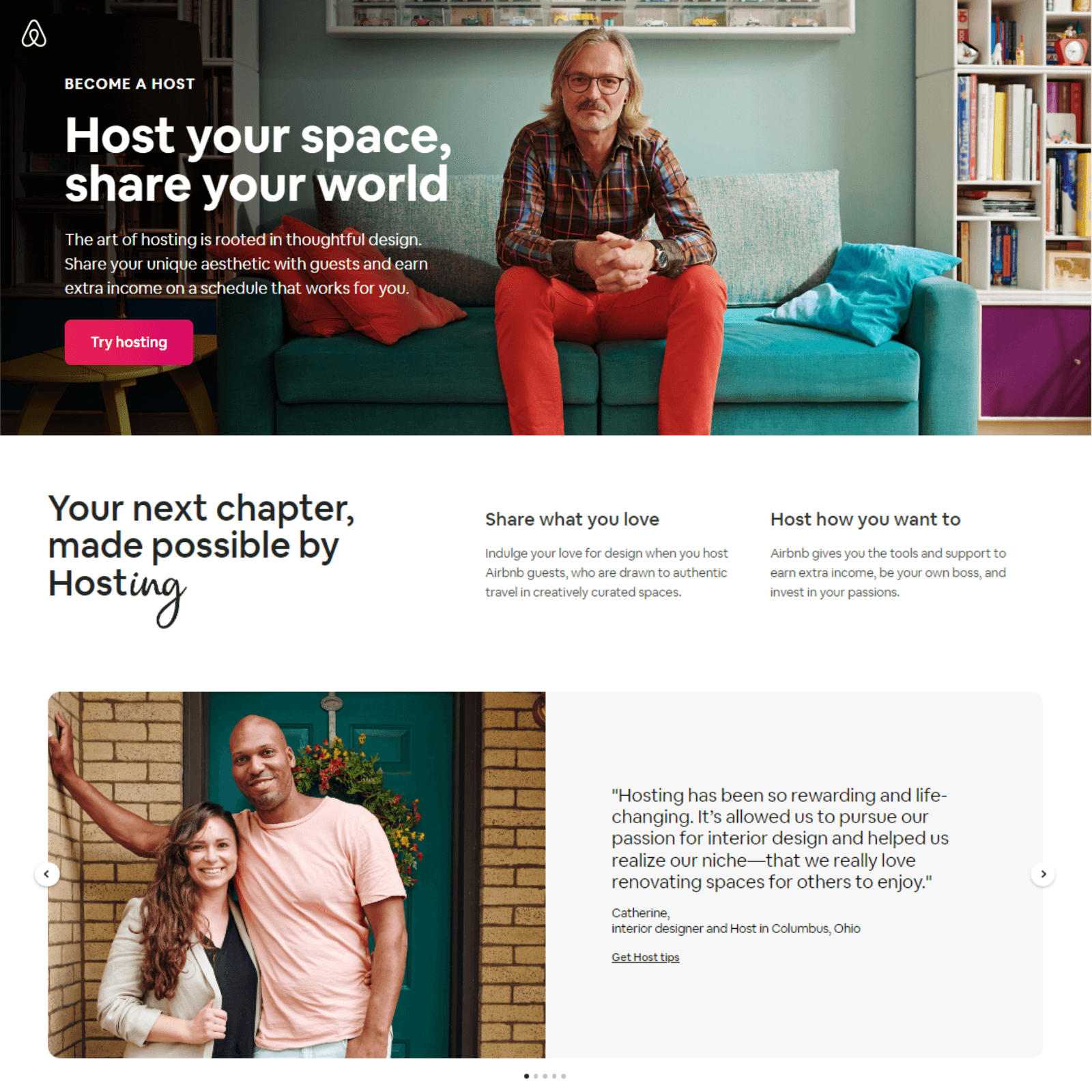
The landing page includes their value proposition as a headline with a sub-headline emphasizing the value proposition and then a colorful CTA. Finally, they added the testimonials of hosts who joined their program.
3. ExpressVPN

The thing that I love most about this landing page is not even present on the landing page. Sounds crazy, doesn’t it? Well, let me explain myself.
I’m talking about the navigation bar, and this landing page doesn’t have one. Now all the attention of the visitors will be automatically diverted to the headline and CTA button. No extra distraction.
If you are looking for the perfect website builder, feel free to browse our comprehensive list of the best website builders to get the hang of the website builder industry.
You can easily create fantastic landing pages for your business by using the stunning pre-built landing page templates of Dorik.
Use Your Landing Page As a Conversion Machine
Now you know the secret of building high-converting landing pages. Try to follow all of the best practices for landing pages to get the best results.
A well-structured landing page design can be a powerful tool for increasing conversions and driving business growth by grabbing the visitors’ attention and persuading them to take the desired action.
Additionally, testing and analyzing the performance of your landing page can help you continually improve its effectiveness and achieve even better results.
Finally, now that you know about the landing page best practices, you can read this checklist to build a landing page that will convert and gain more in-depth knowledge on the subject matter.
