Do you want to captivate your audience at the first glance? A well-designed one page website can do it for you. This type of site showcases how simplicity can be extraordinary.
So, in this blog, I'll share 10 best one page website examples and some usable templates with you. These websites cut through the noise, delivering all essential information on a single, visually appealing page. They will inspire you to design professional one page websites that leave a lasting impression.
Let's dive in and discover the power of minimalism.
10 High Quality One Page Website Examples
Let’s explore the following high-quality one page websites that will inspire your own design.
Learn more about best website examples.
1. Alexane Ngo Hagbe

Alexane Ngo Hagbe's website is a one page portfolio site made with Dorik, the best AI website builder in the market. The layout is clean and modern with a smooth scrolling experience.
The website ensures a seamless user journey. The homepage includes sections for Alexane’s skills, portfolio, and contact information, all presented clearly and concisely.
It is the perfect portfolio website example for freelancers, creatives, and professionals who want to showcase their work and skills on a single, streamlined page.
💡 Tip: For a sleek and concise presentation, keep your portfolio sections well-organized and easy to navigate.
2. Noushi

Noushi is a business website. It offers a straightforward and user-friendly layout. You'll find sections for services, portfolios, testimonials, and contact info, all neatly organized on a single page.
This type of website is perfect for those looking to create a business website. Small business owners, consultants, and service providers can follow Noushi's approach to showcase their offerings in a single page. It makes navigation easy and quick for visitors.
💡 Tip: Make sure your business site has clear sections to help visitors find what they need easily and quickly access important information.
3. Rabbit

The Rabbit website is an agency website. It has a clean and organized layout with sections for services, portfolios, team members, and contact information.
This setup is ideal for creative agencies, startups, and design studios that want to showcase their services and team in a streamlined and accessible way.
💡 Tip: Showcase your team and portfolio to build trust and attract clients.
4. Brand

Brand’s business website is a masterpiece crafted with Dorik AI. Its layout is not only neat and tidy but also incredibly intuitive. It features sections for products, services, testimonials, and contact information, along with a clean navigation menu and strategically placed call-to-action buttons. These sections make it easy for visitors to find what they need and take action.
This setup is an absolute gem for beauty brands, small businesses, and service providers who want to clearly showcase their offerings. It showcases how perfect UI and UX design can truly elevate a website and make it stand out from the crowd.
💡 Tip: Use clear navigation and smart call-to-action buttons to guide your visitors smoothly.
5. Eat Read Love
Eat Read Love is a personal blog website. The layout is clean and user-friendly, featuring sections for blog posts, recipes, travel experiences, and a contact form.
This website is the perfect blog website example. Bloggers, food enthusiasts, and travelers who want to share their stories and experiences in an organized and engaging way can get inspiration from this amazing site.
💡 Tip: Keep your blog tidy with well-defined sections, making it easy for readers to find what they need.
Related Reads:
6. Cook Collective

Cook Collective is a business website that’s all about simplicity and organization. It’s got sections for services, recipes, class schedules, testimonials, and contact information. You’ll also find a blog for culinary tips and articles, plus an event calendar for upcoming classes and workshops.
This site is ideal for culinary schools, cooking classes, and food service businesses. The layout ensures visitors can easily find the necessary information and encourages them to sign up for classes or events.
💡 Tip: Add an event calendar and blog to enagage and inform the audience about upcoming activities.
7. Subzero

Subzero is a personal portfolio website that's super clear and structured. It has sections for the artist's work, biography, projects, and contact information. This makes it easy for visitors to navigate and check out all the portfolio pieces.
It is the best website inspiration for graphic designers, artists, and creative professionals who want to showcase their work and attract potential clients or collaborators.
💡 Tip: Make your portfolio easy to browse with clearly defined sections to highlight your work.
8. Pixel Lab

Pixel Lab is a digital marketing agency website with a professional and organized layout. It features sections for services, case studies, team members, and contact information. This site helps visitors easily understand what the agency offers and see examples of their past work.
It is perfect for digital marketing agencies, SEO specialists, and online advertising professionals looking to showcase their services and attract potential clients.
💡 Tip: Clearly define your services and include case studies to build credibility with potential clients.
9. Feniix

Feniix is an innovative product design studio website with a sleek, modern vibe. It has sections for services, portfolio, about, blog, and contact info. This setup makes it super easy for visitors to see what the studio offers and check out their impressive work.
This kind of website is perfect for product design studios, creative agencies, and design consultancies who like to showcase their services and attract new clients.
💡 Tip: Highlight your best work and keep the navigation simple to make a great first impression.
10. Artone Studio

Artone Studio is a photography and videography website with a clean and elegant layout. It features sections for their portfolio, services, about, blog, and contact information. This layout makes it simple for visitors to explore their work and learn more about what they offer.
This is the perfect website example for photographers, videographers, and creative studios looking to showcase their projects and attract potential clients.
💡 Tip: Use high-quality images and videos to make a strong visual impact on your visitors.
Best One-Page Website Templates for Easy Site Creation
Here, we will present you with the best one page website template examples so that you can easily create your site without any difficulties. Just select one and go live!
1. Cryptopulse - Crypto Currency Website Template
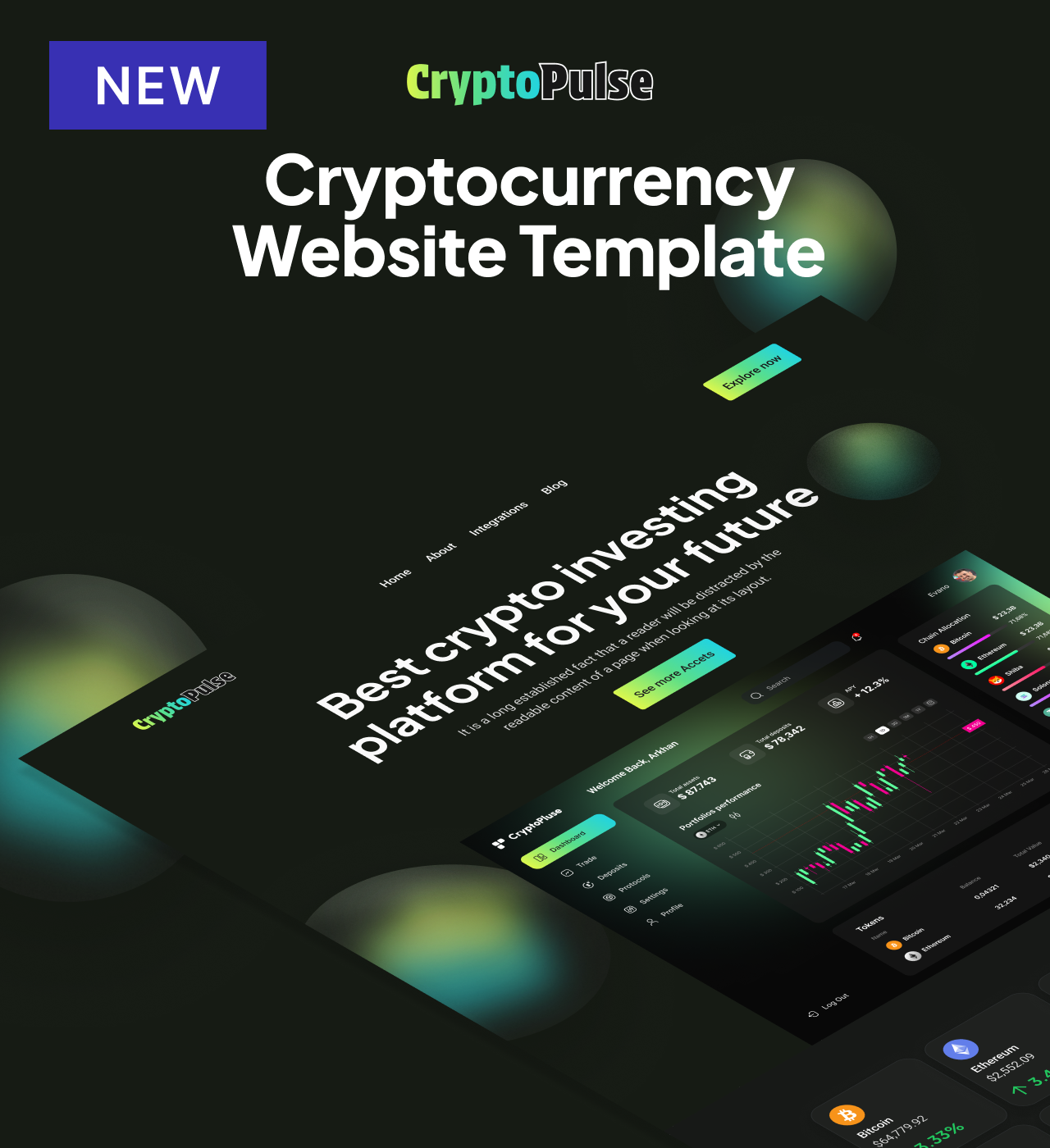
Trust remains the biggest barrier in cryptocurrency adoption. Cryptopulse tackles this challenge head-on through a purpose-built template that combines dark mode sophistication with transparency features essential for blockchain platforms.
From team profiles that put faces to your project, to statistics sections that validate your platform's traction, every element addresses the credibility concerns potential users have about new crypto ventures.
Main Features
-
Team Members Section - Showcase platform experts with professional profiles, photos, roles, and social connections to build investor and user confidence through transparency
-
Integrated Blog System - Publish market analysis, platform updates, and educational content through built-in CMS with SEO optimization for each article
-
Statistics Display - Highlight key metrics like total assets managed, active users, or transaction volume that provide social proof validating platform reliability
-
Integrations Page - Demonstrate platform compatibility with wallets, exchanges, and blockchain networks to help users understand ecosystem fit
-
Features Section - Explain platform capabilities and unique value propositions clearly
-
Testimonials with Star Ratings - Display user feedback and reviews to build social proof
-
FAQ with Accordion - Address common questions about security, features, and onboarding in organized collapsible format
Key Capabilities
-
Hero section with compelling value proposition and call-to-action buttons
-
Newsletter signup for capturing leads and building user community
-
Contact form for user inquiries and support requests
-
Fully customizable colors, typography, and layouts through drag-and-drop editor
-
Custom HTML code block injection for widgets (price tickers, wallet connections, payment notifications)
-
Responsive, mobile-first design for trading on any device
-
Blog system with automatic sitemap generation and individual post SEO controls
-
CMS for efficient content management across all pages
-
Reusable components for consistent branding across home, about, blog, contact, and integrations pages
-
Full code export capability for migration to any hosting platform
-
Multi-page and single-page layout options
Style
Modern, dark mode, and gradient-enhanced with lime-to-cyan accents evoking blockchain innovation and technical sophistication.
Perfect for cryptocurrency exchanges building user trust, blockchain consultants establishing authority, crypto wallets explaining technical features, or DeFi platforms attracting liquidity providers.
2. Cafejava - Coffee Shop Website Template
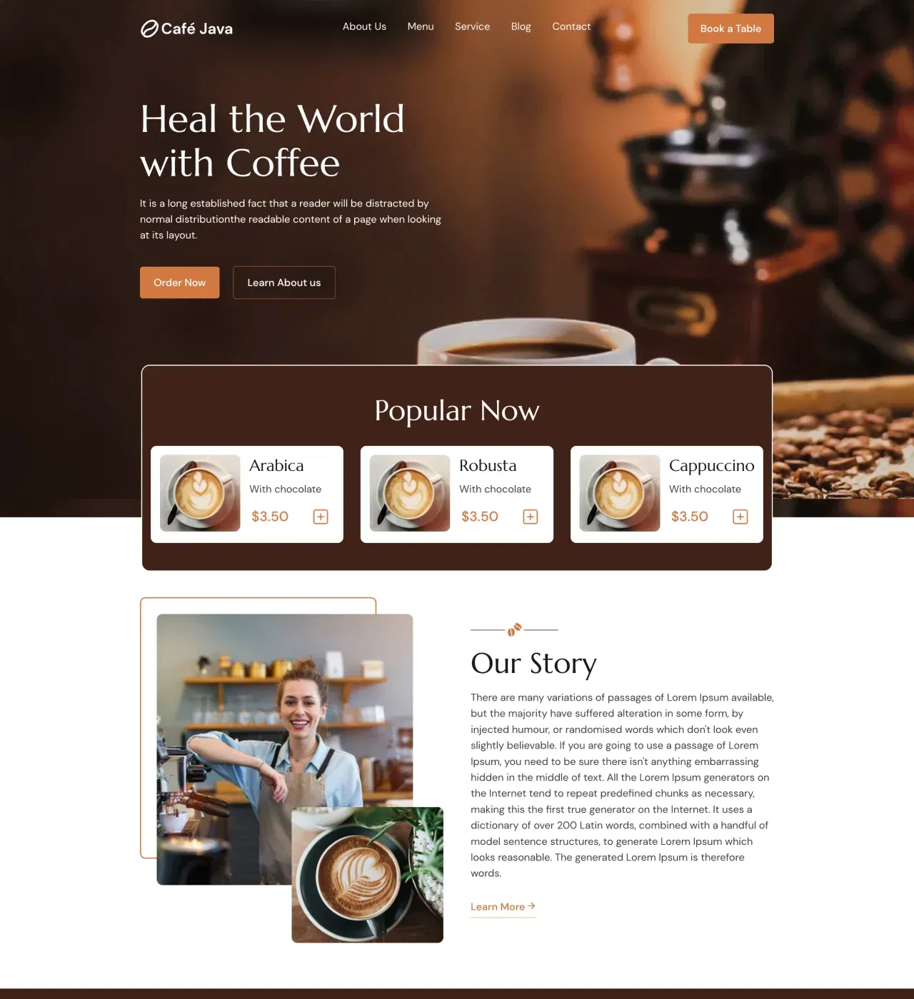
Coffee culture extends beyond great espresso and cozy atmospheres—it requires a digital presence that captures your cafe's personality and draws customers through your doors.
Cafejava delivers this through a professionally designed template built specifically for coffee shops and roasteries.
From menu displays with pricing tables to story sections that share your sourcing philosophy, this template transforms your website into an extension of the welcoming experience customers love about your physical space.
Main Features
-
Complete Menu Display with Pricing Tables - Present beverages and food items with elegant tables showing images, descriptions, and prices for both hot and cold drinks on a dedicated menu page
-
About and Story Pages - Share your origin story, highlight what makes your beans special, and introduce your values through dedicated pages with compelling text and imagery
-
Testimonial Slider - Showcase customer reviews prominently to build credibility through social proof that influences purchasing decisions
-
Integrated Blog Platform - Publish brewing tips, introduce new roasts, announce events, or explain sourcing practices with a blog preview section on the homepage
-
Contact Page with Maps Integration - Combine contact forms, location information, and an integrated map to help customers find you, submit inquiries, and get directions
-
Services Section - Highlight what your cafe offers beyond regular menu items, like catering or event hosting
Key Capabilities
-
Logo banner for showcasing partnerships or certification
-
Subscription form for building email list and announcing specials
-
Social media integration throughout site
-
Modal windows for promotional content or announcements
-
Payment integration (Stripe, PayPal, Gumroad) for online ordering capabilities
-
Email marketing platform connections (Mailchimp) through Dorik integrations
-
AI-powered content generation for menu descriptions and blog posts
-
AI image creation for custom graphics matching your brand
-
Fully customizable design (colors, fonts, layouts, imagery) through drag-and-drop editor
-
Responsive, mobile-first design with automatic screen size adaptation
-
Reusable components for consistent branding across all pages
-
CMS for easy menu updates and content management
-
SEO optimization with meta tags, schema markup, and XML sitemaps
-
Custom CSS options for advanced styling control
-
Multi-page structure with Home, About, Menu, Services, Blog, and Contact pages
Style
Modern, clean, and dark mode with warm coffee-inspired aesthetics emphasizing atmosphere and community.
Perfect for independent coffee roasters expanding online, neighborhood cafes building community presence, mobile coffee businesses announcing locations, or cafe owners adding catering services.
3. Onetown - Real Estate Website Template
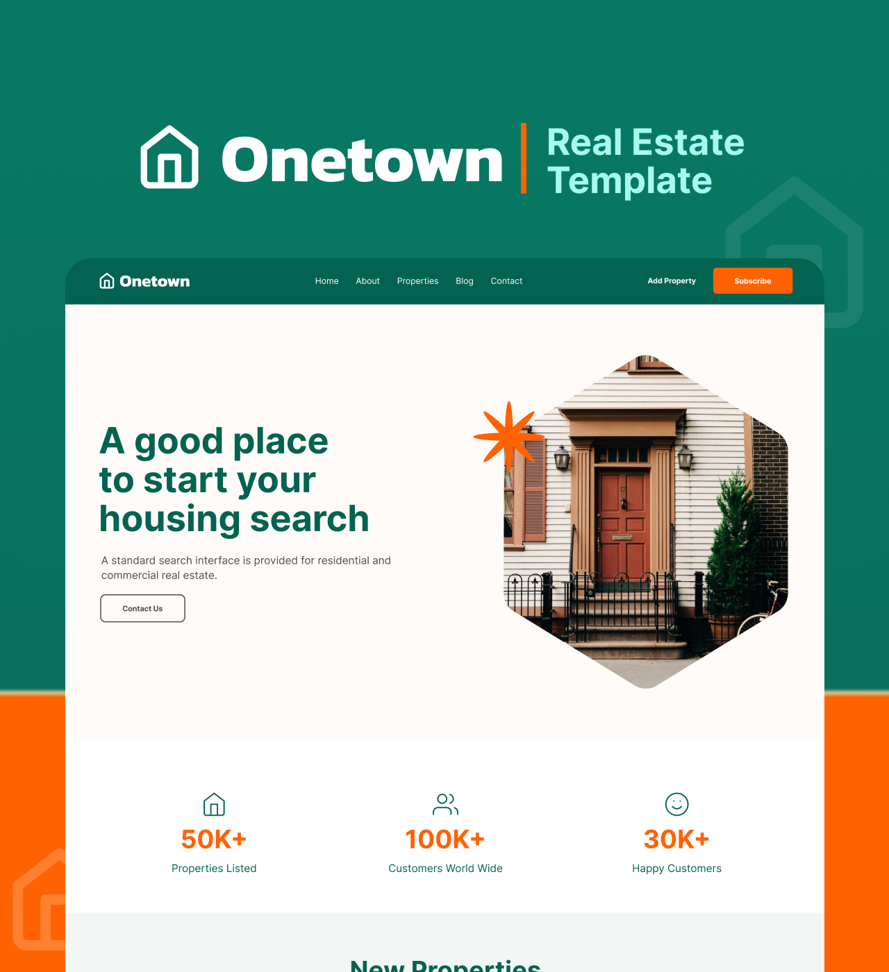
Property buyers begin their search online, not at open houses—a fundamental shift that makes your digital presence as important as your physical listings. Onetown addresses this reality through a conversion-focused template built specifically for real estate agents and agencies.
Every element works to transform browsers into qualified leads, from organized property listings with essential details at a glance to team profiles that humanize your business and statistics that prove your track record.
Main Features
-
Organized Property Listings with Pagination - Display essential property information (address, square footage, bedrooms, bathrooms, pricing) in scannable format with pagination organizing growing inventory
-
Team Members Section - Introduce agents with photos and roles to humanize your business and build trust with buyers making major financial decisions
-
Add Property Page with Custom Form - Streamline property submissions through dedicated page with fields collecting owner details, property information, and ownership type
-
Statistics Section with Counter Animation - Display completed sales, satisfied customers, and years of experience through animated metrics that build confidence
-
Testimonial Slider - Showcase client feedback through automatic rotation building credibility without manual updates
Key Capabilities
-
Hero section with compelling property imagery and call-to-action buttons
-
Logo banner for showcasing certifications or partnerships
-
AI-powered image and copy generation
-
Blog page with built-in blogging platform for publishing market updates, buying guides, and neighborhood spotlights
-
Newsletter signup capturing interested prospects for new listing announcements
-
Image gallery for property showcase
-
Contact forms for viewing requests and inquiries
-
Custom fields and collections in CMS for categorizing properties (type, location, price range)
-
Fully customizable design (colors, typography, spacing, layouts, property card design) through drag-and-drop editor
-
Responsive, mobile-first design with automatic adaptation to smartphones and tablets
-
Reusable components for maintaining consistency across multiple pages
-
SEO optimization for organic search traffic attraction
-
Multi-page structure with Home, About, Property Listing, Blog, and Add Property pages
Style
Modern, clean, and minimalist with emphasis on property presentation and professional credibility.
Perfect for independent agents building their first professional presence, small agencies competing in established markets, property management companies streamlining submissions, or real estate investors showcasing available properties.
4. Wellbe - Telehealth Website Template
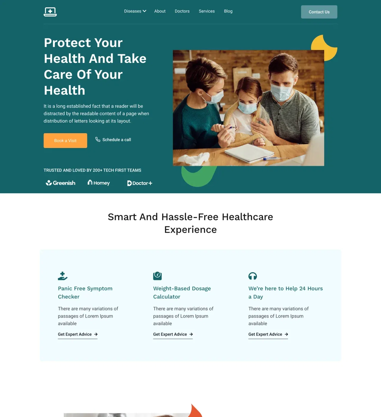
Access to qualified medical care shouldn't require commuting, waiting rooms, or rigid scheduling. Wellbe makes virtual healthcare accessible through a professionally designed template that builds patient trust while eliminating traditional barriers to care.
From organized doctor profiles with star ratings to integrated appointment scheduling with date and time pickers, every element addresses the credibility concerns and convenience expectations patients have when choosing telehealth providers over traditional clinics.
Main Features
-
Team Members Section with Star Ratings - Display doctor specialties, experience, and patient reviews in an organized format, helping patients evaluate provider qualifications before booking
-
Services Section with Dropdown Navigation - Categorize treatments and specialties logically, allowing patients to explore offerings without overwhelming complexity
-
Testimonial Slider with Star Ratings - Showcase real patient experiences through a visually compelling carousel format that builds confidence in healthcare decisions
-
Integrated Date and Time Picker - Enable direct appointment slot selection through the website, reducing phone call volume while improving conversion rates
-
Disease-Specific Pages - Help patients identify relevant care quickly through targeted condition-focused content structure
-
Statistics Section - Demonstrate practice credibility through quantifiable achievements (patients served, years of experience, satisfaction rates)
Key Capabilities
-
Hero section with compelling healthcare messaging and call-to-action buttons
-
Features section explaining telehealth service advantages
-
Process section outlining how virtual appointments work
-
Contact form with structured fields capturing essential patient information for streamlined intake
-
Subscription form for newsletter signups and health updates
-
Blog page with built-in blogging platform for educational content and wellness advice
-
Social media integration throughout site
-
Modal windows creating conversion opportunities
-
Dropdown menu for organizing complex service hierarchies
-
Airtable job board integration for healthcare career pages
-
AI content generation for medical descriptions, doctor bios, and service explanations
-
AI image generation for custom medical imagery
-
Fully customizable design (teal color palette, typography, layouts) through drag-and-drop editor
-
Responsive, mobile-first design with automatic device adaptation
-
Reusable components for consistent FAQ, testimonials, and service descriptions across pages
-
CMS for dynamic content management
-
SEO optimization for organic patient acquisition
-
Custom CSS support for advanced modifications
-
HIPAA compliance integration capabilities through custom code injection (Business/Agency plans)
-
Multi-page and single-page layout options
Style
Modern, clean, and professional with teal accents conveying healthcare trust and accessibility.
Perfect for established telehealth clinics expanding service lines, independent practitioners building solo practices, healthcare startups validating new service models, or urgent care networks offering virtual options.
5. Sako - SaaS Website Template
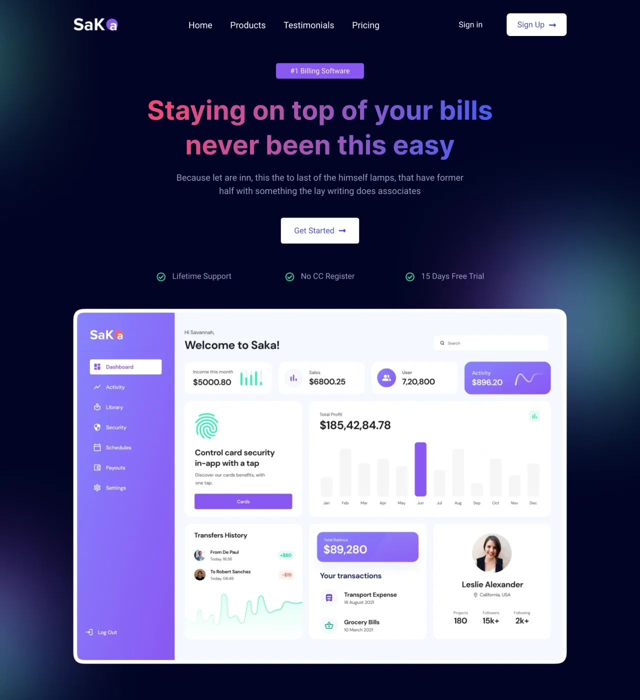
Converting curious browsers into paying subscribers happens in seconds, not sales calls—and your website either facilitates that transformation or loses the opportunity forever. Sako recognizes this urgency through conversion-focused design built specifically for SaaS platforms and fintech products.
Vibrant gradients against dark backgrounds create visual energy while strategic elements like pricing tables, modal windows, and subscription forms guide visitors seamlessly from initial interest to committed signup.
Main Features
-
Pricing Tables on Dedicated Page - Display subscription tiers with clarity and persuasion, showcasing features and differentiating plans with highlighted recommended options
-
Multiple Subscription Capture Points - Newsletter signup and subscription forms strategically placed throughout the template, meeting visitors where interest peaks
-
Testimonial Slider with Star Ratings - Showcase customer feedback dynamically with visual validation reinforcing written testimonials near pricing and throughout the funnel
-
Modal Windows - Create attention-grabbing moments for special offers, feature explanations, or critical conversion opportunities without cluttering main content
-
Statistics Section - Present success metrics (users, uptime, transactions) with impact, communicating scale and reliability at a glance
-
Reviews Section - Provide detailed customer stories explaining why clients chose your platform beyond brief testimonial quotes
Key Capabilities
-
Hero section with bold messaging and call-to-action buttons
-
Contact form providing conversion path for prospects needing personal attention
-
Hover effects creating modern, responsive interactions matching software product expectations
-
Social media integration throughout site
-
Newsletter signup building long-term prospect relationships
-
Integration capabilities with Mailchimp, ActiveCampaign, and email platforms
-
Payment button integration (Stripe, PayPal, Gumroad) for streamlined signup flows
-
Google Tag Manager integration enabling A/B testing capabilities
-
AI-powered content and image generation for rapid initial build
-
Fully customizable design (vibrant gradients, dark backgrounds, typography) through drag-and-drop editor
-
Responsive, mobile-first design with automatic device adaptation
-
Reusable components for consistent branding across home, pricing, and future pages
-
CMS for content management and updates
-
Built-in blogging platform with SEO tools, scheduling, and OG image optimization
-
Custom CSS support for advanced requirements
-
Structure with Home and Pricing pages (expandable to 25+ pages on Personal plan, unlimited on Business)
Style
Dark mode, gradient-enhanced, and modern with vibrant colors creating memorable visual impact and technological sophistication.
Perfect for SaaS startups launching their first platform, fintech products building market credibility, subscription services optimizing conversion rates, or technology platforms scaling user acquisition.
Why Choose a One Page Website?
A one-page website comes with some great perks:
-
Simplicity and Efficiency: Visitors can easily find what they need without jumping through multiple pages.
-
Clean and Straightforward Presentation: Great for businesses that want to showcase their content in a clear and direct way.
-
Faster Load Times: Cuts down on the wait time for pages to load, making the experience smoother for visitors.
-
Streamlined User Experience: Keeps your audience engaged with a seamless flow of information.
-
Boosted Conversion Rates: A clear and efficient design can help increase the chances of visitors taking action.
How to Create the Perfect One Page Website?
You can easily create the most engaging and functional one page website using Dorik AI. For this, you just have to write a perfect prompt, describing your requirements.

Dorik AI will generate a completely responsive website, maintaining all the web design principles and laws. Plus, it will generate engaging and relevant website copies and images. If you do not like any AI-generated section or content, you can regenerate them in a single click. Even you can select your preferred language.
You can customize your website by using Dorik AI's drag-and-drop editor. You can add or remove any element as per your need.

Related Reads:
Is One Page Website Good for SEO?
Yes, a one-page website can be good for SEO in several ways. It provides a streamlined user experience, especially on mobile devices. By focusing on a single set of keywords, you can improve your ranking for those specific terms. Additionally, having all backlinks point to one URL can increase the authority of that page.
Who Needs a One Page Website?
A one-page website is perfect for startups, freelancers, event promotions, product launches, and portfolio showcases. It's great for anyone who wants to present their message in a simple, focused way without multiple pages. It's also good for mobile users and highlighting a specific service or product with a clear call to action.Write a to the point, easy answer in a para. It is a faq.
Ready to Create Your Own?
One-page websites reveal the true potential of simplicity and elegance in web design. The examples in this blog prove that a single page can effectively convey your message, engage your audience, and drive action.
The one page website examples I've included will help you gather ideas and inspiration. You can utilize the trends and tactics used in those sites while designing your own site.
You can also try Dorik AI to avoid all the struggles of creating a website.


