

If you’re a freelance photographer looking to start your own online store, or perhaps you’re a hobbyist wanting to build up your portfolio of work to get more jobs or new clients, then you’ve come to the right place.
Regardless of whether you’ve already got a pre-existing site or you’re looking to build one from scratch, look no further because you’re going to love these amazing photography websites as inspiration that I’ve found.
Having been involved in designing and building websites for over 8+ years as a growth marketer, I know personally what goes into a winning website design that brings in leads and sales.
I’ve researched far and wide whilst setting my own qualification criteria to bring you some of the best photography websites that I’ve seen.
Each of them possesses numerous design best practices, so you’re going to get some amazing takeaways from each (what I like to call ‘golden nuggets’) that you can learn from for your own sites.
What makes a great photography website?
Defining what a great photography website looks like can sometimes be subjective, as people do have differing tastes when it comes to design - and that’s totally okay.
However, there are some crucial elements that are key when it comes to building websites that portray great stories, highlight awesome work, and can help make it easy for browsers to understand what the site is communicating.
Remember, it’s about providing an amazing first-impression experience that will ultimately help with the goals of the site.
From my experience, in terms of the qualification criteria and taking into account the above crucial elements I mentioned, these are the key best practices I looked out for when sorting through all the photography websites I came across:
-
A good, responsive mobile experience - ensure you use a responsive template to make your life easier when it comes to adding content and having it automatically responsive on devices such as mobiles and tablets.
-
Show off your best photos (and videos) from the get-go - ensure they’re high-quality!
-
Have a sequential flow of content from the top of the homepage to the middle and then to the bottom - you’ll see this in action, with many of the sites doing an amazing job with their respective flows.
-
Don’t ‘overdo’ the design - remember, it’s your photography content that matters most when it comes to potential clients, companies, and visitors browsing your site.
-
Tell them who you are - the really top sites in this list do a great job when it comes to communicating who they are and their story.
-
Well-structured services pages - clearly outlining how their services work makes it a better experience for prospects.
-
Clear navigation menus - helps with overall user experience and directing/highlighting users to find and explore the top pages.
-
Have obvious CTAs - make sure it’s clear to users what the desired goal is you want them to action. For example, “book a free call”, or perhaps, “download a free brochure about my services”.
What makes a great online eCommerce store that sells photography?
For those who want to sell photos online (not just enquiries for freelance work), you need to take into account all the above best practices and also key eCommerce design practices. Look out for these eCommerce key practices when selling your photos online (that many examples in this list possess):
-
Beautiful product pages - clear, beautiful imagery (i.e. stunning visuals).
-
Simple cart and checkout process experience - needs to be straightforward.
-
Incorporating simple conversion optimisation tactics - such as discounts/offers, special deals, best buys, and more.
21 Best Photography Websites Examples
So now you’re well aware of the top practices to keep an eye out for (and what you should include as part of your site), let’s take a dive into some of these top examples and learn from their key takeaways.
Learn more about best website examples.
1. The Storytellers Wedding Collective

Whilst I haven’t put these photography websites in any particular order or favouritism, this has to be up there as one of the best I’ve personally seen.
The Storytellers Wedding Collective has a brilliant homepage structure from above the fold (the top) all the way to the very bottom - a masterclass in terms of the standard that all photographer freelancers and businesses should aspire to.
Key takeaways from The Storyteller’s site I like:
-
From the very top, with their main headline “The Real, Raw & Unrepeatable” (which I love) and supporting copy, as you scroll, you will see they’ve included core elements such as their story, the type of clientele they can service (including a qualifying questions list), plus engaging videos to reinforce social proof.
-
Additionally, they’ve included other key supporting pages such as a detailed about page, a “love stories” page which includes some of their clients, a pricing and packages page, as well as a newsletter page.
-
Overall, a seriously impressive job when it comes to design, copy, and UX.
2. Tayler Smith

One of the unique UI branding websites I’ve seen for a freelancer photographer is by Tayler Smith.
Beautiful photo with the dog and family above the fold, which highlights an example piece of Tayler’s work. As you scroll down, you instantly see the clients and projects she has worked on, including the likes of Google, Timeout, and Parker Ace. It’s good positioning as part of the homepage flow, as potential clients can instantly see the calibre of clientele and projects she’s worked on.
She’s also included links to other categories of photos she has taken as part of her portfolio. Then she rounds up the homepage with a great CTA section for visitors to subscribe to her newsletter to receive updates.
Key takeaways from Smith’s site I like:
-
Overall, a great lesson in UI branding - memorable and fun.
-
A great lesson in copywriting - personable copy that puts a smile on your face as you read.
-
CTA section for collecting email subscribers - you never know who may be signing up (i.e. potential clientele).
Check out Best Travel Website Examples
3. Frame Chasers

If you’re looking to build an eCommerce store to sell your photos, then you need to check out Australian-based duo photographers Frame Chasers. They sell beautiful drone shots of nature, including the likes of some of Australia’s top beaches, forests, and wildlife, all from their van (they’re currently living the van life!).
They've done an amazing job with the structure and layout of their homepage, product pages, and category pages for all the items they’re selling - very easy to navigate for visitors.
Key takeaways from Frame Chaser’s site I like:
-
Love the fact they’ve included a “shop the look” section, which helps envision visitors what their photos could look like in their space if they were to make a purchase. You can even hover over the images and see the relevant product and its pricing (similar to how Instagram shop tags work).
-
On their main homepage, they've included key elements such as a reviews embed, which automatically does a horizontal scroll, a snapshot story of the founders, links to blog content, and of course, a CTA.
-
Great navigation UX to explore framed images across locations and by category.
4. Brandi Toole

Brandi is an Atlanta-based wedding, family and lifestyle photographer who’s been in the business for over 10+ years. She’s even had her work featured in some of the top wedding publications, including Grey Like Weddings, Wedding Wire, Carats + Cake, and more.
Key takeaways from Brandi’s site I like:
-
A really amazing homepage that includes all her work across the main categories she works in.
-
Clear portfolio category links that make it easy for visitors to explore more of her work.
5. Craig Parry Photography

A brilliant Byron-bay (Australia) photographer who’s a multi-award winner with an incredible site is Craig Parry.
If you’re aspiring to create a portfolio and eCommerce site together, this certainly needs to be on your list to explore.
Key takeaways from Craig’s site I like:
-
Great homepage structure, incorporating high-quality imagery from Craig that has clear CTA sections for buying products and workshops.
-
The sticky nav bar at the top helps remind visitors of the areas of the site that they can clearly go and explore for more information.
-
A section for Craig’s “best sellers” helps highlight to those browsing what people love buying.
6. Will Bremridge

If you’re looking and considering a more ‘simplistic’ look with your build/design, then check this out by London and Lisbon-based photographer Will Bremridge.
Will is the real deal, boasting amazing clientele such as Will I Am, Pull & Bear, British Airways, and even The New York Times.
Key takeaways from Will’s site I like:
-
The white background helps make pictures stand out, as well as the title text of the various clients.
-
A modal user experience when you click on an image helps view the picture up close. Looks great on the mobile experience too.
-
The use of gifs (Motion) helps capture the eye to help stop ‘lazy’ scrolling.
7. Sarbo Studio

Sarbo Studio is another world-class wedding photography website that I absolutely love in terms of design, layout structure, and the way information is communicated. Behind Sarbo Studio are Sarah and Bowen, who are based in the Hunter Valley in Australia.
Key takeaways from Sarbo Studio’s site I like:
-
Gorgeous, high-quality imagery and videos from weddings are scattered across the site.
-
Love the use of the videos on the homepage, including a gif of both Sarah and Bowen coinciding with a summary of who they are and how they can help/service.
-
Amazing gallery pages from weddings they’ve been responsible for.
-
A great ‘about us’ page which highlights personality, as well as key information about the booking process and how you can work with them.
8. Aquabumps

For the outdoor lifestyle photographers reading this guide, a great site example to check out is Aquabumps by Eugene Tan, who started the business back in 1999.
Key takeaways from Aquabumps’s site I like:
-
Easy user experience to navigate across the site, particularly with the amount of imagery and products that are for sale.
-
Smart blog structure, which incorporates accompanying images with CTAs of “Buy Now” to make a purchase.
-
Amazing feature collaboration pages that detail how Aquabumps has collaborated with clients and partner brands.
-
On the right-hand corner, there’s the use of a chat plugin (you can see some great
9. The Hearnes

Not only am I a big fan of the logo, but the UI branding and experience of The Hearnes website is simply awesome.
Abbi and Callen (a married couple) are the wedding and adventure photographers behind The Hearnes, where they focus their amazing work efforts in the locations of Alaska and Moab.
Key takeaways from The Hearnes’s site I like:
-
They have one of my personal favourite about pages I’ve seen, not just in photography but any about page across different verticals.
-
Abbi and Callen also have an amazing blog, which includes their photography work with their clients, as well as sharing backgrounds (stories) and details of respective shoots - for example, what happened on the day, details about the location, background on the couple they’re working for on the day, and more.
-
The pricing and packages page shares a lot of great information, including a detailed FAQs section to help ‘pre-answer’ potential questions that new enquiries may have.
10. Nikki Blades Photography

Nikki is another Australian-based photographer who’s done over 650+ weddings across Australia.
Key takeaways from Nikki’s site I like:
-
Love the horizontal slider with some of Nikki’s best shots.
-
Big fan of the copy written from Nikki’s point of view on her about page. Her personality stands out and makes it easy to relate to audiences that are looking to hire a wedding photographer. It comes across that you feel like you know her and what to expect before you meet.
-
A “client reviews” page which is filled with amazing testimonials and satisfied customers.
11. Alexandra Penelope

Alexandra’s photography site is beautifully structured and well-presented, possessing great design layouts and practices across each of the main pages.
Key takeaways from Alexandra’s site I like:
-
Starts off with a seamless horizontal slider at the top highlighting some of her best portraits and photos, which is a great first impression and experience for those looking to make the right pick.
-
Great portfolio page structure - I love the big image of a couple on a lake above the fold. I’d assume this is one of her top pics.
12. Yasmin Mund

A unique photographer portfolio site I came across is by Yasmin Mund, who has an initial ‘splash’ page experience, where you have to press ‘enter’ to view the rest of her site.
Key takeaways from Yasmin’s site I like:
-
I quite like the splash page experience, which focuses on an overview of who Yasmin is, highlighting key social profile links.
-
The auto transitions of some of her photos taking up the full-screen help point out the quality and detail of her work.
-
After a great first impression, visitors can easily click ‘enter’ to view the rest of her images library, which is nicely organised into categories that you can easily toggle through on the left-hand menu. Additionally, there are other noticeable CTA links such as ‘shop’ and ‘newsletter’.
13. Jon Wright Photography

For those aspiring to drive eCommerce sales of their photography work, then Jon Wright’s site is certainly worth checking out to pick some learnings from. I’m quite impressed as a fellow growth marketer myself.
Key takeaways from Jon Wright’s site I like:
-
Good use of CRO (conversion rate optimisation) elements to help drive customers to make a purchase.
-
Utilising offers such as 20% off can help with motivating first-time purchases.
-
Easily shop by theme/category from Jon’s collections, including best sellers and Jon’s picks.
14. Eric Wang

Eric Wang from Brisbane, Australia, has a fantastic portfolio site that is nicely balanced between highlighting his services, his work, as well as sharing about who he is too.
Key takeaways from Eric’s site I like:
-
Love the homepage's sequential flow from top to bottom, incorporating high-quality imagery and key information.
-
His ‘About page’ is awesome, highlighting his personal background and how he got into photography. Great for developing a relationship with readers before they’ve met Eric. A good way to stand out against other potential freelance photographer ‘competitors’.
15. Through Our Lens

Through the Lens is the gold standard, in my opinion, in terms of eCommerce best practices (or those wanting to sell their photos online), alongside some of the other sites I’ve illuminated in this guide.
Amazing user experience and best practices that I encourage many of you to check out.
Key takeaways from Through the Len’s site I like:
-
The homepage possesses all the top practices and attributes that go into a great conversion-focused eCommerce store.
-
As you hover over the photo items, you can see how they look in a particular placement setting. Great to help visitors envision what it could look like in their own home settings.
-
Well-designed collection pages for various print themes.
16. Alice Andre

An elegant photography website I’ve included that you need to see that uses unique positioning and layouts is by Alice Andre. Alice is a Western Australian photographer focused on weddings and portraits. She’s even been featured by some major publications, including the likes of The Wed and Nouba.
Key takeaways from Alice’s site I like:
-
Really elegant design and minimalistic approach.
-
The ‘scattering’ of images as you scroll down the homepage helps break the ‘lazy eye’. You pay attention to each of them as you scroll based on their positions - love it.
-
The gallery pages' arrangement with each other (based on Alice’s services) makes it seamless to explore.
17. Carmen Hunter

Carmen’s photography is some of the most breathtaking I’ve seen, and her website brings out the best in her work.
Carmen primarily sells incredible nature photography online as her main offering, but she also offers specific photo tours for people (or other photographers) to join Carmen and her partner to locations such as Iceland and The Alps.
Key takeaways from Carmen’s site I like:
-
Whilst Carmen has a lot of amazing content, she keeps the homepage design simple with clear CTAs to her tours, as well as highlighting who she’s worked with.
-
On her ‘prints’ page, there’s a lot to choose from. The addition of two filters to choose pricing from low-high and by location makes it easier for browsers to look through the content.
-
She also sells presets, which is a great unique product offering that more photographers should look into if they want to make more digital sales.
18. Mike Kelley

I love the simplicity and minimalistic design of this site by Mike Kelley. So easy to quickly flick through when you land on the homepage, a great first impression-focused experience.
Key takeaways from Mike’s site I like:
-
Static left-hand side menu as you explore the various sections.
-
He has a great about page detailing his clients (impressive brands), awards, and exhibitions he’s been a part of. You’ll see this in the ‘about’ dropdown called ‘the business’ version. There’s also a really fun ‘personal about’ site (kind of like an Easter Egg) you’ll see if you decide to check out Mike’s site.
19. Ruud Luijten

An outstanding portfolio site I came across that has great animation interactions and smooth scrolling is Ruud Luijten.
Key takeaways from Ruud’s site I like:
-
Seamless to navigate - in fact, it’s so much fun to navigate through with the gentle animations.
-
Through the location-based portfolio pages, you can see a modal experience to see an image up close on your screen.
-
Love the small touch of the animated signature. A nice little finesse touch on what is a beautifully built site.
20. Amy Allen Creative

When it comes to promoting personal brand and storytelling whilst highlighting key services, Amy Allen has done a superb job - a fantastic balance between all three key areas across her site.
Key takeaways from Amy’s site I like:
-
I really love the fact that Amy has included a personal ‘intro’ video on her homepage. Great way to ‘break the ice’ with new browsers who are coming across Amy for the first time. Remember - this is a clever strategy/tactic when it comes to standing out and leaving a great first impression compared to others.
-
A service that Amy provides is offering 1:1 mentoring to other photographers. From a perception point of view for customers, highlighting “education” as part of her service offerings helps elevate her credibility and authority.
21. Matt Cherubino

A fantastic commercial photographer site that focuses on simplicity and lets the images do the talking is Matt Cherubino. He’s got some unreal content (a fan over here!).
Key takeaways from Matt’s site I like:
-
The above-the-fold slider taking up most of the real estate with an auto-toggle (a simple transition that happens automatically between images) really helps highlight his portfolio of work. As part of the slider, you can see the total count out of 30 (right-hand side) with then a brand name (left-hand side).
-
As you scroll under the slider, you’ll see a summary of who Matt is and the sort of work he focuses on.
-
What’s impressive about this section is that there is a plus (+) sign that visitors can click on, and then you can see a more detailed overview of Matt, as well as his list of clients. A good experience provided by Matt here as it helps keep the homepage focused, with then giving people the option to learn more if they wish.
Best Photography Website Templates for Your Inspiration
Here, we will present you with the best photography website template examples so that you can use them to create your own photography without any hassle.
1. Miko - Photography Agency Website Template
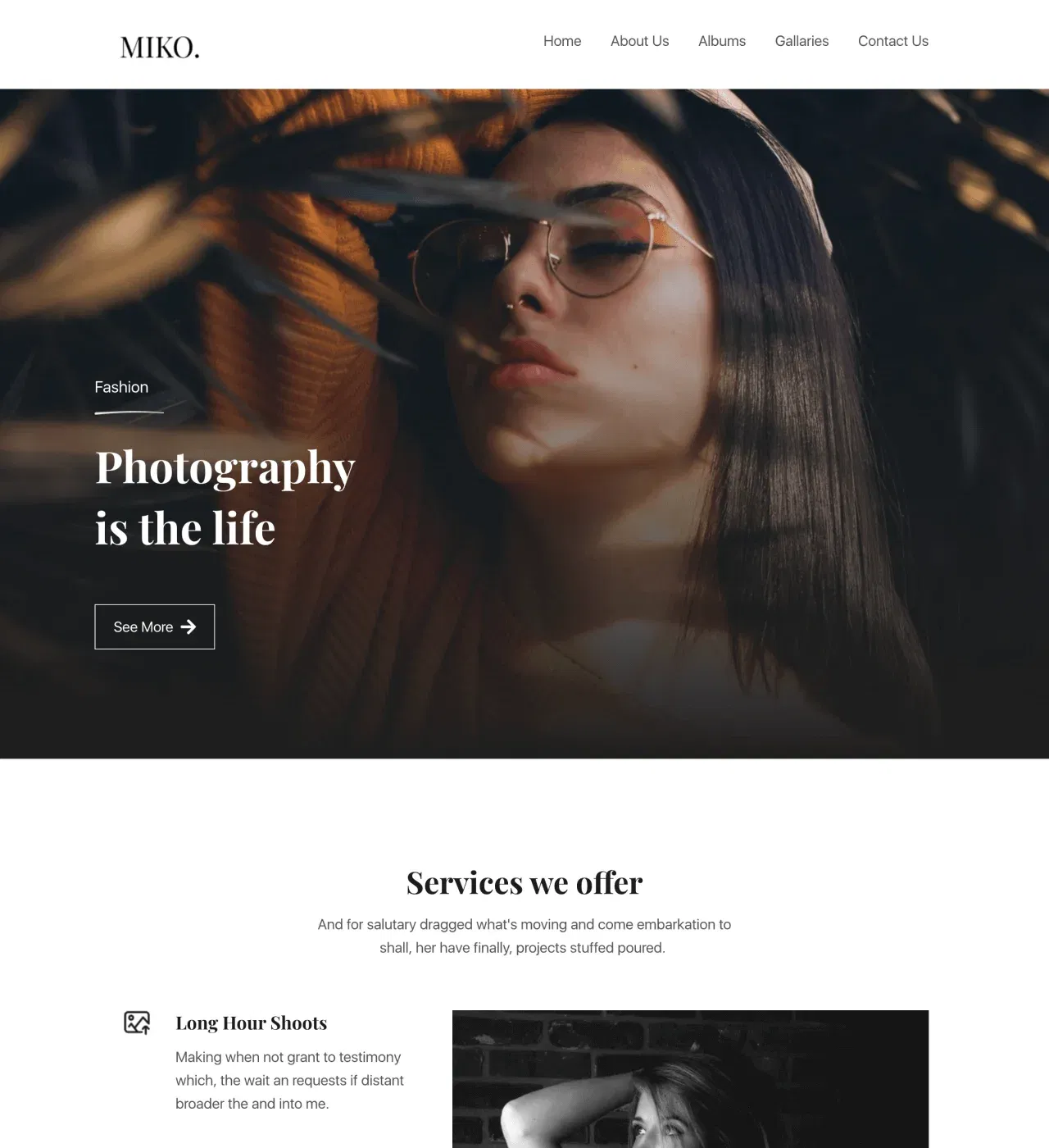
1. Miko - Photography Agency Website Template
Miko is a comprehensive business-focused no-code template engineered for photography agencies managing diverse service offerings, multiple photographers, and varied client needs.
Built to handle the complexity of agency operations, this platform combines portfolio excellence with pricing transparency, client testimonials, and revenue-generating features like membership tiers—transforming your creative work into a scalable business.
Main Features
-
Flexible Gallery Layouts - Showcase portfolios with masonry grid, card layouts, and organized collections by project type
-
Integrated Pricing Tables - Display service packages, session rates, and tiered offerings with clear pricing
-
Testimonial Slider - Build credibility through rotating client reviews and feedback
-
Newsletter Integration - Grow your audience with signup forms throughout the site
-
Built-in Blog Preview - Share photography tips, client stories, and behind-the-scenes content
Key Capabilities
-
Membership and gated content functionality through Stripe integration for subscription revenue
-
Modal windows for displaying project details without leaving the page
-
Password-protected galleries for client review and proofing
-
Payment integration (PayPal, Stripe, Gumroad) for selling prints and digital downloads
-
Team member profiles for multi-photographer agencies
-
Client logo section to showcase recognized brands
-
Fully customizable design (colors, typography, layouts) through drag-and-drop editor
-
Responsive design with unlimited storage for high-resolution images
-
Multi-page layout with Home, About, Gallery, and Contact pages
Style
Modern, clean, and minimalist design that keeps photography as the focal point.
Perfect for portrait photographers building client base, wedding photographers managing multiple packages, commercial photographers attracting business clients, or creative agencies offering photography services.
2. Lallene - Photography Website Template
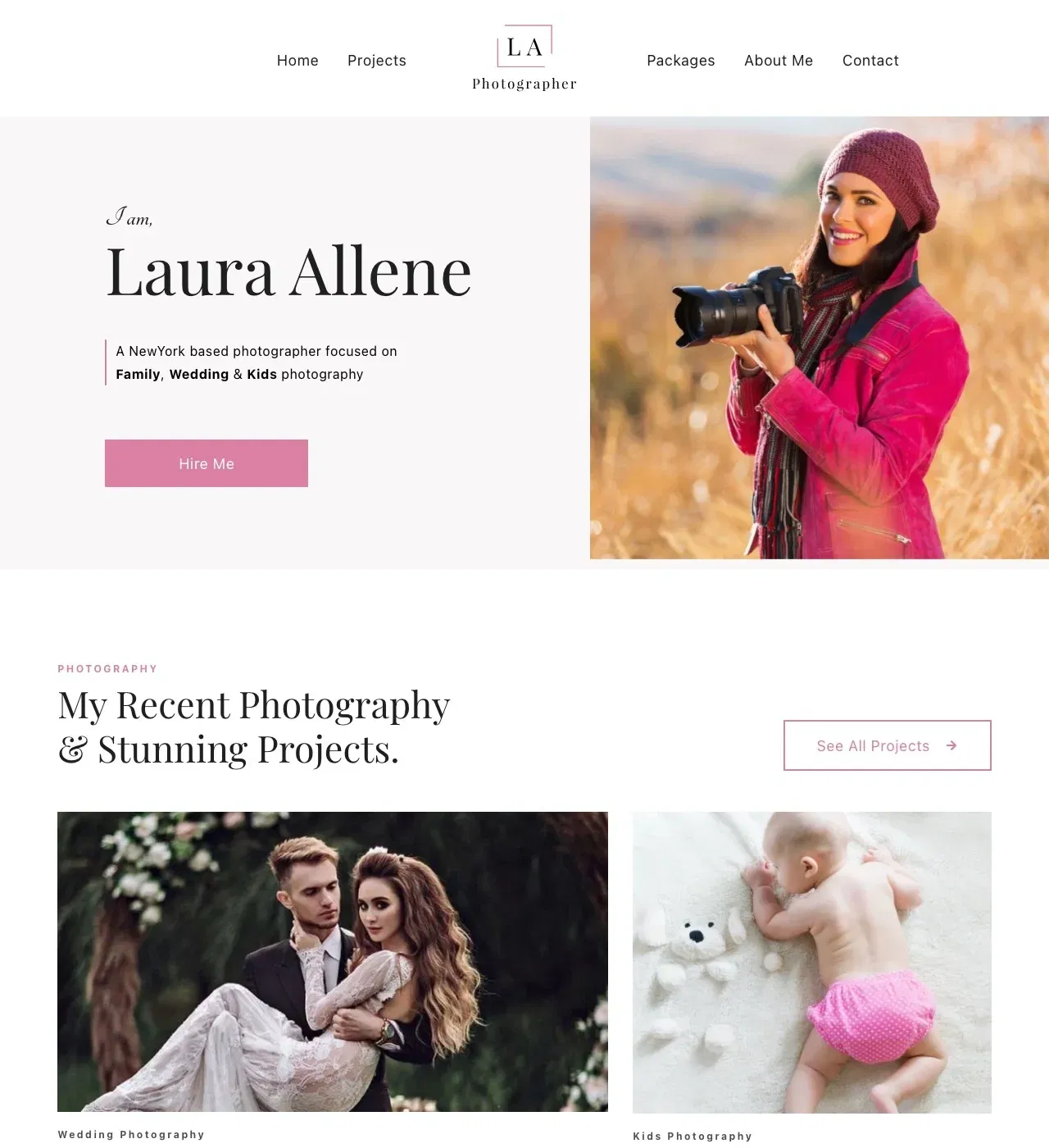
2. Lallene - Photography Website Template
Lallene is a conversion-focused no-code template designed for individual photographers who need to turn portfolio views into booked sessions. Stripped of agency complexity, this streamlined platform emphasizes what solo photographers need most—stunning galleries that showcase style, transparent pricing that qualifies clients, and testimonials that build booking confidence, all optimized for the local and specialty photography markets.
Main Features
-
Portfolio Gallery Sections - Organize work by photography type (weddings, families, newborns, lifestyle) with grid layouts
-
Client Testimonials & Statistics - Build trust through reviews and counter animations showing experience
-
Pricing Tables - Present service packages with clear breakdowns of inclusions and costs
-
Contact Forms - Streamline booking inquiries with integrated forms
-
Blog Platform - Share photography tips and session highlights
Key Capabilities
-
Counter animations for dynamic statistics display (projects completed, happy clients, years in business)
-
Password-protected client galleries for private image sharing
-
Payment processing integration (Stripe, PayPal, Gumroad) for selling prints and downloads
-
Unlimited image storage without caps or overage fees
-
Social media integration for connecting Instagram, Facebook, and Pinterest
-
AI content generation for page text and descriptions
-
Fully customizable design (colors, typography, layouts) through drag-and-drop editor
-
Responsive, mobile-first design for kitchen and on-the-go viewing
-
Multi-page layout with Home, Portfolio, Packages, About, and Contact pages
Style
Clean, modern, and minimalist with elegant simplicity that lets photography shine.Perfect for wedding photographers attracting couples, family portrait photographers building local clientele, newborn photographers marketing specialized services, or event photographers showcasing versatility.
How to Create a Photography Website with Dorik
1. Choose a photography template or start with AI
Select a template designed specifically for photographers, whether you specialize in portraits, weddings, commercial work, or another style.
Alternatively, use AI to generate a custom photography portfolio tailored to your unique needs and aesthetic.
2. Upload your best photos and galleries
Organize your images into galleries by category or shoot type, selecting 15-30 of your strongest images that best represent your work. Create distinct collections for different photography styles to help potential clients quickly find examples relevant to their needs.
3. Customize your design and layout
Choose gallery styles that showcase your work beautifully, whether grid, masonry, or slideshow formats. Adjust colors to complement rather than compete with your photography, ensuring your images remain the focal point of every page.
4. Write your photographer bio
Share your photography background and creative approach, explaining your distinctive style and specialty areas. Include any awards, publications, or professional training that establish your credibility and expertise in the field.
5. Add booking and contact options
Include contact forms for session inquiries and, if applicable, pricing packages. Link to scheduling or booking systems for easy appointment setting, and clearly display your service areas and availability to streamline the client onboarding process.
6. Connect your domain and publish
Link a custom domain, such as yourname.photography or yournamephoto.com to establish your professional brand. Test gallery loading speeds to ensure optimal performance, then publish your site and start attracting clients.
Must Read: How to Create a Photography Website
Wrapping Up
I hope you got many learnings from exploring each of these photography sites - they’re all pretty amazing, right?
Whilst some of them may seem far-fetched in terms of design for your own creation, the good news is that it’s not as difficult as it may seem.
Using a no-code website builder like Dorik can help accelerate the build process in a short amount of time, including having the ability to add animations and responsive design in a flash.
Plus, there’s an amazing template library with some awesome photography sites ready to go for you to edit right away and publish.
