

Are you seeking out the best practices for website header design? Then you are in the right place.
In this blog post, I'll reveal the most effective header design practices and principles to enrich your header. Additionally, this guide will discuss the essential elements a header should have.
So, let's get started!
11 Best Practices for Website Header Design
Now, it’s time to dig deep. Follow the below practices to design a website header that attracts visitors.
1. Maintain visual hierarchy
A well-structured visual hierarchy is crucial for an effective website header design. It's one of the best website design trends.
It helps users easily navigate your site and find the information they need.
If you want to maintain a visual hierarchy, prioritize the most important elements.
For example, your logo, navigation menu, and call-to-action buttons should be placed properly.
A study by the Nielsen Norman Group found that users spend 74% more time on the left side of a web page.
So, placing your logo on the left can improve brand recognition.
However, you can set your logo at the center of your header. But the left-sided one will still be the best practice.
2. Adjust header height depending on the page size
Can't determine the exact height of your header? If yes, it's pretty normal.
Because there is no fixed header height that you can use for all devices.
Adapting your header height to the page size ensures a consistent user experience across different devices.
For instance, a smaller header height on mobile devices can save valuable screen space.
On the other hand, a larger header on desktops can accommodate more navigation options.
In the first quarter of 2023, mobile devices (excluding tablets) generated 58.33 percent of global website traffic.
Therefore, you must optimize your header for various screen sizes.
However, you can easily adjust your header height and width in Dorik, one of the best website builders.
Just hover your mouse over the header area and click on the Edit Element icon.
Then set your header height and width.

3. Employ White Space Wisely
While designing your header, utilizing white space may become the most challenging task for you. You may fail to balance it. Hence, act smart.
White space is the empty area around design elements. Effective use of white space in the header can improve your website design.
It can improve readability and give your header a clean, uncluttered look.
Let's see how white space has impacted the Dorik header.
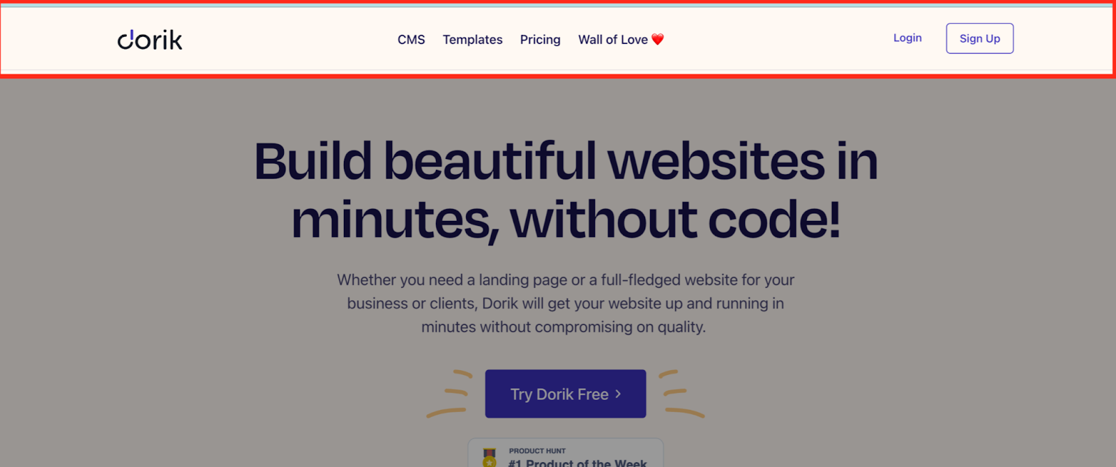
You will find enough space between the logo and the navigation. The left-sided logo easily draws visitors’ attention.
Next comes the nav menu. It includes four equally spaced out links. They stand prominent because of the effective use of white space.
There is no fuss in the header section. Visitors can navigate without being confused.
Then you’ll get two CTA buttons placed strategically on the right side of the header.
The smart design of the Sign Up button is easily noticeable. Visitors can take their desired action effortlessly.
Here I present some tips for employing white space wisely.
-
Balance: Strike a balance between white space and content to avoid overcrowding or underutilizing the available space.
-
Grouping: Use white space to group related elements together. It will be easier for users to process the information.
-
Focus: Utilize white space to direct users' attention to important elements, such as call-to-action buttons or key messages.
However, balancing the white space is a piece of cake with Dorik.
You can easily set the gaps between the links from the Link Style option.
Moreover, you can adjust the margins and padding of your header section from the Style tab.

The builder provides more amazing header customization features. So, explore them for better output.
4. Use clear & highly readable typography
Clear and highly readable typography is vital for a user-friendly website header.
If you want to show your creativity with fonts, the header is obviously not the right place.
Using complex or highly stylized fonts on the navigation menu will make it difficult to understand.
However, you can apply creative and customized typography with your logo.
For example, look at Artlogo. The website has used a handwritten format in its logo to demonstrate the nature of its work.
But the font of the nav menu is straightforward.

Tips for selecting fonts and typography styles
-
Font choice: Choose fonts that are easy to read and understand, such as sans-serif fonts like Arial, Helvetica, or Open Sans.
-
Font size: Use larger font sizes for headings and important elements. Keep body text at a comfortable reading size.
-
Consistency: Stick to a limited number of fonts (1-2) to maintain a cohesive and professional look.
-
Contrast: Use sufficient contrast between the text and the background to enhance readability.
-
Line spacing: Pay attention to line spacing (leading) to prevent text from appearing too cramped or crowded.
-
Test your typography choices on various devices and screen sizes to ensure readability across different platforms.
If you create your website using Dorik, selecting fonts and typography is a breeze.
Follow the below instructions to edit your fonts and typography.

5. Pay attention to color contrast
Color contrast plays a significant role in making your website header visually appealing and accessible.
High contrast between text and background colors ensures that your content is easily readable, even for visually impaired users.
To achieve optimal color contrast, follow the below tips:
-
Use tools like WebAIM's Color Contrast Checker to verify that your color combinations meet accessibility standards.
-
You should not use light text on light backgrounds or dark text on dark backgrounds.
-
Consider using contrasting colors for important elements, such as call-to-action buttons, to make them stand out.
6. Add visual elements only when they require
Adding visual elements to your website header can enhance its appearance. But it's essential to use them judiciously.
If you overload your header with unnecessary visuals, it can create clutter. And ultimately, it will distract users from the main content.
You can undoubtedly use icons for search bars, language switchers, location finders, shopping carts, etc.
But you should be careful while using images and videos. These elements are heavy.
As a result, they may reduce your site's loading speed.
To effectively use visual elements, pursue these practices.
-
Focus on adding visuals that support your brand identity and message.
-
Use icons or illustrations to represent key features or services, but avoid overusing them.
-
Ensure that visual elements do not interfere with the readability and functionality of your header.
7. Keep the navigation menu well-organized
Ensuring a well-organized navigation menu is one of the best practices for website header design.
It facilitates seamless navigation.
Plus, it enhances the overall user experience on your website.
Take Apple, for example:
Apple's website header features a clean and minimalist navigation menu. It allows users to quickly find what they're looking for. The navigation menu links options are neatly arranged and categorized.
Again, Amazon's header showcases a comprehensive navigation menu. It incorporates drop-down submenus. Therefore, users can access specific product categories or departments effortlessly.
To keep your navigation menu well-organized, consider the following tips:
-
Limit the number of menu items.
-
Use clear and concise labels.
-
Group related items together.
-
Consider using drop-down menus or mega menus.
-
Optimize your navigation menu for mobile devices.
-
Incorporate search functionality for quick access to specific content.
8. Add a prominent CTA button
A prominent call-to-action (CTA) button in your website header can encourage users to take the desired action.
You won't get the desired result if you can't design your CTAs perfectly.
Therefore, spend time creating winning CTAs maintaining the principles of web design.
You can follow the below principles to create an effective CTA button
-
Use a contrasting color. It will make the button stand out from the other header elements.
-
Keep the CTA text short, clear, and action-oriented (e.g., "Sign Up," "Shop Now").
-
Place the CTA button in a prominent location within the header, such as next to the navigation menu or in the center of the header.
However, if you use Dorik, you will get professionally designed CTAs with every pre-built template.
You just need to customize them as per your need.
You can edit button text, color, icon, background color, and many more.

9. Use a hamburger menu if needed
A hamburger menu is a common design element used in website headers. It is mainly used in mobile devices.
You can save space and maintain a clean layout utilizing this element.
It consists of three horizontal lines.
When clicked, it reveals the navigation menu.
It will be helpful if your website has a minimalistic UI design or a limited number of menu items.
However, remember that some users may not be familiar with the hamburger menu icon.
So, to improve site usability, consider adding a label (e.g., "Menu").
You can add a hamburger menu with Dorik in just a few clicks.
Click on the header area. Navigate to TOGGLE from the editing modal.
Turn On the switch of the Hamburger Menu on Tab Device. Insert the button text, color, etc.

10. Make your header sticky for more usability
Implementing a sticky header is a valuable technique. This particular header stays fixed at the top of the page while users scroll downwards.
If you want to create a long one-page website, a news, or an e-commerce site (with long feeds), sticky headers will benefit greatly.
No matter how far down a visitor go, it ensures the navigation elements are always visible.
Hubspot is an excellent example of a sticky header. When you scroll down, the header will shrink and stick to the top.
You can go to any page from anywhere.
That's the magic of sticky headers.
When implementing a sticky header, consider the following best practices
-
Ensure the sticky header does not occupy excessive vertical space.
-
Use subtle animations or transitions to indicate the change from a static to a sticky header, providing a smooth visual experience.
-
Confirm the sticky header is responsive and adapts well to different screen sizes and devices.
You can make your header sticky in seconds with Dorik.
From the editing modal of the header section, navigate to the “Settings & Background” option.
Then turn on the Sticky Navigation button.
That’s it!

11. Go for a transparent header only when it makes sense
In a transparent header, you will find all the header elements (logo, nav menu, CTAs, etc.). But there will be no solid background to highlight the links.
It has a see-through or translucent appearance, allowing the background content or imagery to show through the header area.
Its primary purpose is to make the content of the hero section more readable.
For example, Stripe employs a transparent one on its website.
It lets the background image peek through subtly.
This technique adds a touch of sophistication without compromising readability or functionality.

Essential Elements of an Effective Website Header Design
An effective website header design is crucial for creating a positive user experience and making a strong first impression.
Here, I am presenting some fundamental elements for designing a website header:
1. Logo placement and branding
Do you want to build your own brand?
But how?
It's your brand logo that can introduce you to the world.
Website visitors see your logo just after landing on your website.
Therefore, your logo should be prominently displayed in the header, typically in the top left corner.
This helps establish brand identity and makes it easy for users to recognize your website.
Hence, you should ensure the logo is clear, high-quality, and links to the homepage. Consider using an animated logo maker to add a dynamic touch to your brand image, creating a visually captivating logo that enhances brand recognition and engagement on your website.
2. Navigation menu
A well-organized navigation menu is elementary for helping users find their way around your website.
So, you must keep the menu simple and intuitive. Additionally, add clear labels for each section.
You should utilize a responsive design that adjusts to various screen sizes and devices.
3. Search functionality
Imagine you are browsing a small business website. It has thousands of products in multiple categories.
And you want to purchase a security camera from a particular brand.
Now, tell me, is it possible to find your preferred product manually?
Of course, not.
Then what's the solution?
Yes! It's the search functionality that can solve the problem.
Hence, if you want to create a website with massive content or inventories, consider adding a search bar in the header.
Make sure the search bar is easily accessible and visible.
Plus, it should include a clear placeholder text or icon to indicate its purpose.
4. Call-to-action buttons
Want to make the visitors click on your targeted link?
There can be nothing more practical than a CTA.
Call-to-action (CTA) buttons encourage users to take specific actions. It can be subscribing to a newsletter or purchasing a product.
So, place these buttons prominently in the header.
Use contrasting colors and clear, concise text to make them stand out.
According to Serial Position Effect, a significant web design principle and law, people tend to recall the initial and final items in a series more prominently than the others.
Therefore, set your CTAs on the top-right corner of your header.
5. Login/Register button
If you run a membership website, Login/Register button is a must for you.
Ask yourself, where will you put this button on your website?
Indeed, you won't place it in the footer section.
The header is the best location because visitors see it first.
This makes it easy for users to access their accounts or sign up for your services.
6. Social media links
It's not mandatory to add social media links to your header.
Most business websites don't follow this trend.
For example, the Coca-Cola Company did not use its social links in the header. Instead, it positions them in the footer section.
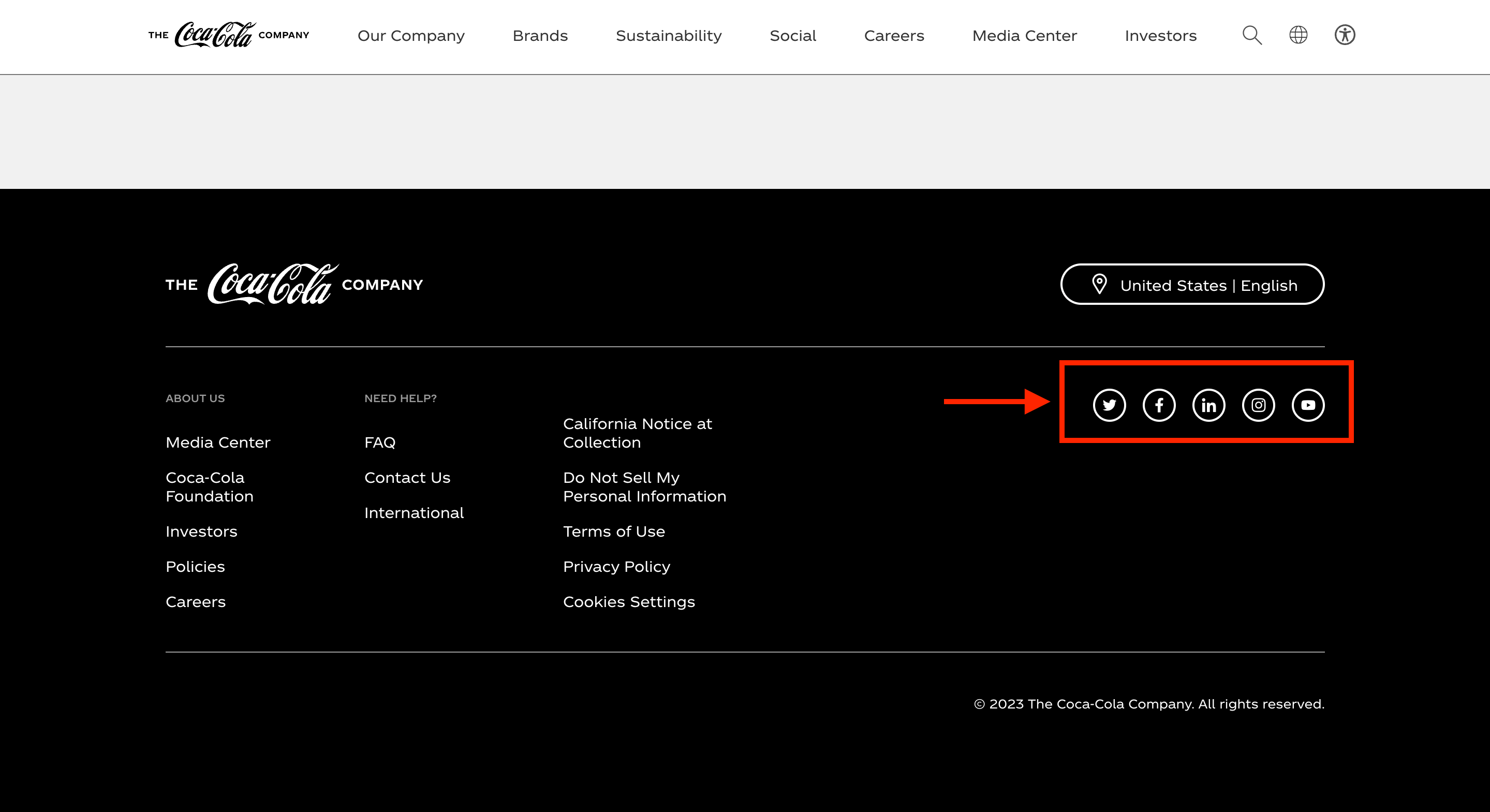
But if you have a portfolio website or a personal website, you can incorporate your social links in the header section.
It will increase your reach and foster a sense of community.
7. Language switcher button
If you have a multilingual website, include a language switcher button in the header.
This allows users to select their preferred language easily and improves the overall user experience.
For instance: Airbnb's website header features a language switcher button indicated by a language abbreviation.
When clicked, a menu appears with different language choices.
In fact, this element is mostly seen in large or small business websites.
To implement a language switcher button effectively, consider the following tips
-
Use a recognizable language icon, such as a globe or language abbreviation.
-
Place the button in a prominent location within the header.
-
Design the button to be visually distinct, making it stand out within the header.
-
Provide a dropdown or menu that displays available language options when the button is clicked.
-
Ensure that switching languages dynamically updates the website content to the selected language.
8. Shopping cart of e-commerce site
The shopping cart is a fundamental component of an e-commerce website's header. It helps users to manage their selected products and proceed to checkout.
Here's how the shopping cart is typically represented in the header of an e-commerce site:
Amazon's header prominently displays a shopping cart icon with a count of the items added.
Users can hover over the cart icon to preview their cart's contents quickly.
Etsy's header features a shopping cart icon and the current item count.
Clicking on the icon takes users directly to their shopping cart page.
To optimize the shopping cart in your e-commerce website header, consider the following:
-
Use a recognizable shopping cart icon that users associate with online shopping.
-
Display the item count or a summary of the cart's contents for easy reference.
-
Make the shopping cart icon clickable, leading users to the cart page for detailed information.
-
Provide options for users to easily add or remove items, update quantities, and proceed to checkout.
-
Ensure the shopping cart is always visible from any page on the website.
Case Studies: Examples of Exceptional Website Header Designs
In this section, we will explore case studies of websites with exceptional header designs.
These examples demonstrate how thoughtful and creative approaches to header design can enhance user experience and leave a lasting impression.
Dropbox

Dropbox's header design is sleek and minimalist. It features a simple logo and a clear call-to-action button for signing in or creating an account.
The use of ample white space and a subtle background image creates a clean and focused aesthetic.
Stripe

Stripe's website header design stands out with its bold color scheme and dynamic elements.
The header incorporates a scrolling animation that showcases various features and benefits of their services.
It captures users' attention and engages them right from the start.
Nike

Nike header design combines strong visuals with intuitive navigation.
It showcases dynamic product images. Plus, it highlights their latest offerings.
The header also includes prominent calls to action, encouraging users to explore specific product categories or customize their own shoes.
TED

TED header design is simple yet impactful.
It prominently features the TED logo and a search bar.
It lets users discover inspiring talks.
The concise and well-organized navigation menu provides easy access to different content categories and events.
GitHub

The GitHub header design is clean and functional, catering to its developer-focused audience.
The header includes a search bar, repository navigation, and user account options.
It provides quick access to essential features while maintaining a minimalist, uncluttered appearance.
FAQs on Best Practices for Website Header Design, Answered
1. What Is a Website Header?
A website header refers to the top section of a web page that is consistently present across all pages of a website. It typically includes elements such as the website's logo, navigation menu, and essential information.
2. Types of Website Headers
There are several types of website and also different types headers. Some of them include
-
Static headers
-
Sticky headers
-
Responsive headers
-
Minimalist headers
-
Hero headers
-
Double menu headers
3. Is a header important for SEO?
Yes, the header is essential for SEO. It typically contains important elements such as the website's logo, which can be tagged with an "alt" attribute for better image SEO.
The main navigation menu helps search engines understand the site's structure.
Additionally, a well-designed header can improve user experience, which search engines consider while ranking websites.
If you want to learn more about the SEO of your website, read the following article.
4. Do all websites need a header?
While not every website is required to have a header, it is generally recommended for most sites.
A header provides a consistent and recognizable element across all pages, making it easier for users to navigate and interact with the website.
Apply the Best Practices and Make Your Header Prominent
A great header design is essential for your website. So, make it easy to use, focus on navigation, and stay consistent.
Use a design that works on all devices and add your brand's touch.
If you follow these best practices for website header design, your header will look great and help your website work better for everyone.
However, you can design your header professionally with Dorik. All the standards are met here.
