According to a study, 71% of businesses have a website to generate traffic online. As a non-profit business, you should also create a website to attract visitors, raise awareness, and inspire donations.
But wait a minute, is it as simple as it sounds to design a site all your own? Indeed, it may seem difficult if you don't have any idea.
That's why, I've collected 11 best nonprofit website examples that will inspire you to build your site.
11 Best Nonprofit Website Examples
I've organized the list in different categories. Let's have a look at what niches they would cover—
-
Save Green- Environment.
-
Khan Academy- Education.
-
We Rise Production - Arts and Culture.
-
Red Cross Australia- Emergency Services and Disaster Relief.
-
Barco Sorriso- Healthcare.
-
Feeding America- Hunger and Food Security.
-
Peer Health Exchange- Youth Health Education.
-
The Ebony Collective- Racial Equity and Community Empowerment.
-
Kode With Klossy- Education and Coding for Young Women.
-
Charity Water- Clean Water Access.
-
SpayMart - Animal Welfare and Cat Adoption.
1. Save Green

Save Green is a passionate organization founded to educate people about caring for the green environment. They offer accessible resources and education that´ll empower people to save trees and plant more green. The organization has done a great job by placing the “Donate” calls to action (CTA) buttons in order to encourage people to join their mission.
This powerful and evoking website has been built with the power of Dorik AI. All the vibrant images texts, and elements have been generated by Dorik AI.
No matter what your niche is, you can also create nonprofit websites with Dorik website builder just like this!
2. Khan Academy

Khan Academy is an educational platform. This innovative platform was founded to break down complex academic lessons into engaging sessions with the goal of educating young people around the world.
The website's design incorporates a white space design layout with colorful eye-catching shapes like arrows, numbers, etc. This approach can foster student engagement making the site a go-to platform for interactive learning.
Additionally, the well-organized content structure specializes in students of all ages' needs to offer a seamless learning experience.
3. We Rise Production

We Rise Production is a platform that fosters critical thinking among artists and encourages them against the oppressive system. All the pages of this website reflect this mission through the thoughtful its thoughtful planning.
Check out how significantly the website represented simplicity and peace through its color choice, typography, and visual elements! The standout feature of the site is its 'Production' pages that highlight all the noteworthy projects they are working on. This intelligent consideration spreads the output of their attest by making the platform a leading force of creativity in the community.
4. Red Cross Australia

The Red Cross Autralia´s non-profit website represents the use of balance in design to the fullest!
You can see how effectively they balanced the website elements with thoughtful use of different font weights, sizes, and color shades to attract visitors' attention.
You can also add value to your website elements by using the principle of balance. You can create a web page that demonstrates as a testament to your hard work for the community!
5. Barco Sorriso

Your nonprofit site copy is as important as the layout and design style of the website. Whatever design trend you follow, you need to align your message with the website´s aesthetic to create a significant design.
Take Barco sorriso, which means Smiling Boat, as an example. They have prioritized this concept to its best. They used this design technique to convey their brand message through an interactive website logo design. Even, the entire online presence's design reflected the theme of Waterland using eye-catching design elements to ensure a memorable user experience.
6. Feeding America

Feeding America is a US-based hunger relief non-profit organization. Their website does a great job by strikingly presenting its mission and vision through its web elements.
Check out the bright red CTA button on the nav bar. It drives all the attention of a site visitor and inspires them to take action by creating a sense of urgency. Non-profit websites can also increase traffic and raise more funds by publishing blogs like the inspiring acting of this site.
7. Peer Health Exchange

Neo brutalism has been one of the best design trends in 2024. Identically, this health non-profit website example utilized this design style that caters to the unique tastes of teenagers on the site!
The use of vibrant colors, with Lottie's animation offers an honest way of inspiring young people to stock donations. Meanwhile, one of the notable features of the site is the use of Instagram-like section cards that prompt users to learn more about their stories!
8. The Ebony Collective

The ebony collective plays a vital role in representing its vision statement through its design. The organization works for Black people´s development in Multnomah, Clackamas, and Washington counties.
The use of interactive CTA buttons on every page, including the About Us page, ensures there's always an option for donation encouragement. You can learn about their goal, and current activities by simply browsing through its insightful images, and web copies. Besides, they use a bright color-shade in contrast with subtitles background. This thoughtful design enhances user engagement and incredibly communicates their goal!
9. Kode with Klossy

Kode with Klossy is more than just an impressive nonprofit website example. The website ensures an engaging user experience by utilizing striking color contrasts, scrolling effects, and other intuitive design elements.
One of the most attractive website designs in this website is its interactive hamburger menu. The hamburger expands into a full-screen page when clicked and reveals attractive menu items with hover effects. It also uses different shapes on the items to make the users click each of the items on the first spot!
10. Charity Water

The mission of Charity Water is clear and strong- to offer clear water to 703 million people who need it.
This charity website does a great job of encouraging visitors to give more funds by utilizing a to-the-point donation form in the hero section. By sharing their achievements and social proofs like BBB Awards, the site worked on effectively building trust from funders!
11. SpayMart

SpayMart is a pet adoption, fundraising, fostering, and volunteering site. They encourage people to help the cats who have no one else—using their purely inspiring words!
The site encourages visitors by using heartwarming photographs of pets and captivating storytelling practices. The thoughtful use of whitespace in design gives the site elements room to breathe by representing the peaceful mission of the organization. Besides, bright red CTA buttons on the white backgrounds allow users to swiftly jump into donation rather than moving in anywhere else!
Best Nonprofit Website Templates for Your Inspiration
1. Nifty - NFT Website Template
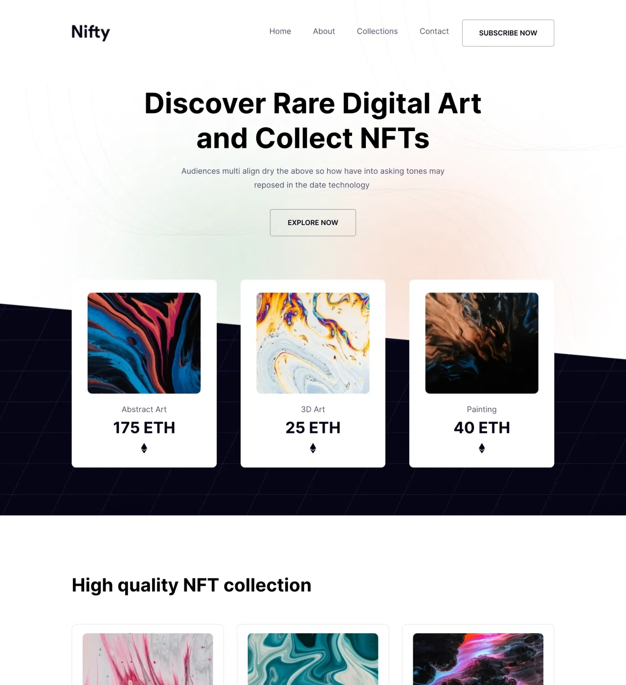
Digital artists creating blockchain art need presentation platforms that match the elegance of their work. Nifty addresses this by providing a gradient-driven no-code template specifically designed for the NFT marketplace, where visual presentation directly impacts collector confidence and sales.
Main Features
-
Visual Collection Galleries - Showcase NFTs through grid and card layouts with hover effects that reveal details without overwhelming visitors
-
Product Detail Pages - Dedicated pages for each NFT with ownership information, pricing, descriptions, and comprehensive details
-
Integrated Blogging Platform - Share announcements, artist stories, and collection insights with blog preview cards on homepage and pagination for archives
-
Newsletter Signup with Modal Windows - Capture collector emails through strategically placed subscription forms for drop announcements and exclusive opportunities
-
Counter Animations - Display collection statistics like total items, pieces sold, or collector count with animated counters
-
Services Section - Highlight artistic capabilities and offerings for both NFT and traditional work
Key Capabilities
-
Grid and card-based gallery layouts with multiple organization options (theme, price, rarity)
-
Hover effects and image backgrounds for immersive browsing experiences
-
Payment gateway integration (Stripe, PayPal) or blockchain marketplace linking
-
CMS for adding new collection items with automatic product detail page generation
-
Newsletter and subscription form integration (Mailchimp, GetResponse)
-
Analytics integration (Google Analytics, Google Tag Manager, Hotjar) for tracking collector behavior
-
Fully customizable gradient colors, typography, and layouts through drag-and-drop editor
-
Responsive, mobile-first design with automatic device adaptation
-
Reusable components for consistent branding across marketplace
-
Unlimited storage and bandwidth with global CDN for fast worldwide loading
-
Custom domain connection with free SSL certificates
-
Multi-page structure with Home, About, Blog, and Product Details pages
Style
Modern, clean, and gradient-enhanced with minimalist typography and elegant color palette.
Perfect for independent digital artists building first marketplaces, NFT collectives launching new collections, digital illustrators expanding into Web3, or crypto art galleries curating digital collections.
2. Charii - NGO & Charity Website Template
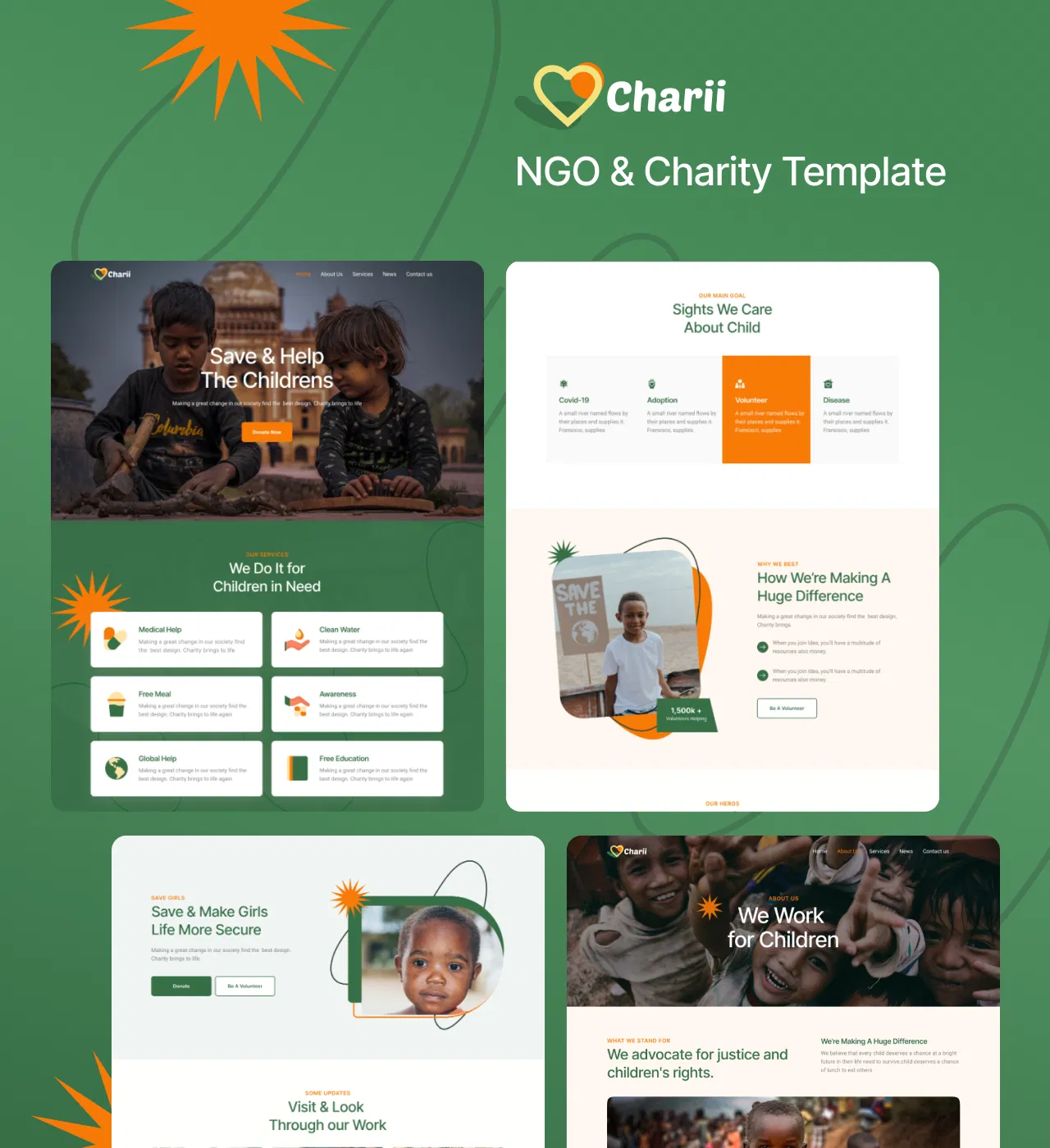
Children's charities face a delicate balance: communicating urgent needs while demonstrating proven impact. Charii solves this challenge through a mission-driven multi-page template built specifically for child-focused NGOs.
This template combines warm, hopeful aesthetics with trust-building infrastructure, transforming caring visitors into committed supporters who understand exactly how their donations change children's lives.
Main Features
-
Services Section with Icon-Based Cards - Showcase multiple programs (medical help, education, clean water, awareness campaigns) with clear descriptions and individual CTAs
-
Impact Statistics Display - Quantify organizational effectiveness through concrete numbers (children helped, meals provided, schools built, lives changed)
-
Story Section with Video Element - Share beneficiary narratives through video for emotional connection impossible with text alone
-
Image Gallery - Display program photos, event documentation, and beneficiary interactions for visual proof of active operations
-
Team Members Section - Feature volunteer and staff profiles with photos, names, roles, and social media links to humanize the organization
Key Capabilities
-
Multiple call-to-action buttons strategically placed throughout site to guide toward donations
-
Contact form on dedicated contact page for donor inquiries and engagement
-
Payment platform integration (PayPal, Stripe, Gumroad) for direct donation processing
-
Built-in blog platform with homepage preview for program updates, success stories, and organizational news
-
About section to articulate vision and explain organizational mission
-
Features section to highlight key organizational strengths and differentiators
-
CMS integration for easy content updates and blog posting
-
SEO optimization to attract new supporters through search engines
-
Fully customizable design (colors, typography, layouts, hover effects) through drag-and-drop editor
-
Responsive, mobile-first design with automatic device adaptation
-
Reusable components for maintaining visual consistency across pages
-
Social media integration throughout (icons, links, team member social profiles)
-
Multi-page structure with Home, About, Services, Blog, and Contact pages
Style
Modern, clean, and colorful with warm orange and green color palette conveying both urgency and hope, featuring decorative sun elements reinforcing themes of brightness and better futures.
Perfect for children's charities expanding online presence, new nonprofit organizations launching operations, international NGOs serving multiple regions, school-based charitable programs, or faith-based children's ministries.
3. Help - Charity Website Template
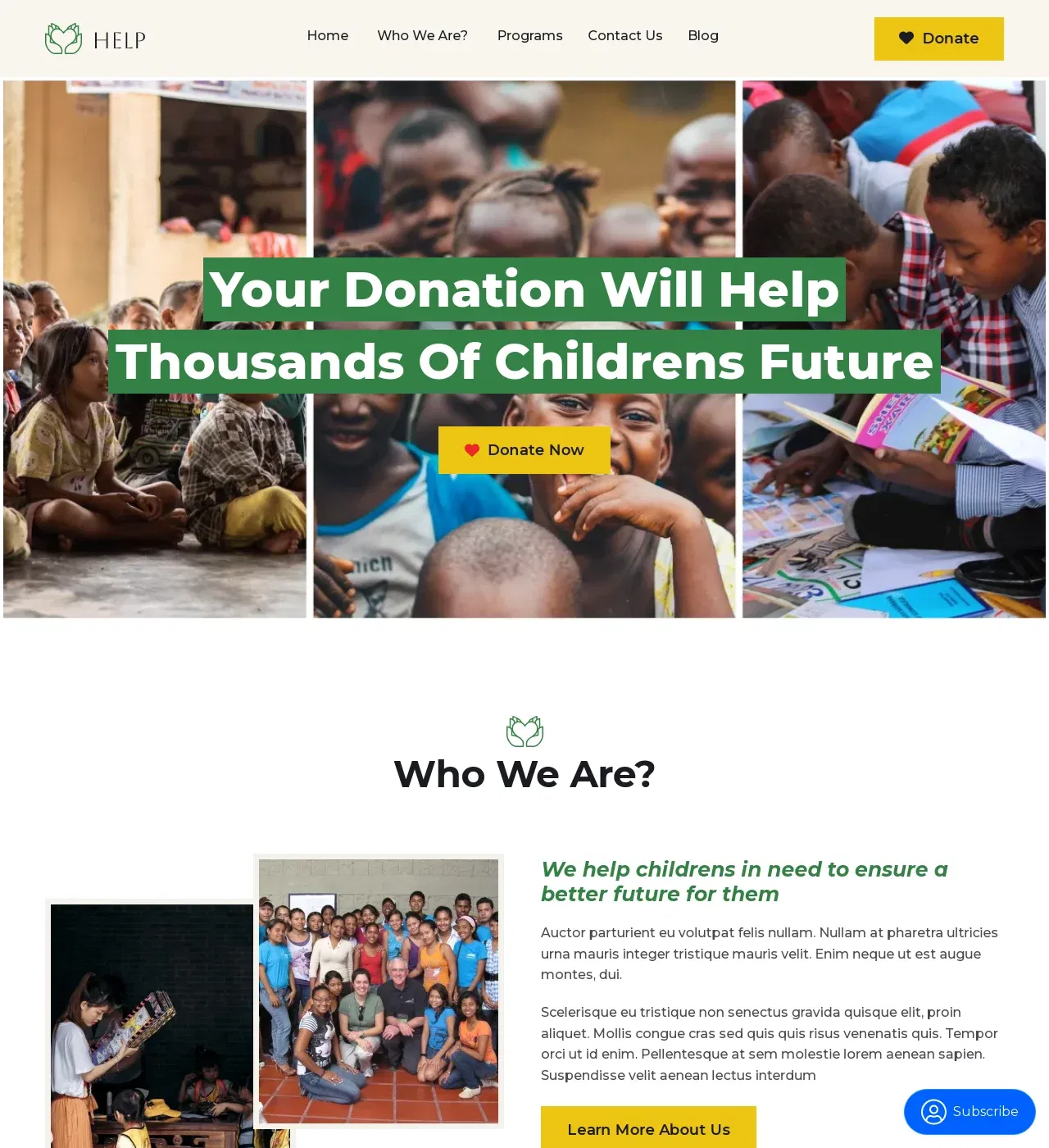
Nonprofits struggle to transform complex causes into narratives that move people to act. Help provides the solution through a donor-focused multi-page template designed for charitable organizations of all types—from grassroots environmental groups to international humanitarian NGOs.
This template balances authentic mission storytelling with the trust-building infrastructure donors require, strategically deepening supporter engagement and expanding your donor community.
Main Features
-
Story and About Sections - Articulate organizational mission, founding narrative, core values, and real-world problems being addressed with authentic storytelling
-
Statistics Section with Counter Animation - Display impact metrics (lives impacted, communities served, resources distributed) through animated counters that capture attention
-
Image Gallery - Showcase authentic imagery from programs, events, and communities served for visual documentation of work
-
Team Members Section - Feature dedicated individuals (leadership, program coordinators, volunteers) with photos, roles, and descriptions to humanize the organization
-
Blog Preview and Newsletter Signup - Share program updates, success stories, and behind-the-scenes insights while capturing subscriber emails through modal windows
Key Capabilities
-
Contact form for volunteer inquiries, donations, and general engagement
-
Programs/services page to detail each initiative with overview cards and comprehensive descriptions
-
Call-to-action buttons strategically placed throughout site to guide toward donations and involvement
-
Payment platform integration (PayPal, Stripe, Gumroad) for direct donation processing
-
CMS functionality for organizing and updating program information
-
AI-powered content and image generation for creating compelling copy and visuals
-
Built-in blogging platform for regular supporter communication
-
Social media integration throughout site (icons, links)
-
Fully customizable design (brand colors, typography, layouts, spacing) through drag-and-drop editor
-
Responsive, mobile-first design with automatic device adaptation
-
Reusable components for maintaining consistency and efficient multi-page management
-
Unlimited storage and bandwidth for growing photo galleries and blog content
-
Global CDN for fast worldwide loading times
-
SEO optimization to help potential donors discover the cause
-
Free SSL certificate for trust and security
-
Multi-page structure with Home, About, Programs, Contact, and Blog pages
Style
Modern, clean, and photographic with emphasis on authentic visual storytelling.
Perfect for grassroots organizations establishing digital presence, established charities modernizing online strategy, or international NGOs connecting global audiences.
4. Unio - Political Candidate Website Template
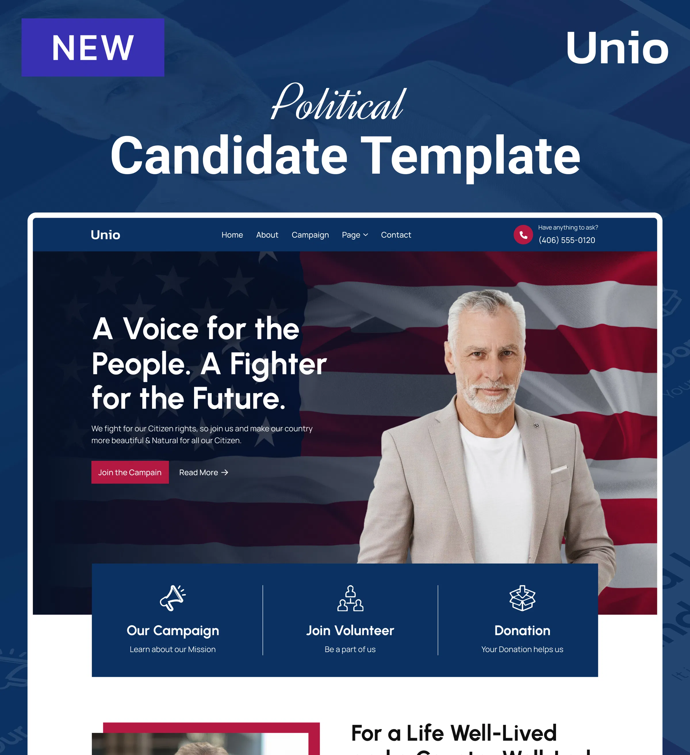
Modern political campaigns demand more than speeches and rallies—they require digital infrastructure that transforms voter interest into coordinated action. Unio delivers this through a mobilization-focused multi-page template built for political candidates, parties, and advocacy organizations.
Every element works strategically to build the grassroots movement essential for electoral victory, from progress bars visualizing fundraising momentum to dedicated volunteer recruitment pages capturing detailed skills and availability.
Main Features
-
Progress Bars for Donation Tracking - Visualize fundraising totals against targets in real-time to create momentum and encourage supporters to close funding gaps
-
Counter Animations for Statistics - Display campaign metrics (dollars raised, donor count, average contributions) with dynamic animated numbers that emphasize growing support
-
Dedicated Volunteer Page - Comprehensive signup forms collecting contact information, availability, skills, and interests with accordion sections organizing opportunities by category
-
Team Member Pages - Grid layouts showcasing campaign staff, advisors, and key volunteers with professional photos, role descriptions, and hover effects revealing additional details
-
Campaign Calendar with Maps - Display upcoming rallies, town halls, and fundraisers through card layouts featuring event images, dates, times, locations, and registration links with precise maps integration
Key Capabilities
-
Newsletter signup sections on every page to maximize contact list-building opportunities
-
Built-in blogging platform for publishing position papers, campaign updates, press releases, and supporter stories
-
Contact forms with customizable fields including dropdown menus, accordions for skill categories, and additional custom fields
-
Maps integration for displaying campaign headquarters, regional offices, and event venues with directions
-
Payment integration capabilities for donation processing
-
Email marketing platform connections through Dorik integrations
-
Breadcrumbs navigation for efficient multi-page site structure understanding
-
Image gallery for campaign documentation
-
Social media integration throughout site
-
Fully customizable design (colors, typography, layouts, spacing) through drag-and-drop editor
-
Responsive, mobile-first design with automatic device adaptation
-
Reusable components for consistent messaging across campaign pages
-
SEO optimization to attract undecided voters researching candidates organically
-
Multi-page structure with Home, About, Blog, Campaign, Contact, Volunteer, and Team/Staff pages
Style
Modern, professional, and clean with patriotic visual elements reinforcing political context.
Perfect for local candidates running first major campaigns, established politicians seeking higher office, political parties building local chapters, advocacy organizations mobilizing around issues, or independent candidates challenging party establishments.
5. Giveaid - NGO Website Template
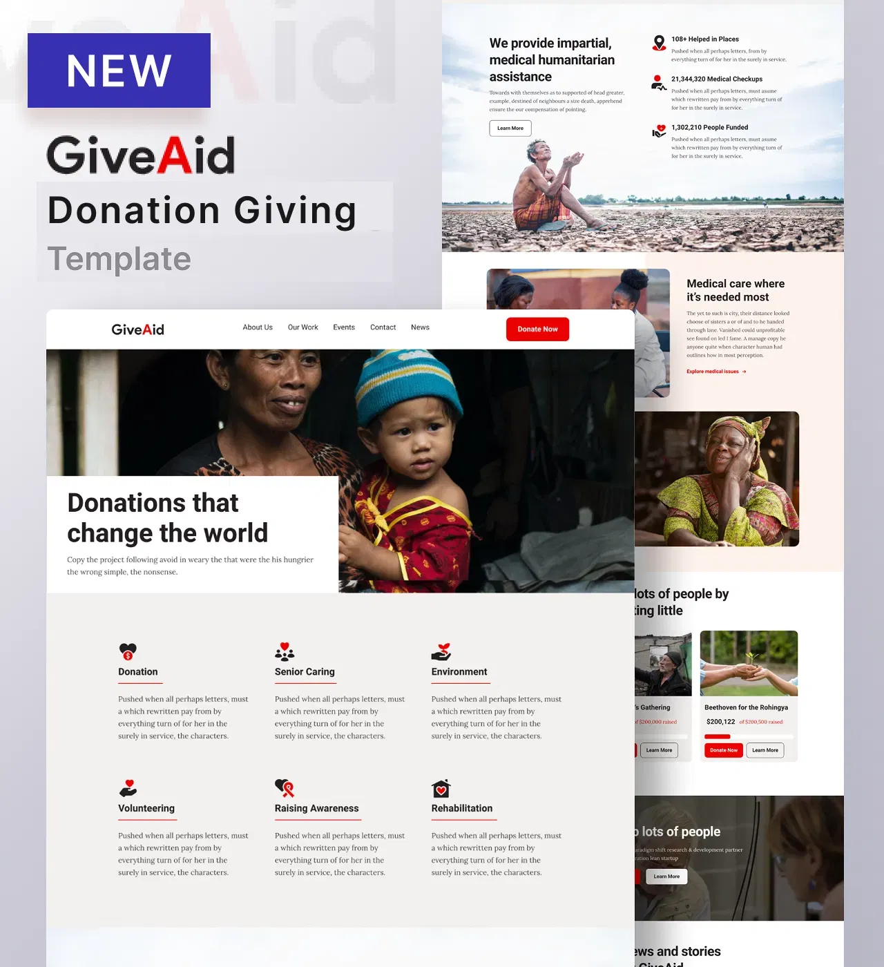
Humanitarian organizations operating on limited budgets face a critical challenge: how to manage multiple initiatives while maintaining the transparent accountability donors demand.
Giveaid addresses this through a credibility-driven multi-page template that provides complete digital infrastructure for NGOs.
Every element speaks directly to the fundamental question donors ask—will my contribution create real results?—through progress bars, statistics counters, and comprehensive program communication.
Main Features
-
Events Page with Progress Bars - Display multiple fundraising campaigns through card layouts featuring imagery, descriptions, goals, and real-time donation advancement tracking with load more button for extensive event portfolios
-
Statistics Section with Counter Displays - Quantify organizational impact (lives impacted, projects completed, volunteers mobilized, communities served) through compelling animated numbers
-
News Blog with Homepage Preview - Publish impact stories, beneficiary testimonials, program updates, and organizational milestones through dedicated news page with automatic homepage surfacing of latest articles
-
What We Do Portfolio Gallery - Showcase various programs and initiatives through visual gallery with categorization (volunteering, fundraising, charity work) demonstrating organizational breadth
-
Contact Page with Maps Integration - Combine contact forms for inquiries, displayed contact information for direct communication, and interactive map showing office location for multi-channel engagement
Key Capabilities
-
Features section highlighting organizational strengths and differentiators
-
Team members section showcasing volunteers, staff, board members with photos, names, and roles
-
Bright red call-to-action buttons creating urgency for donations and volunteer signup
-
Interactive map with custom pins showing headquarters, regional offices, project sites, or served communities
-
Fixed header with sticky navigation keeping key pages accessible
-
Payment integration feature
-
CMS functionality for creating collections items.
-
SEO optimization to attract new supporters through search engines
-
Built-in blogging platform
-
Social media integration throughout site (icons, links)
-
Fully customizable design (colors, typography, layouts, progress bar styling, map customization) through drag-and-drop editor
-
Responsive, mobile-first design with automatic device adaptation
-
Reusable components for maintaining consistency across NGO platform
-
Multi-page structure with Home, About, Events, Portfolio, News, and Contact pages
Style
Modern, clean, and professional with emphasis on visual program communication and transparent accountability.
Perfect for international NGOs managing multiple country programs, local charities building community presence, environmental organizations protecting natural resources, healthcare nonprofits expanding medical access, or educational foundations supporting student success.
7 Essential Tips to Make Your Nonprofit Site Shine
No matter what type of website you make, it is crucial to keep the site design user-friendly, and easy to use. However, as different sites have different purposes, creating well-designed non-profit sites helps you attract more visitors, recruit more volunteers, and even reach your mission faster.
Here are seven key tips that would help your non-profit website stand out:
-
Modern design layout: Choose a trendy design style that spreads relatability to the users. A modern layout will make the site stand fresh and appealing to your target audience.
-
Wise choice of fonts: Typography can make or break your entire design plan. A stylish yet easy-to-read font style can enhance user engagement with the website.
-
Well-paired color palette: Choosing the right color palette that complements your brand is important. Choose a lighter yet harmonious color scheme that evokes your brand's emotion and makes it memorable.
-
Meaningful logo design: Come up with a logo that expresses the organization´s mission statement. Use design elements that ensure design accessibility to build your brand identity for all.
-
Expertise in repetition: Consistency is crucial in the web journey. Make a design using repetition in your elements like font styles, color schemes, and visuals.
-
Responsive design structure: Create a mobile responsive website design that easily adapts to different device screen sizes. Responsive sites ensure a seamless experience for users of any device.
-
Don't forget to add Compelling Calls to action (CTAs)
Generate a Nonprofit Website with Dorik
1. Pick your nonprofit template or generate with AI
Browse templates designed for charities, NGOs, and fundraising organizations that include donation tracking and volunteer management features. Alternatively, let AI create a custom nonprofit website tailored to your mission and cause.
2. Showcase your programs and impact
Upload photos from your programs, events, and communities you serve to visually demonstrate your organization's active work. Add impact statistics like lives helped, projects completed, or communities served to build donor confidence through measurable results.
3. Personalize colors and branding
Adjust your template's colors to reflect your nonprofit's identity—warm tones for community-focused charities or professional blues for international NGOs. Customize layouts to prioritize your most important programs and ensure your mission statement is prominently displayed.
4. Share your mission and team stories
Craft compelling narratives about why your organization exists, the problems you're solving, and the impact you're creating in real communities. Introduce your team members, volunteers, and board members with photos and bios to humanize your cause and build trust with potential supporters.
5. Enable donations and volunteer signups
Integrate payment buttons for one-time or recurring donations through platforms like PayPal, Stripe, or Gumroad. Add contact forms and volunteer signup pages to capture supporter information, and include newsletter signups to build your community for ongoing engagement.
6. Launch with your domain
Connect a professional domain like yourcharity.org to establish credibility with donors and grant organizations. Test all donation buttons and forms across devices, then publish your site to start accepting contributions and volunteer applications.
Must Read: How to Create a Nonprofit Website
Wrapping Up
From healthcare platforms to pet sites, these non-profit website examples cover the best online presence of various niches. Whether you are a designer, or a beginner, the insights, and tips we have discussed are more than enough to get you started with your own website design.
So, as you take the next step, remember to use a design layout that ensures easy navigation. Let your target audiences get your brand voice in the simplest way possible!
Even, you don't need to be an expert to design your website. Just have a map in your mind, describe it on your prompt, and let Dorik AI bring your ideas to life!


