Your website's homepage is the gateway to your brand. It displays your value and expertise and entices visitors to explore further.
A good-quality homepage helps you increase conversion and revenue and decrease your overall bounce rate. A bad homepage, on the other hand, does the opposite.
Therefore, you need to build a professional and captivating homepage to take your online presence to a new height. However, creating such a homepage comes with its fair share of challenges.
Don’t be afraid! This comprehensive guide reveals the secrets of 'how to create a homepage' that leaves a lasting impact.
Read on to craft a homepage that drives business growth.
Must-Have Elements to Create a User-Centric Homepage
A homepage contains some fundamental elements that you must keep to make your homepage professional, attract potential customers, and increase conversions.
Let me help you to unveil and optimize your homepage with all the must-have elements. These homepage design tips will make your page more converting.
1. Logo and Theme
A logo is the first identity of a business. A logo visually represents your brand, making it instantly recognizable. It helps visitors remember your brand and return to your website.
Similarly, the theme is an essential element of a website's homepage. A visually appealing and well-organized theme makes navigation easy and enjoyable.
An attractive logo and a theme can capture visitors' attention and encourage them to explore your website. Therefore, your homepage must feature these two essential elements.
2. Navigation Bar
The navigation bar plays a crucial role. It helps to navigate quickly to different web pages of a website. It should be concise and legible.
3. Strong Call-to-Action (CTA)
An impactful and persuasive call-to-action (CTA) motivates visitors to purchase or subscribe to newsletters. Keep the CTA copy and content strong so visitors can click on it.
👉 Check out the Top Reasons Why Your Homepage Video Fails
4. Updated Hero Section
The Hero Section is the first impression of a website. An engaging hero section converts visitors into leads. It should be most engaging to keep visitors on your website for longer.
You will need to create an engaging copy with the target keyword here. The hero section is about more than just engaging copy.
5. Headings
The heading is one of the most essential elements of a homepage. It helps Google crawler to pick important information from a homepage. Highlight crucial data for visitors by using H1, H2, etc tags.
6. Graphical Content
Graphical content is another must-have element for a homepage. It is proven that visuals are more impressive than copies on a homepage. So, keep visuals in the hero sections and in the other sections, too.
Make sure visuals are high quality and relevant to your business website niche. According to Hostinger, site visitors spend 88% more time on the page with videos.
7. Features and Services
Highlighting the value you offer to your customers is crucial. Especially when selling products or services and retaining their loyalty.
Highlighted features direct site visitors to take action.
The homepage is not a page where you should write a blog on various topics but a page where you can highlight some of your services, your website’s mission, your projects, and more with concise words.
So, keep your feature-related content clear and concise.
8. Testimonials
Testimonials or social proofs take your homepage to the next level. If you are a freelancer or run a business where you need to showcase your portfolio, you must feature testimonials on the homepage to build a lasting impression and attract new clients.
90% of customers admitted that they purchased after checking the testimonials of a website.
If you do not have any testimonials yet, ask for a testimonial from your customers and enrich your website homepage.
9. Content Below the Fold
The bottom part of your homepage will change depending on what your website is about. This "below the fold" area is what people see when they scroll down. What you put here will depend on your website's purpose.
For example, some websites use their homepage like a sales page. They might include customer reviews, social proof, information about their products or services, and more.
Other websites might list their blog posts, share company information, or have something completely different.
There are numerous elements to include in this section according to your website niche, requirements, and value proposition. You can add a contact form, FAQs, subscription form, team introduction, etc.
Make sure the element you are using is genuinely necessary for your homepage. Otherwise, avoid maximizing your homepage with unnecessary elements.
10. Engaging Footer
A footer is a homepage section that speaks about the whole site. Make it capable enough for visitors to visit any page from your footer. Add essential links, but keep it clear and concise.
You should include essential page links in your footer. For example: Sign up box, terms and conditions, contact us, privacy policy page, etc. To gather inspiration, explore the designs and examples of footers and incorporate them into your website.
Practical Tips to Consider While You Design a Homepage
You now know what elements to include in your homepage. It’s time to know how to design a homepage to increase conversions and reduce bounce rates. That said, let’s get straight into the topic.
I. Pay Attention to the Combination of Color Scheme and Background
A unique homepage needs time and careful planning. Your homepage’s background and color scheme play a major role in drawing visitors in and encouraging them to stay.
So, select colors that align with your brand and appeal to your audience's emotions.
II. Maintain a clear and user-friendly layout
A clean, organized layout allows users to browse your website easily. Place elements where users expect them so they can navigate quickly without searching for specific buttons.
III. Strategically Place CTAs
As you may know, a call to action (CTA) encourages users to take specific steps on a website.
Clickable buttons are the most common form of CTA because they draw attention and prompt quick responses. Therefore, focus on designing and placing strong CTA buttons to increase engagement on your homepage.
IV. Use High-Quality Graphical Content
Ensure that you use high-quality graphical content on the homepage. If you utilize images, make sure every image is high resolution. Low-resolution images appear blurry and can negatively impact the user experience.
Additionally, optimize your homepage for responsiveness to ensure images load quickly. Besides using high-resolution images, include videos and animations to enhance your homepage design.
These items can add a professional touch to the homepage, boost customer engagement, and strengthen your brand image.
Pro tip: Use smooth and dynamic animations to create a memorable homepage.
V. Include High-Quality and Updated Content
Your site's content should be special and high-quality. It must be fresh and relevant to keep visitors coming back. Outdated information can turn people away.
VI. Ensure an Engaging Experience for the User
If users enjoy browsing your homepage for a long time, that's a good sign. To keep them engaged, your website should be easy to use. Hence, spend a lot of time to ensure your homepage is user-friendly.
VII. Make the Homepage Responsive
A responsive homepage is crucial because it adapts to different screen sizes, ensuring a seamless user experience across all devices.
A responsive homepage allows users to easily navigate your site on any device, whether a desktop, tablet, or smartphone.
Besides this, responsive design often leads to faster load times, reducing user frustration. Having such a page will help you in SEO as well. For your information, Google prioritizes mobile-friendly websites in search results.
A responsive design can improve your website's overall SEO performance.
VIII. Add Live Chat Support
it's important to offer live chat support on every website page, especially the homepage, to keep customers happy. This way, customers can quickly get help with their questions anytime.
Having a live chat or a customer service representative available 24/7 can significantly improve customer satisfaction.
So, these are the primary tips you should consider while designing a homepage. Let’s now discuss how to create such a page with ease.
How to Create a Homepage?
When you are building a website, homepage creation is always the priority. So, it is high time you designed an effective homepage for your website with the elements we discussed already.
You can create your homepage by hiring a designer. But this might cost you a lot, and you might not like the end result.
What if I said you can create a homepage independently, even if you don't have any previous design or coding experience?
Many website builders are available on the market, and they allow you to create entire websites without writing a single line of code.
All you need to do is find the best website builder that fits your needs. We recommend using Dorik to create your homepage.
Why? Because it's the easiest website builder on the planet. If you spend only 5-10 minutes learning this builder's basics, you can create a fully functioning website within an hour.
Here, we can create a homepage in 3 ways using Dorik: With AI, With a pre-built template, and From scratch. You can follow these three methods if you choose Dorik’s CMS option.
However, you can build a homepage using four methods if you select the Static option. Once you choose the Static site option, you can utilize those three website-creation methods mentioned above.
Additionally, you can follow this method: Upload a JSON file. This technique is for advanced users who know how to build a homepage with a JSON file.
However, I will discuss three major methods under the CMS option to keep this article beginner-friendly for building a website. Let's roll up our sleeves and dive in.
How to Make a Homepage with AI
1. First, sign up with Dorik if you haven’t registered an account yet. Then,
2. Head to Sites > CMS.
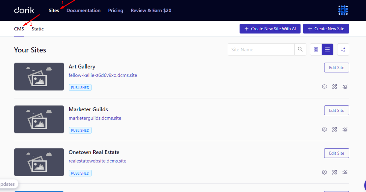
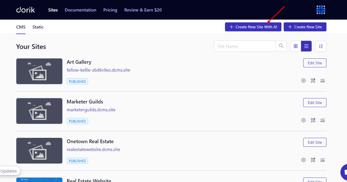
3. Tap the “+ Create New Site With AI” button.
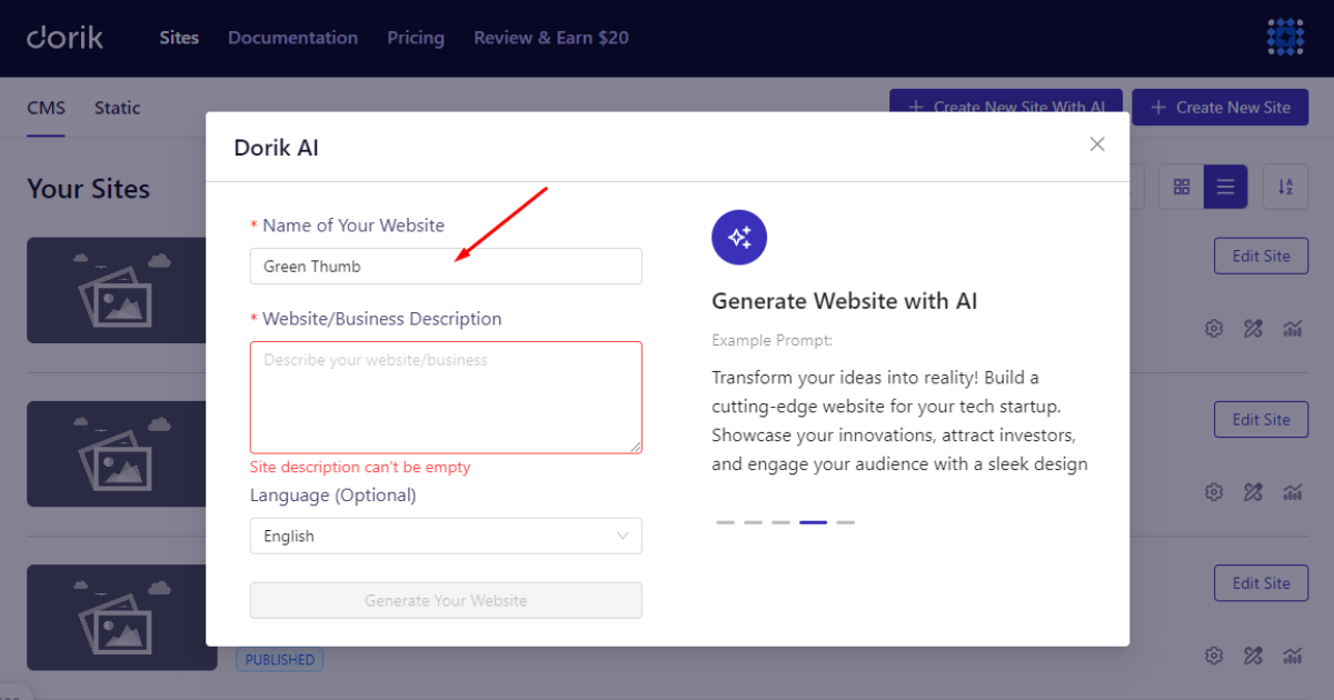
4. Now, write your homepage/website name.
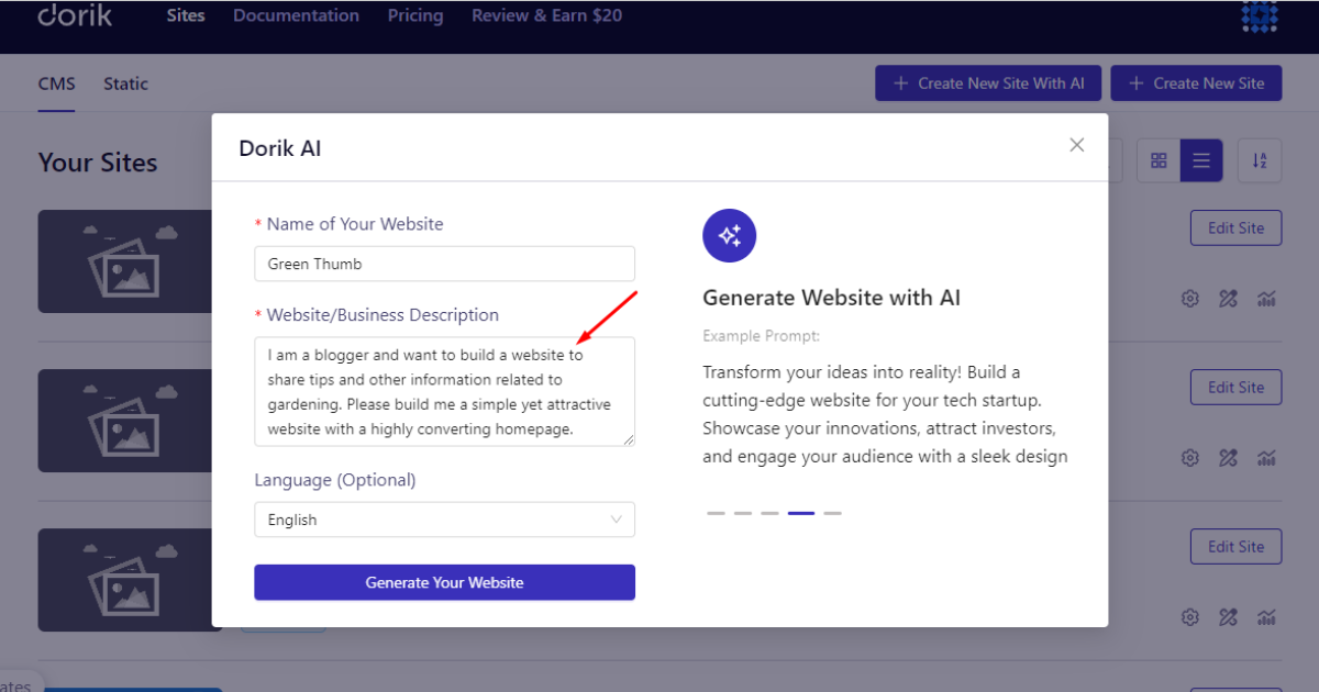
5. Write a well-crafted prompt to make your homepage.
6. After that, choose your homepage language.
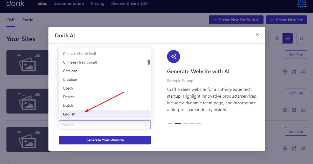
7. Finally, smash the “Generate Your Website” button.
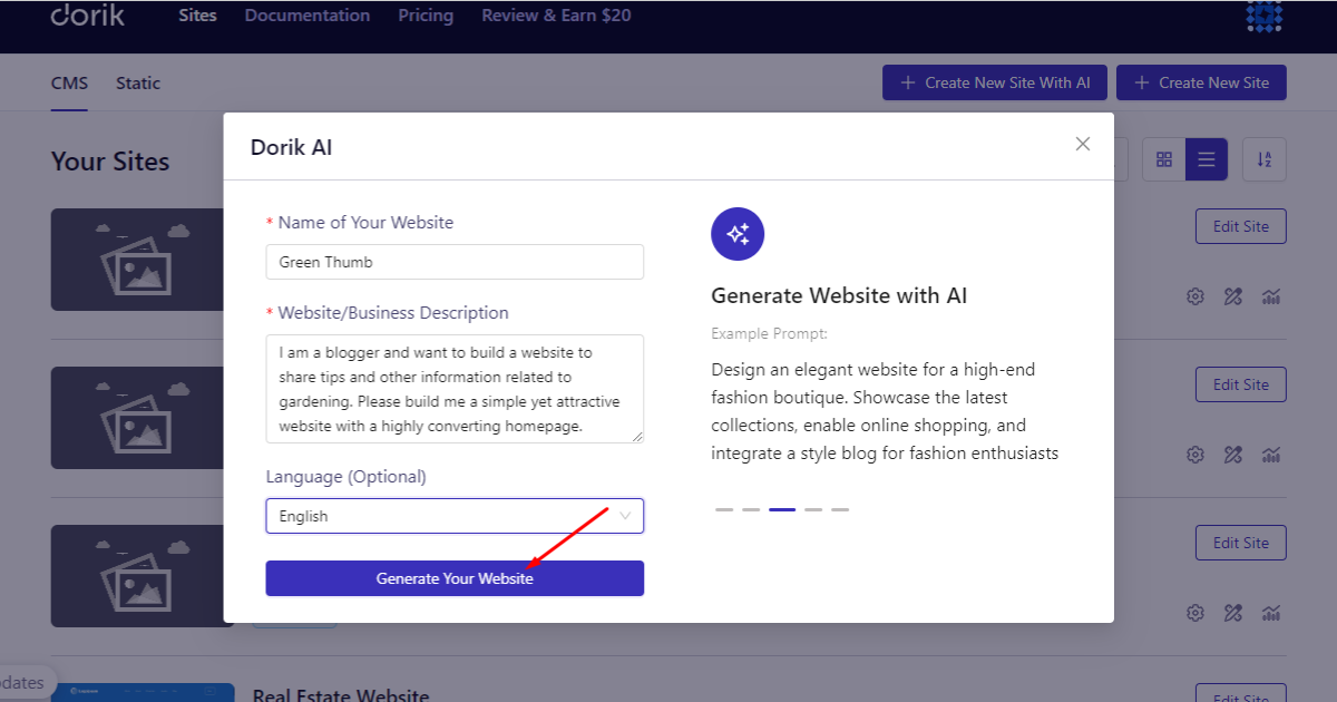
Wait a moment. Ta-da! Your homepage is ready. Let’s check what I created using this prompt-
I am a blogger and want to build a website to share tips and other information related to gardening. Please build me a simple yet attractive website with a highly converting homepage.

How to Make a Homepage with a Template
This method is super easy. You follow a few steps and make some customizations. That’s it. Here’s what you’ll do while applying this website-creation technique.
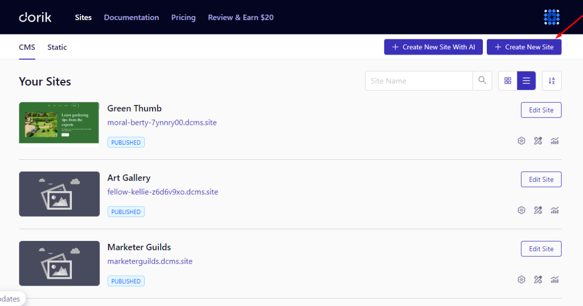
1. Sign in to your Dorik account and head to Sites > CMS.
2. Hit the “+ Create New Site” button.
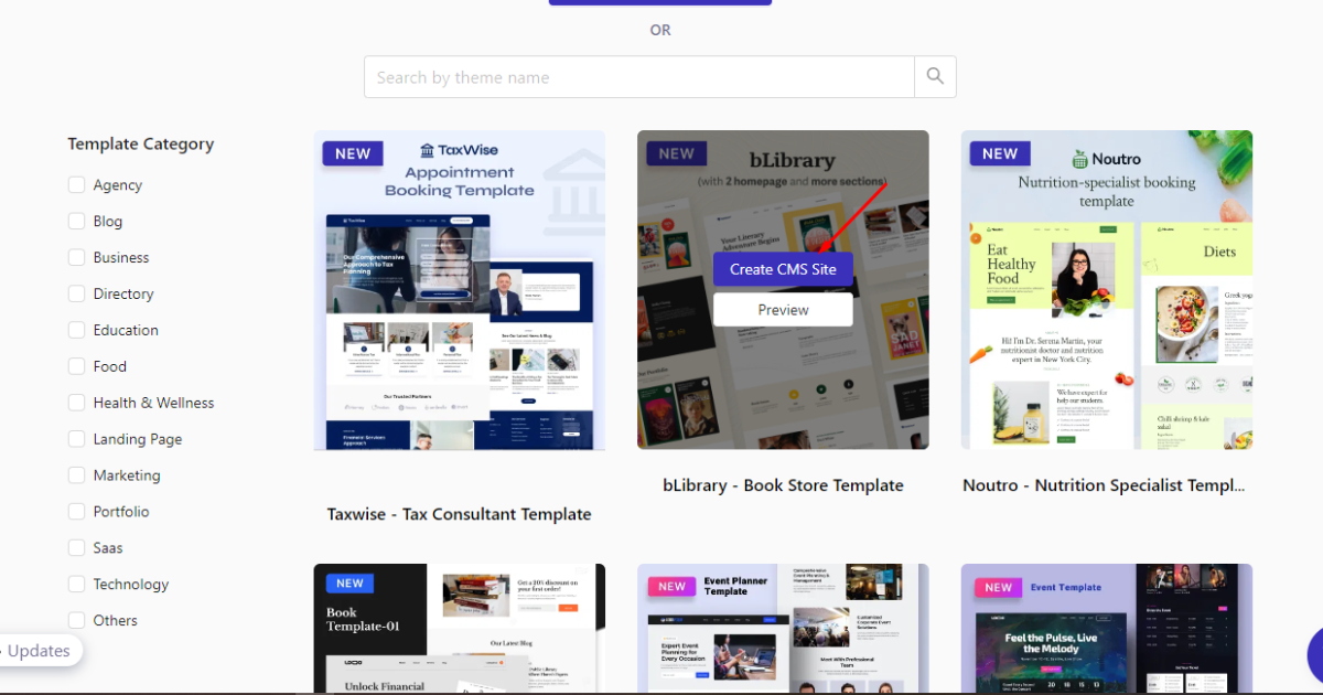
3. Afterward, explore all the templates, choose your preferred one, and hit “Create CMS Site” button.
4. Now, enter your site name and domain and click the ‘Create’ button.

Wait a while until your template gets installed. Then, you can customize it as per your preferences.
I’ll demonstrate how to customize a homepage with Dorik later in this article. Hence, that’s how you create a homepage with a free template on Dorik.
How to Make a Homepage from Scratch
Let’s discuss the last technique you may follow to build a homepage from scratch. Here are the steps:
1. Log in to your account and go to Sites > CMS.
2. Click the “+ Create New Site” button.
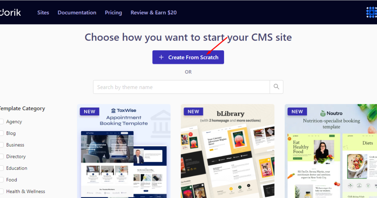
3. Smash the “+ Create From Scratch” button.
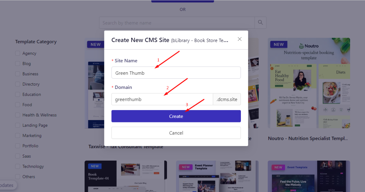
4. Type your homepage name and domain, and hit the ‘Create’ button.
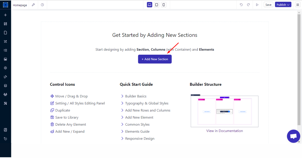
You’ll visit the Dorik editor. You can now build the homepage from scratch using Dorik’s containers, elements, and components. In the following section, you’ll see how to use these features of the editor.
How to Customize Your Homepage
Remember I talked about some elements that your homepage must have. I’ll show you how to add those elements effortlessly using Dorik’s drag-and-drop editor. Let’s begin.
Add an Eye-catching Header
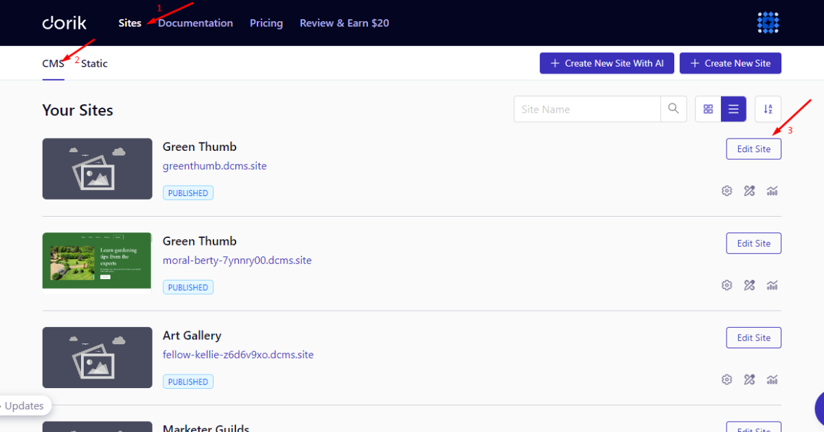
First, log in to your account, head to Sites > CMS, and click the “Edit Site“ button of your website/homepage to go to your site dashboard.
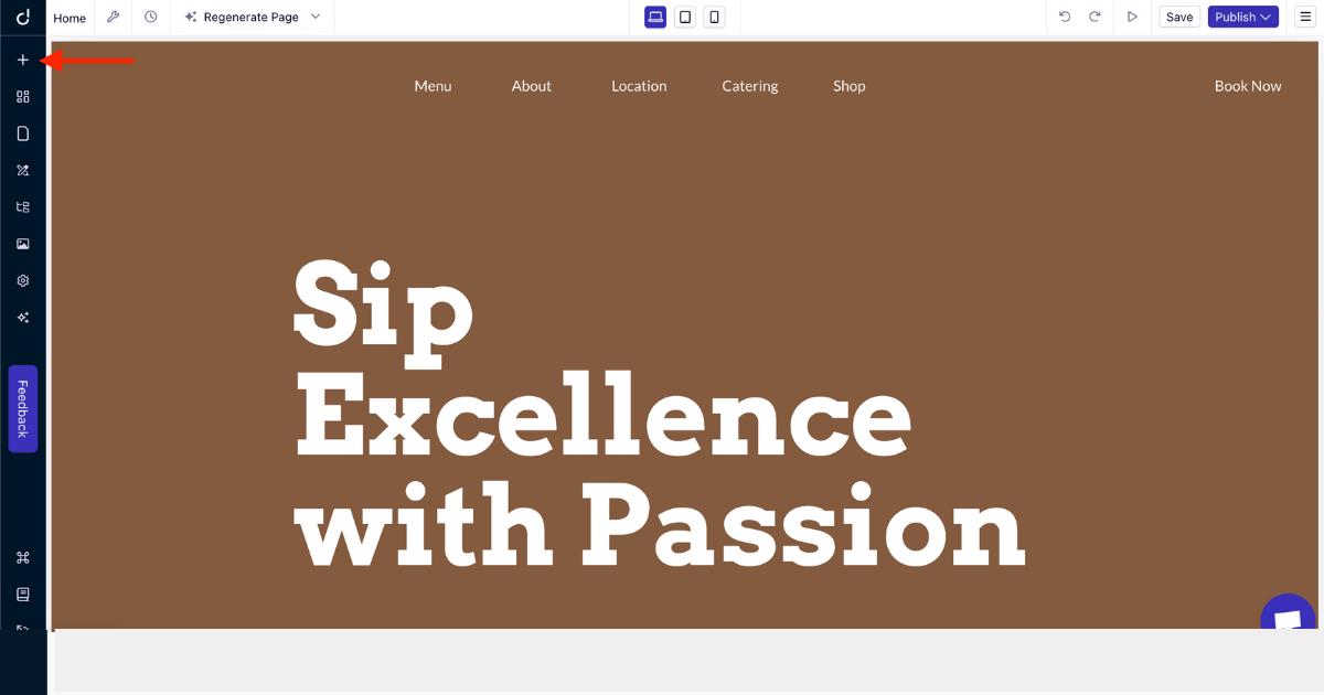
1. Click the “+” menu on the left-side panel.
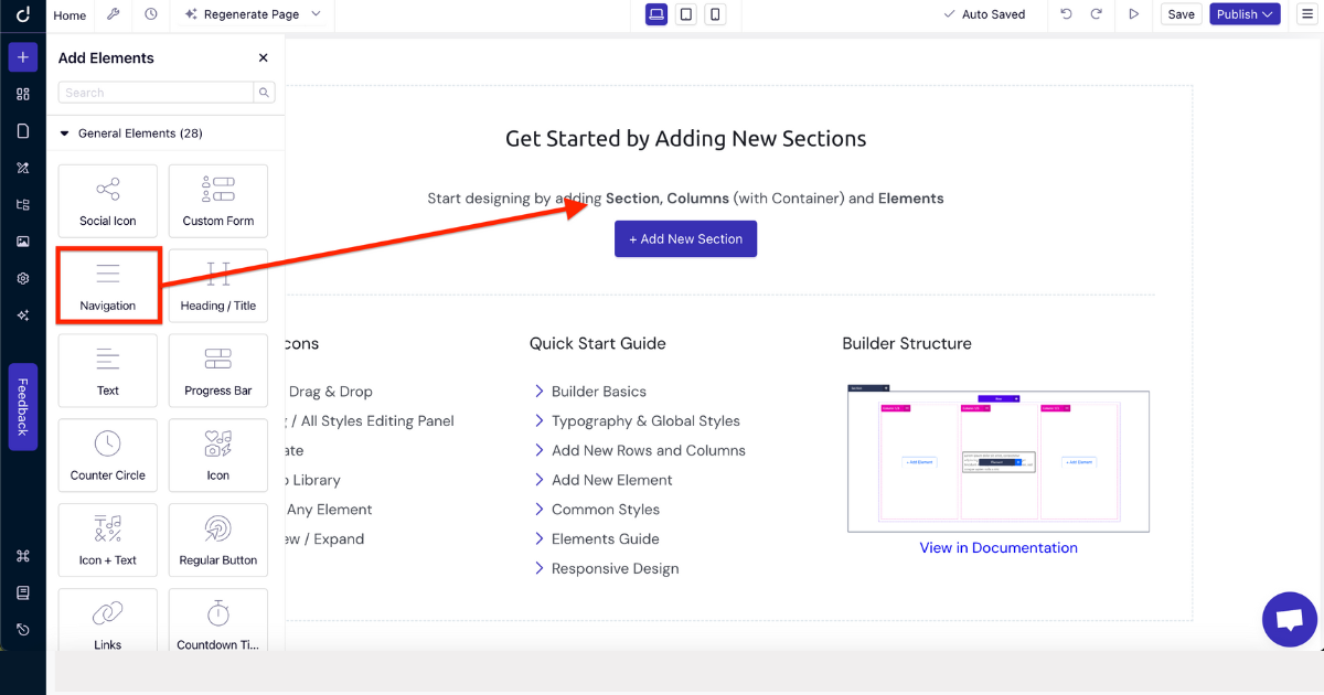
2. Choose the ‘Navigation’ element and drag and drop it into your preferred homepage area (place it at the top section).
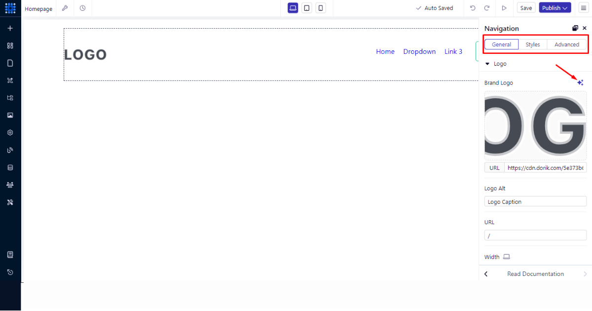
3. Now upload your logo and edit menu names and links using the Navigation editing panel, which features three tabs: General, Styles, and Advanced.
I encourage you to explore all these tabs to create an eye-catching header section. Also, don’t forget to use the AI Image Generator to create a logo.
Create an Updated Hero Section
Once you’ve worked on the header section, it’s time to build a professional hero section. To do so, follow the steps below.
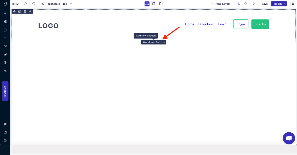
1. Hit the “Add New Section” button.
2. Pick your preferred container.
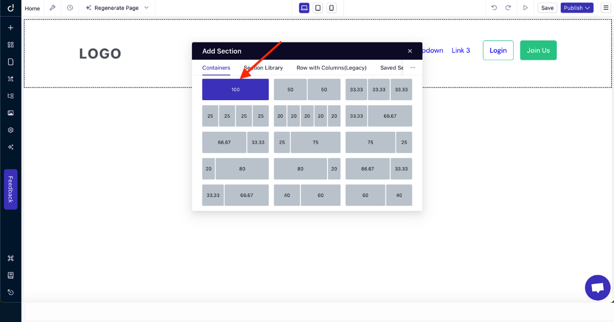
3. Click ‘+’ button to add an element. Nonetheless, you can add an element using the left-side panel as well.
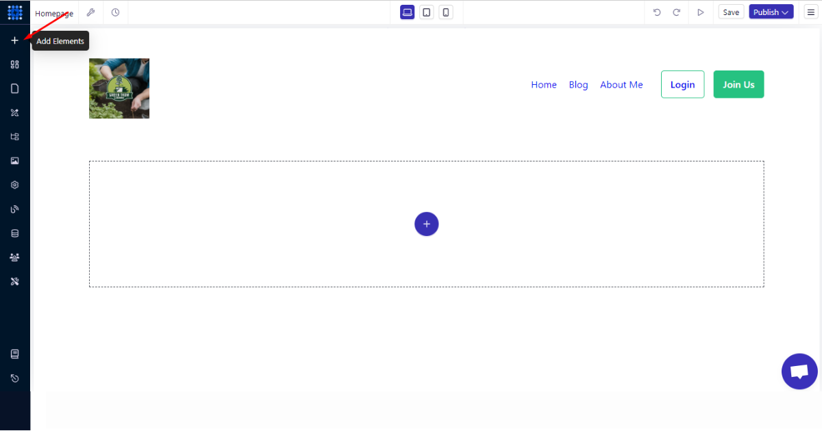
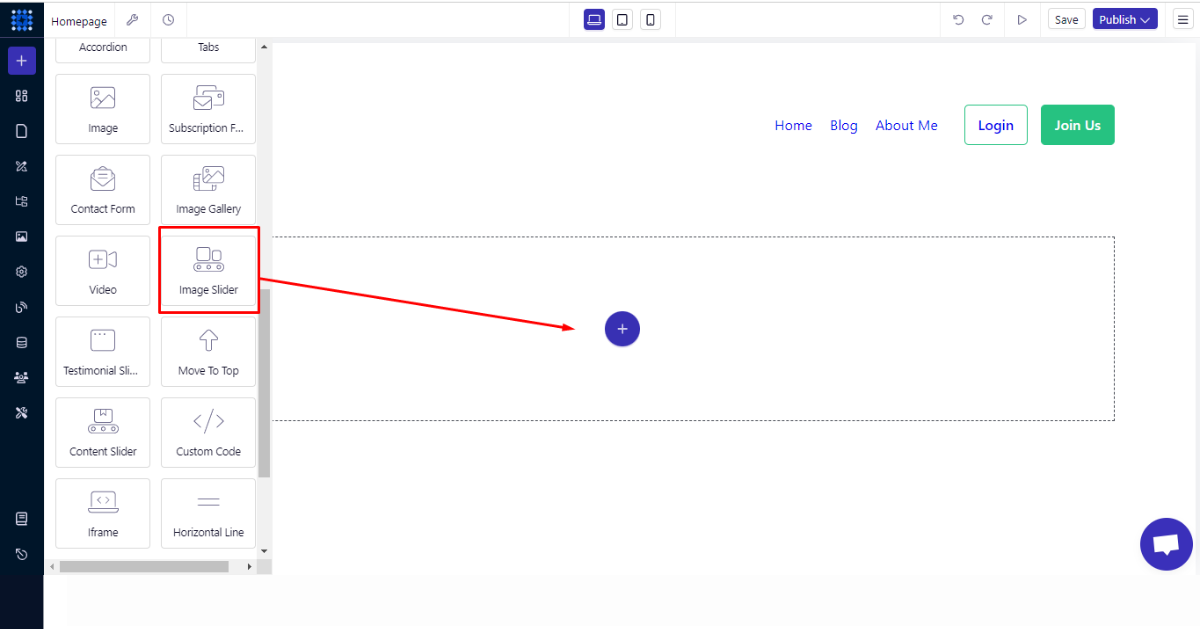
4. Add an element that will fit better. I recommend you choose the “Image Slider” element to show multiple images in the hero section.
Once you find that element, drag and drop it into the section you’ve just created.
5. Now, upload or create images or illustrations using Dorik’s AI Image Generator.
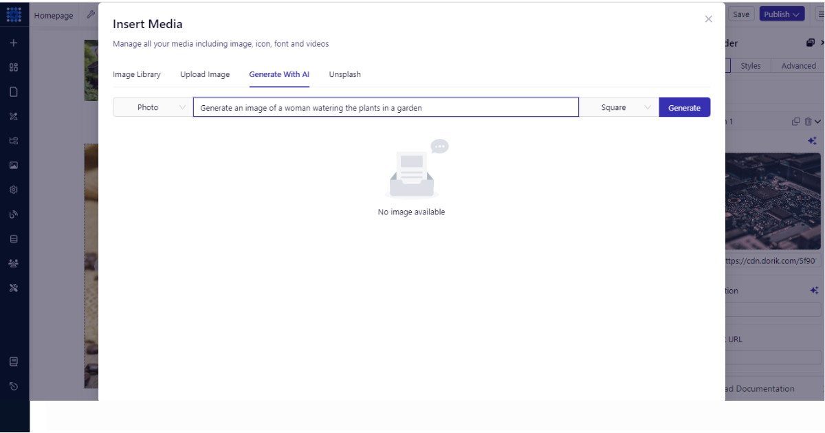
6. After that, you can insert links into image captions to take visitors to a different page. This will work as a strong CTA, but it’s optional.
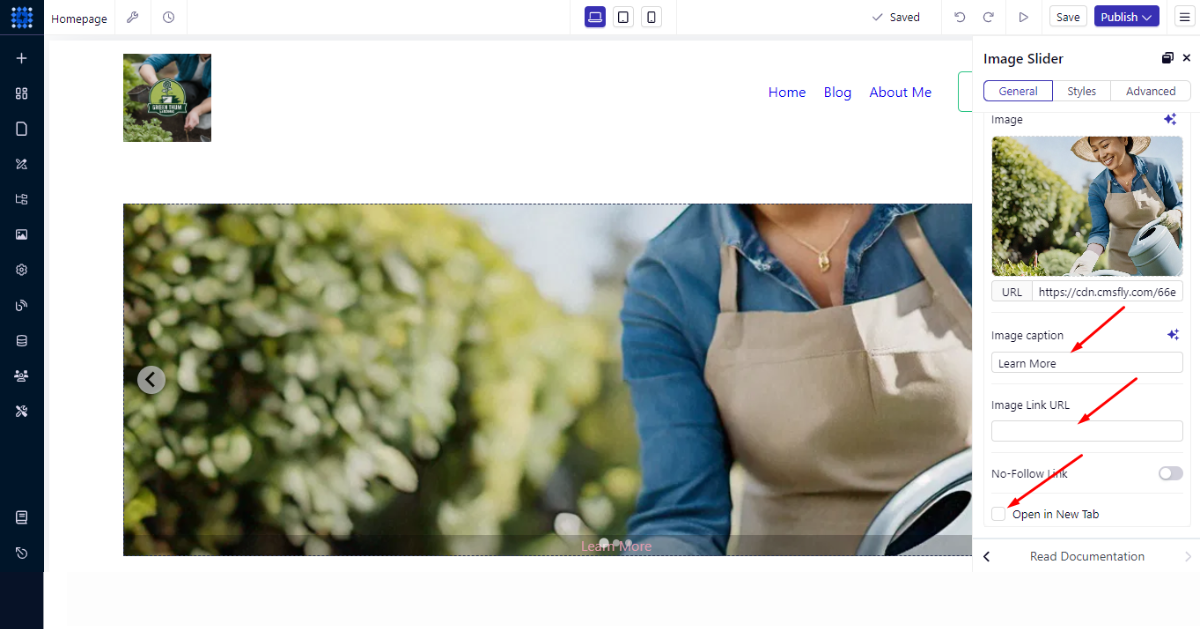
So, that’s how you can build a hero image using Dorik’s drag-and-drop editor.
Build Other Sections and Add Necessary Features
Now that you’ve built the header and hero sections, it’s time to build other necessary sections and add features according to your preferences. I’ll show you how to build these sections to help you create your own in your own style.
Let’s add an image and a heading in a separate section. To do that -
1. Click the “Add New Section” button.
2. Now, choose a container.
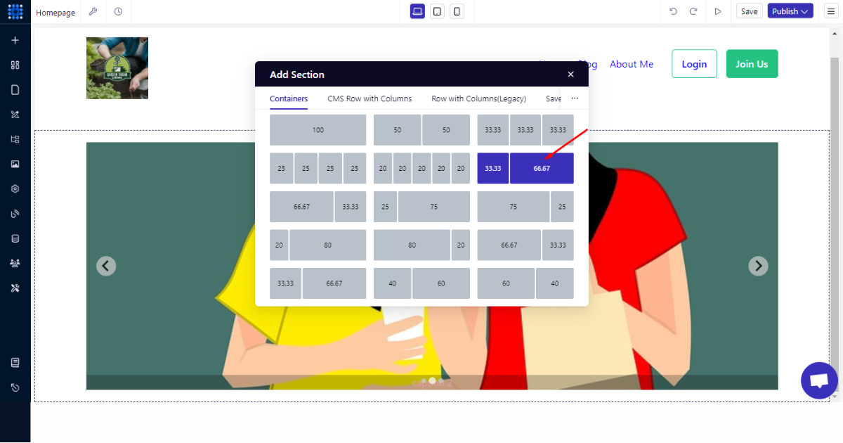
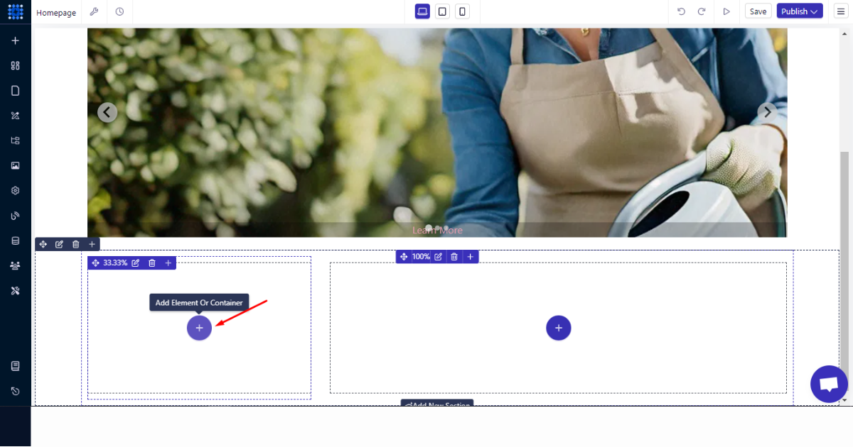
3. Click ‘+’ menu on the left-side container to add an image element.
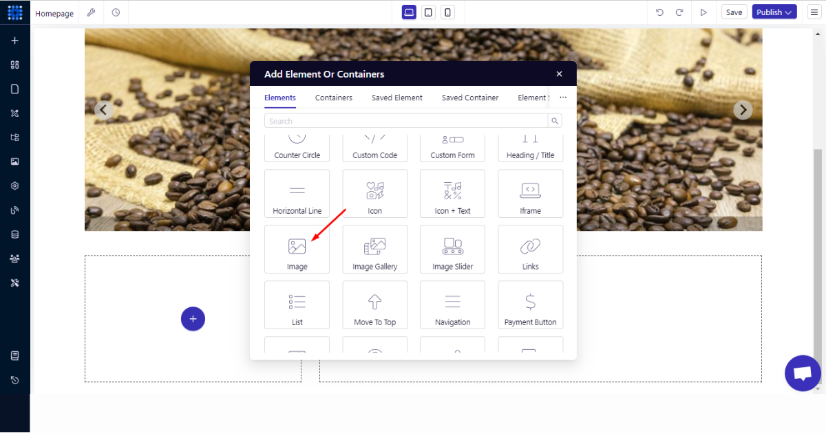
4. Select the ‘Image’ element.
5. Upload or generate an image.
6. Next, hit ‘+’ button (or your can drag and drop an element from the left-side panel of the editor) and select the ‘Heading/Title’ element.
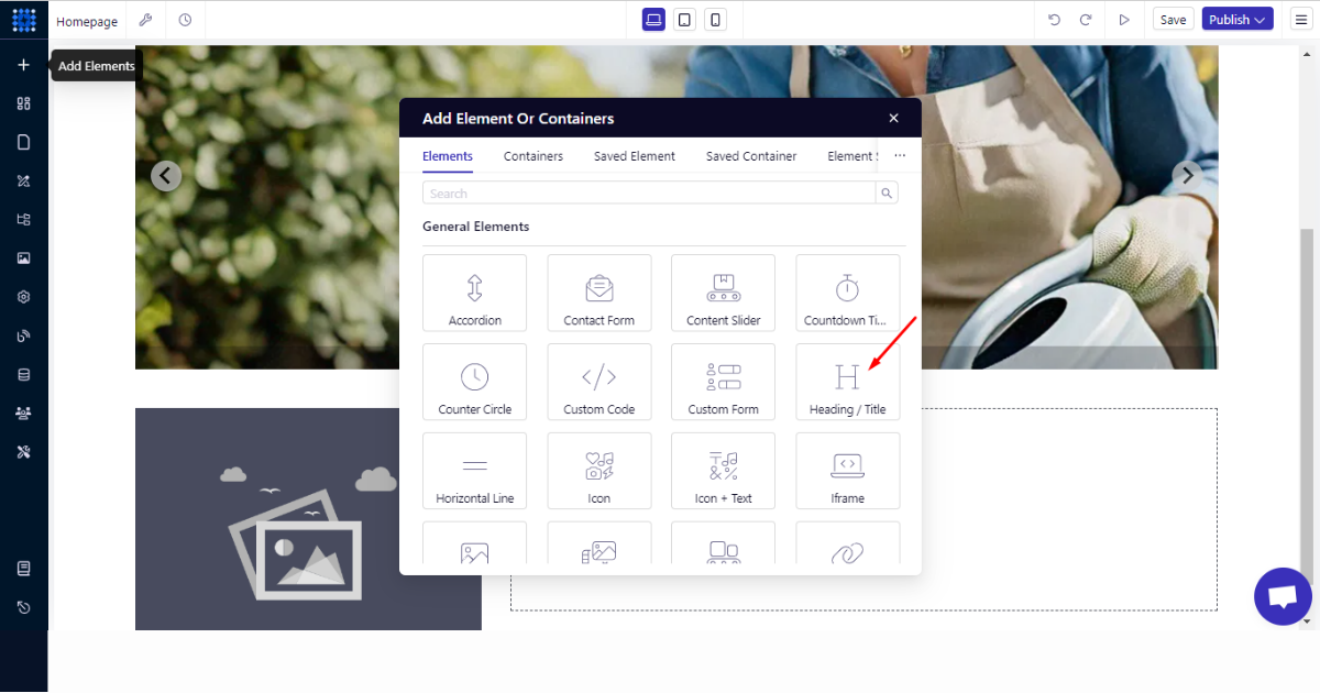
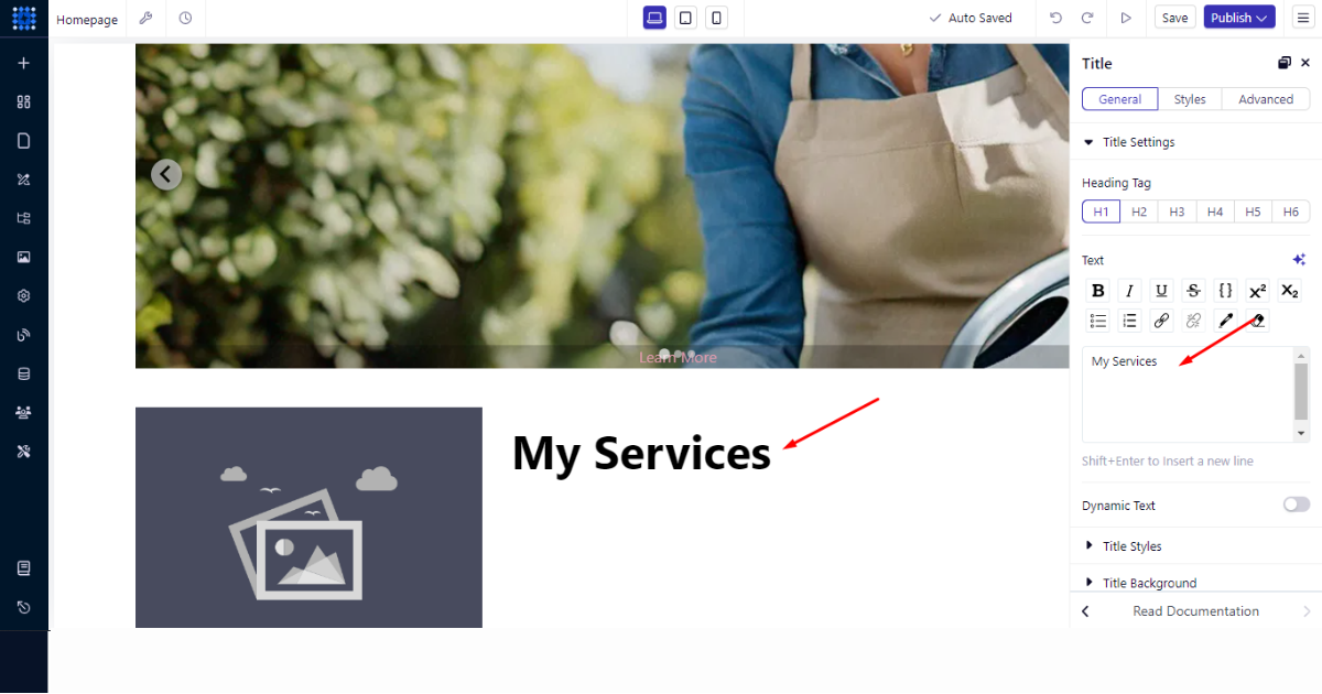
7. Type your heading.
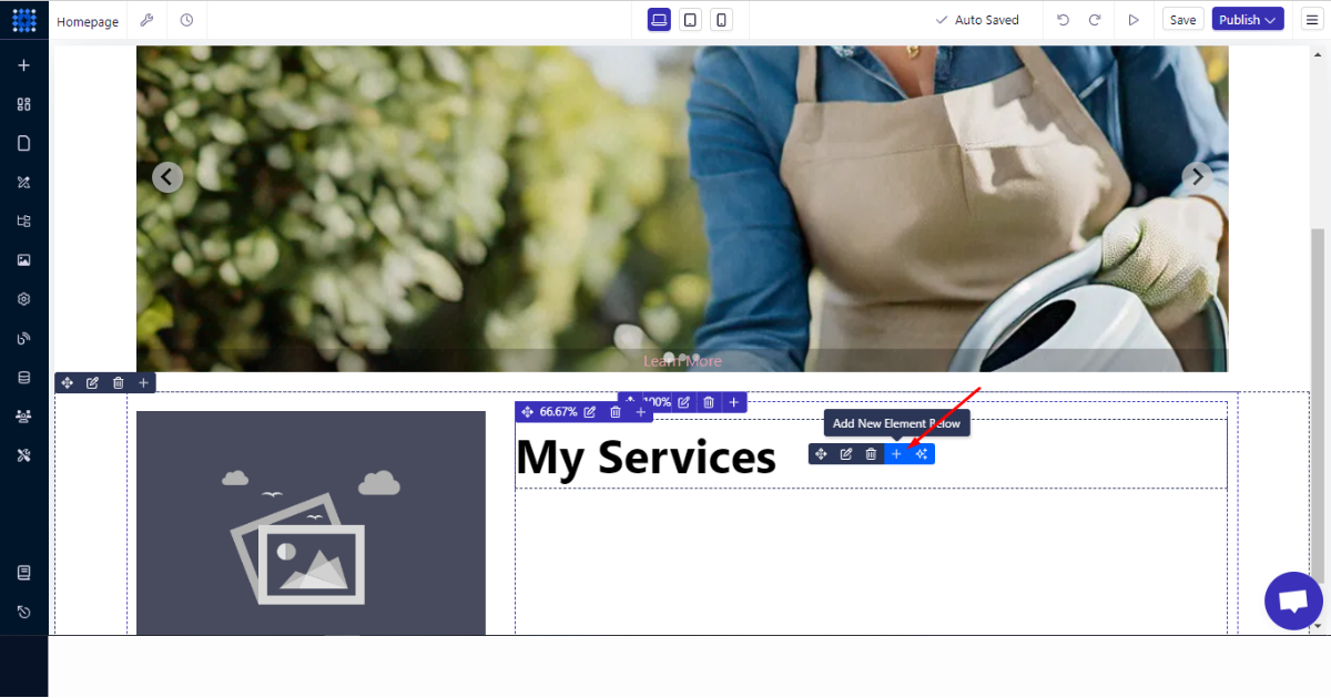
8. You can now add another element underneath the heading element. To do so, hover your mouse over the element and click ‘+’ button on the element to add another element below (remember not to click ‘+’ button on a container).
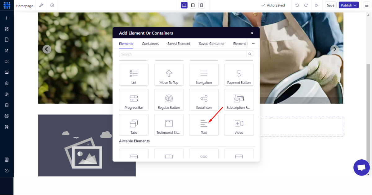
9. Pick the ‘Text’ element.
10. You can now write your desired text on your own, or you can use the AI Text Generator to write, rephrase, improve, and shorten a copy for you.
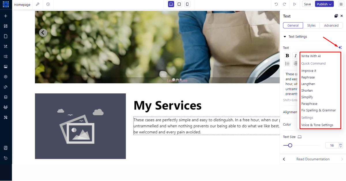
Thus, this is how you can build a section containing an image, a headline, and a few sentences. Let’s now see how to use Dorik’s components to build other essential sections, such as a contact form, testimonials, and a footer.
Use Dorik’s Components
You can effortlessly build any section with Dorik’s Components features. Until now, you had to create a new section, choose a container, and select an element, which is a pretty long process.
But now, you just choose a component and drag and drop it into your preferred homepage area to build your desired section. Let’s see it in action.
Create a Testimonial Section
Here are the steps to follow to build a testimonial section.
1. Go to your site dashboard.
2. Head to the left-side panel and click the 'Components' menu.
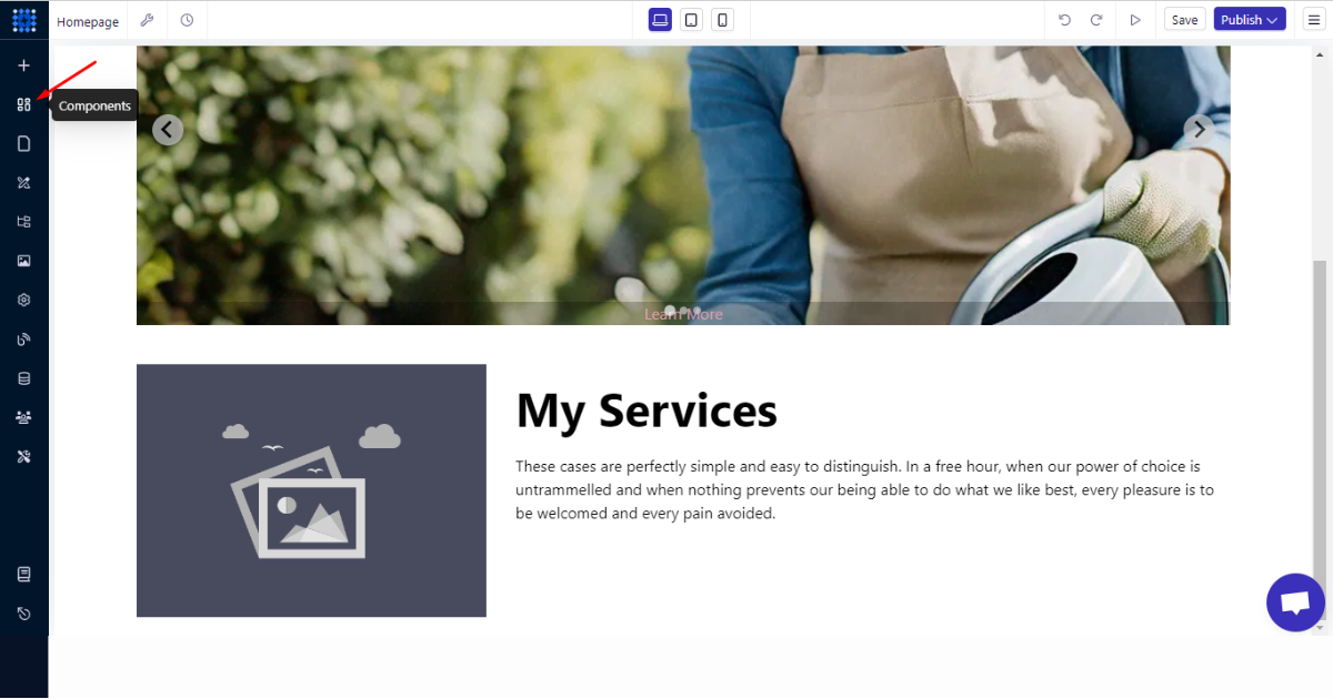
3. Go to the ‘Library’ tab.
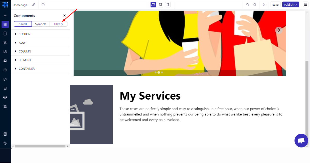
4. Click the 'Testimonials' component.
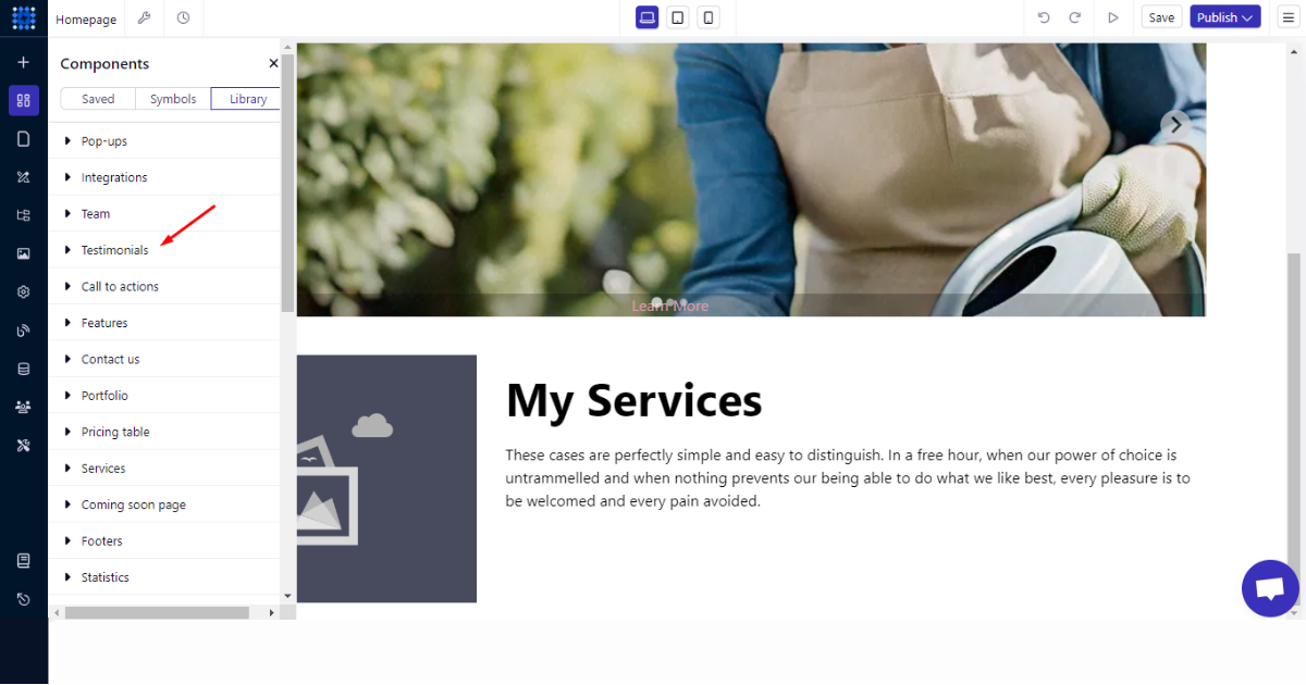
5. Afterward, select a component you like and drag and drop it into your chosen section.
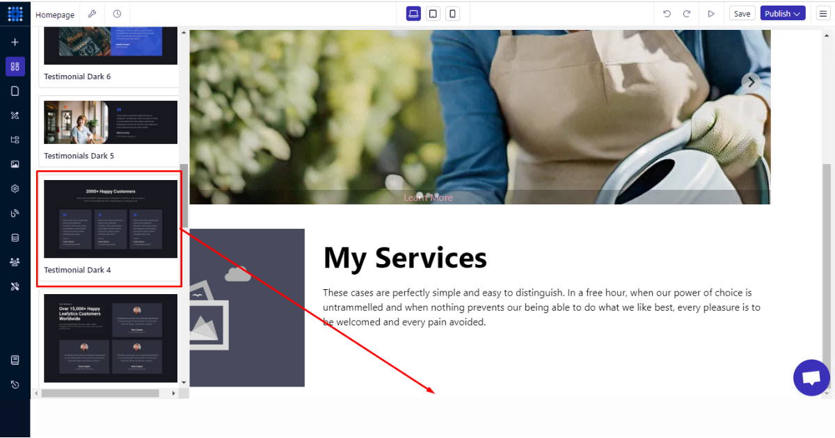
6. Finally, customize that component as you wish.
Add a Contact Form, a Newsletter Sign-up Form, and a Footer Section
To add these sections, you can follow all the steps you followed while creating the testimonial section. To remind you again, here’s a glimpse into the how.
To add a contact form-
1. Visit your site dashboard.
2. Click the ‘Components’ menu on the left-side panel (sidebar).
3. Tap into the ‘Library’ tab.
4. Navigate to ‘Contact forms’ component.
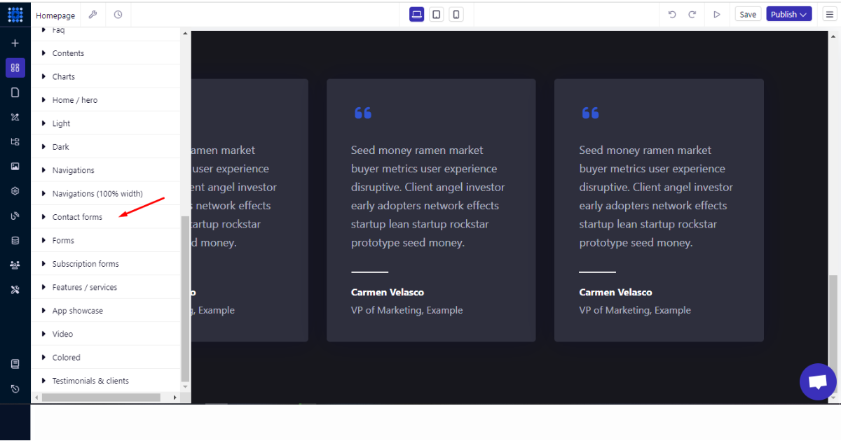
5. Then, select a contact form component and drag and drop it into your preferred section.
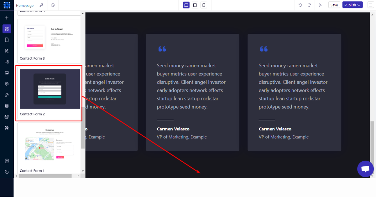
6. Lastly, edit this form as per your preferences.
In order to add a newsletter sign-up form, you’ll follow all the steps you’ve just followed now.
But instead of choosing a component from the “Contact forms” component, you’ll select one from the “Subscription forms” component.
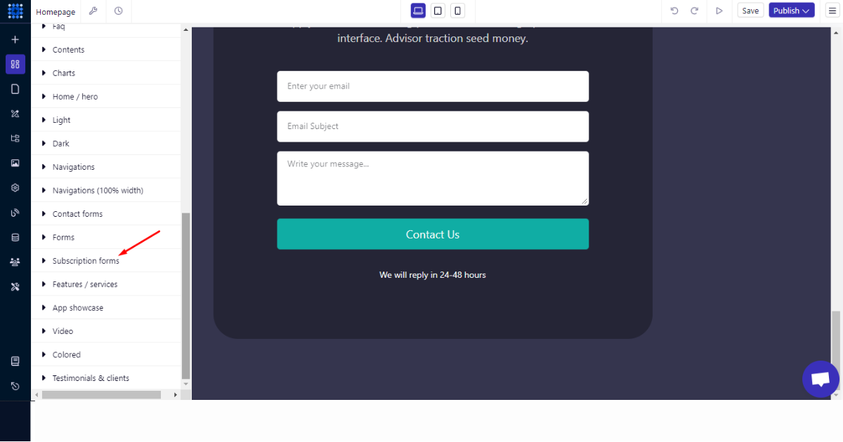
I think you can drag and drop a subscription form into a section now. So, I decided not to demonstrate this part again.
Now, let’s talk about building the footer area. Well, you can use the ‘Footers’ component to build a professional and modern footer area on your homepage.
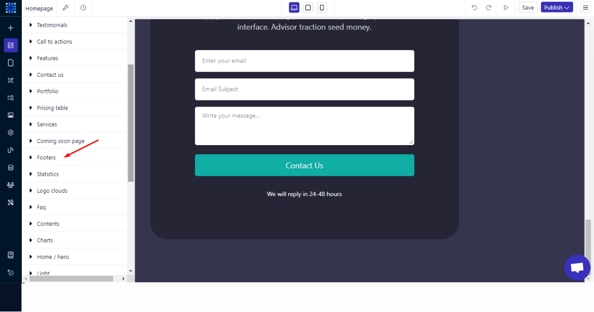
I think you can easily create the footer section using the steps I’ve mentioned earlier. So, let’s not waste your precious time by repeatedly showing the same thing.
Instead, I can discuss what you should do next. You can explore other sidebar menus and learn how to create a page.
You can also learn to use Global Styles, Navigator, Media Library, Site Settings, AI Quick Style, Blogs, Collections, Memberships, Advanced Configurations, and read the Documentation.
After that, you can focus on publishing your homepage. But before that, it’ll be wise to consider the tips I shared below.
Essential Tips to Consider Before Publishing Your Homepage
Before publishing your homepage, don't forget to consider the following tips,
Test Preview
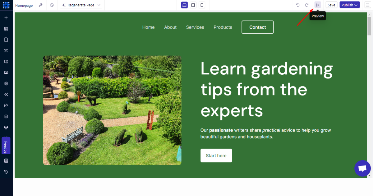
Evaluate the appearance of your homepage and its functionalities. Before publishing your homepage, consider checking that all the functions and links are working as planned.
Preview your homepage interface before publishing from the Preview Button.
SEO Optimization
SEO optimization is crucial for a website, even if it’s a homepage, especially when you want to gain organic traffic.
SEO helps a homepage rank for relevant keywords and lets other pages on your website rank. However, for that, you need to implement significant SEO best practices correctly.
Also Read - SEO Trends
For example, you must tell Google and your target audience what your homepage is about. Choose target and relevant keywords based on your business/organization type.
Then consider the following while crafting your homepage’s title:
-
Make it accurate and eye-catching
-
Include the target keyword in the title
-
Insert your brand name
-
Keep the title in 60 characters
Afterward, keep these facts in mind while writing meta description:
-
Craft your description to be genuinely compelling—enough to inspire a user to click—without relying on “clickbait” tactics.
-
A title and short meta description containing around 150-160 characters should work together as a cohesive message.
Then, focus on your homepage’s main content. While creating the main content, consider these questions:
-
What key information should visitors learn about your business right away?
-
What sets you apart from the competition?
-
What journey should users follow as they navigate your website?
Then, get into the SEO thing. We mean to design your main content to ensure it matches search intent. Also, naturally include the target keyword in the H1 tag of your main content.
If you use images, infographics, or other graphics, ensure they are optimized for SEO. For instance, those graphical items should load fast and feature proper Alt texts.
You don’t have to consider these factors related to image optimization if you use Dorik. Dorik uses a Global Content Delivery Network (CDN) to load images and pages faster.
This platform takes care of all the SEO-related stuff without requiring you to undergo any learning curve.
You can easily create internal links and set no-follow links, add alt texts and index pages, and do much more on this AI website builder.
Good Read - Why Dorik is Best for SEO
Social Media Integration
Social media integration is the possession of incorporating social media links with your own website. It helps generate visitors to your social media to increase engagement in your business or community.
You can effectively add social media integration to any section of your homepage by using Dorik’s Social Icon Element.
Mobile-Friendly Design
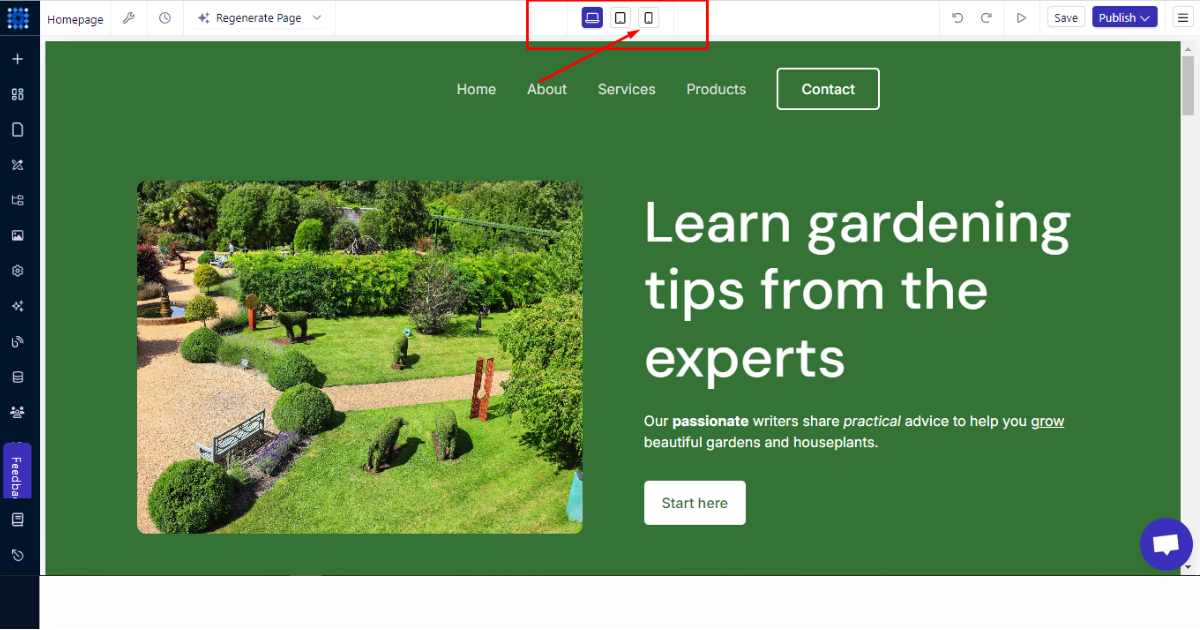
55% of visitors come from mobile devices, so keeping your homepage design mobile-friendly is essential. Check if your homepage is in full swing in the mobile interface.
In the top middle section of your site dashboard, you will find 3 buttons to check 3 device interfaces of your homepage.
Review & Publish Your Homepage
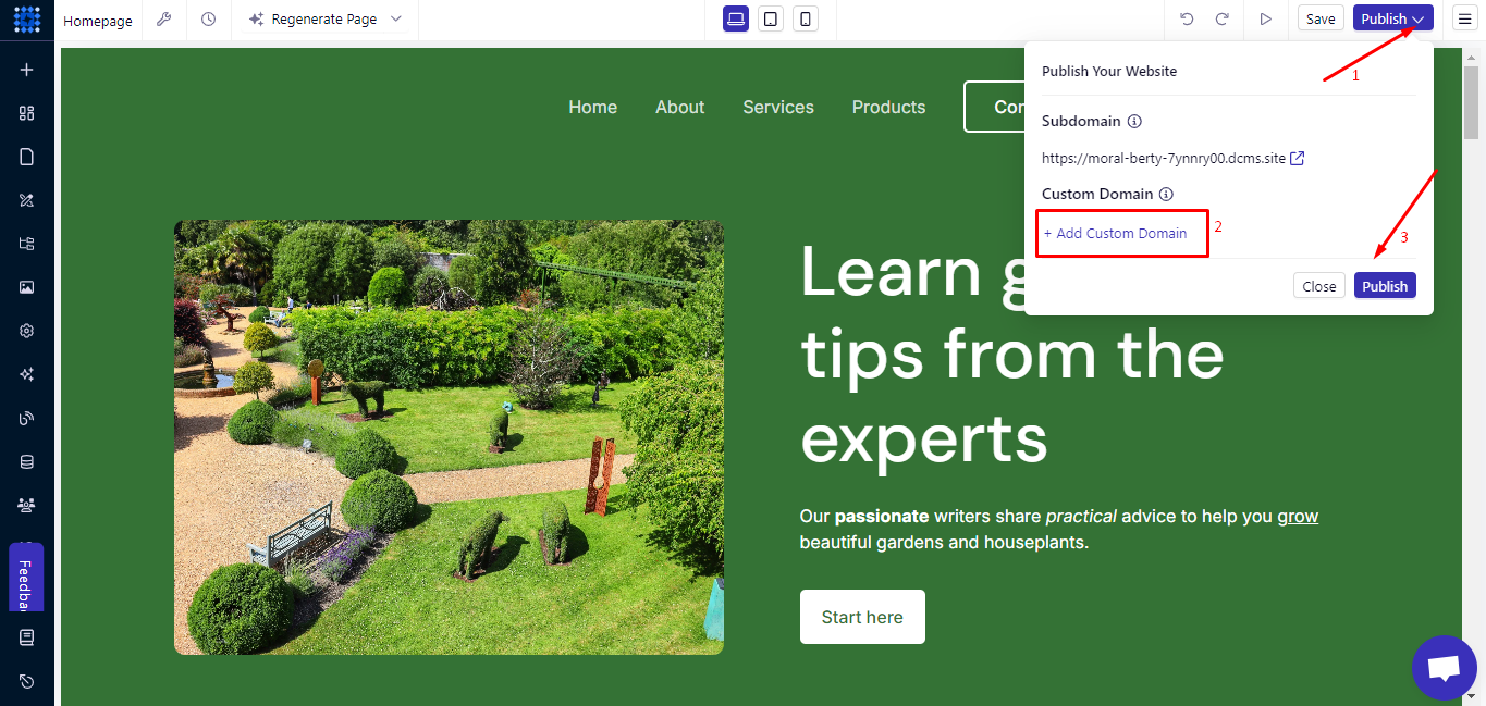
After following these tips, review your homepage yourself and get it reviewed by friends, family, or experts. Then, add a custom domain to your homepage and hit the publish button.
Examples of Engaging Homepage
Here are some hot examples of home pages that can inspire you in your project.
1. Hubspot
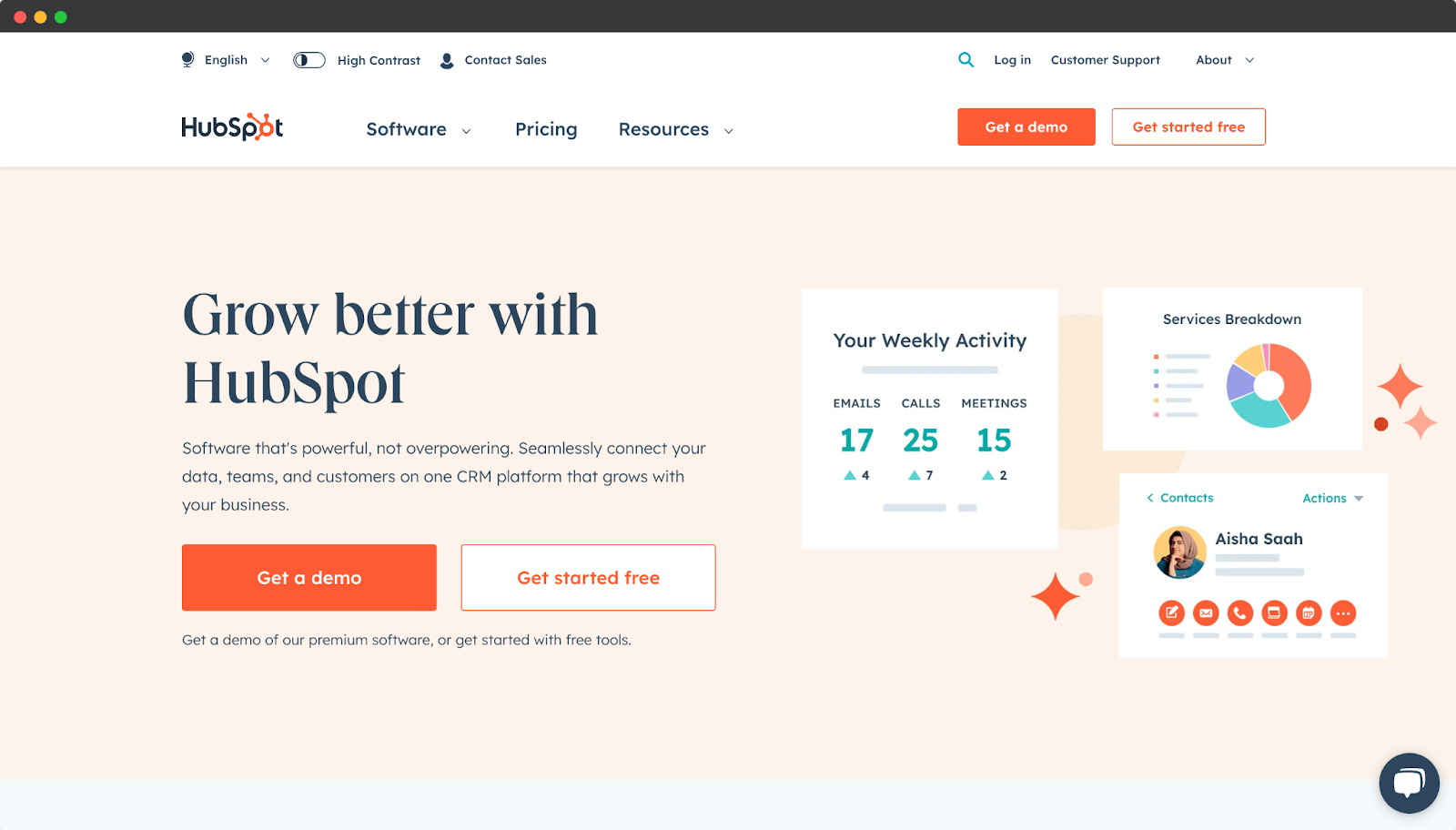
Look at this most well-designed and engaging homepage that belongs to Hubspot.
This homepage displays the products and services very effectively. They have enriched their homepage with on-the-mark CTAs, features, services, and other elements that users can navigate and explore effortlessly.
2. Crazyegg
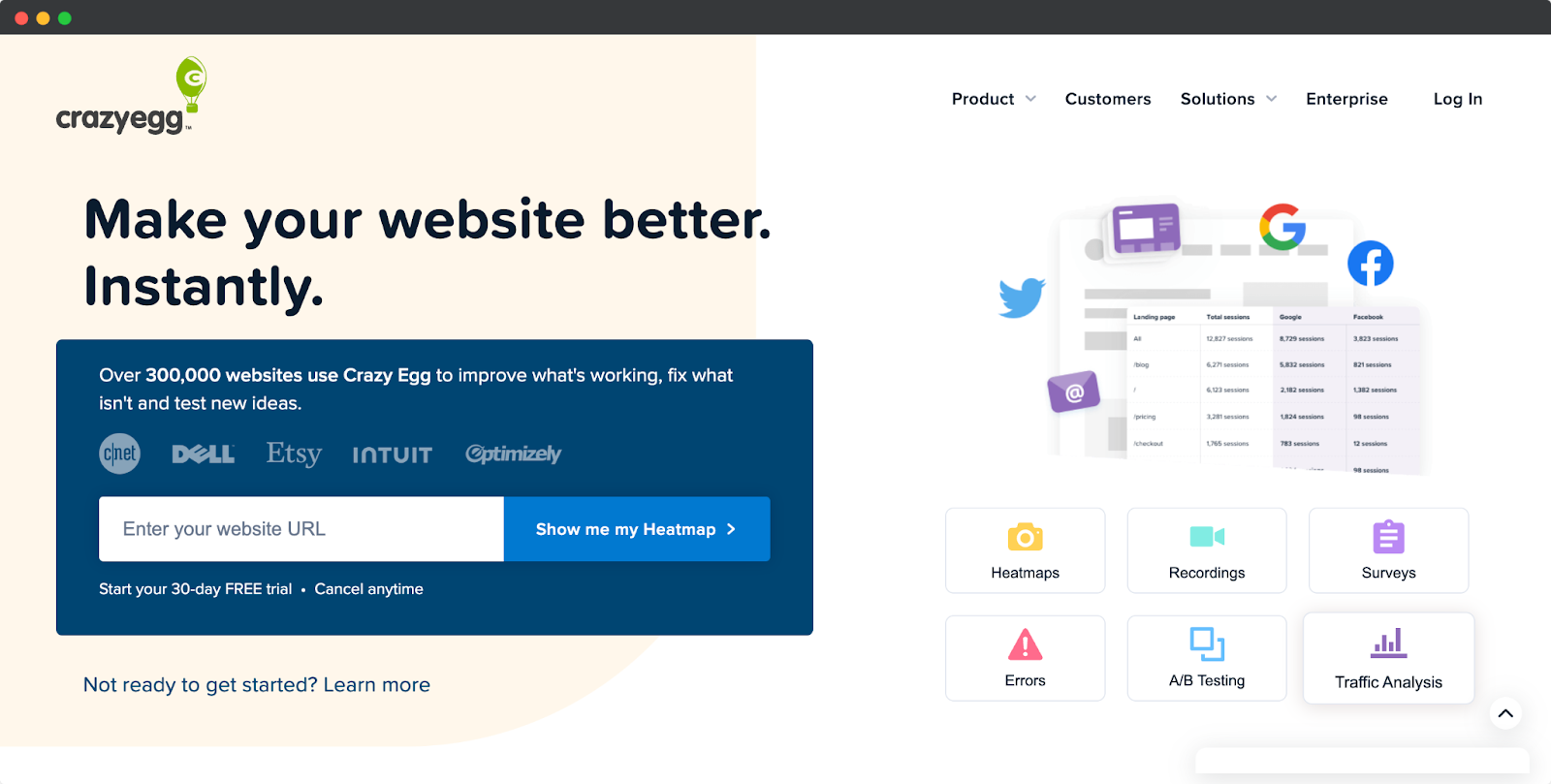
Crazyegg's Homepage is clean and visually appealing.
Moreover, it showcases the product's benefits clearly and offers a path for visitors to take action gracefully.
They have focused on value proposition, presenting relevant information, and engaging visitors with their homepage design.
3. Hotjar
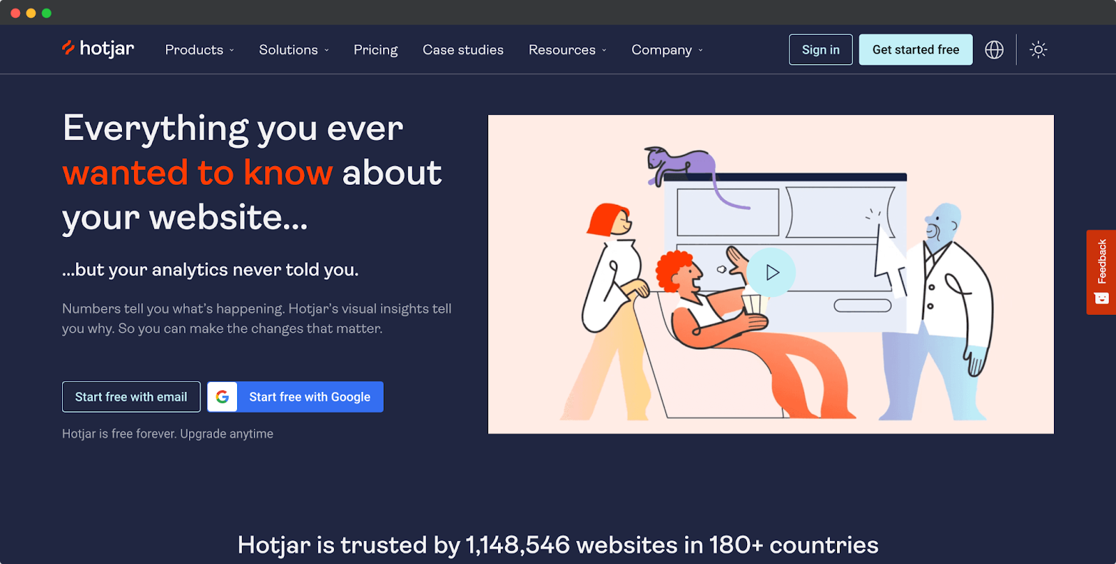
This homepage of Hotjar has the most engaging content on its heading with instant CTA. Right after the above-the-fold section, they enriched the interface with credential information, services, and features with amazing animations.
These elements and right-on-the-dot placement make the user journey easier.
4. Southern Tide Media
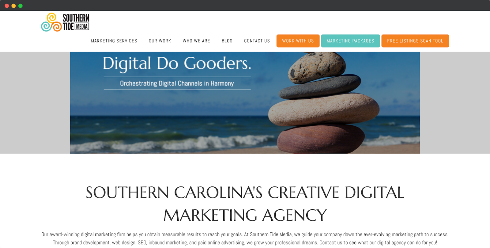
Southern Tide Media is a digital marketing agency. They have arranged their homepage interface with unique visual content.
Also, they kept their services, key features, and other information very efficient and concise.
5. Search Engine Journal

Here comes a unique homepage with a different approach to generating leads. Search Engine Journal's homepage is full of their articles.
They segmented articles by Popular and Latest blog posts.
Moreover, the nav bar describes all the topics of the blog page. So that readers can easily navigate to their preferences and start reading.
FAQs
1. What is a Homepage?
A homepage is a website's main or introductory page that serves as visitors' entry point.
It contains essential information, navigation menus, and links to various sections or other web pages within the site.
2. What is the Difference Between a Homepage and a Landing Page?
A homepage is a static page that serves as the central hub of a website, providing an overview of the brand and its offerings.
On the other hand, a landing page is a targeted separate page designed for specific marketing goals. It focuses on driving conversions or capturing leads.
3. What is the Difference Between a Website and a Homepage?
A homepage is a part of a website that visitors first see when they directly visit a website. Usually, a homepage features an overview of a website and links to other essential pages of a website. In short, a homepage is a static page, while a website can contain many other static pages.
Your Homepage, Your Story
Your home page is more than just a digital presence—it's the canvas where your brand's story unfolds.
With the guidance of this comprehensive guide on how to create a homepage, you have the tools to transform your vision into reality.
Seize the opportunity to leave an unforgettable mark. And embark on your journey to build a captivating website with Dorik, where your unique story springs to life.


