
Your homepage is the first thing people see when they visit your website. In just a few seconds, they decide if they want to stay or leave. That’s why it's important to learn smart homepage design tips so that you can keep visitors on your site longer.
A well-designed homepage helps visitors feel welcome and interested. It guides them clearly and shows what your site is about. Even if you are not a designer, you can follow simple ways to improve your homepage.
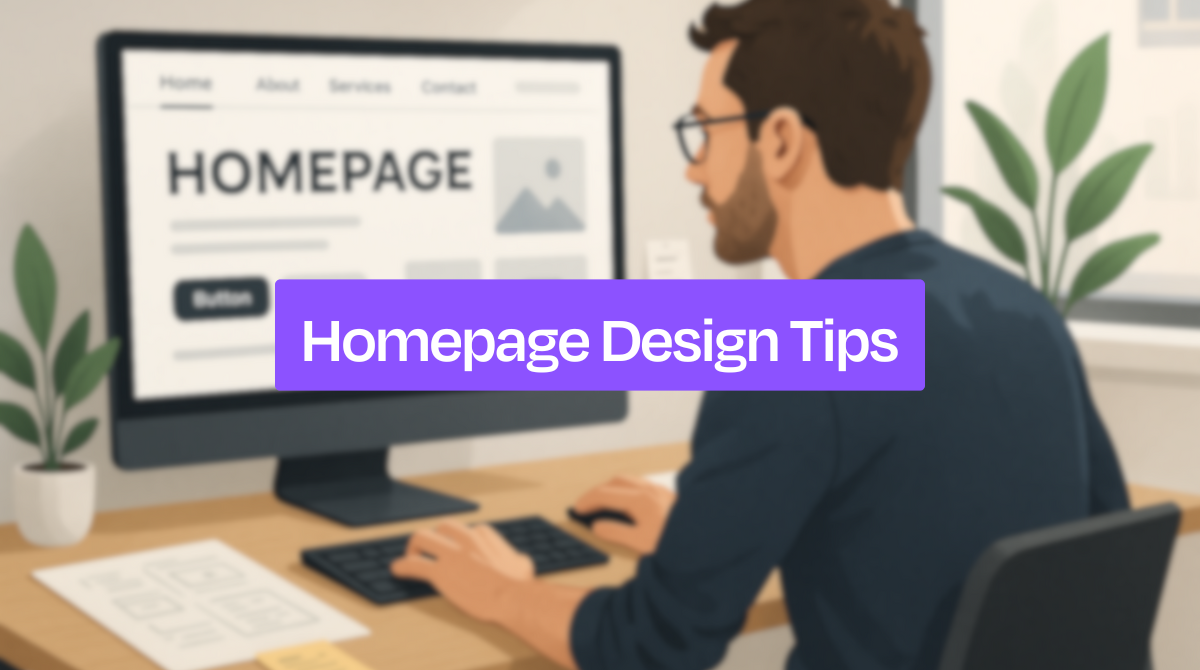
This blog shares those easy homepage design tips that really work. These ideas are beginner-friendly, clear, and tested. Let's check them out.
Related Read: Web Design Trends For 2025
Why Does Your Homepage Design Matter?
Your homepage is the face of your website. It’s often the first thing people see. If the design looks good and works well, it will get traffic to your website. But if it feels messy or confusing, they may leave within seconds. That’s why your homepage design matters more than you think.
It Creates First Impressions
Visitors quickly decide how they feel about your website. A neat and clean homepage tells them you care about your brand. It shows professionalism. If the design looks poor, they may not trust your content, products, or services.
It Guides the Visitor
A good homepage helps people know where to go next. With clear menus, buttons, and sections, visitors don’t feel lost. This clean strategy saves time and keeps them on your website longer. Also, a helpful layout turns confusion into smooth browsing.
It Tells What You Do
When someone lands on your homepage, they should understand your purpose right away. A short headline and simple message can explain who you are and what you offer. It ultimately helps visitors stay and explore more.
It Builds Trust
Trust is very important online. A homepage that looks modern and easy to use makes your brand feel safe. Visitors feel more comfortable sharing information or buying something from you when the design feels professional and secure.
It Helps You Reach Goals
Do you want people to contact you, buy your product, or sign up for your service? A smart homepage design shows the way. It highlights your main goal with clear buttons or messages, so visitors take the right action.
Related Read: What Makes a Good Website?
Tips for Perfect Homepage Design
Your homepage plays a big role in your website’s success. It’s where visitors decide if they want to stay or leave. Let's learn about some helpful tips to make sure your homepage keeps visitors interested and makes them want to explore more:
1. Make Your Homepage Accessible
Accessibility means making your homepage easy for everyone to use, including people with disabilities. If someone can’t read small text, can’t use a mouse, or relies on a screen reader, your site should still work for them.
When your site is not accessible, you may lose visitors who simply can’t use it. It also affects your site’s trust and search engine ranking. Here's what to do to make it accessible:
-
Use readable font sizes and clear contrast between text and background.
-
Add text for all images (alt text) so screen readers can describe them.
-
Make sure buttons and forms can be used with a keyboard.
-
Avoid fast-moving sliders or flashing visuals.
2. Keep the Design Clean and Clutter-Free
Too much content on the homepage can confuse visitors. They won’t know where to look or what to click. A clean design makes your website easier to use and more enjoyable to browse. Follow these tips to keep it clean:
-
Use only the most important content on the homepage.
-
Group similar items together.
-
Avoid using too many fonts, colors, or buttons.
-
Make sure there’s enough space between sections.
A clutter-free homepage helps people focus on what matters, like your message, your services, and your value.
You can also read: Best Fonts for Web Design
3. Design to Communicate with the Audience
Your homepage should speak directly to your target audience. If it feels too general or unclear, people won’t connect with it. You need to understand what your audience wants and show them that you can help.
In this case, you should use simple and clear language that your audience understands. You can also add a strong headline that explains what your site is about. Use images or icons that feel familiar to your audience.
When your design matches the needs of your visitors, they are more likely to stay and explore.
4. Include a Suitable Call to Action (CTA)
A CTA is a button or message that tells the visitor what to do next, like “Sign up,” “Shop now,” or “Get started.” Without a clear CTA, visitors may leave without taking any action. They often need a little push to take the next step, and a strong CTA can give them that push.
You can make the CTA effective by:
-
Using action words like “Join,” “Try,” “Explore,” or “Buy.”
-
Placing it in a spot that’s easy to see.
-
Making the button stand out in color.
-
Keeping the message short and clear.
5. Make Navigation Simple and Intuitive.
Navigation is how people move through your website. If it’s confusing or hard to use, visitors may leave. Your homepage should guide them clearly.
Good navigation should have a top menu with 4 to 6 main options, a search bar if you have a lot of content, a clear logo that links back to the homepage, and a footer with links for contact info, FAQs, and policies. The easier it is to find things, the longer people will stay on your site.
6. Use High-Quality & Relevant Visuals
The right visuals can make your homepage look more professional and help explain your message. But poor-quality or random pictures can do the opposite. So, what to use? Here's the answer:
-
Use photos that match your brand or service.
-
Utilize product images if you’re selling something.
-
Add icons to highlight features.
-
Insert graphics or charts to explain ideas.
Also, remember to avoid blurry images or stock photos that don’t feel real. Real, high-quality visuals create a stronger connection with your visitors.
7. Highlight Your Value Proposition
Your value proposition is a short statement that explains what makes your product or service special. It tells visitors why they should choose you instead of someone else. The best place to add the value proposition is right near the top of the homepage. Sometimes, people also use them just below the main headline or image.
To write it, make sure to focus on the main benefit you offer. Use simple and friendly language. Also, keep it short within one or two sentences.
Example: “Affordable online courses that help you build real skills - anytime, anywhere.”
When people see the value quickly, they’re more likely to explore the site further.
8. Make It Responsive
Many people visit websites from their phones and tablets. If your homepage looks broken or is hard to use on a small screen, they’ll leave right away. That’s why a multi-device-friendly design is a must. In this case, you must check:
-
Does the layout adjust to different screen sizes?
-
Are buttons easy to tap?
-
Is the text readable without zooming?
-
Do images load properly on mobile?
Use responsive design, which means your homepage changes shape to fit phones, tablets, and computers. You can test it by shrinking your browser window or checking on your phone.
Related read: Best Responsive Website Builders
9. Ensure Fast Load Times
Nobody likes a slow website. If your homepage takes too long to load, people might leave before they even see it. A fast website makes the user experience smoother and keeps visitors around longer.
Fast load times also help with search engine rankings. Google prefers websites that load quickly and work well. To speed things up:
-
Use smaller image sizes (without losing quality).
-
Don’t use too many animations or large files.
-
Choose a good hosting provider.
-
Use simple design tools and clean code.
10. Add Testimonials or Trust Signals
People feel safer when they see proof that others trust your site. Testimonials, ratings, and trust badges help new visitors feel confident. Generally, good trust signals include:
-
Short quotes from happy customers.
-
Star ratings or reviews.
-
“As seen in” logos from media or partners.
-
Security badges for payments or privacy.
Place these signals near the bottom or middle of your homepage. They don’t have to be big, but with a moderate size that people can easily notice. Remember that even a few words from real users can make a difference.
Related read: How to Ask for a Testimonial
11. Use White Space Effectively
White space means the empty space between text, images, and sections. It doesn’t have to be white, but it should give breathing room. Many people try to fill every space, but that’s a mistake.
Using white space is essential because it makes content easier to read and helps important items stand out. It makes your homepage feel open, not overwhelming. It lets your message get noticed without shouting. Also, it gives the homepage a calm and clean look. To use it well, try to:
-
Leave space around headlines and buttons.
-
Don’t cram too much text together.
-
Let each section feel separate and balanced.
Before you plan to design your website homepage or the entice, you should make a proper website design checklist. Include all the tips in steps and add necessary tasks so that you don’t leave anything undone.
Common Homepage Mistakes to Avoid
Visitors don’t stay on a homepage that feels messy or hard to use. Even if your content is great, a few design mistakes can drive people away. Here are some common homepage mistakes to avoid if you want to keep visitors hooked:
Too Much Text or Too Many Elements
When your homepage is crowded with text, images, and buttons, it becomes hard to read. Visitors feel confused and may not know where to look first. Keep things simple. Show only the most important information to guide them clearly.
No Error Management
Broken links or images that don’t load can make your site look unprofessional. If visitors click on something and get an error, they might leave. So, remember to check your homepage often and fix broken parts to make sure everything works properly.
Poor Visual Hierarchy
Visual hierarchy means the way content is arranged to show what’s most important. If everything looks the same, visitors won’t know where to focus. In this case, you can use bigger fonts for headlines, bold colors for key buttons, and clear space around each section.
Inconsistent Branding
Your homepage should match your brand’s look and feel. If you use random colors, styles, or fonts, it can feel confusing. So, it's necessary to use the same logo, color theme, and tone on all sections to create a strong and clear identity.
Not Optimized for Mobile
Many people visit websites from their phones. If your homepage looks broken or hard to use on a small screen, you’ll lose visitors. That's why, always test your homepage on mobile devices and make sure everything fits and loads smoothly.
Excessive Advertising
Too many ads can make your homepage feel spammy. Pop-ups and banners can distract or annoy visitors. Try to use ads carefully and ensure that they don’t block your content or stop people from exploring your site.
Related Read: Website Design Mistakes to Avoid
FAQs
Should I use a video on my homepage?
Yes, you can use a video on your homepage, but only if it’s short and useful. A video can grab attention and explain your message quickly. Just make sure it loads fast, doesn’t auto-play with sound, and doesn’t slow down your homepage.
How often should I update my homepage design?
It's recommended to update your homepage at least once a year or when your business changes. If you launch new products, change branding, or get feedback about confusion, it’s a good time to refresh the design and improve user experience.
How do I know if my homepage is working well?
To know whether your homepage is working well or not, check your website data. If people stay longer, click buttons, and visit other pages, your homepage is doing well. High bounce rates or short visits may mean it needs changes. You can also ask real users for feedback.
Final Thoughts
Your homepage doesn’t need to be perfect from day one, but it should always be clear, clean, and helpful. Keep things simple and focus on what visitors need.
Try to follow all the homepage design tips mentioned above. Don't ignore using clear headlines, simple navigation, and strong calls to action. Also, don’t forget to test your homepage on mobile and update it when needed.
Remember that small changes can make a big difference in increasing your website engagement.