Encountering a 404 error doesn't have to be frustrating for users. With a bit of creativity, you can transform it into something fun and professional.
Curious about how to do it? This quick guide will walk you through the simple steps to create a 404 page. Plus, I've shared some of the best 404 page examples to inspire your custom design.
Let's dive in and turn those errors into creative opportunities!
Step-by-Step Guide to Creating a Custom 404 Page in Dorik
A quality 404 page should look appealing, and you might think you need a web designer to create one. But what if I told you that you can do it yourself without any technical knowledge?
Sounds interesting, right? In this guide, I cover all the steps to create a custom 404 page using Dorik.
Let’s dive right into the steps and get started.
Step 1: Login to Dorik Dashboard and Edit Your Static Site
Here’s how to get started with creating a 404 page on your website using Dorik.
If you haven't created your account yet, please sign up for Dorik by following the on-screen instructions.
Learn More about How to Create a Website Using AI.
For those who already have a website created through Dorik, log in to Dorik. Once logged in, go to the Dashboard to edit your site.
Note: This feature works only in Static sites.
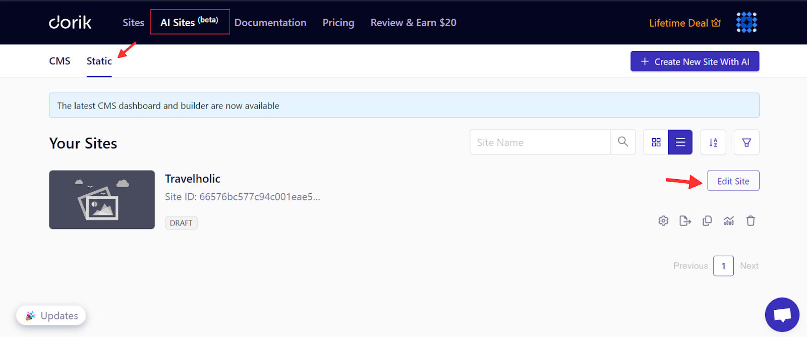
Step 2: Add and Design Your 404 Page
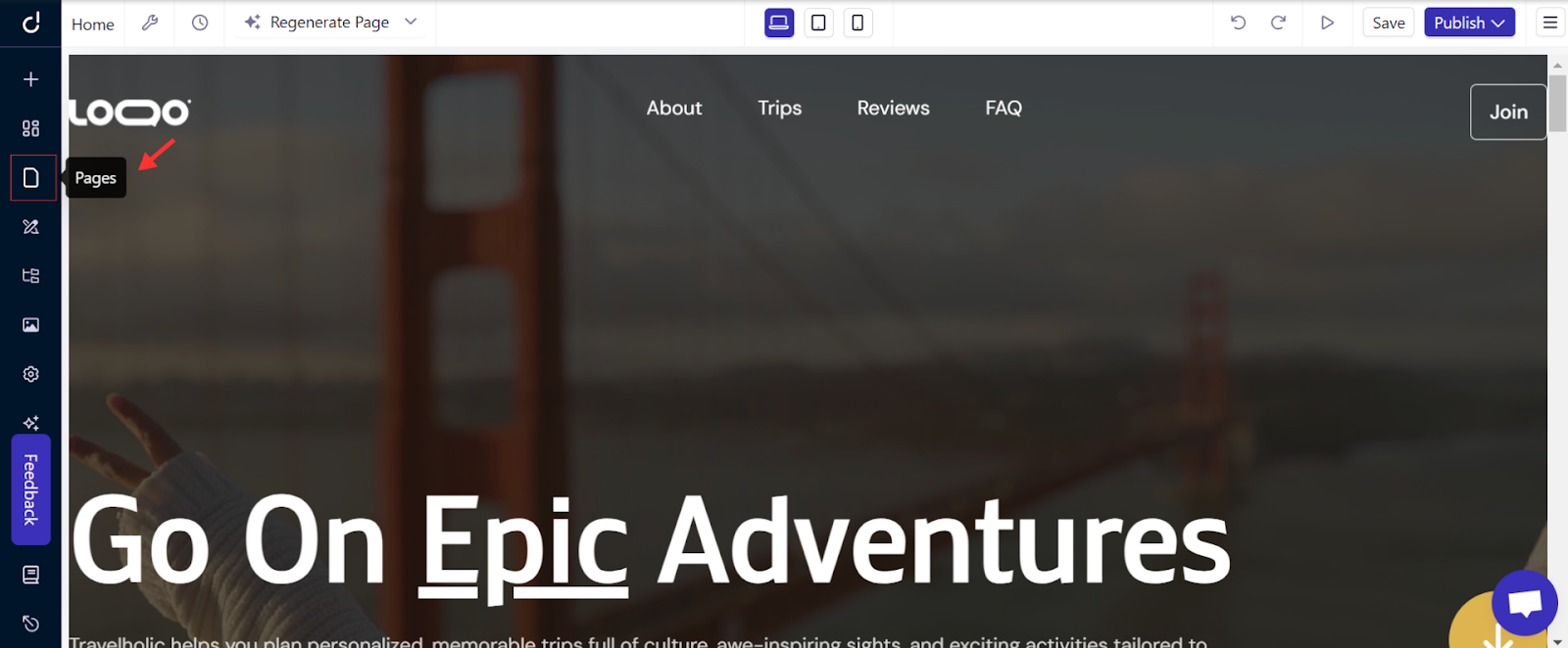
Start by creating a new 404 page. Click on the Pages icon on the left sidebar.
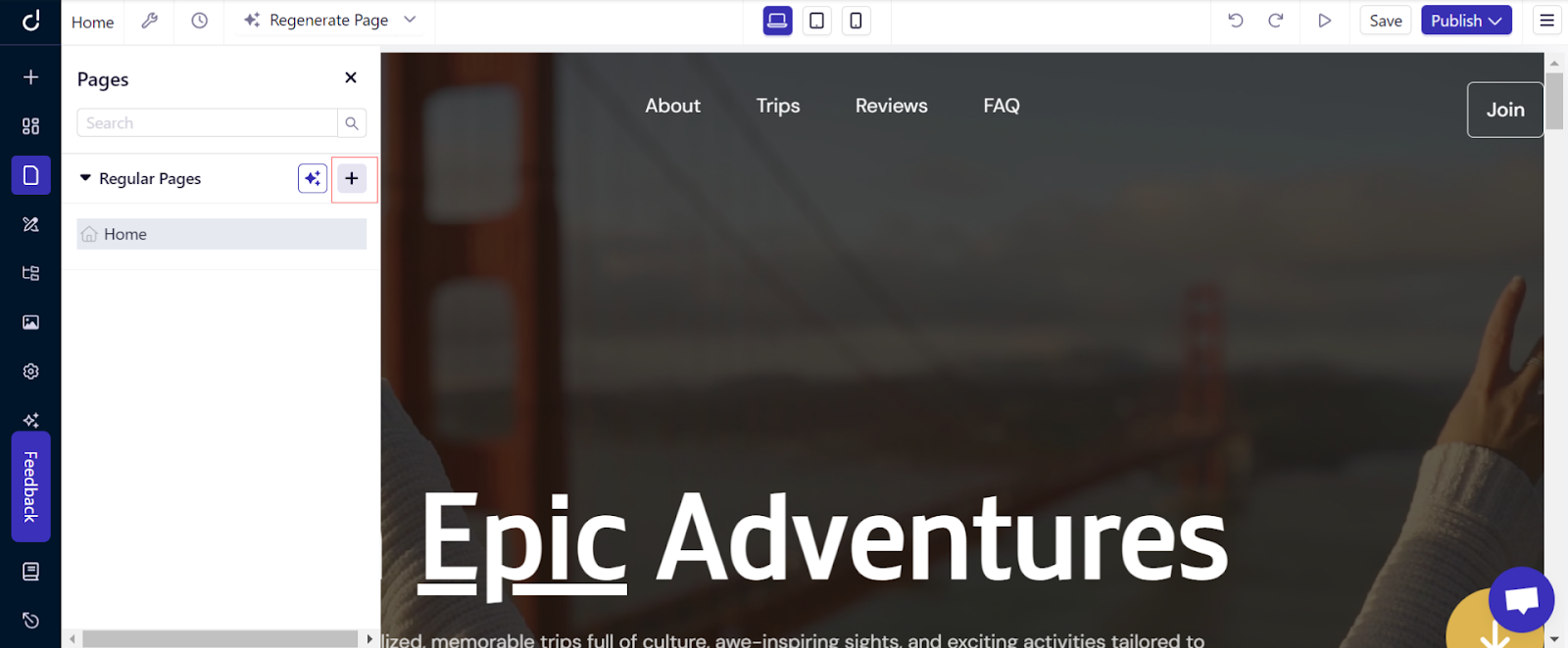
Then tap the "+" icon to add a new page.
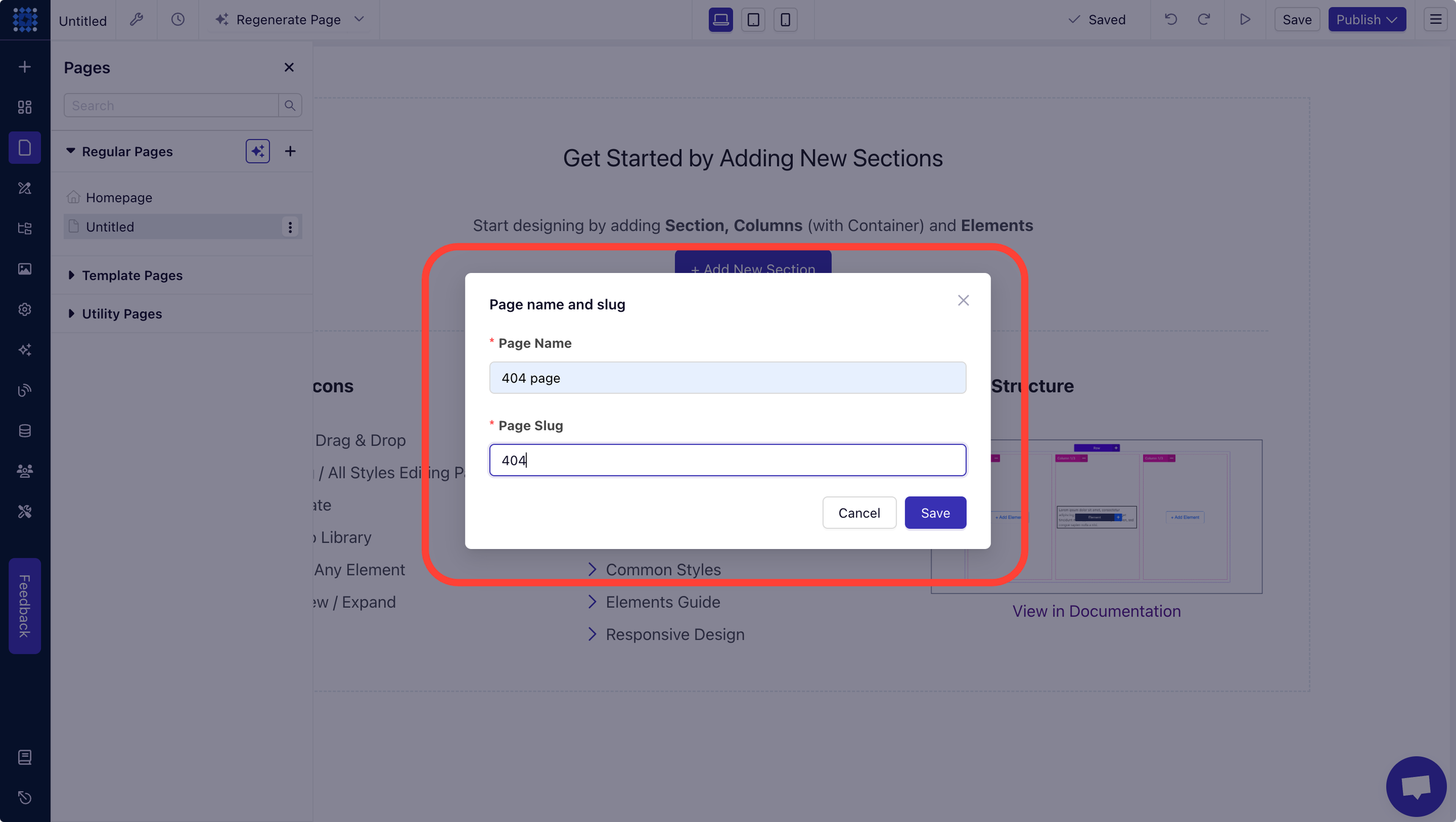
Name it "404 Page" and set the slug as "404" before saving.
Note: Remember the slug must be 404 and don't forget to hit the save button.
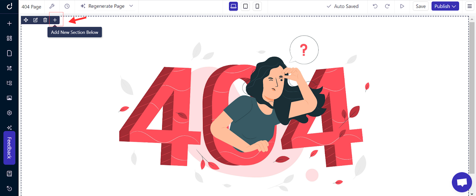
Now, let’s bring your page to life. Add a Section by Clicking "Add New Section".
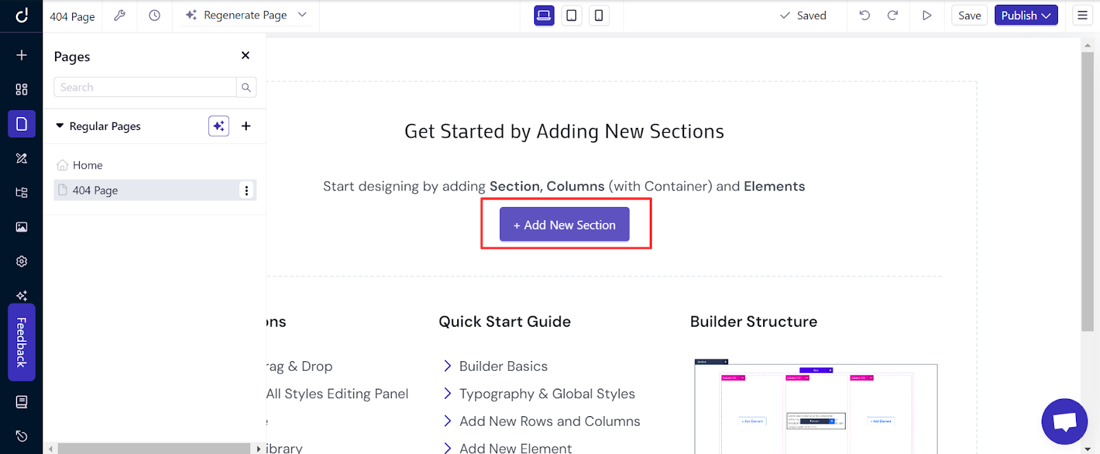
Choose a layout with regular columns.
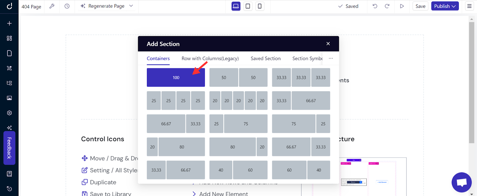
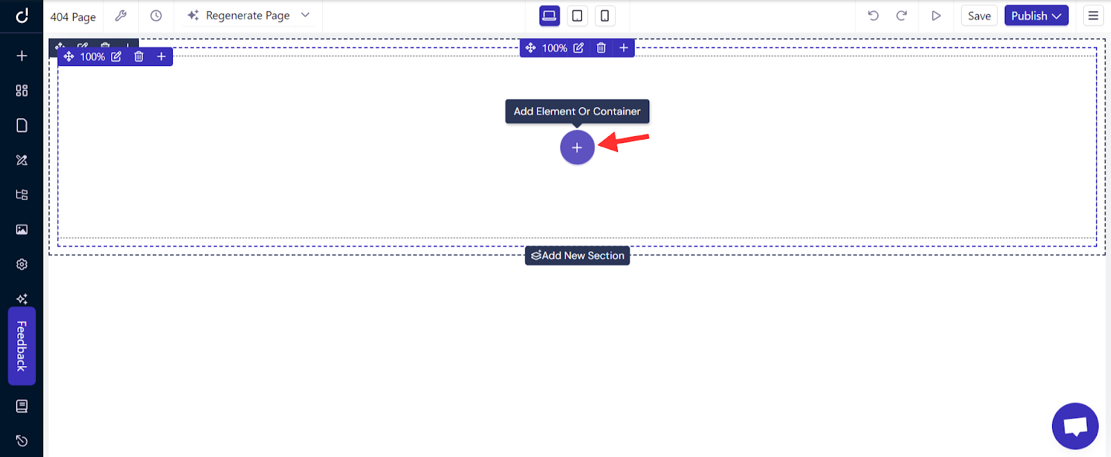
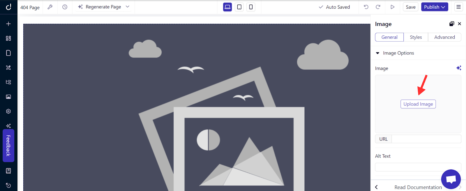
To Insert an Image, click "Add Element".
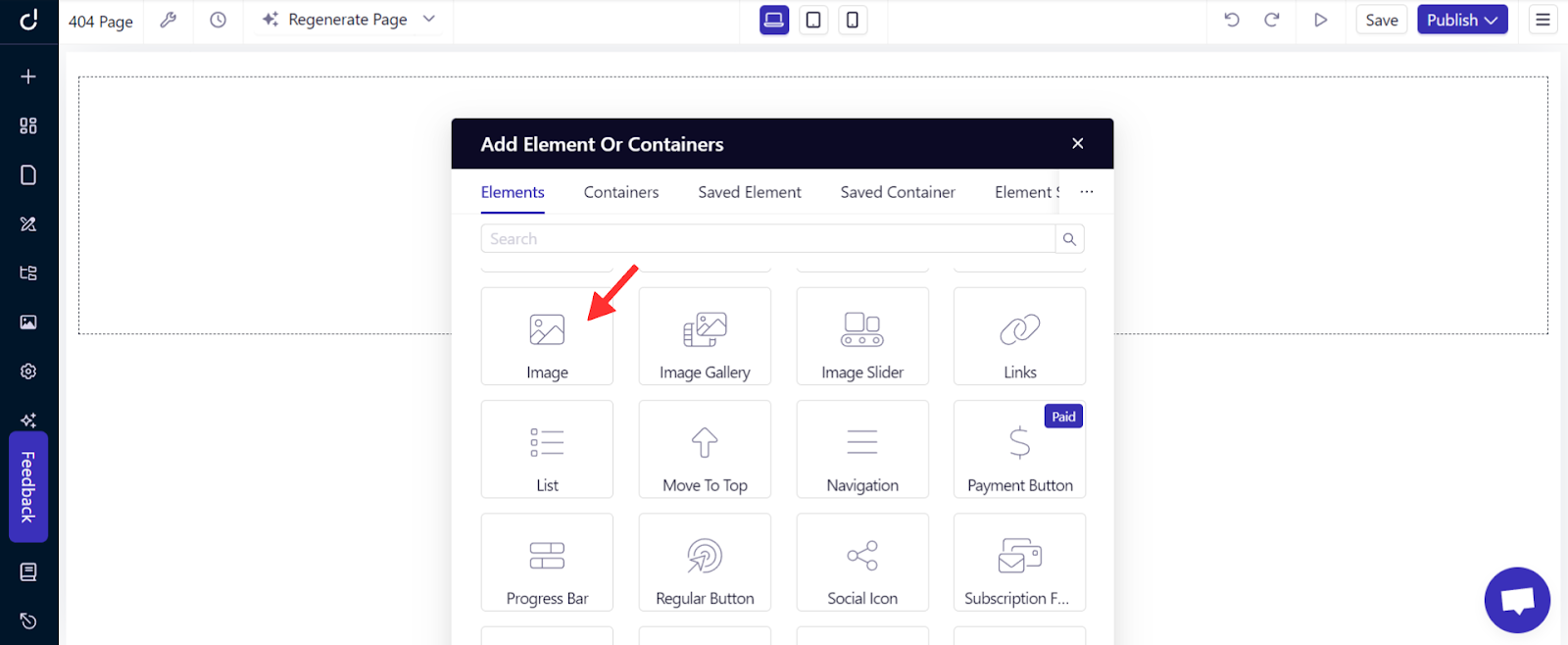
Select the "Image" element.
Upload your chosen 404 image. From the right sidebar, you can adjust the alignment, size, and more to enhance the page’s visual appeal.
Now, to inform visitors they've reached a non-existent page, click the "+" icon to add a new section below the image.
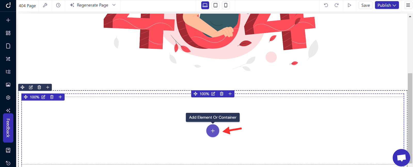
Then, click “Add Element”.
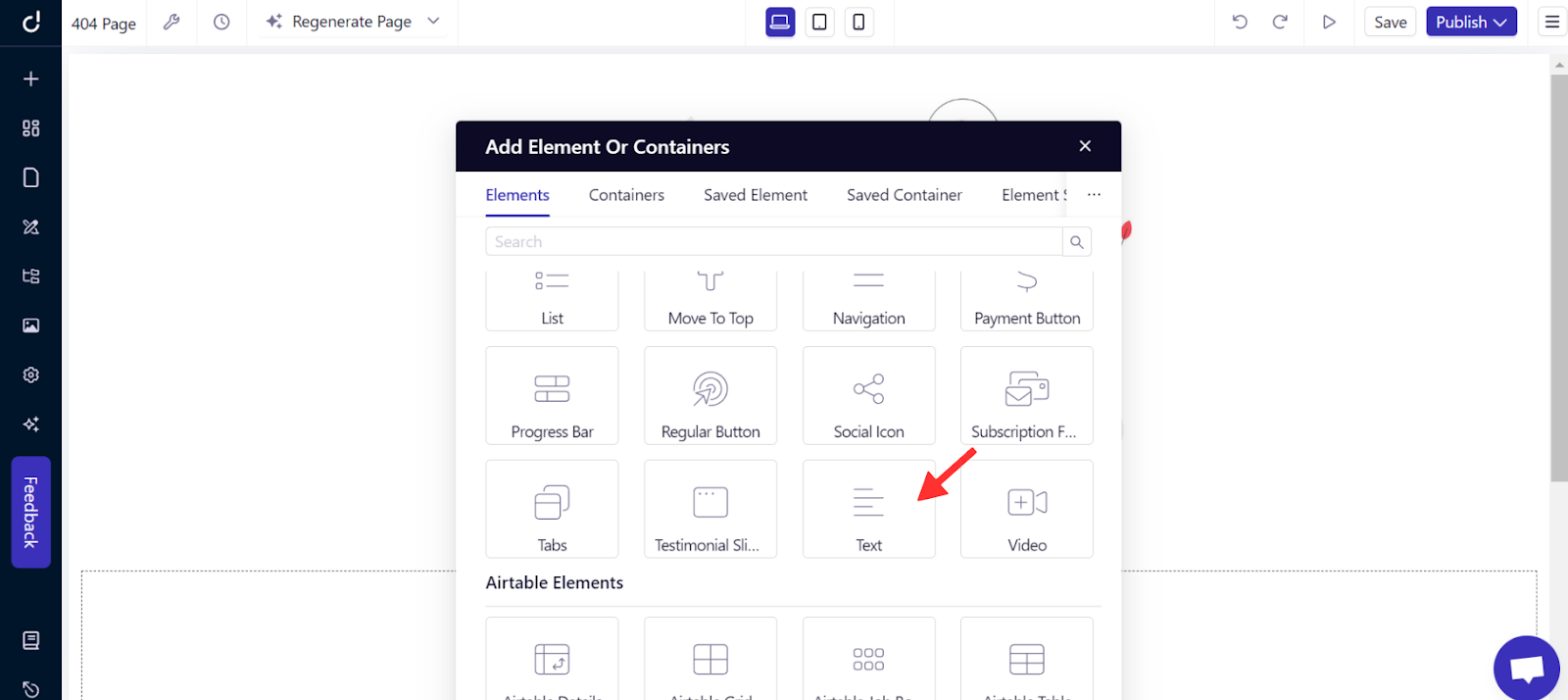
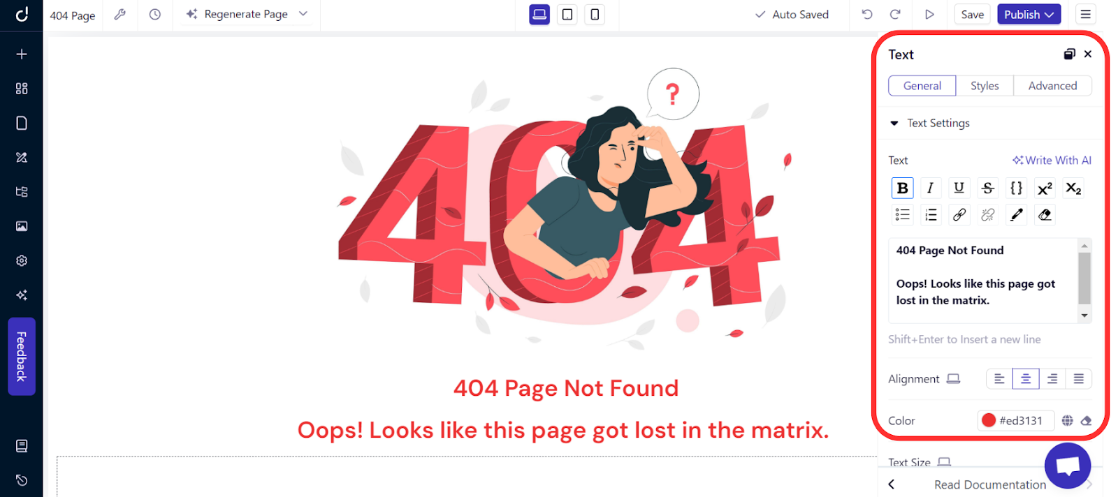
Choose the “Text” element, and enter your custom 404 message.
Now, for further customization of your text, feel free to explore options like size, color, alignment, and more on the right sidebar.
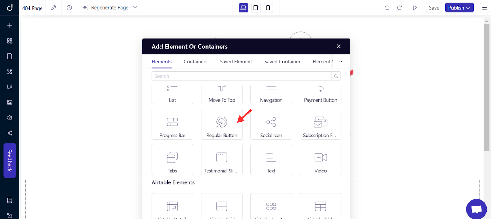
Next, to help visitors navigate back to your site, add a button by following the same steps to add a new section and element. Choose the “Regular Button” option, then customize it by adjusting the text, alignment, and size to suit your page's style.
Step 3: Link to Homepage
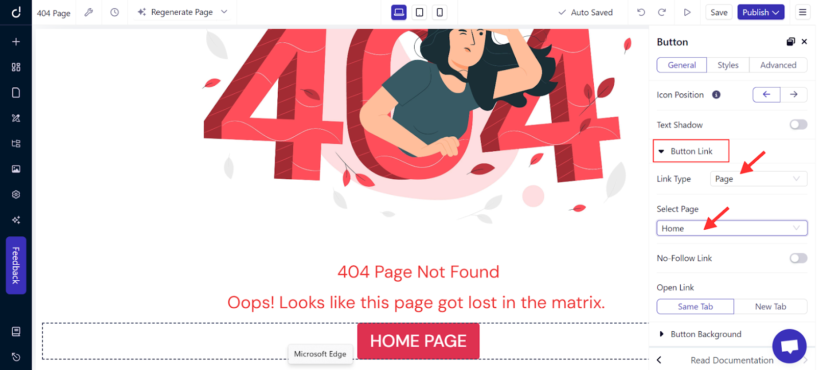
Now that the button is set, click on “Button Link” in the right sidebar options, choose "Page" as the link type, and select your homepage. This way, visitors can easily navigate back to your site, enhancing their experience even after a stumble.
Learn more about how to create a homepage.
Step 4: Preview and Publish
Before going live, preview your 404 page to ensure everything looks as expected, then click “Publish.”
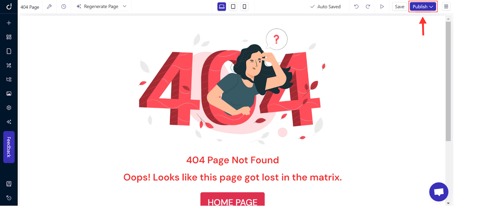
This is the final look of the 404 page I created. Feel free to get creative and design a user-friendly, customized 404 page.
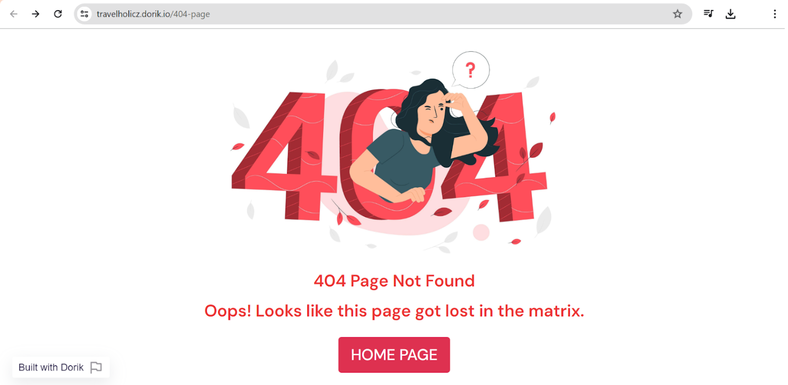
As you can see, creating a 404 page is simple and easy with these steps. Now, you can easily create your own 404 page on Dorik by yourself.
Good Reads: Best Website Builder With Free Templates
Tips to Design A User Friendly 404 Page
A well-designed 404 page can turn a potential site exit into an opportunity for engagement. Here's how to make your 404 page not only user-friendly but also helpful and visually appealing:
-
Design a Visually Appealing Layout: Keep the layout clean and straightforward. A clutter-free design helps maintain user focus and reduces frustration.
-
Use Engaging Visuals: Use graphics or images that align with your brand but are also fun or interesting. This can lighten the mood and make the error less frustrating.
-
Craft a Concise Error Message: Clearly explain that the requested page isn't available. Keep your tone light and helpful, and avoid technical jargon.
-
Include Navigation Links: Offer links to popular pages or a site search feature. This gives visitors options to continue browsing rather than leaving your site.
-
Optimize for Mobile: Ensure your 404 page looks good and functions well on mobile devices. This is crucial as a significant amount of web traffic is mobile.
-
Test Across Devices: Check how your 404 page displays on various devices and browsers to ensure a consistent user experience.
How Custom 404 Pages Boost SEO?
Custom 404 pages boost SEO in several ways:
-
Reduce Bounce Rates: A well-designed 404 page keeps users engaged, preventing them from leaving your site immediately after encountering a broken link. Lower bounce rates can improve your site’s SEO ranking.
-
Maintain Link Equity: Custom 404 pages that include links to other parts of your site help preserve the link equity that might otherwise be lost with a broken link. This supports the strength of your site's network.
-
Improve User Experience: Helpful and easy-to-navigate 404 pages enhance the overall user experience. Search engines prefer websites that provide a good user experience, potentially boosting your rankings.
-
Encourage Longer Visits: Strategic links and appealing design on your 404 page can motivate visitors to explore more of your site instead of leaving, thus increasing their time spent on your site.
For further reading, check out these informative blogs:
6 Best 404 Page Examples
Navigating to a 404 page doesn't have to be a letdown. In fact, I've seen some brands turn this unexpected stop into a real highlight.
Below are the five fantastic 404 page examples that brilliantly fuse creativity with practicality. These pages show how a well-designed error page can turn a mistake into a positive experience.
1. Dorik
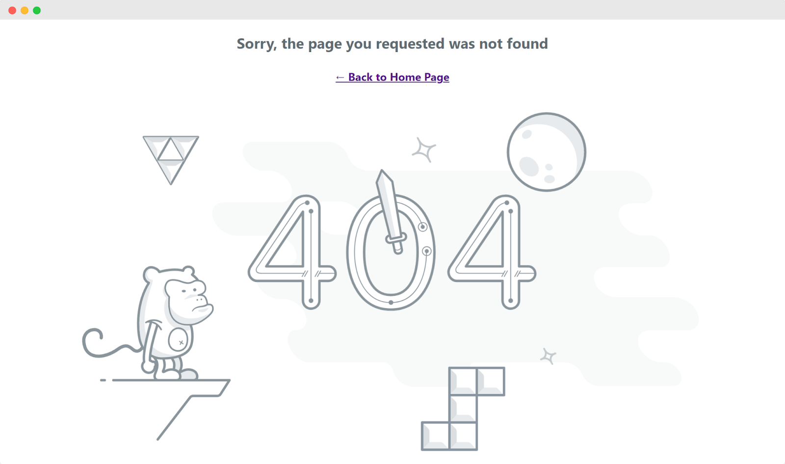
Dorik's 404 page features a playful design with a space-themed illustration, including a monkey astronaut and quirky graphics. The simple message, "Sorry, the page you requested was not found," along with a "Back to Home Page" link, makes it easy for visitors to return to familiar ground.
This approach keeps the experience light and user-friendly, even when they land on a missing page.
2. Pixar
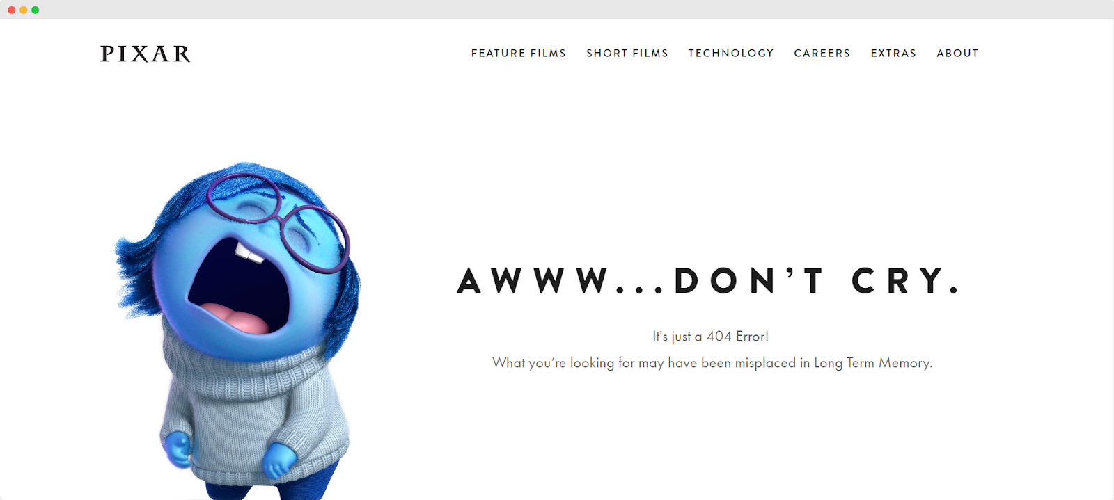
Pixar delights with a 404 page that features a character from "Inside Out," crying humorously. The message "Aww...Don't Cry. It's just a 404 Error!" not only addresses the mishap but playfully hints that the missing content might be "misplaced in Long Term Memory," cleverly tying into the film's theme.
3. YouTube
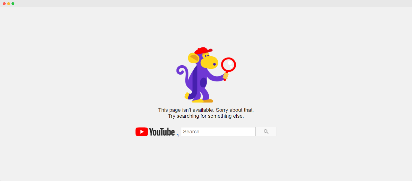
YouTube keeps it simple yet effective with a colorful cartoon monkey holding a magnifying glass, embodying a search gone awry. The prompt to "Try searching for something else" alongside an integrated search bar invites users to continue their exploration without leaving the site.
4. Amazon
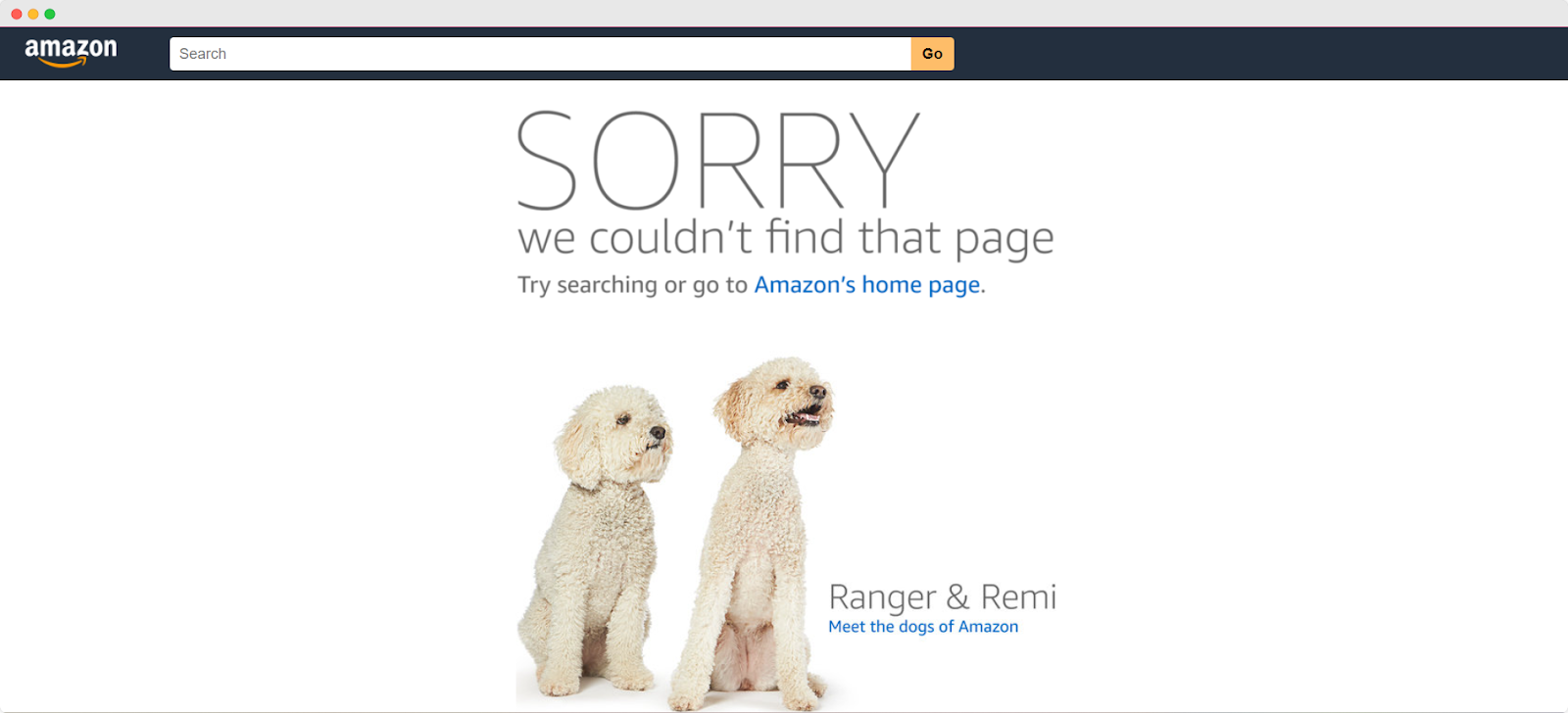
Amazon takes a personal approach by introducing two adorable dogs, Ranger & Remi, known as the 'dogs of Amazon.' This not only softens the disappointment but also adds a relatable touch, encouraging users to either search again or return to the homepage.
5. LEGO
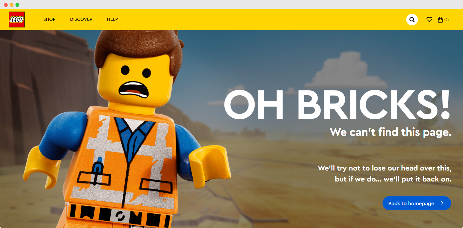
LEGO uses its brand theme creatively with a panicked LEGO figure exclaiming "OH BRICKS!" This playful pun, along with a direct link back to the homepage, combines humor with a seamless navigation solution, making it easy for users to find their way.
6. Mailchimp
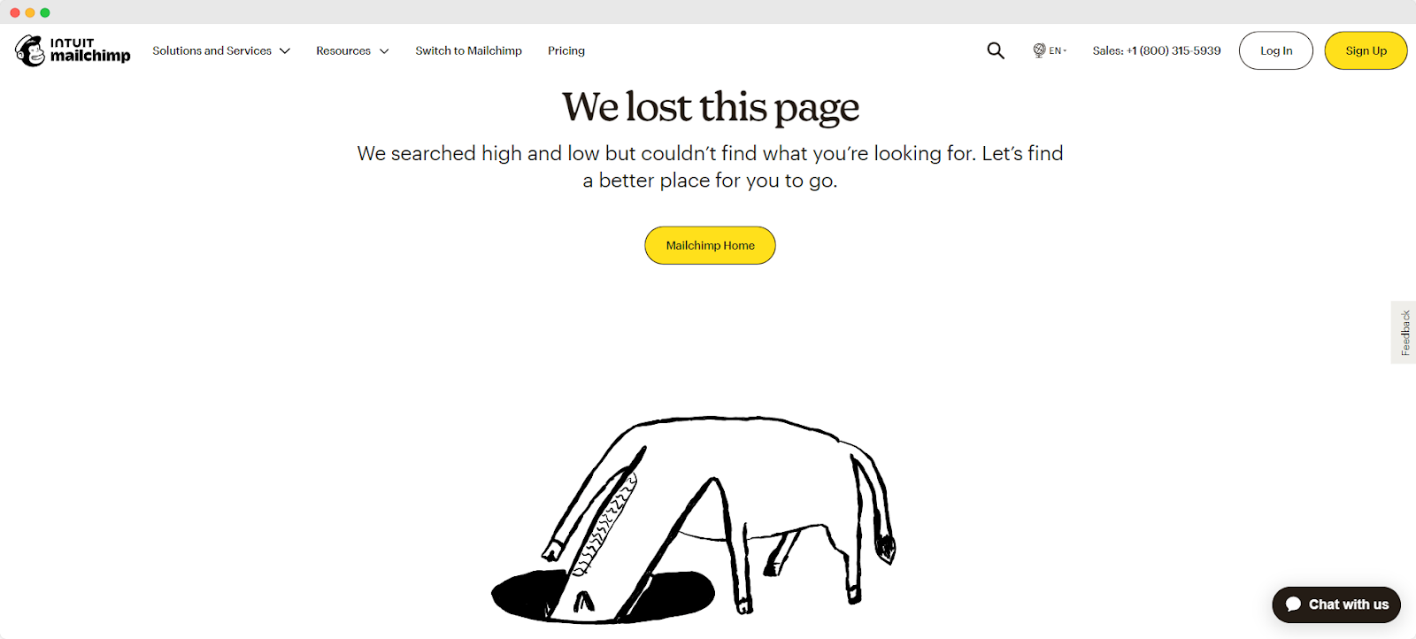
Mailchimp opts for a minimalistic design with a striking black and white illustration of a hand pointing down to where the page should be. The simple yet effective phrase "We lost this page" coupled with a direct prompt to find a better place keeps the mood light and guides users back to the homepage with ease.
Related Read: Best About Us Page Examples
What are 404 pages?
A 404 error page, also known as "404 not found," appears when you try to access a webpage that doesn't exist. This error might show up if you've entered a URL for a page that's been deleted or moved, or if you've simply mistyped the address.
Additionally, a 404 error can occur if DNS settings are misconfigured. This means the specific page you're looking for can't be found on the website.
What Makes A Good 404 Page?
A good 404 page goes beyond just telling visitors that something went wrong. It should be useful, clear, and reflect your brand’s personality. By combining practicality with creative design, your 404 page can help keep visitors engaged and direct them back to your main content smoothly. This not only improves user experience but also maintains the flow of your website traffic.
What is the best practice for 404 pages?
The best practice for designing 404 pages is to guide users effectively when they land on an error page. Ideally, you should redirect them to a relevant page on your site where they can easily find the information or services they need. This approach helps ensure that even if visitors encounter an error, they can still navigate your website smoothly and find what they are looking for without much hassle.
Custom 404 pages vs. Generic 404 pages
Custom 404 pages are far more beneficial than generic ones. A generic 404 page typically just shows a basic message like "Error 404 or 404 page not found," which isn’t very helpful. It doesn’t guide users on what to do next, which can lead to confusion and might make them leave your site.
Custom 404 pages can do more than just notify visitors of a missing page. They can guide users to other parts of your site through links to popular content, a search bar, or creative brand elements. This keeps the experience positive and encourages visitors to keep exploring your site.
Make a Big Difference!
Now it's your turn. We’ve talked about how creative and helpful 404 pages can make a big difference. If you've got your own tips or tricks for crafting a standout 404 page, we'd love to hear them. Share your ideas and experiences below to help others improve their sites too.


