

Is your website feeling a bit cluttered? Like, do visitors get lost or just leave? Maybe it's time for a simpler approach. This guide is here to help you with that.
We'll look at some great minimalist websites examples to spark ideas, break down the key principles that make them work, and then walk through how to build one yourself.
Let's create a site that's clean, clear, and finally conveys your point without all the noise.
10 Minimalist Website Examples to Inspire
This section discusses some of the best minimalist websites to help you gather design ideas before you build your website.
1. Apple
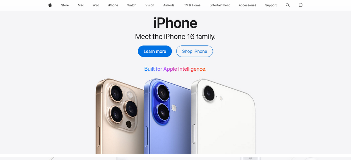
Apple's website embraces minimalism by putting the products front and center. You immediately notice the bold, beautiful product photography against a clean, white background.
This generous use of whitespace creates a sense of focus and eliminates distractions. We see a simple, clear navigation bar at the top, guiding you without overwhelming you with options.
This site's typography is clean, legible, and easy to read. Apple avoids clutter by presenting information in concise, scannable blocks of text. This approach ensures you can find what you need quickly.
Its design feels intuitive and uncluttered, allowing the quality of the products to speak for itself. It’s a masterclass in using simplicity to create a sophisticated and user-friendly experience.
2. The New York Times
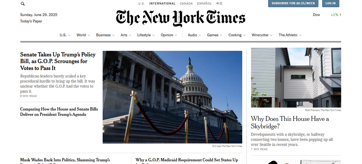
The New York Times website presents a classic, content-rich take on minimalism. You first notice its organized, grid-based layout, which brings order to a vast amount of information.
This structure helps guide your eyes from one headline to the next, preventing you from feeling overwhelmed. We see a strong use of a simple, serif typeface for headlines, which adds a touch of classic authority.
The site uses whitespace effectively, creating clear separation between articles and columns. You find a clean, black-and-white color scheme that keeps the focus firmly on the news and photography.
Related Read: Website Color Scheme
For a site with so much content, its navigation remains straightforward, making it easy to explore different sections. It demonstrates that minimalism can be effective for complex news sites, prioritizing readability and user experience.
3. Dropbox

Dropbox's website shows you the power of focused design. Its homepage immediately communicates its purpose with a clear headline and a single, prominent call-to-action button.
You'll notice a simple color palette, primarily consisting of blues and whites, which creates a calm and professional feel. We see how whitespace is used generously to draw your attention to key features and illustrations.
The typography is clean and modern, making all text easy to read. This website presents information in digestible sections as you scroll, avoiding overwhelming you with excessive content.
Its design feels clean and efficient, reflecting the straightforward nature of the product itself. Everything on the page works together to keep you engaged.
4. Grammarly
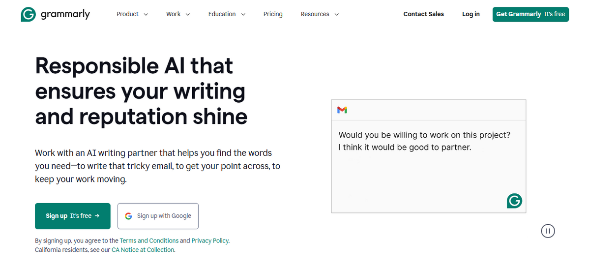
Grammarly's website is a strong entry in our list of minimalist websites examples. You see a design that focuses on a single concept: improving your writing.
Its homepage uses a soft, green-and-white color scheme that feels inviting and clean. We find the page is built with ample whitespace, which directs your focus to the text editor demonstration.
The copy is concise and benefit-driven. It clearly states what the product does without unnecessary words. You can navigate the entire site through a simple and clear top menu.
This uncluttered approach builds trust and confidence in the product. The design makes you feel that the tool itself will bring similar clarity to your own work.
Related Read: Best AI Writing Tools
5. Muji

Muji's website perfectly reflects its "no-brand" philosophy. You immediately notice the site's simple grid layout, which presents product categories in a clean and organized way. Its design uses a neutral color palette of whites and grays.
This choice creates a calm browsing experience for you. We see a focus on product category information over aggressive marketing. The typography is straightforward and functional, prioritizing readability above all else.
You won’t find any flashy banners or pop-ups here. Instead, the site gives you clear categories and high-quality images. This digital space feels practical and honest.
6. Everlane

Everlane's design feels direct, just like its brand promise. What do you see when you first land on the site? You find clean, organized rows of apparel presented without distraction. The focus stays entirely on the clothing.
We see that product pages provide you with essential information in a clear, easy-to-read format. There are no flashy sales banners or complex visuals.
The site features a muted, neutral color palette that allows the product photography to take center stage. This uncluttered and transparent approach to e-commerce design builds a sense of trust.
7. Aesop
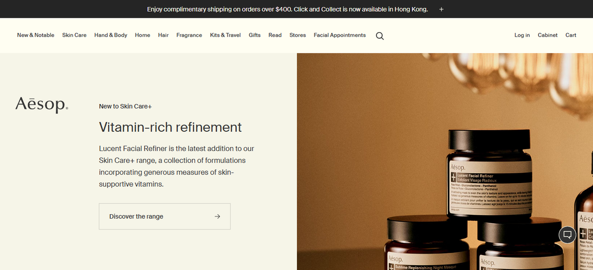
Aesop's website greets you with an unconventional layout. This unique design sparks your curiosity from the start. We see artistic photography and short essays that draw your eye across the page.
This approach builds a quiet and intellectual mood. The site uses a warm, earthy color palette and a distinctive font. You find that these elements create a sophisticated and calming atmosphere.
The brand presents its products with clear information. This design proves that minimalism can feel warm and rich.
8. Kinfolk
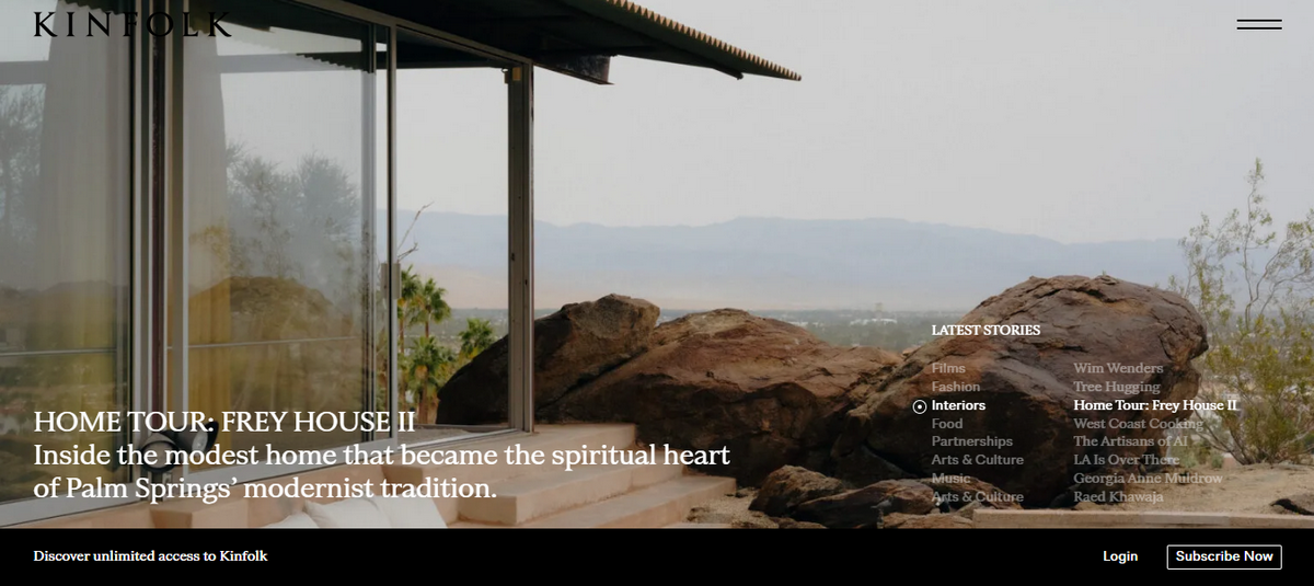
Kinfolk extends its print magazine's aesthetic directly to its website. We see a design that prioritizes beautiful, editorial-style photography above all else. Large, artful images dominate the screen.
Related Read: Best Photography Website Examples
The site uses generous whitespace, which frames each story like a gallery piece. Elegant typography gives every headline a classic, readable quality. This minimalist approach creates a slow and thoughtful browsing experience for you.
9. Design Within Reach
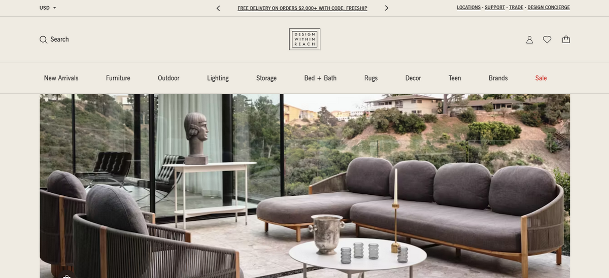
Design Within Reach uses minimalism to showcase its iconic furniture. The website's clean, grid-based layout presents each product like a piece in a museum. We notice that the design gives every chair and table ample room to breathe.
While examining the furniture, you notice a simple, neutral colour palette that places all the focus on the product's details and craftsmanship.
The navigation is clear and logical. It helps you browse extensive collections with ease. This site demonstrates that a simple design can evoke a sense of luxury and sophistication.
10. Matt D'Avella

It's the last contender on this list of the best minimalist websites examples. Matt D'Avella's website reflects his minimalist ideas. It’s simple and practical.
The layout is clean and uncluttered. It uses plenty of white space. This design helps you focus on the main message. The site has an apparent goal. It wants to draw you into his world.
The main button guides you toward joining his courses. The navigation menu is also very simple. It avoids complex or distracting links.
This focused approach removes everything unnecessary. It creates a clear path for visitors. You instantly understand what he offers.
Related Read: Influencer Website Examples
What is Minimalism in Web Design?
Minimalism in web design is a philosophy rooted in the principle of "less is more." This approach focuses on keeping only the essential elements on a page. Designers use minimalism to create a clear and uncluttered experience for you.
This means the design eliminates unnecessary visual clutter. It prioritizes the information and tasks you came for.
This style uses generous whitespace, bold typography, and a simple color palette to create focus. Every element serves a purpose. Therefore, the website's usability enhances and helps you achieve your goal without confusion.
5 Key Elements of Minimalist Website Design
Here are the five key elements of minimalist website design.
1. Active Whitespace
We often think of whitespace as empty, but in minimalism, it is an active element. Designers use generous whitespace, or negative space, to give your eyes a rest. Good use of whitespace makes a design feel open, balanced, and easy to follow.
2. Simple Color Palette
Minimalist designs use a limited and deliberate selection of colors. You’ll rarely find more than three colors used in the entire design.
3. Clear Typography
Typography becomes a central design feature in minimalism. With few other elements on the page, the choice of font has a major impact. Consistent and simple typography helps communicate the message directly and adds to the site's overall character.
4. No Unnecessary Elements
This is the core principle of minimalist design: if an element does not serve a purpose, you should remove it. Only include elements that have a clear job to do.
5. Clear Visual Hierarchy
Minimalist design tells you what is most important on a page. It creates a clear visual hierarchy. Designers use size and placement to guide your attention.
This clear structure tells you where to look first and how to navigate the page intuitively.
How to Build a Minimalist Website
Creating a minimalist website is about focus and clarity. We broke down the process into six simple steps to make a website easily.
1. Choose a Powerful Website Builder
Your first step is to select the right website builder. We recommend a flexible platform like Dorik. Dorik helps you build any kind of website with its AI Website Builder; you just write a simple prompt.
It also lets you start with professional templates or build a site from scratch. Plus, Dorik includes built-in hosting. This means you do not need to worry about finding a separate hosting service. This simplifies the technical aspects, allowing you to focus on your design.
2. Pick a Clean Foundation
Once you choose your tool, select a simple starting point. With Dorik, you can ask the AI to "create a minimalist website for a portfolio."
You can also browse its library and select a template with clean lines and ample open space. Your goal is to find a layout that puts your main content in the spotlight.
3. Customize with Minimalist Principles
Now, you can customize your design. Focus on a limited color scheme of two or three colors that match your brand. Select one or two clean and readable fonts for all your text.
Actively use whitespace to create balance and guide the eye. Check that you leave enough space between text, images, and other elements. Resist the urge to add graphics or animations that do not serve a purpose.
4. Add Only Essential Content
Minimalism also applies to your words and images. Include only the necessary pages, such as a homepage, an about page, and a contact page.
Write text that is concise and direct. Every sentence should give your visitors valuable information. Select high-quality images that complement your design and effectively convey your message.
5. Ensure a Flawless Mobile Experience
Your website must work perfectly on any device. Minimalist designs often adapt well to smaller screens because of their simplicity.
If you use Dorik, you don’t have to think about this aspect of website building. Dorik always builds responsive websites that work on all devices.
6. Publish Your Site
Once you are satisfied with your design, it's time to publish. Before you share it with the world, preview the site one last time.
Test every link, button, and contact form to ensure they work correctly. A great minimalist website is not just beautiful; it is also functional and reliable for every visitor.
Our Concluding Thoughts
These minimalist websites examples prove that a simple design can make a powerful impact. As we have seen, minimalism is more than just an aesthetic. It is a strategic choice that prioritizes clear communication and a great user experience.
By focusing on essential elements and following the steps outlined, you can create your own effective website. Now you can build a clean, uncluttered space that genuinely connects with your audience.