

Design a website by moving through nine phases: set goals and audience; map sitemap and user flows; wireframe core pages; design branded mockups; create SEO content and media; build with code or no-code; test speed, accessibility, and mobile; launch with analytics and SSL; then optimize and maintain with audits and backups.
This guide provides a complete roadmap on how to design a website that drives growth.
We'll cover everything from planning to choosing the right tools, avoiding costly mistakes, and launching a site. Let's get going.
TL;DR
-
Plan Before You Build: Always start with clear goals, audience research, and a solid plan. A good plan prevents major headaches later.
-
Follow a Clear Process: The best workflow moves from a basic wireframe (blueprint) to a visual mockup (the look) before you build, test, and launch.
-
You Don't Need to Code: Modern no-code builders like Dorik allow anyone to create a professional, high-quality website with a visual drag-and-drop interface.
-
Avoid Critical Mistakes: The fastest way to lose visitors is with a slow-loading site, poor mobile design, or confusing navigation. Prioritize these fundamentals.
-
Test and Optimize: Launching is just the beginning. Use analytics and user testing to continuously improve your design and get better results over time.
How to Design a Website: Step-by-Step Guide
The website design process follows 9 sequential phases from strategy to maintenance, with each phase building on the previous one to create functional, conversion-optimized websites.
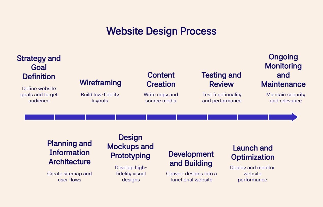
Phase 1: Strategy and Goal Definition
Define your website's primary goals, target audience, and competitive positioning.
Create a project brief documenting the following:
-
Your site's purpose (e-commerce sales, lead generation, portfolio showcase)
-
Target user demographics and pain points
-
Competitor strengths and weaknesses
-
Required features (shopping cart, blog, cutom forms, etc.)
-
Budget allocation
-
Project timeline with milestones.
Deliverable: Comprehensive project brief with measurable success metrics.
Phase 2: Planning and Information Architecture (IA)
Create a sitemap showing all pages and their hierarchical relationships.
Map your site architecture from the homepage through the main sections (About, Services, Products, Contact) to individual content pages.
Design user flows for critical tasks like checkout processes (5-7 steps), contact form submissions (2-3 fields minimum), and content discovery paths.
Modern website builders with built-in wireframing capabilities streamline IA creation by providing visual structure templates.
Deliverable: Approved sitemap and user flow diagrams.
Phase 3: Wireframing
Build low-fidelity layouts using boxes and lines to establish structure without visual design.
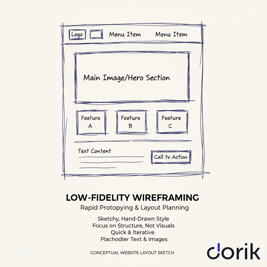
Wireframes define element placement (header, navigation, content blocks, CTAs, footer), content hierarchy, functional requirements, and responsive behavior across desktop (1920px), tablet (768px), and mobile (375px) breakpoints.
Tools: Balsamiq for rapid sketching, Figma for detailed layouts with collaborative commenting, or built-in builder wireframe modules.
The wireframing phase helps visualize how responsive website templates adapt across devices.
Checkpoint: Stakeholder approval of core page structures before visual design begins.
Phase 4: Design Mockups and Prototyping
Transform approved wireframes into high-fidelity visual designs with complete branding.
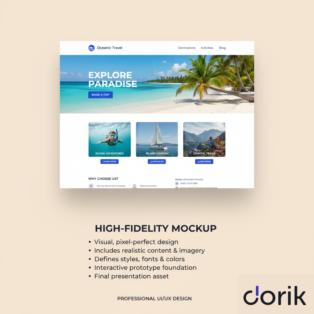
Apply your color palette (2-3 primary colors with HEX codes), typography system (headline font, body font, sizing scale), imagery style (photography, illustrations, icons), spacing and grid system, and interactive element states (hover, active, disabled).
Create pixel-perfect mockups in Figma or Adobe XD, then convert static designs into clickable prototypes linking pages to test navigation flow, form interactions, and user journey before development.
Deliverable: Approved high-fidelity mockups and interactive prototype.
Phase 5: Content Creation
Write website copy, source images, and produce videos during the design phase.
Create SEO-optimized text for all pages (homepage value proposition, service descriptions, product details, about page story), high-resolution images (minimum 1920px width for hero sections), videos (product demos, testimonials, explainer content), and downloadable resources (PDFs, guides, templates).
Content creation becomes more efficient with AI-powered text generation tools that maintain brand voice consistency while producing first drafts in minutes.
Deliverable: All final text, optimized images, and media assets ready for integration.
Phase 6: Development and Building
Convert design mockups into a functional website using code or visual builders.
Traditional development uses HTML for structure, CSS for styling, and JavaScript for interactivity.
Modern no-code platforms like Dorik eliminate manual coding. You design visually while the platform generates clean, efficient code automatically.
Integrate your CMS for content management, connect third-party tools (email marketing, analytics, payment processing), implement responsive breakpoints, and optimize assets (compress images, minify code, enable caching).
Milestone: Fully functional website deployed on staging server.
Phase 7: Testing and Review
Test functionality, compatibility, performance, and usability before launch.
Run technical tests checking broken links, form submissions, payment processing, mobile responsiveness across iOS and Android, and cross-browser compatibility (Chrome, Safari, Firefox, Edge).
Measure page speed with Google PageSpeed Insights (target: under 3 seconds), conduct usability testing with 5-8 real users completing key tasks, and verify accessibility using WAVE (target: WCAG 2.1 AA compliance).
During testing, use modern analytics tools to gather baseline metrics for post-launch comparison.
Checkpoint: All critical issues resolved, performance benchmarks met.
Phase 8: Launch and Optimization
Deploy the website following the ultimate design checklist from staging to your live domain and monitor initial performance.
Transfer your site to production servers, configure DNS settings, implement SSL certificates for HTTPS security, submit sitemap to Google Search Console and Bing Webmaster Tools, and set up analytics tracking (Google Analytics, heatmaps, conversion tracking).
Monitor closely for 2-4 weeks post-launch, tracking server errors, user behavior patterns, conversion rates, and traffic sources.
Use this real-world data to make immediate optimizations. Adjust CTAs based on click rates, refine content for better engagement, and improve load times for high-traffic pages.
Follow this website launch checklist to avoid common mistakes.
Goal: Stable, performing website with baseline metrics established.
Phase 9: Ongoing Monitoring and Maintenance
Maintain website security, performance, and relevance through continuous updates.
Perform weekly uptime monitoring (target: 99.9% availability), monthly security scans and software updates, quarterly content audits and refreshes, and yearly performance reviews against business objectives.
Regular backups (daily for e-commerce, weekly for business sites) protect against data loss.
Content updates keep information current and support SEO performance. Security patches prevent vulnerabilities from emerging threats.
Timeline: Ongoing throughout website lifecycle, typically 3-5 years before major redesign consideration.
How Long Does Each Design Phase Typically Take?
Website design projects take 1-3 days for simple sites, 2-6 weeks for business sites, and 1-6 months for complex sites. Project complexity, custom design level, and client responsiveness determine the final timeline.
Website design timeline estimates by project size:
| Phase | Simple Site | Business Site | Complex Site | Key Factors |
|---|---|---|---|---|
| Planning | 1-2 days | 1 week | 2-3 weeks | Content volume, features |
| Design | 3-5 days | 2-3 weeks | 1-2 months | Customization level |
| Build | 1-3 days | 1-2 weeks | 1-3 months | Platform choice |
Pre-built template foundations reduce design time by 60-80% for business websites.
No-code platforms like Dorik cut build time by over 95% compared to traditional hand-coding.
What Can Slow Down the Design Process?
Four bottlenecks delay website projects: choosing the wrong platform, scope creep, delayed feedback, and late content delivery.
-
Choosing the wrong platform is the biggest bottleneck in website design. You can design a site within hours using a no-code AI website builder, whereas custom website design takes months to get the desired result.
-
Scope creep expands requirements beyond the original agreement, such as adding e-commerce features mid-project. Combat this by establishing a detailed project brief and signed contract before work begins.
-
Delayed feedback halts progress when design teams wait days for approvals. Set 24-hour turnaround expectations for mockup reviews.
-
Content delays occur when clients deliver text and images late. Require all final content before the development phase starts.
How to Choose the Right Website Design Platform?
The right website design platform balances user-friendliness, customization power, and features that match your technical skills, project goals, budget, and timeline.
Beginners prioritize ease of use, while professional designers need advanced customization, and agencies require white-label capabilities and client management tools.
Here are the top website builders that makes the design process a breeze:
| Platform | Best For | Ease of Use | Customization | Unique Features | Price Range | Agency Features |
|---|---|---|---|---|---|---|
| Dorik | Agencies, AI Design | High | High | White-label, AI content | $20.75-$79/month | Yes |
| Wix | Beginners, Small Business | Very High | Medium | ADI, App Market | $14-$39/mo | Limited |
| Webflow | Designers, Developers | Medium | Very High | Visual code, CMS API | $14-$39/mo | Yes |
| WordPress | Developers, Bloggers | Low-Medium | Very High | Plugin ecosystem | $4-$45/mo | With plugins |
| Squarespace | Creatives, Portfolios | High | Medium | Design templates | $16-$40/mo | Limited |
Selection Framework:
To select the right platform, you can use a simple decision-making process.
-
Assess your technical comfort level first: Beginners benefit from Dorik AI, Wix, or Squarespace with high ease-of-use scores and intuitive drag-and-drop editors.
-
Define your customization needs: Choose WordPress or Webflow for complete creative freedom and code-level control. Select template-based platforms like Dorik and Squarespace for professional designs that require minimal customization.
-
Consider scalability requirements: Platforms with robust Content Management Systems (CMS) like Dorik AI, WordPress, and Webflow support extensive content growth, complex features, and third-party integrations.
Agencies require white-label website building platforms that maintain client branding throughout the process.
Dorik provides white-label CMS capabilities, client management tools, and AI-powered website generation that creates complete sites from business requirements in minutes.
What Features Matter Most for Different Website Types?
Different website types require distinct feature sets based on their primary function.
-
Small Business Websites: Contact forms, service/product pages, and built-in SEO tools generate leads and attract customers through search visibility.
-
E-commerce Sites: Secure payment gateways, product galleries with inventory management, and streamlined checkout processes minimize cart abandonment and maximize sales conversion.
-
Portfolio Websites: High-quality template designs, fast-loading image galleries (under 2 seconds), and prominent contact methods showcase creative work effectively.
-
Blogs: Powerful Content Management Systems (CMS), integrated social sharing buttons, and comment sections drive content distribution and community engagement.
-
Membership Sites: User authentication, content gating, recurring payment processing, and tiered access levels control subscriber experiences and revenue streams.
Choose platforms natively strong in your website type's required features rather than platforms requiring complex workarounds or third-party integrations.
How Do Beginners Choose Their First Design Platform?
Beginners should prioritize 3 criteria:
-
Ease of use
-
Support quality
-
Template selection.
Drag-and-drop editors reduce the learning curve by 70-80% compared to code-based platforms. Robust support options, such as tutorials, community forums, and responsive customer service, resolve technical obstacles during the building process.
Test platforms through free trials or plans before committing financially. This hands-on experience reveals whether the interface matches your workflow preferences and technical comfort level.
Budget for transparent pricing models. Entry-level plans ranging from $10-50/month typically include hosting, templates, and core features, preventing unexpected costs for essential functionality.
How to Create Effective Wireframes and Mockups?
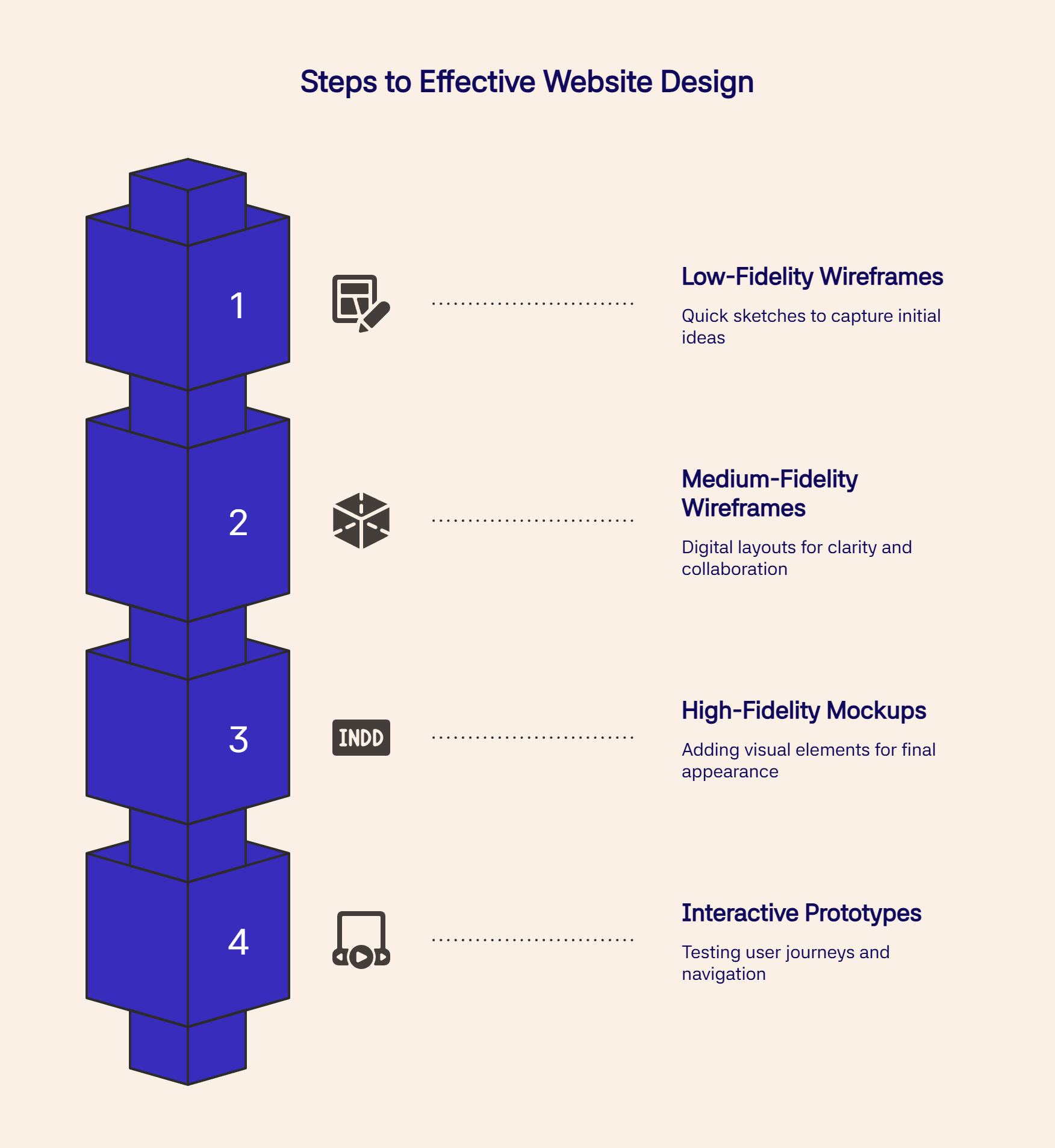
Wireframes are basic blueprints that map structure, content placement, and features for each page using only lines and boxes—no colors, fonts, or images. This function-first approach forces layout agreement before visual design, preventing costly revisions later.
Start with low-fidelity wireframes through quick whiteboard sketches to capture ideas rapidly. Progress to medium-fidelity digital wireframes using tools like Balsamiq for clean layouts or Figma for complex projects requiring real-time team collaboration and commenting.
Modern website builders include built-in wireframing capabilities that accelerate the design-to-development transition. For agencies managing multiple clients, design system templates provide consistent wireframe foundations that reduce project setup time.
After wireframe approval, create high-fidelity mockups by adding visual elements, such as color palettes, typography, and brand imagery, to the structural foundation. These pixel-perfect, static images represent the final appearance of the website.
Transform static mockups into interactive prototypes by connecting pages and enabling clickable buttons to test user journeys. Conduct usability testing at this stage to identify confusing navigation or awkward user flows before development begins, ensuring a user-friendly final website.
What Wireframing Tools Work Best for Beginners?
You don't need to be a professional designer or buy expensive software to create a great wireframe. For beginners, the best tool is often the one that's fastest and easiest to learn.
-
Balsamiq creates low-fidelity wireframes with a hand-drawn aesthetic and drag-and-drop interface that focuses on layout over visual details. The tool costs $9/month for individuals.
-
Figma provides real-time collaboration features, component libraries, and progression from wireframe to high-fidelity mockup in one platform. The free plan includes three projects and unlimited collaborators, making it the industry standard for team-based design.
-
Adobe XD integrates with Photoshop, Illustrator, and other Creative Cloud applications, offering a streamlined interface for designers already in the Adobe ecosystem. The free starter plan includes one shared document and 2GB of cloud storage.
-
Canva offers basic wireframing through simple shapes and templates in its free plan, suitable for users seeking familiar drag-and-drop editing without learning specialized design software.
Choose Balsamiq for rapid concept sketching, Figma for collaborative projects requiring design system development, Adobe XD for Creative Cloud integration, or Canva for simple layouts using existing platform knowledge.
What Are the Essential Elements of Effective Website Design?
Effective website design combines eight core elements: visual hierarchy, color theory, typography, layout principles, imagery, white space, navigation, and responsive design.
Each element serves both aesthetic and functional purposes to guide visitors and represent brand identity.
1. Visual Hierarchy
Visual hierarchy arranges elements by importance using size, color, contrast, and placement. Designers make headlines and call-to-action buttons larger and more prominent to draw attention. Strong hierarchy guides users through pages, making content scannable and easier to understand.
How Does Visual Hierarchy Guide User Attention?
Visual hierarchy directs visitor focus through size, color, contrast, and positioning. Users scan websites rather than reading word-for-word, following predictable patterns that designers can control.
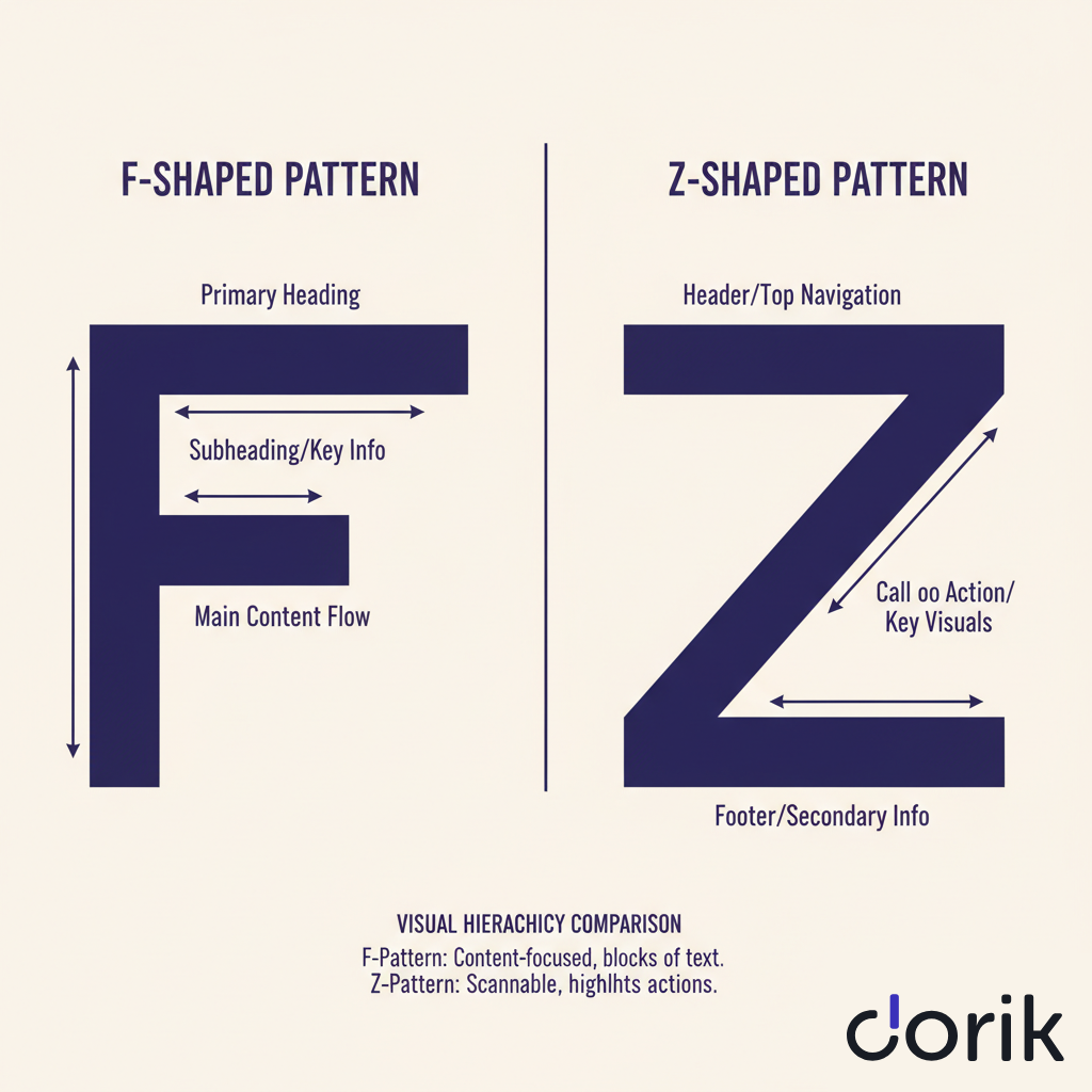
-
On text-heavy pages, users follow an F-pattern: scanning horizontally across the top, down the left side, then making shorter horizontal scans.
-
On visual pages, users follow a Z-pattern: top-left to top-right, diagonally to bottom-left, then across to the right.
Designers control scanning behavior through three techniques:
-
Size and scale make critical elements like main headers the largest on the page.
-
Color and contrast make call-to-action (CTA) buttons stand out from surrounding content.
-
Strategic positioning places value propositions where users' eyes land first.
Well-structured landing page templates demonstrate effective hierarchy with clear visual flow from headline to CTA.
Weak hierarchy occurs when insufficient contrast exists between elements or when too many items compete for attention, overwhelming users and diluting message impact.
2. Color Theory
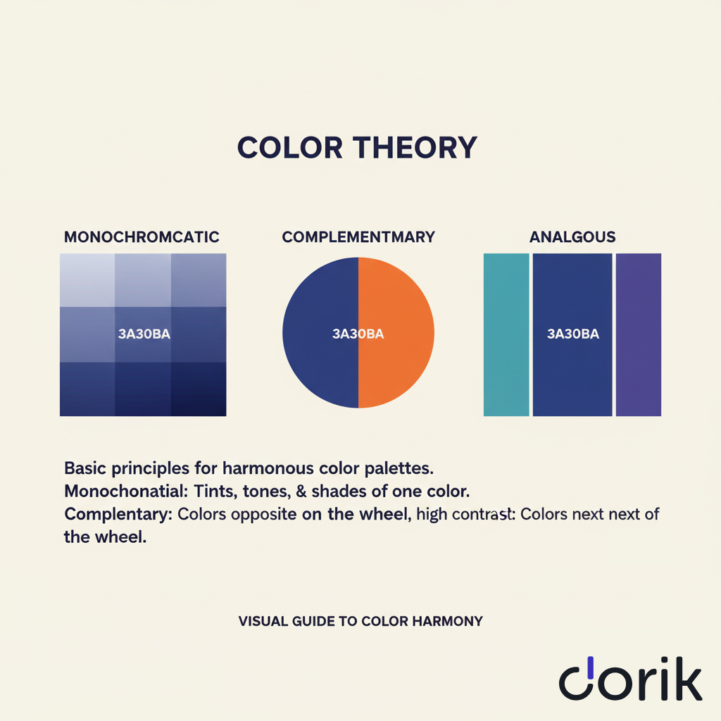
Color evokes emotion and communicates brand personality. A cohesive color palette reinforces brand identity across all pages. Consistent color schemes work best when applied across branded website templates that maintain design coherence.
3. Typography
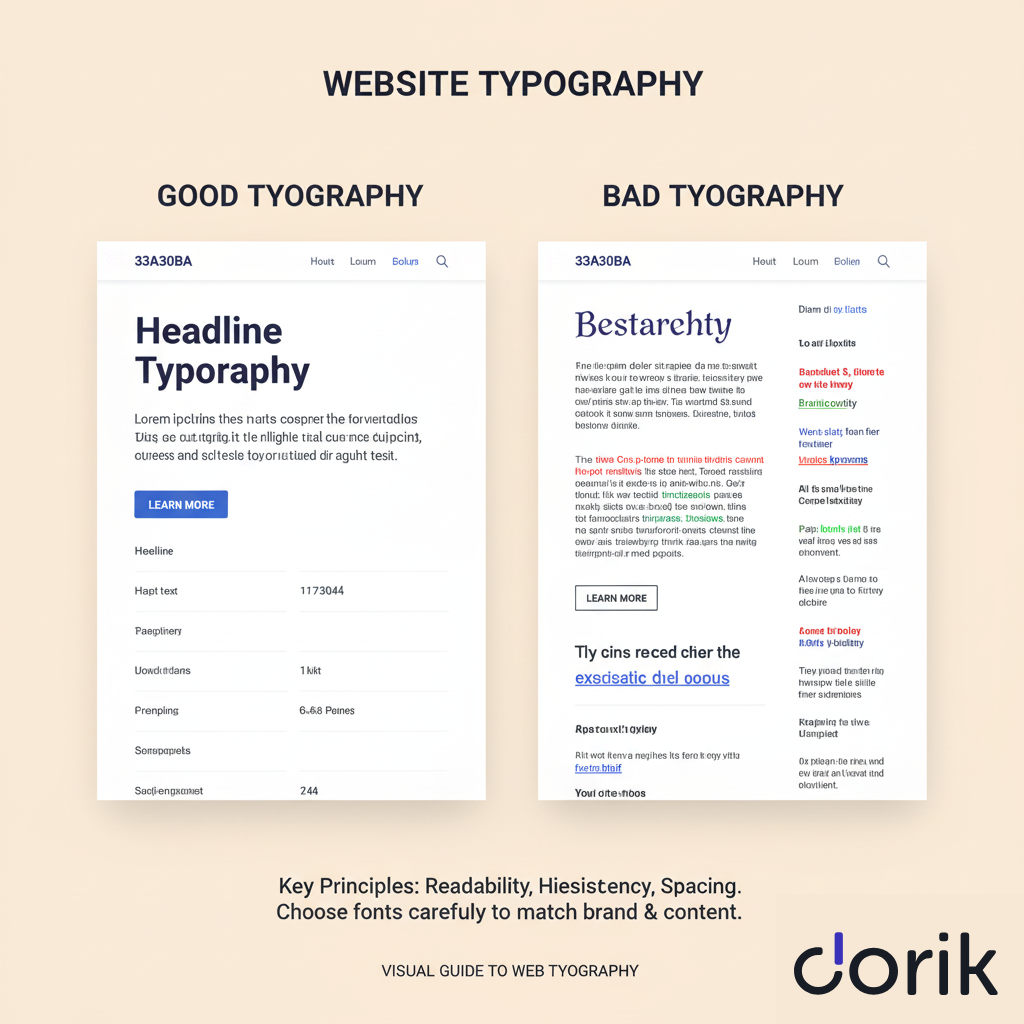
Typography encompasses font choice, size, and spacing—all of which impact readability and tone. Clear, legible fonts ensure messages are easy to consume. Typography choices significantly impact readability for content-heavy membership sites.
What Typography Choices Work Best for Websites?
For body text, use clean sans-serif fonts like Lato, Open Sans, or Roboto, as their simple letterforms ensure easy reading on digital screens.
For headlines, use distinctive serif fonts like Merriweather or Playfair Display to create contrast and add personality.
Pair fonts strategically to create harmony. Combine serif headlines with sans-serif body text.
For example, pairing bold Playfair Display headers with Roboto paragraphs creates modern, elegant websites.
Limit your site to two or three fonts maximum to maintain a professional, uncluttered appearance.
How Does Font Size Affect Mobile Readability?
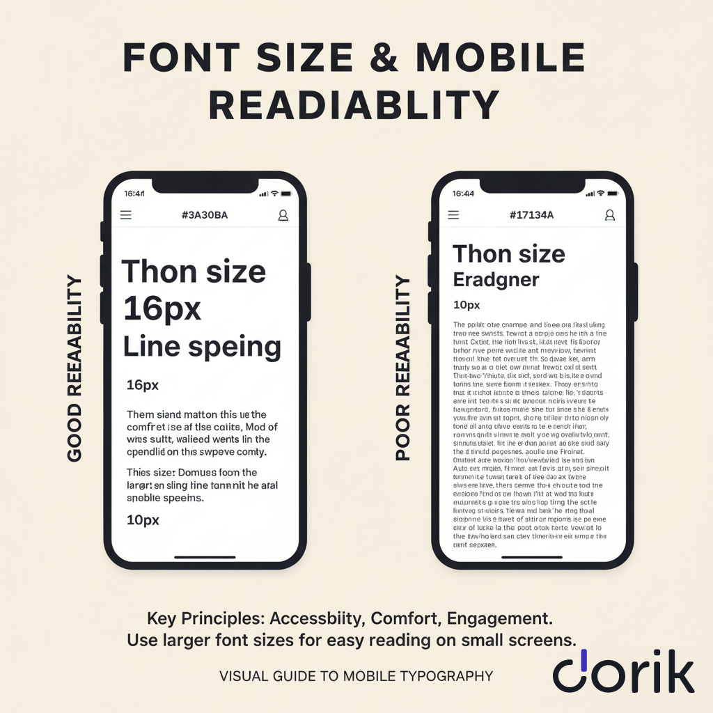
Mobile readability requires larger font sizes due to smaller screen dimensions. Text legible on desktop becomes unreadable on smartphones, forcing users to pinch and zoom.
Use 16px minimum for body text on mobile devices. It's large enough for comfortable reading without eye strain.
Scale headlines proportionally larger to maintain a clear visual hierarchy on smaller screens.
4. Layout and Grid Principles
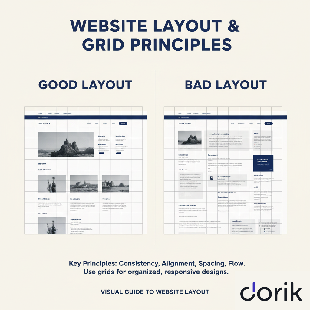
Consistent layouts bring order and balance to designs. Most websites use grid systems to align elements and create organized structures. This framework makes websites feel predictable and easy to navigate.
5. Imagery
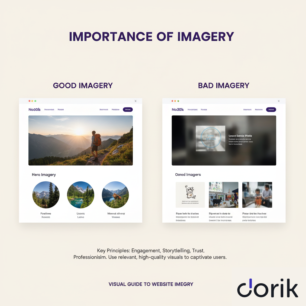
High-quality images, illustrations, and icons capture attention and communicate complex ideas faster than text. Visuals should be relevant, optimized for fast loading, and consistent with brand identity.
6. White Space
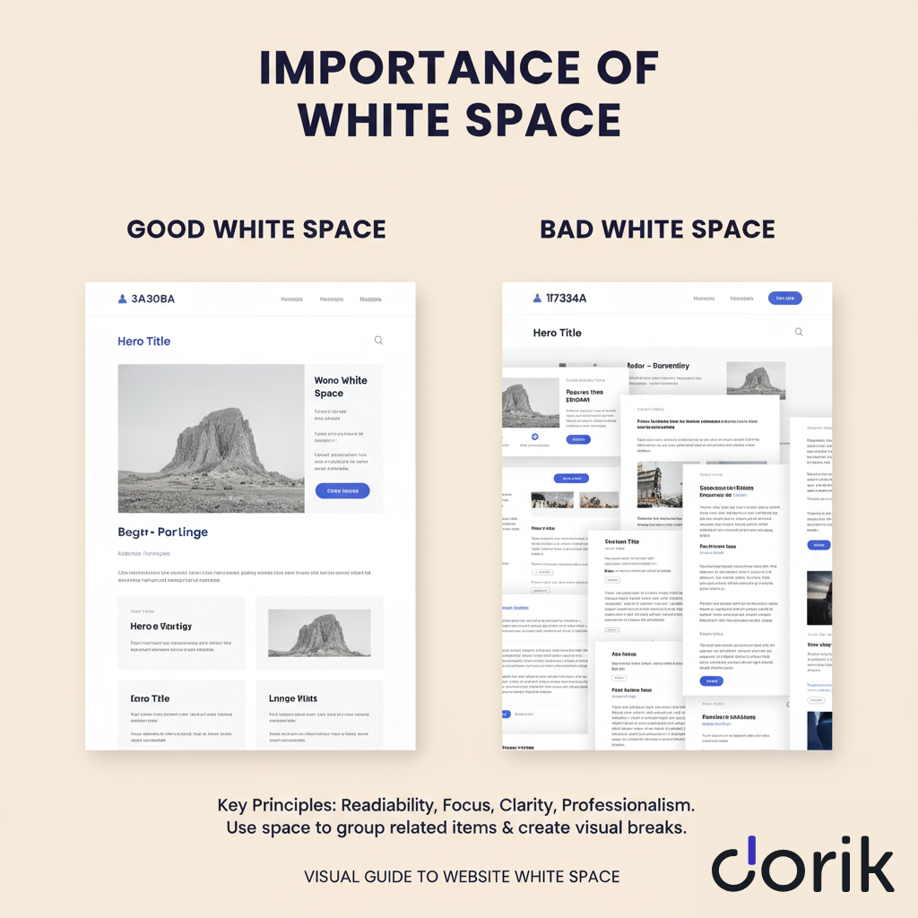
White space (negative space) is the empty area around design elements. This active element reduces clutter, improves focus, and increases content legibility. Proper white space usage creates clean, modern, uncluttered designs.
7. Navigation
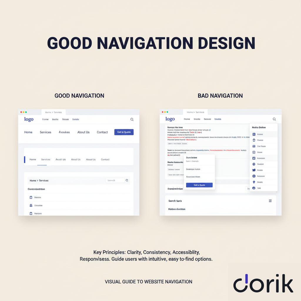
Navigation guides users through websites like a roadmap. It should be intuitive, simple, and consistent across every page. Clear navigation helps users find information quickly, reducing frustration and lowering bounce rates.
8. Responsive Design
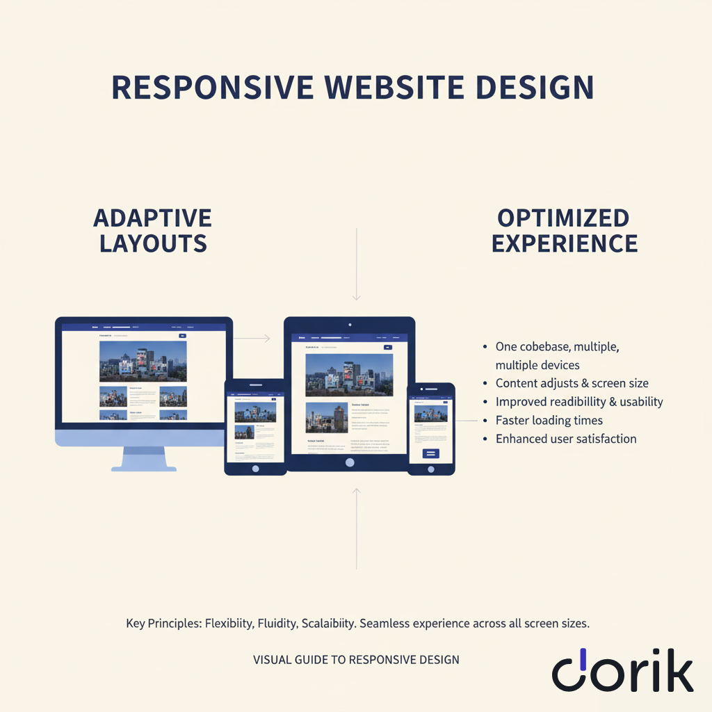
With 60%+ of internet traffic from mobile devices, responsive design is non-negotiable. Website layouts must automatically adapt to any screen size—desktops, tablets, and smartphones. Mobile-first approaches ensure seamless experiences for all visitors.
Advanced animations and micro-interactions can enhance user experience when used purposefully to provide feedback or delight users without distraction.
How Do You Plan a Website Design Project?
Plan your website design project in 6 steps: define goals, research your audience, analyze competitors, develop a content strategy, outline technical requirements, and set a budget/timeline.
1. Define Your Goals
Determine your website's primary purpose: selling products, generating leads, showcasing portfolios, or providing information.
E-commerce sites drive sales, corporate sites attract talent, and portfolio sites showcase work.
Establish measurable objectives like "generate 50 qualified leads monthly" or "achieve 2% conversion rate" to guide design and content decisions.
2. Research Your Target Audience
Gather demographic and preference data using surveys and questionnaires. Conduct user interviews to identify goals, motivations, and frustrations. Use website analytics tools to track user paths and drop-off points on similar sites.
Create 2-3 detailed user personas from this research. Each persona includes a name, goals, key characteristics, technical skills, and specific design preferences like minimalist layouts or bold colors. These personas guide design choices to match user needs and expectations.
This research ensures your design serves real user needs rather than assumptions.
3. Analyze Your Competitors
Evaluate 3-5 competitor websites for design strengths, functionality gaps, and content approaches.
Document specific features: navigation structures, call-to-action placement, mobile responsiveness, and loading speeds. Start by exploring professional website templates to understand layout standards within your industry and identify differentiation opportunities.
4. Develop a Content Strategy
Map your website structure by listing all required pages: homepage, about, services, products, blog, and contact.
For each page, specify content needs: text word counts (homepage: 300-500 words), image quantities (product pages: 5-8 images), and video requirements.
Plan messaging hierarchy to ensure consistency across the site.
5. Outline Technical Requirements and Scope
List required functionalities: e-commerce shopping cart with payment processing, content management system for blog updates, third-party integrations (Google Analytics, email marketing, CRM systems), and user authentication for membership areas.
Define feature priorities as must-have versus nice-to-have.
For agencies, consider white-label solutions that maintain client branding throughout the project.
6. Set Budget and Timeline
Determine your budget covering design ($500-$15,000), hosting ($10-$300/month), domain ($10-$20/year), and maintenance ($50-$500/month).
Create a project timeline with specific milestones: planning (1-3 weeks), design (2-8 weeks), development (1-12 weeks), testing (1-2 weeks), launch (1 week).
Build in a 20% buffer time for revisions and unexpected delays.
Planning transforms vague ideas into actionable blueprints, connecting business goals to final design outcomes and preventing costly mid-project changes.
Dorik makes it the most cost-effective solution to design a website within hours.
Dorik starts at $0/mo with unlimited sites with custom domains, pages, and bandwidth. Pro costs $39/mo (billed annually) or $49/mo (billed monthly). Agency costs $79/mo (billed annually) or $99/mo (billed monthly).
All 3 plans include custom domains and SSL certificates.
What Questions Should You Ask Before Starting Design?
Ask these nine essential questions before starting design work to define project scope, align stakeholders, and select the right platform.
Business Goals (Strategic)
-
What is the primary purpose of the website (e.g., increase sales, generate leads, build brand awareness)?
-
How will we measure the website's success?
-
Who are our main competitors, and what are their digital strengths and weaknesses?
User Needs (User-Focused)
-
Who is our primary target audience? What problems are they trying to solve?
-
What is the single most important action we want users to take on the site?
-
What content and information will be most valuable to them?
Technical & Resource Requirements (Technical)
-
What specific functionalities are non-negotiable (e.g., e-commerce, blog, membership area)?
-
What is the budget and timeline for this project?
-
Who will be responsible for creating content and maintaining the site post-launch?
Organize answers into a decision matrix to prioritize requirements and select the right design platform and tools.
What Are the Biggest Website Design Mistakes to Avoid?
Common design mistakes damage credibility, frustrate visitors, and reduce conversions. Users who experience poor design rarely return, resulting in lost leads and revenue.
Here are the 7 critical website design mistakes and their prevention strategies:
1. Poor Mobile Optimization
The Problem: Over 60% of web traffic comes from mobile devices. Non-responsive websites actively reject the majority of potential visitors.
Prevention: Implement mobile-first design using responsive website builders that automatically optimize for all screen sizes. Test on actual devices, not just browser simulators.
2. Slow Loading Speeds
The Problem: Sites loading longer than 3 seconds lose 40% of visitors before the content displays. Each additional second drops conversion rates by 4.42%.
Prevention: Compress images to under 200KB, enable browser caching, and select hosting with SSD storage and CDN integration. Optimized hosting platforms provide built-in performance features that reduce load times by 50-70%.
3. Unclear Navigation
The Problem: Confusing menus, hidden pages, and illogical structures cause 37% of users to abandon sites within 10 seconds.
Prevention: Limit main navigation to 5-7 items, use descriptive labels like "Services" instead of "What We Do," and maintain consistent menu placement across all pages.
4. Weak or Missing Calls-to-Action (CTAs)
The Problem: Unclear or hidden CTAs prevent users from taking desired actions, directly reducing conversion rates by 20-30%.
Prevention: Place CTAs above the fold, use action verbs like "Start Free Trial" or "Download Guide," and apply contrasting colors that stand out from the background by at least a 4.5:1 ratio for accessibility.
5. Poor Content Hierarchy
The Problem: Text blocks without a clear structure force users to read linearly, increasing bounce rates by 25-35% as visitors cannot quickly locate relevant information.
Prevention: Structure content with H1 for page titles, H2 for main sections (3-5 per page), and H3 for subsections. Limit paragraphs to 3-4 sentences and use bullet points for lists of 3+ items.
6. Overcrowded Design
The Problem: Excessive elements competing for attention create cognitive overload, reducing comprehension by 40% and making important information invisible.
Prevention: Apply 40-60% white space in layouts, limit each screen section to one primary focus, and remove decorative elements that don't serve user goals or business objectives.
7. Inconsistent Branding
The Problem: Different logos, color variations, and font changes across pages reduce brand recognition by 30% and signal unprofessionalism.
Prevention: Document brand standards with 2-3 primary colors (with hex codes), two font families (one for headers, one for body), and consistent logo placement. Apply these standards to every page without exception.
How to Fix Common Mobile Design Problems?
Mobile design problems include tiny touch targets (buttons under 44x44 pixels), unreadable text (below 16px font size), images that break layouts, and cramped navigation menus.
Fix touch target issues by setting minimum button sizes to 44x44 pixels with 8px spacing between interactive elements. Make text readable by using a 16px minimum font size for body content and 20-24px for headlines on mobile screens.
Prevent image scaling problems by using responsive image techniques: set max-width to 100% and height to auto in your CSS, or use picture elements with multiple source files optimized for different screen sizes.
Simplify navigation by implementing a hamburger menu (three horizontal lines icon) that reveals links when tapped, reducing the main navigation to 4-5 essential items visible on small screens.
Modern website builders ensure mobile-responsive templates automatically adapt content for optimal mobile viewing, eliminating manual responsive design work.
Choose platforms, such as Dorik AI with built-in mobile optimization to prevent these issues from occurring.
How to Test and Optimize Your Website Design?
Website testing identifies usability problems, performance bottlenecks, and conversion barriers through data-driven analysis. Testing begins immediately after launch and continues throughout the site's lifecycle, using real user behavior to guide strategic improvements that increase engagement and revenue.
Effective optimization requires 5 core testing methodologies:
-
Usability Testing observes real users completing specific tasks on your site. Tools like Hotjar record 30-60 minute sessions showing exactly where visitors get confused, abandon forms, or fail to find information. Testing 5-8 users typically reveals 85% of major usability problems. Run usability tests every quarter or after significant design changes.
-
A/B Testing compares two page versions to determine which performs better. Test one variable at a time—headlines, button colors, form lengths, or CTA placement. Show version A to 50% of traffic and version B to the other 50%, then measure which produces more conversions. Tools like Google Optimize, Optimizely, and VWO automate this process. Run tests for a minimum of 2 weeks or until reaching 95% statistical significance with 1,000+ conversions per variation.
-
Performance Testing measures technical speed using Google PageSpeed Insights, GTmetrix, or WebPageTest. These tools identify render-blocking resources, oversized images, and inefficient code that slow loading. Test from multiple geographic locations and devices. Pages loading in under 2 seconds retain 87% more visitors than 5-second pages.
-
Accessibility Testing ensures usability for the 26% of adults with disabilities. WAVE, axe DevTools, and Lighthouse scan for violations: missing alt text, insufficient color contrast (below 4.5:1 ratio), keyboard navigation barriers, and screen reader incompatibilities. Test manually with keyboard-only navigation and screen readers like NVDA or JAWS.
-
Cross-Browser Testing verifies consistent display across Chrome (65% market share), Safari (19%), Edge (4%), and Firefox (3%). BrowserStack and LambdaTest provide access to 2,000+ browser-device combinations. Test all major browsers on desktop, tablet, and mobile monthly.
The optimization framework follows a continuous cycle: Analyze Data → Form Hypothesis → Test Change → Measure Results → Implement Winner → Repeat.
Google Analytics reveals user behavior patterns. If 70% of visitors abandon on the pricing page, hypothesize that unclear pricing causes exits. Test simplified pricing tables against the current version.
Measure conversion rate changes over 2-4 weeks. Implement the winning version and test the next optimization.
What Metrics Indicate Successful Website Design?
Website design performance requires measurement through Key Performance Indicators (KPIs) that quantify user behavior and business outcomes. Tracking specific data points reveals design weaknesses and optimization priorities.
Monitor these 8 critical metrics weekly:
-
Conversion Rate: Percentage completing desired actions (purchases, signups, downloads). Average e-commerce conversion: 2.5-3%. Business sites: 5-10% for lead generation.
-
Bounce Rate: Visitors leaving after viewing one page. Below 40% indicates engaging content and clear navigation.
-
Average Session Duration: Time spent per visit. 2-3 minutes suggests valuable content. Under 1 minute signals relevance problems.
-
Pages Per Session: Average pages viewed per visit. 3+ pages indicate strong engagement and effective internal linking.
-
Page Load Time: Time until the page becomes interactive. Under 2 seconds retains 87% of visitors. Each additional second reduces conversions by 4.42%.
-
Mobile Usability Score: Google's mobile-friendliness rating. Aim for 85+ out of 100. Scores below 70 hurt mobile rankings.
-
Core Web Vitals: Google's user experience metrics, including Largest Contentful Paint (under 2.5s), First Input Delay (under 100ms), and Cumulative Layout Shift (under 0.1).
-
Goal Completion Rate: Percentage of visitors achieving specific objectives. Benchmark against industry standards for your sector.
Track metrics by traffic source (organic, paid, social, direct) and device type (desktop, mobile, tablet) to identify specific optimization opportunities.
Design elements directly impact these three among the 8 metrics mentioned above:
| Metric | Good Range | Design Impact | Improvement Methods |
|---|---|---|---|
| Bounce Rate | <40% | Navigation clarity, page speed, content relevance, mobile optimization | Strengthen headlines, improve loading speed to <2s, add clear CTAs, enhance mobile responsiveness |
| Page Speed | <2 seconds | Image optimization, code efficiency, hosting quality, caching | Compress images to WebP format, minify CSS/JavaScript, implement CDN, enable browser caching |
| Mobile Score | >85/100 | Responsive design, touch targets, font sizes, viewport configuration | Use mobile-first templates, ensure 44×44px minimum touch targets, set 16px minimum font size |
| Conversion Rate | 2-10% | CTA visibility, form complexity, trust signals, value clarity | Make CTAs contrast strongly, reduce form fields by 50%, add testimonials above fold, clarify unique benefits |
Track metrics in Google Analytics 4, set up custom dashboards for weekly monitoring, and establish automated alerts when metrics drop 15% or more below baseline.
Compare performance against industry benchmarks from sources like Contentsquare, Littledata, and Unbounce.
Design optimization succeeds when metrics improve consistently. A 0.5% conversion rate increase on a site with 10,000 monthly visitors and $100 average order value generates $5,000 additional monthly revenue ($60,000 annually).
How Often Should You Redesign Your Website?
Full website redesigns require specific triggers rather than fixed timelines. Redesign when you observe these six indicators:
-
Performance Decline: Conversion rates dropping 20%+ over 6 months, bounce rates increasing 15%+ persistently, or organic traffic declining 25%+ year-over-year signal design problems requiring comprehensive fixes.
-
Competitive Disadvantage: Competitor sites offering superior user experiences, faster loading (2+ seconds faster), better mobile optimization, or more intuitive navigation create a disadvantage requiring a response.
-
Technology Obsolescence: Sites failing Google's mobile-friendly test, lacking HTTPS security, running outdated platforms (PHP 5.x, jQuery 1.x), or incompatible with modern browsers need rebuilding.
-
Brand Evolution: Major rebranding, merger/acquisition, or significant business model changes necessitate design alignment with the new identity and positioning.
-
User Feedback Patterns: Consistent complaints about specific design elements, such as difficult navigation (mentioned by 30%+ of support tickets), poor mobile experience, slow loading, or unclear information architecture, indicate redesign needs.
-
Conversion Barriers: Abandonment rates exceeding 70% at specific funnel stages, poor form completion (below 20%), or checkout abandonment above 85% require fundamental redesign.
Most businesses achieve better results through continuous incremental optimization rather than complete redesigns every 2-3 years. Implement weekly small tests (headline changes, CTA modifications, layout adjustments) and monthly moderate updates (new page templates, navigation improvements, content reorganization).
Complete redesigns cost $5,000-$50,000 and require 2-6 months, risking SEO rankings and user familiarity. Continuous optimization costs $500-$2,000 monthly but maintains momentum, preserves rankings, and compounds improvements over time.
Reserve full redesigns for the six specific triggers above. Otherwise, optimize continuously using A/B testing, user feedback, and performance data to guide design improvements.
How Much Does Website Design Cost?
Website design costs range from $0 to $15,000+, depending on your approach, complexity requirements, and customization level.
| Approach | Initial Cost | Monthly Cost | Time Investment | Best For | Quality Level |
|---|---|---|---|---|---|
| DIY Builder | $0-$50 | $0-$50 | 10-50 hours | Small businesses, individuals | Good |
| Template + Customization | $50-$500 | $15-$100 | 20-80 hours | Growing businesses | Very Good |
| Freelance Designer | $500-$5,000 | $20-$100 | Hands-off | Professional needs | Excellent |
| Agency Design | $2,000-$15,000+ | $50-$300 | Hands-off | Enterprise, complex | Premium |
Beyond initial design fees, budget for the total cost of ownership, including domain names ($10-$20 annually), web hosting ($5-$50+ monthly), premium plugins, and ongoing maintenance for security updates and backups.
All-in-one platforms bundle hosting, domains, and essential features into a single monthly fee.
Transparent platforms like Dorik's straightforward plans eliminate hidden fees. For agencies managing multiple clients, white-label pricing structures offer better profit margins.
Calculate your website's return on investment (ROI) to evaluate whether design costs generate business value through increased leads, sales, or brand credibility.
What Hidden Costs Should You Budget For?
Budget for 4 recurring expenses beyond initial design costs:
-
Domain Name: Your website address (e.g., dorik.com) costs $10-$20 annually.
-
Web Hosting: Server space keeping your site online costs $5-$50+ monthly based on traffic volume, storage needs, and performance requirements. However, most website builders include hosting with their plans without any extra cost.
-
Premium Features: E-commerce capabilities, booking systems, advanced integrations, and specialized plugins require paid plans ranging from $10-$100+ monthly, depending on functionality.
-
Ongoing Maintenance: Security scans, software updates, backups, and bug fixes cost $50-$200 monthly for professional services, or require 2-5 hours monthly if self-managed.
Reduce total costs by choosing platforms that bundle hosting, free first-year domains, SSL certificates, and core features into predictable monthly pricing.
What is Website Design and Why Does It Matter?
Website design is the strategic process of planning, conceptualizing, and arranging content for the internet, combining visual aesthetics with user experience to influence how users interact with digital platforms.
Effective website design focuses on visual layout, technical performance, and brand representation. Every element—from color schemes to navigation menus—serves a specific purpose in guiding user journeys, making information easy to find and actions simple to complete.
Website design extends beyond aesthetics to include functional and strategic components. The design must deliver seamless user experiences across all devices, load quickly to maintain engagement, and guide visitors toward conversion actions. Modern website builders with comprehensive design systems integrate visual and functional elements while maintaining professional standards.
What Makes Website Design Different from Web Development?
Website design creates visual layouts, color schemes, and user interfaces, while web development writes the HTML, CSS, and JavaScript code that powers functionality like form submissions, data processing, and interactive animations.
Designers build wireframes and select typography to guide users through content. Developers code the technical infrastructure that makes buttons respond to clicks, databases store information, and pages load securely across browsers.
How Do Design and Development Work Together?
Design and development operate as collaborative processes rather than separate sequential steps. Designers create wireframes, interactive prototypes, and design systems in tools like Figma, which include specific assets, measurements, and code snippets for developer reference.
Developers access design files directly as the project's single source of truth, ensuring pixel-perfect implementation. This tight integration through shared tools enables rapid iteration, immediate feedback, and seamless handoffs between teams.
FAQs
Can I Design a Website Myself If I Don't Know How to Code?
No-code website builders like Dorik, Wix, and Squarespace eliminate coding requirements through drag-and-drop interfaces. Dorik's AI website builder generates complete sites from text prompts, while Wix provides 800+ customizable templates and Squarespace offers design-focused layouts for portfolios and businesses.
How Can I Make My Website Design Look Professional?
Professional website design requires three core elements: limited color palettes (2-3 colors maximum), consistent typography (no more than 2 fonts), and strategic white space. Use high-resolution images at 1920x1080px minimum, maintain 40-60px spacing between sections, and ensure 16px minimum font size for body text. Platforms like Figma and Adobe XD provide design systems that maintain consistency across pages.
What is the Difference Between UI and UX Design?
UI (User Interface) design controls visual elements, including color schemes, typography, button styles, and spacing, through tools like Figma, Sketch, and Adobe XD. UX (User Experience) design optimizes user workflows, navigation structures, and task completion through wireframing, user testing, and analytics tools like Hotjar and Google Analytics. UI designers create aesthetics; UX designers create functionality.
