
For many, many years, the hamburger menu has been the go-to solution for saving space in app and web design. But now, it’s slowly falling out of favor because it hides important options and confuses users.
Right now, designers are moving beyond this hidden menu trend for more visible and intuitive options. They look for hamburger menu alternatives that make it easier for users to find their way quickly and enjoy a smoother experience.
In this blog, we’ll explore some of the best hamburger menu alternatives that help your users find what they need faster and make your site or app easier to use.
What Is a Hamburger Menu?
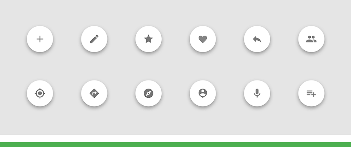
A hamburger menu is a type of navigation process, generally used in websites and mobile apps. It is called a “hamburger” because it looks like three stacked lines, which is pretty similar to a burger. When users click or tap on it, a hidden menu appears with links to other pages or features.
This design became popular because it saves space, especially on mobile devices. Instead of showing all the menu options, it keeps them hidden until needed. As a result, the screen stays clean and simple to make the apps and website more responsive.
However, not everyone likes the hamburger menu. Many users don’t notice it or don’t know what it does. Therefore, it can lead to a poor user experience, as people may miss important parts of the site.
Studies have shown that hidden menus were used only 27% of the time, while visible and combo navigation saw 48% and 50% usage. On mobile, hidden menus had 57% usage, but combo navigation led with 86%.
So, a hamburger menu is a space-saving tool for navigation. It works well in some cases but may not be the best choice for every website or app.
Also Read: How to Build a Website from Scratch
Best Alternatives to the Hamburger Menu
The hamburger menu might look clean, but hiding navigation can create confusion and slow down users. If you want better usability and stronger engagement, try these alternatives to the Hamburger menu that offer more visibility, speed, and clarity:
1. Top Navigation Bar
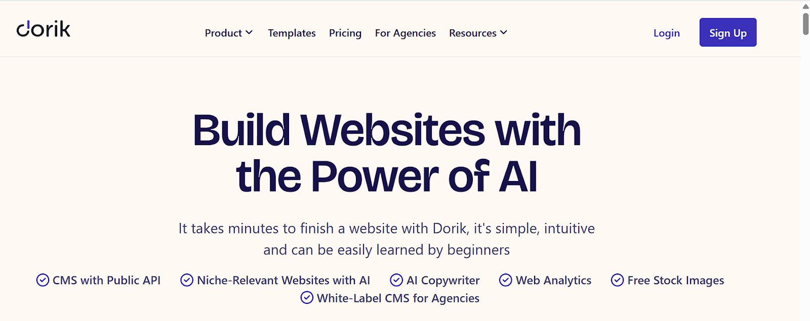
Top navigation bars are a classic, especially on desktop and tablet. They display menu items in a horizontal line that makes the key sections immediately available. This directness reduces clicks and helps users navigate faster. It's one of the best practices for designing a website header.
It’s a great alternative for websites with a few main categories. Unlike the hamburger menu, users don’t need to open or guess; everything is clearly labeled and placed in front of them. Sites like Dorik AI and Apple show how clean and efficient top navigation can be.
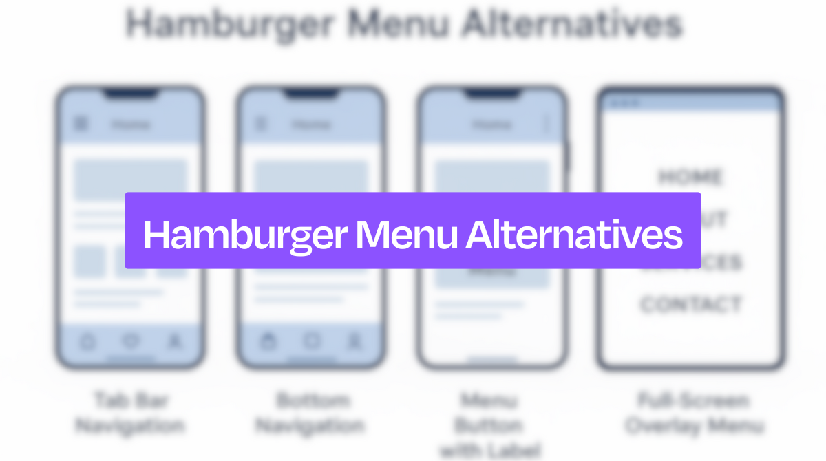
2. Tab Bar (Bottom Navigation)
The tab bar is one of the most popular alternatives to the hamburger menu, especially in apps with mobile first design. Placed at the bottom of the screen, it’s easy to reach with the thumb, even on larger phones. It usually holds 3 to 5 core sections.
What makes the tab bar effective is its visibility. Users don’t need to guess where to go, they see their options right away. This function improves interaction and encourages exploration. It's one of the best website header examples. Apps like Instagram and Facebook use it to keep their most-used features always in view.
3. Progressively Collapsing Menu
A progressively collapsing menu starts by showing the most important links, while less-used items are hidden under a "More" option. This strategy creates a balance between space-saving and visibility.
This layout is smart for websites with lots of categories. Users can quickly access top content without being overwhelmed. LinkedIn’s desktop header is a good example of this style. It focuses attention on key actions and, at the same time, keeps the interface tidy and responsive.
Related Read: 9 Best Website Builders for Landing Pages in 2025
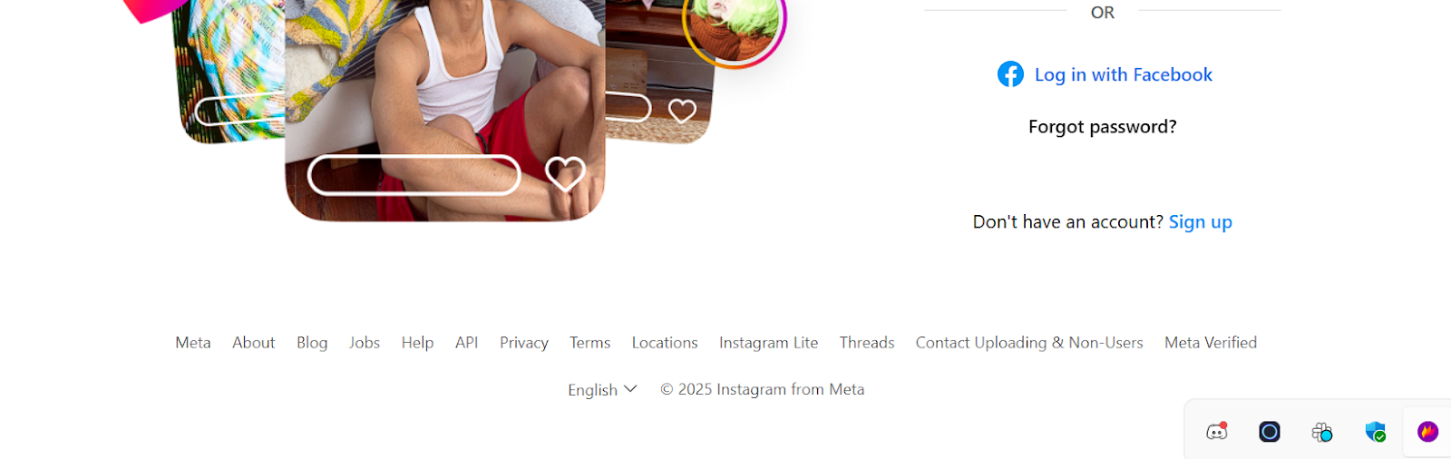
4. Gesture-Based Navigation

Gesture-based navigation uses swipes, taps, or edge pulls to move between screens. This is a hands-on, interactive approach often seen in mobile apps. It removes the need for visible buttons while keeping access smooth.
Though invisible by design, gestures feel natural and intuitive once users get familiar. Instagram’s swipe-to-switch between feeds is a popular example. It works well as an alternative because it saves space without reducing accessibility to core features.
5. Floating Action Button (FAB)
A floating action button is a circular icon that hovers over the screen, usually in the lower-right corner. It’s ideal for highlighting a single core action, like composing a message or adding a post.
This method works well when your app has one primary purpose. Instead of tucking this action away in a menu, the FAB keeps it front and center. Gmail uses it effectively with the “+” icon for composing emails. It makes the most important task instantly accessible.
Also Read: Website Design Checklist for Perfect Launch!
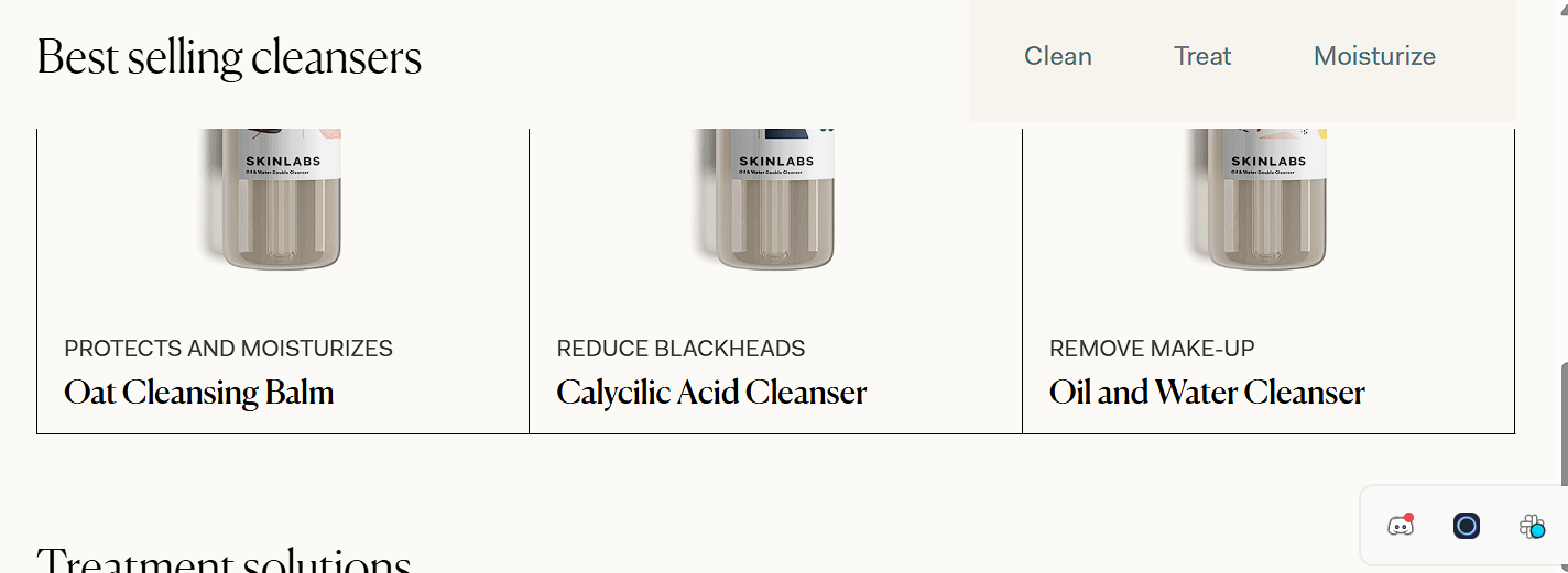
6. Segmented Control (Toggle Menu)
Segmented controls allow users to switch between different views or categories with a single tap. It’s commonly used for toggling between lists, grids, or filters on the same screen.
This navigation style shines when you need quick toggles between closely related content. Airbnb’s filter menus use this method to help users adjust search results without navigating away. It’s a good hamburger menu alternative because it keeps choices visible and transitions smoothly.
7. Full-Screen Navigation

Full-screen navigation replaces the current view with a menu that takes up the entire screen. It’s bold and immersive, often used on portfolio sites or landing pages for maximum impact.
Even though it may seem excessive, it actually focuses the user’s attention on navigation alone. This approach helps eliminate distraction and improves clarity. Designers often choose this style, especially when visual storytelling is important, and menu access needs to feel like part of the experience.
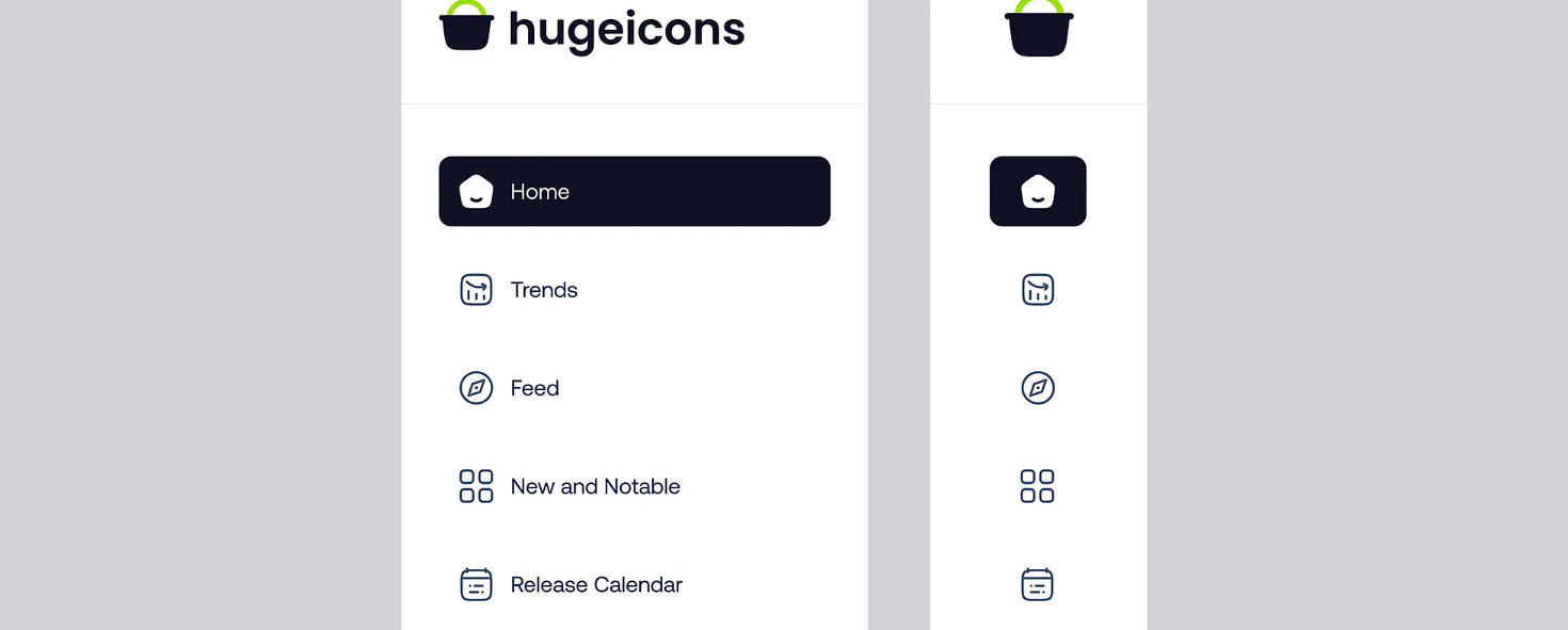
8. Sidebar Menu (Visible or Slide-In)
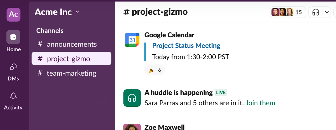
A sidebar menu stays fixed on the side or slides in from the left or right. It offers more space for deeper menu structures, like subcategories or grouped features.
This hamburger alternative is useful for content-heavy apps or dashboards, like Slack or Notion. Users can see their options at all times or access them with a simple swipe. Unlike the hidden hamburger menu, sidebar menus support hierarchy and make multitasking easier.
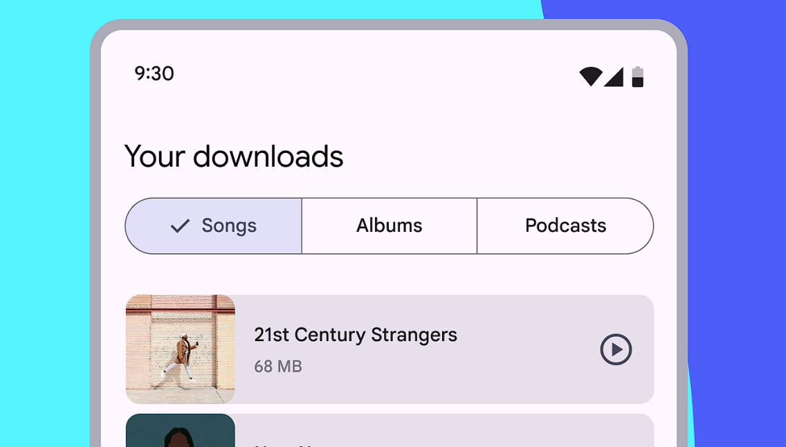
9. Search as Primary Navigation

When users already know what they’re looking for, a strong search function becomes the best guide. Making search a central feature helps people skip menus entirely and get straight to content.
This is perfect for e-commerce, streaming platforms, or content libraries. Amazon and Netflix lead in this approach. Search-focused navigation saves time, reduces frustration, and outperforms hidden menus in user satisfaction.
10. Scrollable Navigation Bar
A scrollable navigation bar extends beyond the screen’s width to let users swipe left or right and view more options. This approach works especially well on mobile when there are many sections to include.
It keeps items visible without overwhelming the layout. Users only need a gentle swipe to explore more, which is easier than opening a hamburger menu. Many news and blog apps use this to display categories like “Latest,” “Trending,” or “Tech.”
Related Read: 10 Best SaaS Landing Page Examples
Why Should You Look for a Hamburger Menu Alternative?
Even though the hamburger menu might look clean and modern, it often creates more problems than it solves, especially when it comes to user experience.
Here are some strong reasons why you should consider better alternatives.
1. Low Discoverability
The biggest issue with hamburger menus is that they’re not always obvious. Many users, especially less tech-savvy ones, don’t know what the three lines mean or that they can tap them to explore more. As a result, they miss out on valuable content or features simply because they don’t see them.
2. Poor User Engagement
When users don’t easily find options, they interact less with the site or app. Hamburger menus make navigation less visible, which often leads to lower engagement rates. Users are more likely to stay and explore when they see clear and direct paths to content.
3. Slower Navigation
Hidden menus require extra steps, like tapping the icon, waiting for it to open, and then finding the right link. This requirement slows users down. In contrast, visible menus let users act faster with fewer clicks, improving overall speed and satisfaction.
4. Hidden Core Features
Important features should never be tucked away. If your key actions or pages are hidden in a hamburger menu, users might never find them. This issue can hurt your product’s effectiveness and may leave users feeling confused or lost.
5. Reduced Conversion Rates
When people struggle to find what they need, they’re less likely to take action, no matter if it’s signing up, purchasing, or clicking a CTA. However, a hidden menu adds friction to the user journey, which can directly impact your conversion rate.
Tips to Choose the Right Navigation for Your App or Website
Choosing the right navigation style is important for building a smooth and user-friendly experience. For a mobile app or a website, the navigation should guide users effortlessly. Here are some helpful tips to make the right decision:
Understand User Behavior
First, learn how your users interact with your product. Are they looking for quick access to certain features? Do they browse casually or visit with a clear goal? Knowing their patterns helps you decide whether to use tabs, visible menus, or a search-first layout.
Prioritize Core Features
Not all features are equal. So, identify your app or website’s most important actions and make them easy to reach. Never keep them hidden deep inside menus. Also, try to place them upfront to boost usability and encourage engagement.
Consider Screen Size and Platform
Designing for mobile, tablet, or desktop requires different approaches. A bottom tab bar may be perfect for smartphones, while a sidebar works better on desktops. Always match the navigation style with the device’s natural use.
Test for Accessibility
Make sure your navigation is easy to use for everyone, including people with disabilities. For that, you must use clear labels, simple structure, and keyboard or screen reader support. Inclusive design improves the experience for all users.
Keep It Visually Clear
Don’t overload the interface with too many choices. A clean, simple layout helps users focus and reduces decision fatigue. Group related items and use icons and text wisely.
Use Data to Guide Decisions
Check analytics, heatmaps, or user feedback to see what’s working. Real data shows you where users get stuck or drop off. Use this insight to tweak and improve your navigation over time.
FAQs
Is the hamburger menu outdated?
The hamburger menu is not completely outdated, but many designers now prefer visible navigation options. It may work in some cases, newer designs focus on faster access and better visibility for key actions.
When not to use a hamburger menu?
You shouldn't use a hamburger menu when your app or website has important features that users need often. Hiding them behind a menu slows users down and can harm engagement and conversions.
Why are hamburger menus considered bad for UX?
Hamburger menus are sometimes considered bad for UX as they hide key options, which makes them less discoverable. Users may miss important features, take longer to navigate, feel frustrated, and finally cause a poor overall user experience.
Conclusion
For years, the hamburger menu served its purpose, but today, clearer and more accessible navigation options are here for better user experiences. The mentioned hamburger menu alternatives, like bottom tab bars, visible sidebars, or gesture-based controls, can greatly improve how users interact with your app or website.
Try to choose the right navigation style to make it easier for users to find what they need quickly. Thus, you can keep them engaged and satisfied. So, it’s time to replace hidden menus with smarter design.