
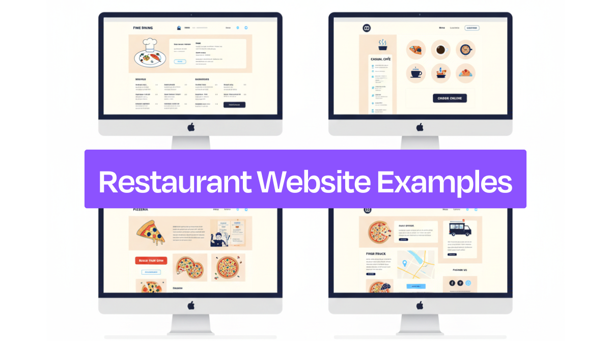
Restaurant website examples like Sushima, Loro, Sweet Cheeks, Old Lady Gang, Forage, Kuma’s Corner, and Rebel Cheese show how strong design pairs with useful features. These sites use bold colors, clear menus, online ordering, and mobile-friendly layouts to make browsing simple and enjoyable for customers.
Here are seven great sites that get both style and usefulness.
Top 7 Restaurant Website Examples for Your Inspiration
Here are seven restaurant websites that get it right with excellent designs and useful features. Each one shows different ways to create a site that looks great and works well for customers.
These examples will give you ideas for your own restaurant website.
Sushima
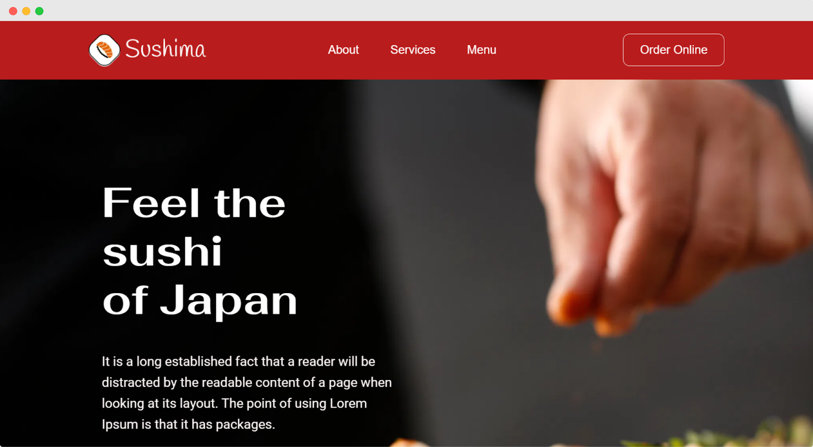
Sushima is a restaurant website template that uses a smart red and black color scheme that feels both elegant and appetizing. The bold white typography on the dark hero section makes the "Feel the sushi of Japan" headline pop, while clean fonts throughout keep everything easy to read. This template is built by Dorik AI, the best AI website builder that creates websites within a few minutes.
The hero section nails it with a mouth-watering sushi photo background and a bright red "Place Your Order" button that's impossible to miss. High-quality food images fill the site - from the stunning hero shot to circular category photos and detailed menu pictures that make you want to order immediately.
This sushi template's clean design and strong color contrast create a professional look that builds trust. The red CTAs stand out perfectly against the dark sections, making it simple for hungry visitors to place orders or browse the menu without any confusion.
Loro
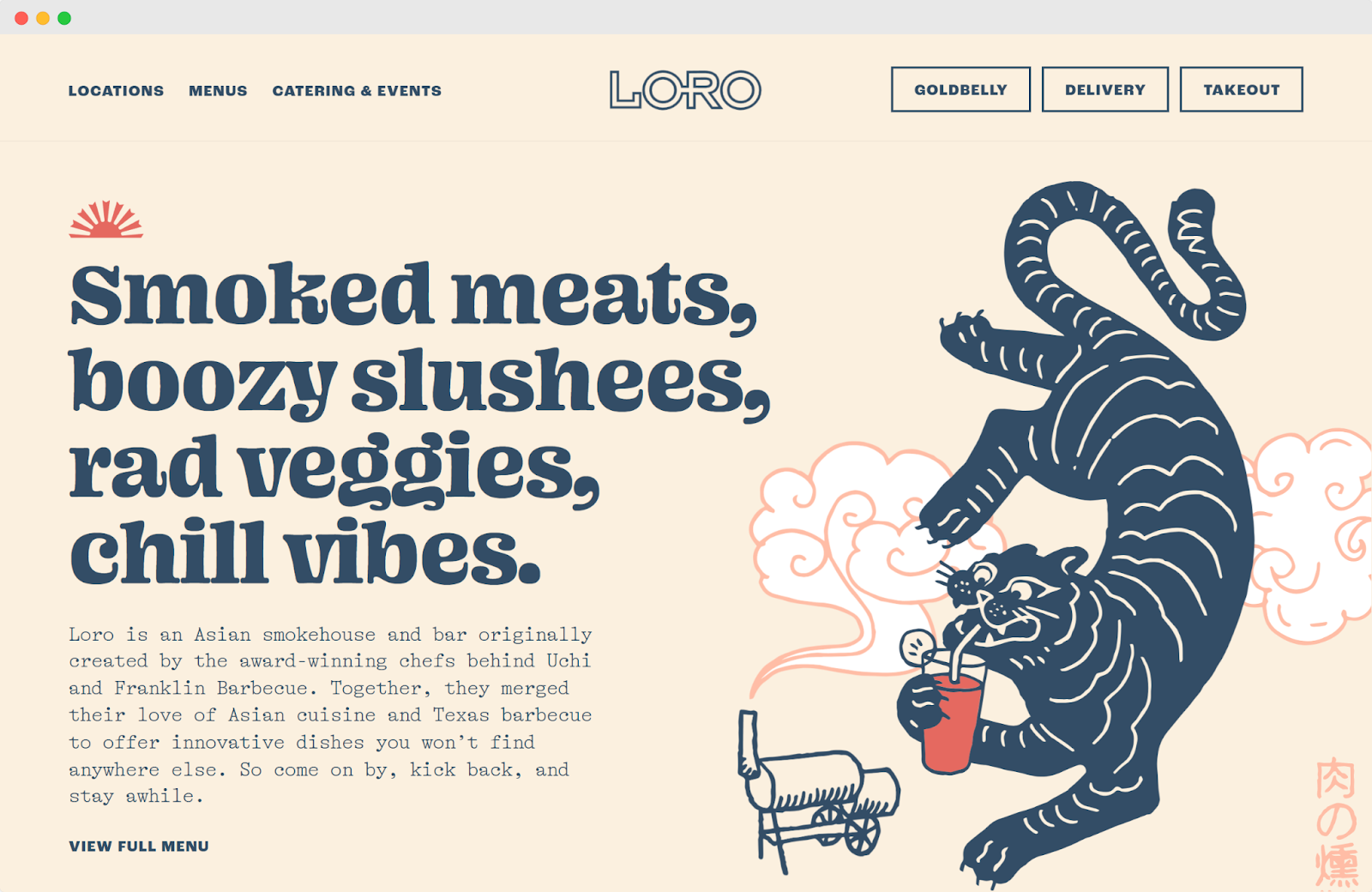
Loro's website uses a warm cream and navy color palette that feels both modern and welcoming. The playful serif fonts in headlines like "Smoked meats, boozy slushees, rad veggies, chill vibes" give the site personality, while clean text keeps everything readable.
The hero section combines fun illustrated graphics with mouth-watering food photography that tells the whole story at once. Each section uses different background colors, creating visual breaks that guide visitors through the menu offerings.
Simple "VIEW FULL MENU" buttons work perfectly as CTAs, letting the beautiful food photos do most of the selling. Like the best travel website examples, Loro creates an experience that makes you want to visit before you even finish browsing.
Sweet Cheeks
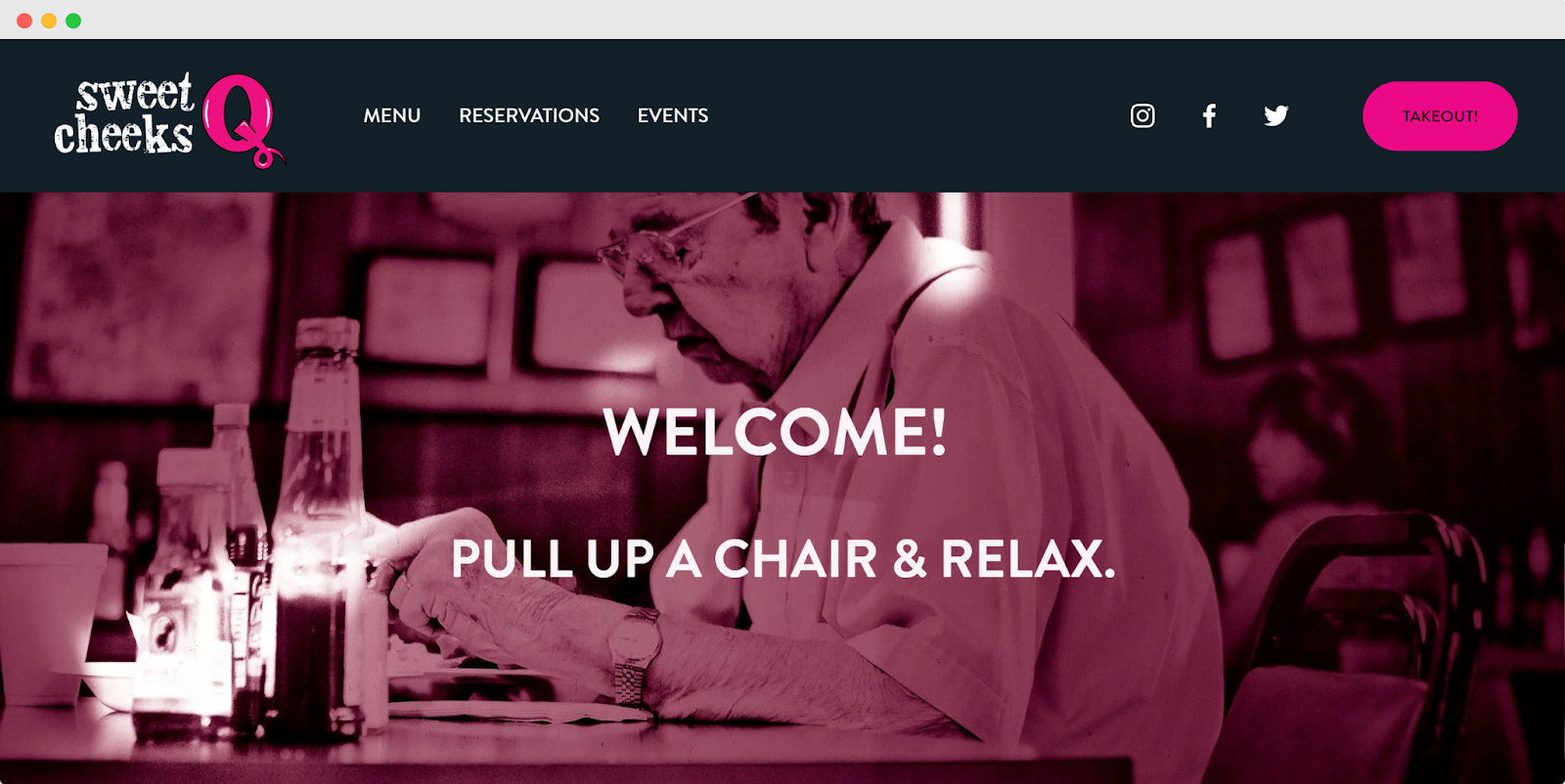
Sweet Cheeks uses a bold pink and dark navy color scheme that's both fun and sophisticated. The clean sans-serif fonts keep everything modern and readable, while the bright pink "TAKEOUT" button immediately grabs attention.
The hero section features a soft pink background with simple white text that sets a welcoming tone. Beautiful food photography - from golden pastries to colorful cocktails - makes the menu come alive in each grid section.
Each section title acts as a clickable navigation element, creating smooth browsing. The clean grid layout and high-quality images show how effective a simple design can be, much like what you'll find in the best one-page website examples across different industries.
Old Lady Gang
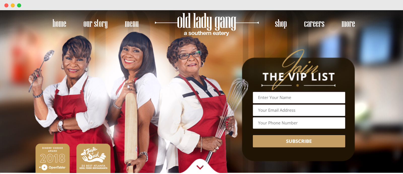
Old Lady Gang uses a warm gold and brown color palette that feels upscale and inviting. The elegant script fonts in headlines add personality, while clean sans-serif text keeps information easy to read throughout the site.
The hero section features the three owners in chef attire with a smart VIP list signup form overlay - perfect for building an email list right from the start. High-quality photos of the founders, mouth-watering food shots, and restaurant interiors create a personal connection with visitors.
Strong CTAs like "SUBSCRIBE," "READ MORE," and "GO INSIDE" guide users through the experience without being pushy. The professional photography and sophisticated design elements make this stand out among professional website examples, showing how personal branding can elevate a restaurant's online presence.
Forage
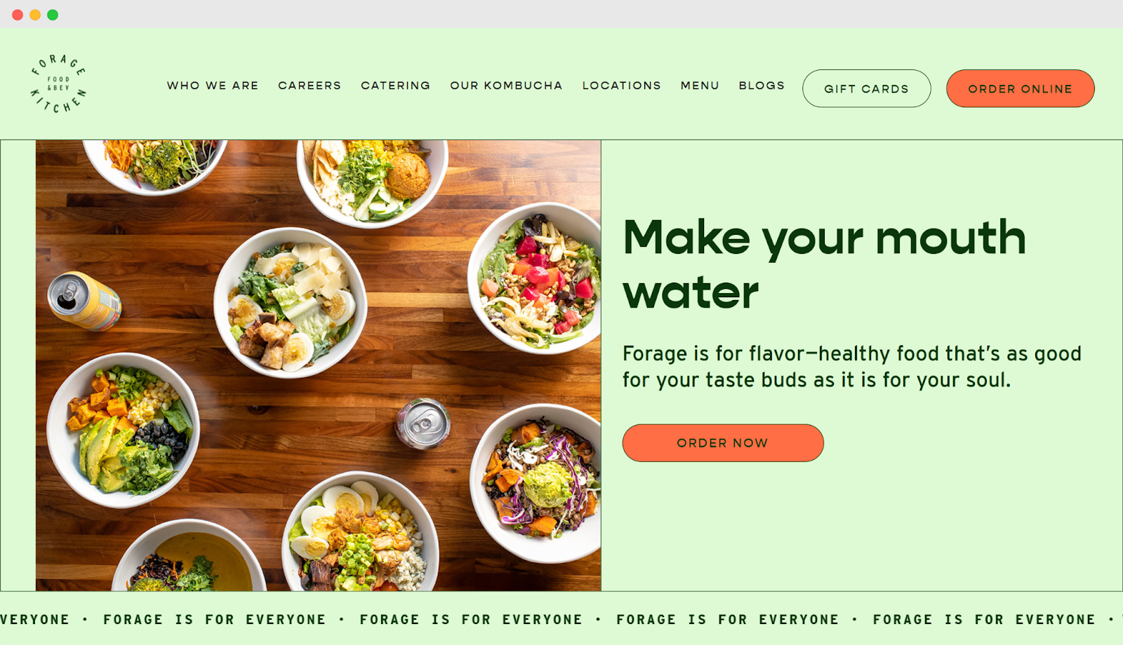
Forage uses a fresh mint green and multi-color palette that feels healthy and vibrant. The clean sans-serif fonts keep everything modern and readable, while the bright orange CTAs like "ORDER ONLINE" and "FLAVOR YOUR EVENT" pop against the soft backgrounds.
The hero section showcases beautiful overhead shots of colorful bowls that immediately communicate the fresh, healthy brand promise. Each section uses different background colors - from mint to blue to coral - creating visual interest while maintaining brand consistency.
High-quality food photography, restaurant interiors, and lifestyle shots tell the complete story of the dining experience. The strategic color blocking and clean typography show how effective visual storytelling can make healthy food look irresistible.
If you're looking for broader inspiration beyond restaurants, check out the best service website examples to see how other industries handle design and user experience.
Kumas Corner
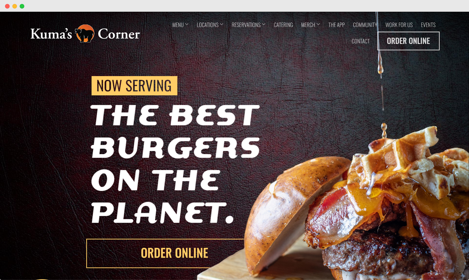
Kuma's Corner uses a bold black and orange color scheme that screams rock and roll attitude. The edgy, metal-inspired fonts in headlines like "THE BEST BURGERS ON THE PLANET" and "HAND-CRAFTED" perfectly match their rebellious brand personality.
The hero section features a massive, drool-worthy burger photo with confident white text that makes big claims and backs them up visually. Orange "ORDER ONLINE" and "CHECK OUT" buttons stand out perfectly against the dark background, making it easy for hungry visitors to take action.
High-quality photos of towering burgers and craft beer create serious food envy, while trust badges from Zagat, Yelp, and Food Network add instant credibility. The dark, gritty design aesthetic tells you this isn't your typical burger joint - it's an experience for people who like their food as bold as their music.
Rebel Cheese
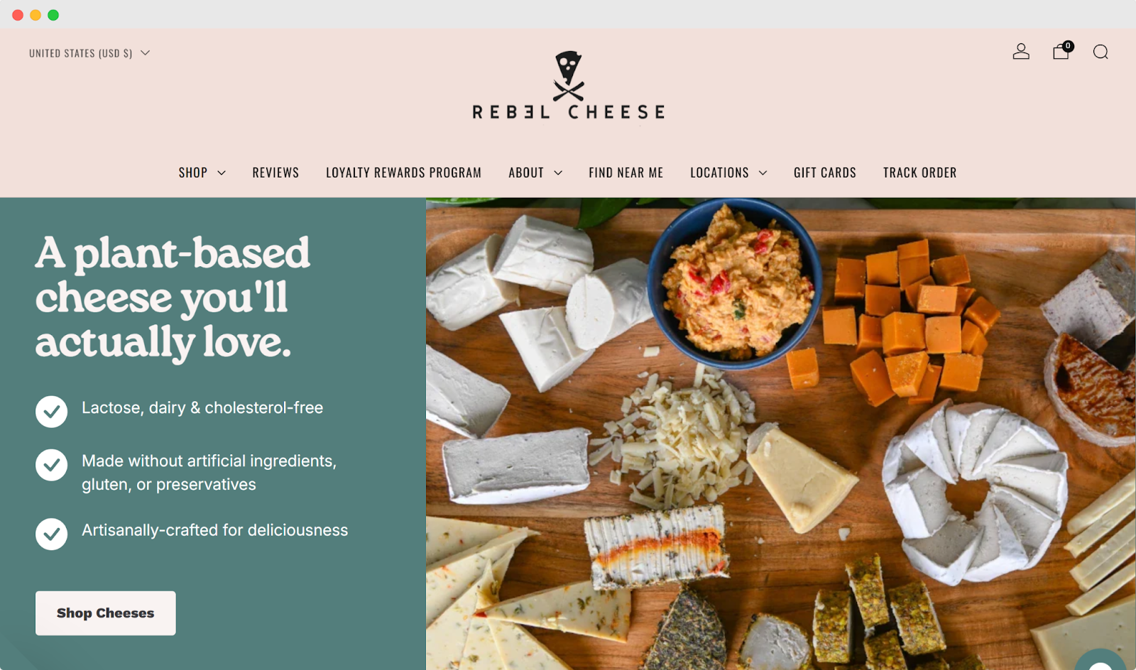
Rebel Cheese uses a calming green and cream color palette that feels natural and premium. The clean sans-serif fonts keep everything modern and easy to read, while the soft colors create a sophisticated, health-conscious vibe.
The hero section features a gorgeous cheese board spread with the compelling tagline "A plant-based cheese you'll actually love" that immediately addresses potential skepticism. Beautiful product photography throughout shows colorful cheese boards and happy customers enjoying the food.
Simple "SHOP ALL" and "VIEW MORE" buttons blend smoothly with the design without being pushy. The comparison chart with checkmarks against competitors is a smart trust-building element.
The clean layout and premium photography create an upscale artisanal feel that makes plant-based cheese look as appealing as traditional dairy options.
How to Make a Good Restaurant Website
Learning how to build a restaurant website requires essential features beyond basic website design. Include online ordering, reservation systems, and customer data management. Hire a developer for custom solutions or use third-party plugins for these functions.
Test everything before launching. Place test orders, make reservations, and click every menu link. Check that forms submit properly and payment processing works. Fix any broken features immediately.
Your finished site should let customers easily browse menus, place orders, and book tables without technical problems.
Some Tips on Getting The Most Out of Your Restaurant Website
Overall Online Presence
Your restaurant website is important, but it's not the only place customers find you online. Social media and local business listings work as additional marketing tools that bring in customers.
Since 97% of people search for local businesses online, many will discover your restaurant through Google Maps or review sites. Claim these listings immediately and keep them updated with current hours, menu changes, and contact information.
Integrate services like OpenTable for easy reservations and customer reviews. These platforms let people book tables and leave feedback in real-time, expanding your reach beyond your main website.
Keep all your online information consistent across every platform - from your website to Google listings to social media profiles.
Mobile-friendly Design
Mobile-friendly design is essential for restaurants. Google reports that 89% of restaurant research happens on mobile devices, so your website must work perfectly on phones and tablets.
Even if you have a mobile app, you still need a mobile-optimized website. Make sure your site scales properly, images load quickly, and buttons are easy to tap on both iOS and Android devices.
Your mobile site should be just as functional as your desktop version - no pinching or zooming required.
Online Purchase Options
Online ordering systems let customers place delivery and takeout orders directly from your website. You can either embed third-party ordering apps or hire a developer to build a custom system that handles payments automatically.
When done right, this automation brings in delivery revenue without creating extra work for your staff. Customers can order and pay online while your team focuses on cooking and service.
Don't limit online purchases to just food. You can also sell restaurant merchandise, digital gift cards, and physical gift cards through your website for additional revenue streams.
Quality Content
Quality content can make or break your restaurant website. Surveys show that 70% of potential diners avoid restaurants with poor websites, so high-quality photos and well-written text are essential.
If your current photos look amateur or your menu descriptions are bland, consider hiring professionals. Great food photography and compelling copy directly impact whether people choose to visit your restaurant.
Don't let beautiful content slow down your site. Test that images and videos load quickly on all devices. Work with a developer if needed to properly format media files and avoid lag times that frustrate hungry customers.
Your content should make people want to eat at your restaurant, not click away to a competitor.
Email Signup Options
Email signups help you stay connected with customers and promote menu changes or special offers. Place a signup box directly on your website - avoid pop-up windows that annoy visitors.
Offer incentives like discounts or exclusive deals to encourage people to share their email addresses. A simple "Sign up for 10% off your next order" works well.
Once you start collecting emails, use software like Mailchimp to automate your newsletter campaigns. You can easily send updates about new menu items, special events, or seasonal promotions to keep customers coming back.
FAQs
How important is a website for a restaurant?
A website is essential for restaurants today. Customers expect to see your menu, food photos, and reviews online before deciding where to eat. Without a website, they'll simply choose a competitor who makes this information easily accessible.
Your website works as a 24/7 digital storefront, helping customers discover you and decide to visit - even when your restaurant is closed.
How many pages should a restaurant website have?
Most restaurant websites should have 5-10 pages to cover the essentials without overwhelming visitors.
Include your homepage, menu, about page, contact info, and reservations/ordering. Add extra pages for events, catering, or careers only if needed.
Keep it simple - too many pages confuse hungry customers.
What is one feature that many restaurant websites offer?
One of the most common features on restaurant websites is online ordering. This lets customers browse your menu, place orders, and pay directly through your website for pickup or delivery.
