Are you new to Figma and unsure where to begin? Feeling overwhelmed by its many features is very natural. Specially, the newbies struggle to create designs that truly stand out.
Whether you’re a professional or a newbie, don’t worry—Figma is a great tool for web design and is easy to use. It’s a web-based design and prototyping tool, so there's no need to download anything. Plus, you can collaborate with your team in real time which makes the design process smoother and faster. But the key is understanding how to use Figma effectively.
In this guide, we'll break down how to use Figma for web design. We'll cover the basics, tips, and tricks to get you started.
Let's dive in and make your web design process easier with Figma.
Get Introduced to the Key Elements
Before we discuss the guide on using Figma for web design, we introduce you to some of the common elements and features of Figma.
-
Frames: In Figma, web pages are shown as artboards, also called Frames. They work as containers for the design elements. You can create multiple frames to show different pages or screen sizes in one project.
-
Vector tools: Next, Figma offers many vector design tools like the Pen, Shape, and Text tools. You can use them to make shapes, icons, buttons, and typography elements for your web design.
-
Components and Styles: Figma allows designers to create reusable components and styles. You can design elements like buttons or navigation bars once and then use them across different projects and screens. It ensures consistency in design and saves time.
-
Auto Layout: The Auto Layout feature of Figma helps UI/UX designers create adaptable designs. It automatically resizes and repositions elements and it ensures consistency and appeal as content changes. This element is also perfect for lists and navigation menus.
-
Text and Typography: Figma offers many text and typography tools. You can choose from various fonts and adjust size, weight, and color. Moreover, you can use text styles for consistency. Advanced settings, such as letter spacing and line height, are also available. These features make your web design look professional.
-
Prototyping: Figma’s prototyping allows UI/UX designers to create interactive mockups within the design tool. It simplifies workflow and allows user experience testing and quick iterations.
To enhance your design process, you can explore various popular UX design tools. These tools provide a range of functionalities to streamline your workflow and improve the user experience of your projects.
How to Use Figma for Web Design: The Beginner'sd Guide
Below we show you an easy 5-step guide on using Figma for web design.
Step 1: Sign up and Build a Design
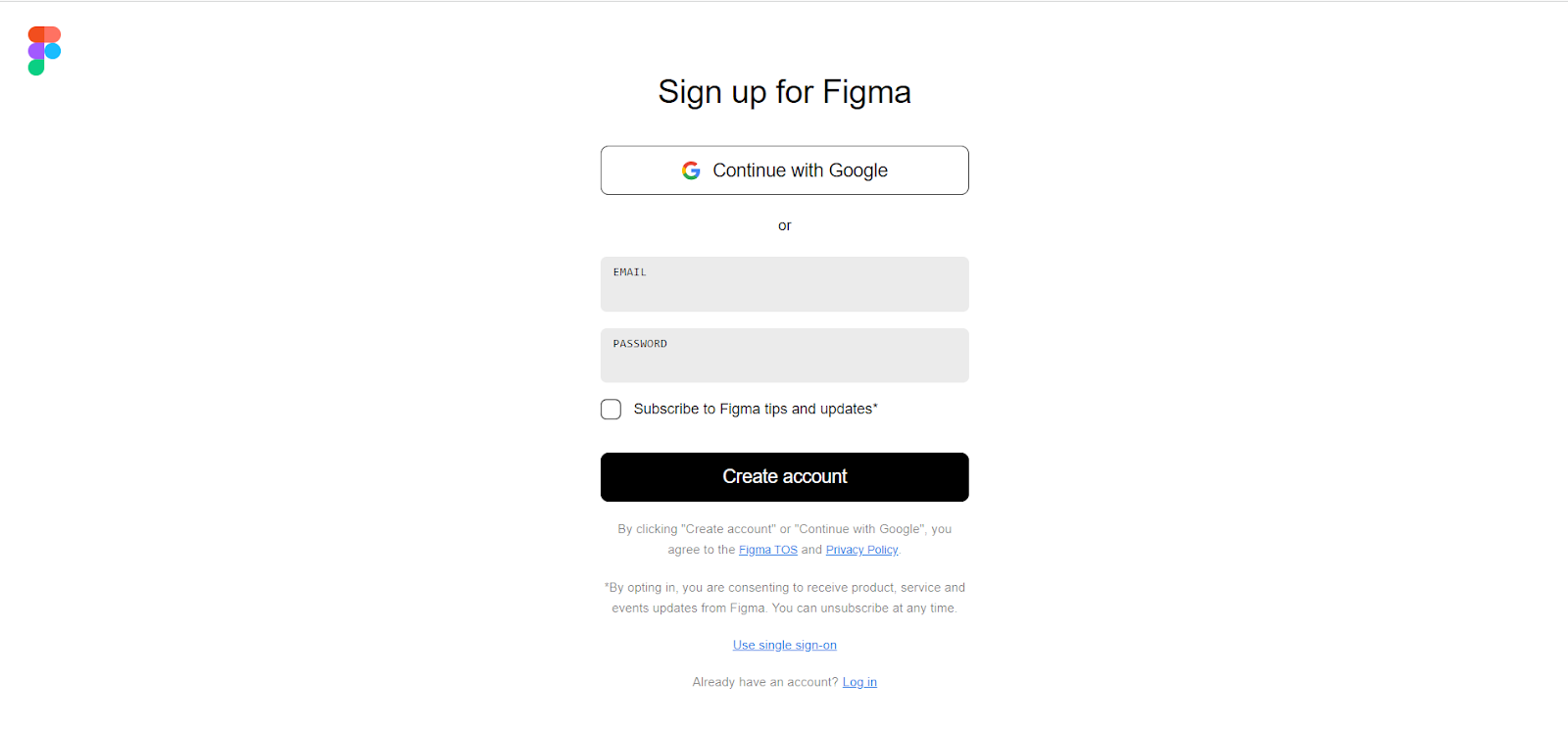
To start designing with Figma, you'll need to create an account. Visit the Figma sign-up page and register for free to get started.
After you sign up, you can start from scratch or start using the pre-built wireframes. To start from scratch, create a new project from the Menu as the image suggested.
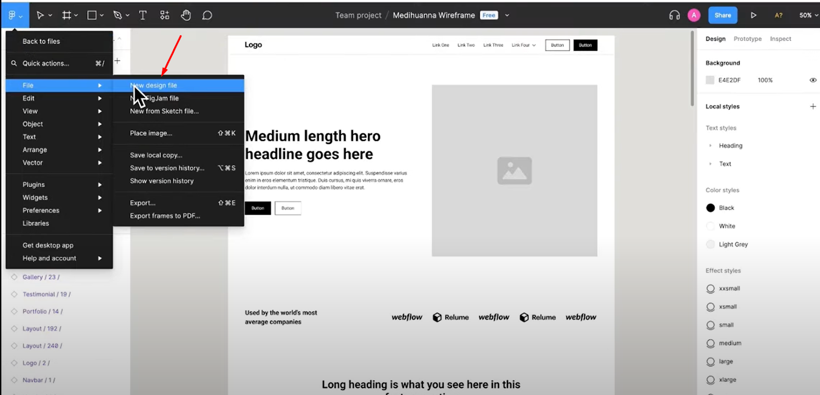
However, for beginners, it’s quite difficult and time-consuming to start from scratch. There is another option to make the task a lot easier: using wireframes. We’ll use a wireframe to continue the design. So, let’s move forward.
Step 2: Building Wireframes
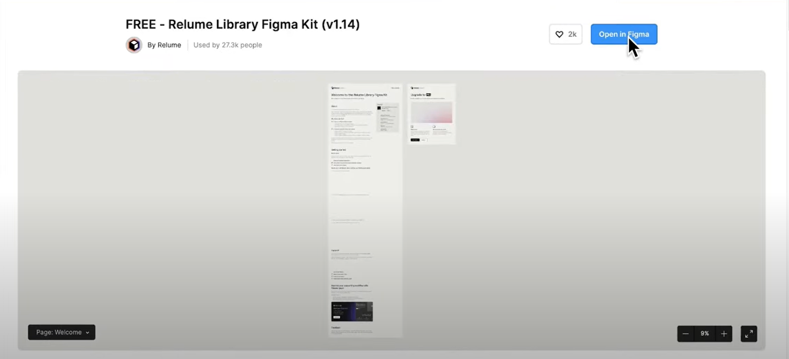
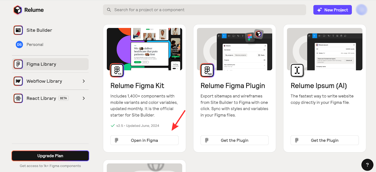
To build wireframes in Figma, it’s best to use the Relume Library. It offers free Figma components to quickly assemble essential website sections such as headers, featured areas, and pages.
So, first, visit the Relume Library website and create an account.
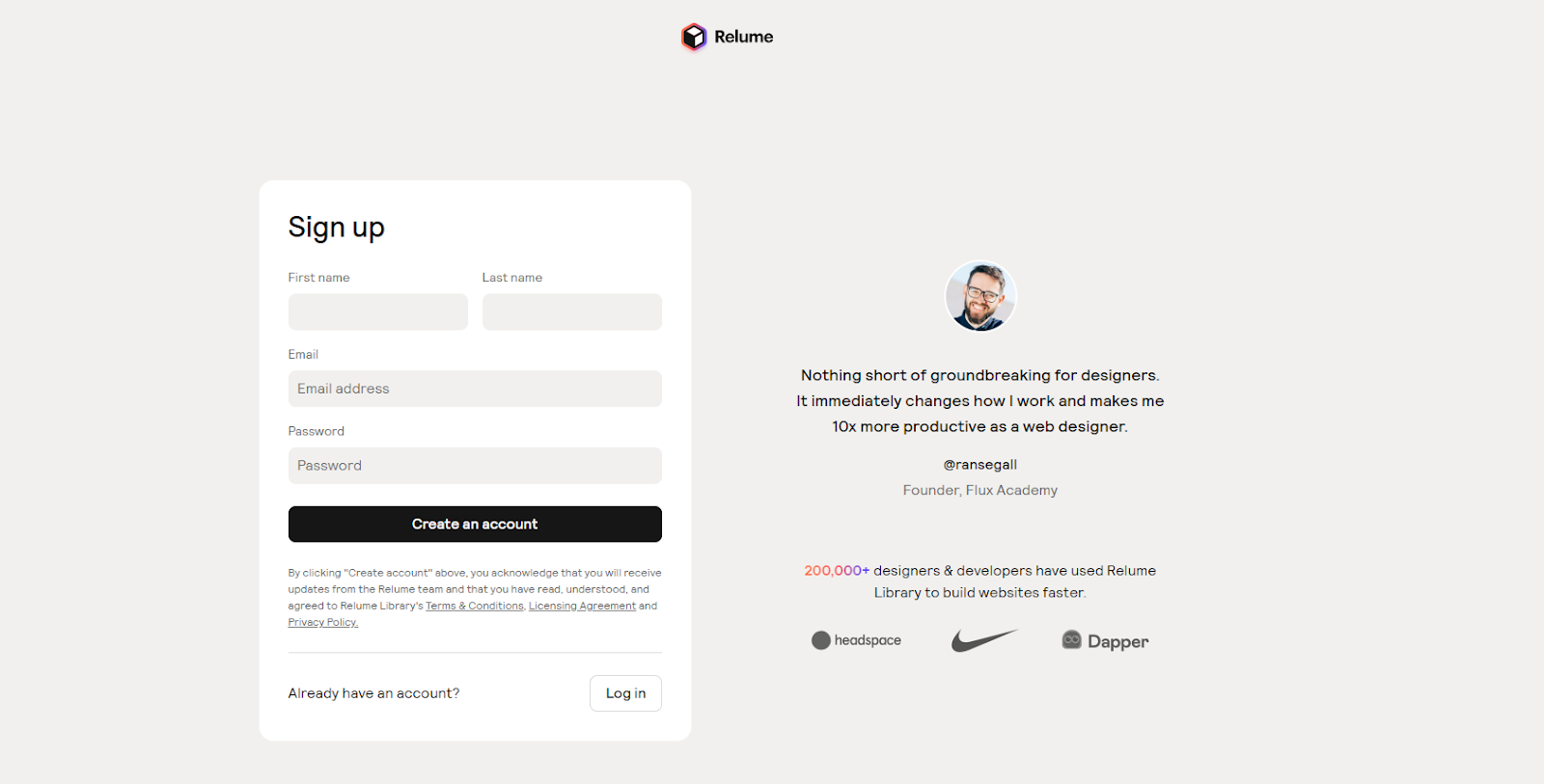
Once logged in, navigate to the left sidebar to find the Figma Library. Click on it, and then select 'Open in Figma' to access the wireframe components and get started on your design.
Step 3: Writing Copy and Adding Images
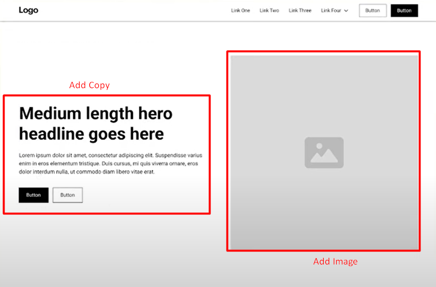
This is an important step and here you can get help from ChatGPT. First, pick the sections you are going to add to the website and then generate the website copy using ChatGPT. Make sure the copy is based on the Story Brand framework.
Now with a copy, if the section or your business demands photos, try to add unique and relevant images to enhance the visual appeal of your design.
Step 4: Creating a Style Guide
Now, to ensure a cohesive look and feel, create a style guide. If it’s a client project, then follow the guidelines as the client recommends. Aside from that, define typography, colors, spacing, iconography, component states, button styles, and others.
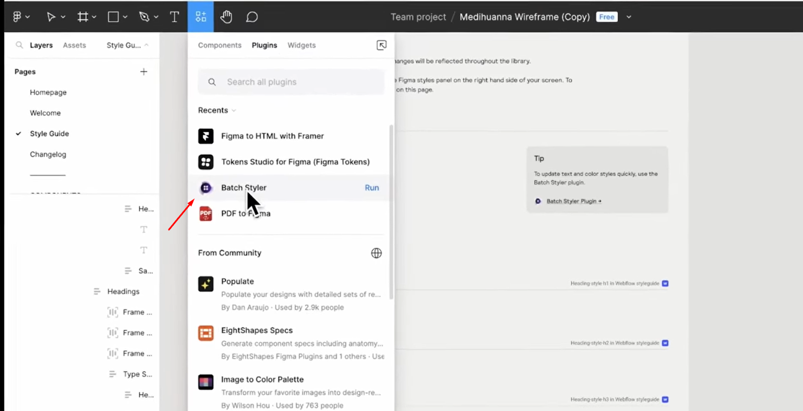
If you want to make your task easier you can use a plugin like Batch Styler. To use, go to Plugins, search for Batch Styler, and click ‘Run.’
Step 5: Designing the Homepage

This is the final step. Here you’ll have to design the homepage in a modern and specific manner. You can build the homepage by copying and pasting the approved wireframe elements. Aside from that, you’ll have to adjust the colors, graphics, and text as needed to complete the design.
Here are 3 brief tips for designing an effective homepage using Figma:
-
Highlight Key Content and CTAs: Focus on your value, top products, and main goals. Use Figma's layout and typography tools to create a clear visual order.
-
Optimize for Mobile: Ensure your homepage is fully responsive. Use Figma's auto-layout and constraints features to adapt the layout seamlessly across devices.
-
Add Interactive Elements: Use Figma's prototyping tools for animations, hover effects, and scrolling interactions.
Figma Best Practices for Web Design
To help you avoid common web design mistakes, we’ve compiled practical web designing tips. Let's dive in and improve your web design process with Figma.
-
Compress Your Images: Figma compresses raster images when you import them. Avoid overloading your page with high-resolution images. You should also think about people with slower PCs or weaker GPU cards. Use mood boards and paper sketch photos selectively.
-
Use the Comments Function: Comments in Figma allow real-time collaboration with your teammates. You can leave messages for feedback, discuss urgent issues, review comments on designs, and follow up on questions.
-
Avoid Placeholder Text: Placeholder text, like LOREM IPSUM, is common in design. However, leaving it in the final design can create a bad user experience. Instead, you can use relevant text from Wikipedia or other sources. If you're short on time, use a Figma plugin to quickly fill your pages with text.
-
Opt for Mobile First: Since more than half of website traffic comes from mobile devices, you should prioritize designing for smartphones if your audience primarily uses mobile. Focus on creating mobile-friendly websites and apps.
-
Apply Responsive Web Design: Use a flexible grid system for your website content. It’ll ensure your pages automatically adjust to fit various screen sizes.
Practical Application of Figma in Creative Design
Below, we explore how Figma revolutionizes creative design with its practical applications. So, let’s check out.
1. Spotify
Spotify designed their website using Figma and ensured consistency and efficiency with variables. Their initial website design ideas were prepared before using Figma.
Figma’s Dev Mode facilitates collaboration between designers and developers. As a result, it speeded up the design-to-production process. This also helped Spotify maintain a unified appearance across its products and platforms.
2. HP
HP used Figma's Dev Mode to cut 1.5 hours from its design-to-code workflow. By streamlining their tech stack and using the Veneer design system, they improved consistency and efficiency across 70+ products.
Moreover, the Dev Mode has reduced duplicative work and enhanced collaboration. It has saved HP significant time and resources.
3. Vanguard
Vanguard is an investment management company that improved their design efficiency by using Figma. By simplifying their tech stack, they reduced duplicative work and improved team communication.
Figma’s features, such as auto-layout and FigJam, made design, prototyping, and collaboration faster. This helped Vanguard design and ship products 50% quicker while keeping high-security standards, benefiting millions of clients.
You can explore our value-packed guide if you're into AI web design.
Insight From Forum and Community Discussion
Right now people are also talking a lot about using Figma in web development. Below we break down a little of their discussion.
Well, the main conclusion of the discussion is that using Figma in web development makes the process more efficient.
A Reddit user, Ygorhpr mentioned that it allows for quick testing and refining of ideas before coding. Thus, it ultimately reduces the overall costs. Another user, xDermo says detailed annotations in Figma help developers understand the design better. Additionally, Affectionate-Ask-154 mentioned that Plugins like "Design Assistant," make it easier to move from design to code while keeping everything consistent.
FAQs on How to Use Figma for Web Design, Answered
Can I design a website using Figma?
Yes, you can design websites using Figma. In Figma, you can design every detail precisely, from layout to pixels. It's a popular tool among designers and creators for prototyping.
Is Figma better than WordPress?
There is no direct answer to this question because both Figma and WordPress serve different purposes. Figma is great for design and prototyping, with advanced features and security. WordPress is easier for non-designers, using drag-and-drop tools. Converting designs from Figma to WordPress is a smart choice if you want to focus on design without coding.
Is Figma similar to Elementor?
No, Figma and Elementor are different. Figma is used for designing user interfaces, while Elementor is used for building websites without coding. Figma is an online design tool, while Elementor is a page builder plugin for WordPress.
Bottomline
That’s everything we’ve got on the topic of how to use Figma for web design. After discussing the steps, you should now understand that mastering Figma is simple and quite straightforward. We would suggest you begin with small projects, explore its features, and gradually expand your skills and confidence.
Figma is the future of web design, and mastering this powerful tool is essential for any designer who wants to stay ahead of the curve. So what are you waiting for? Start learning Figma today and watch your web design career soar!


